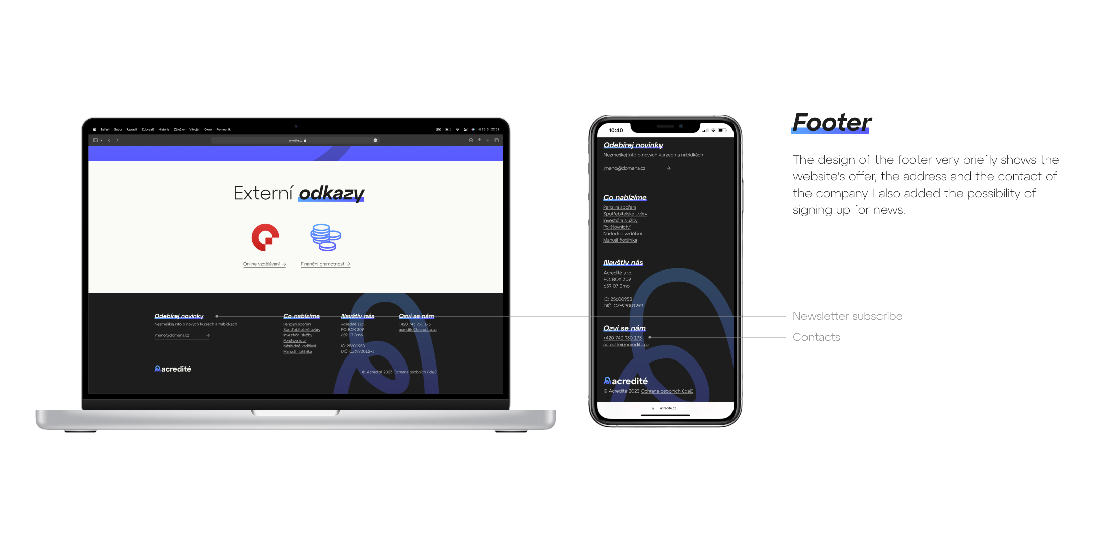
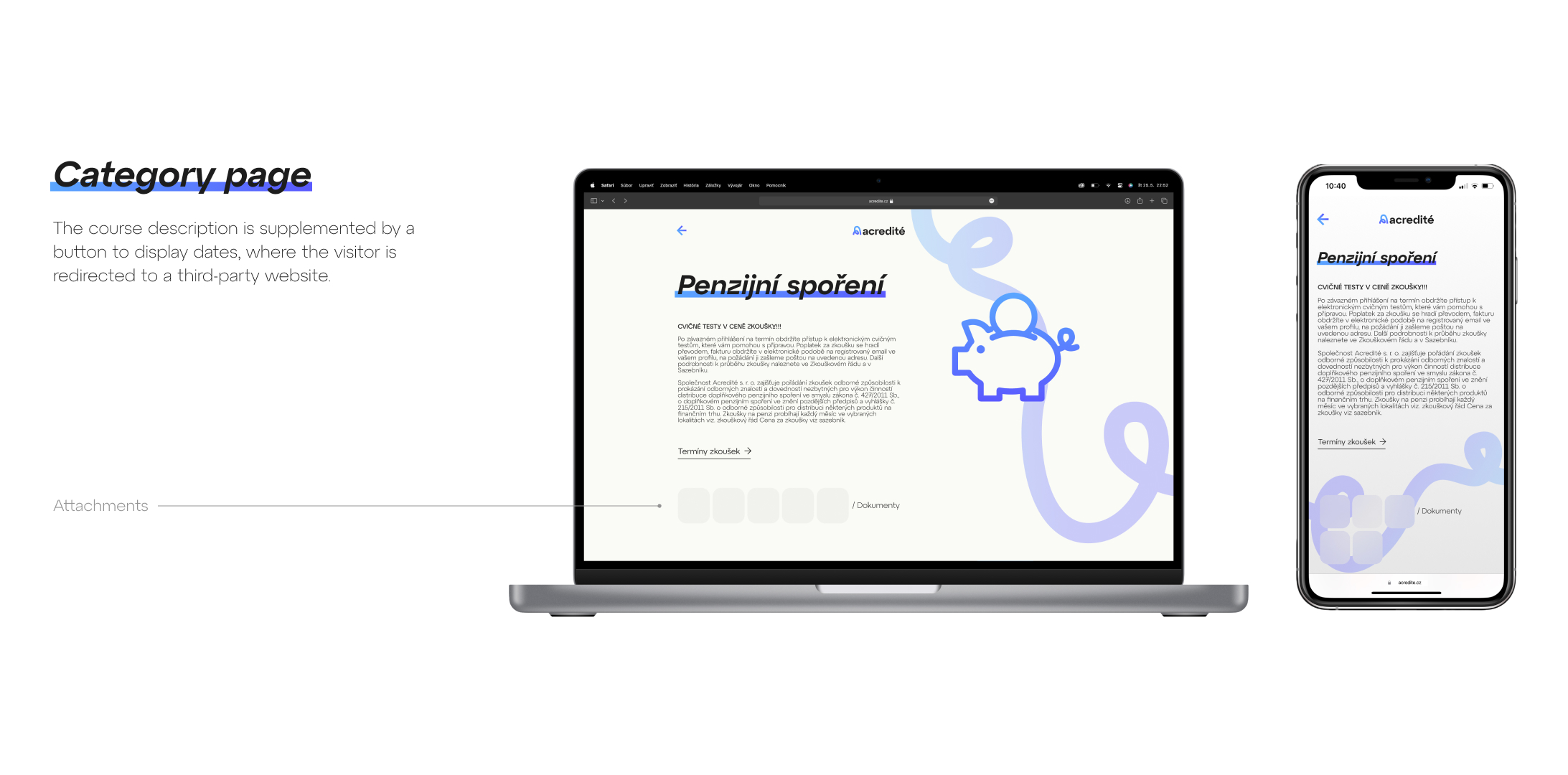
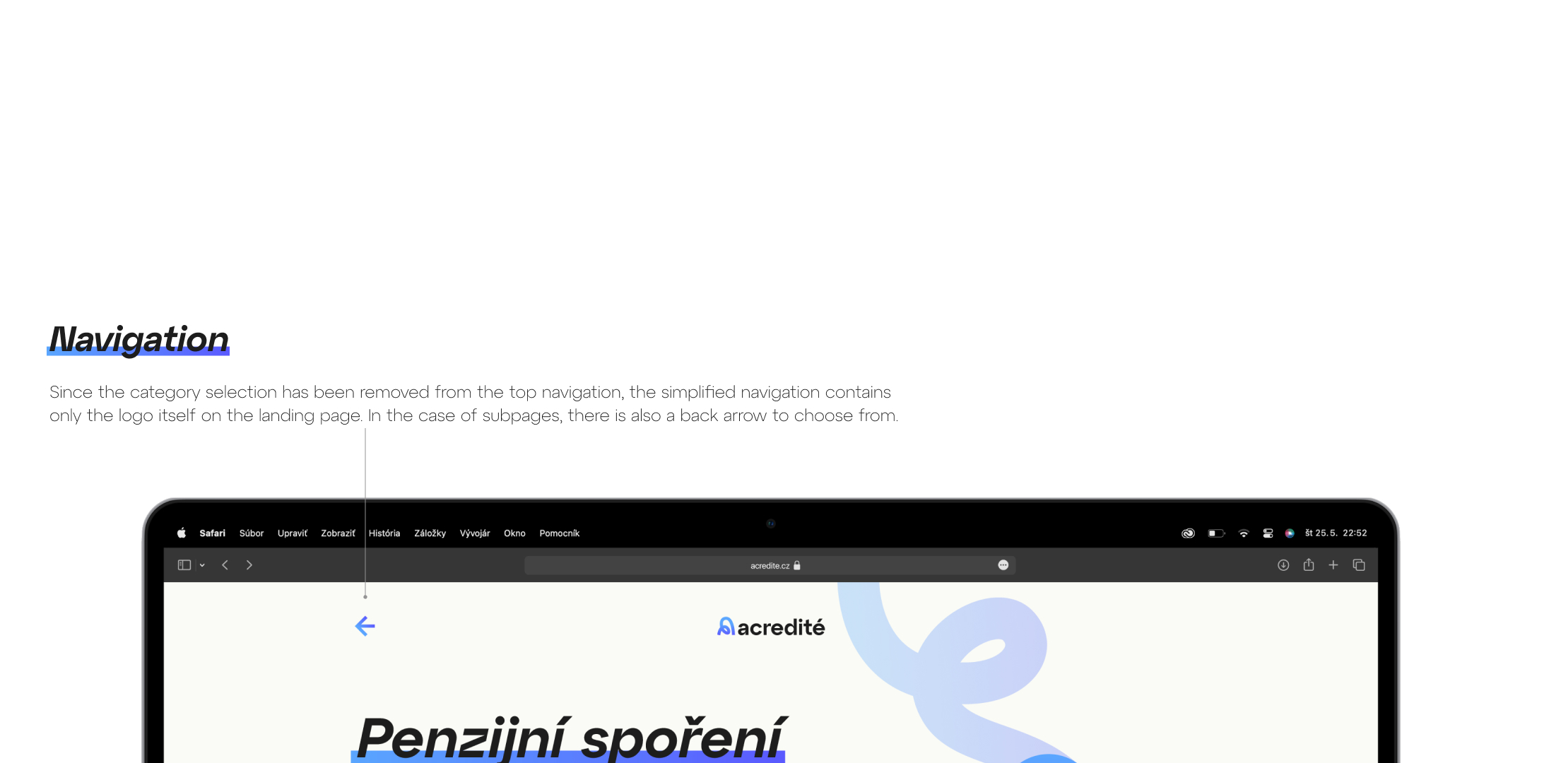
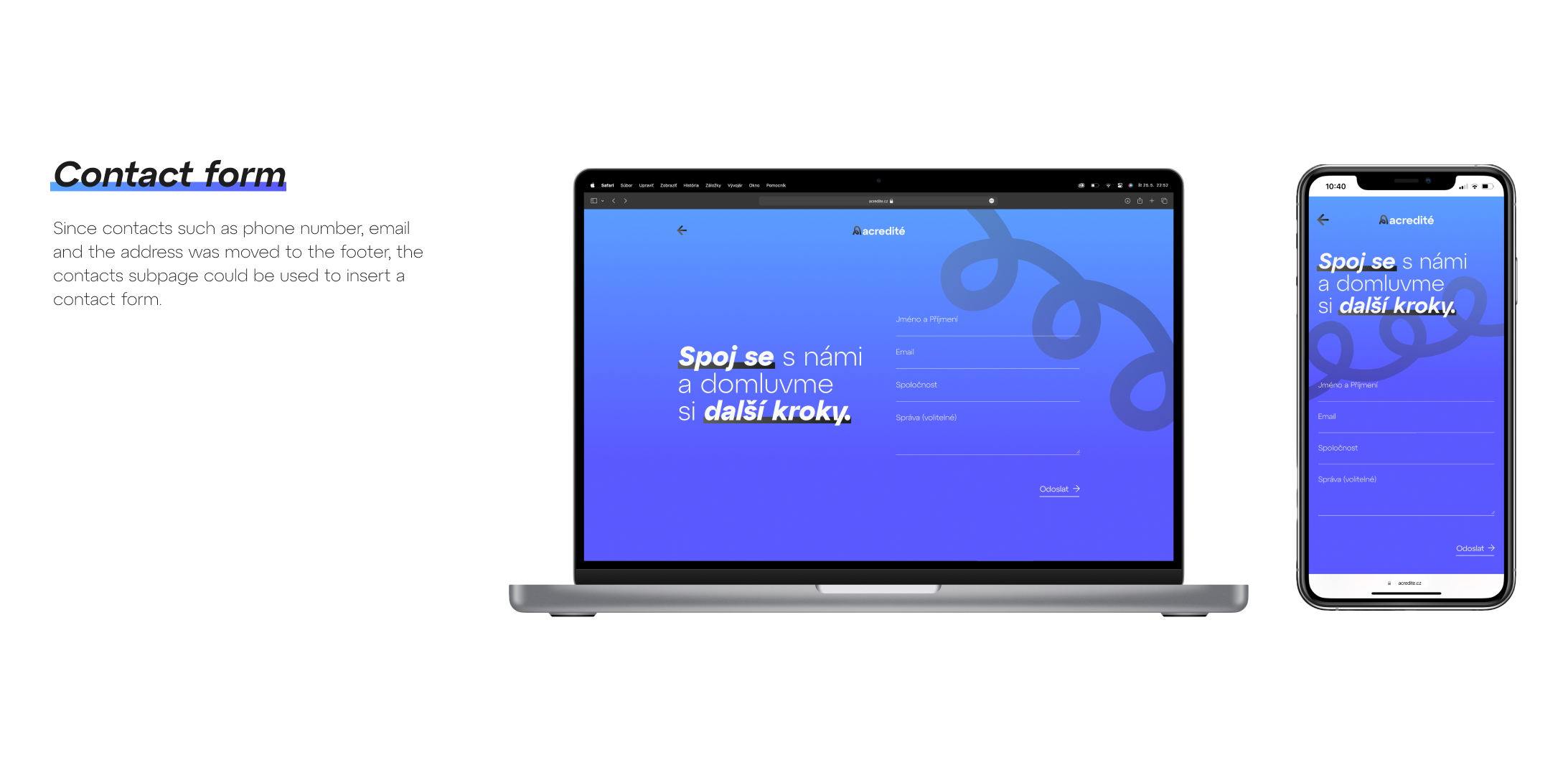
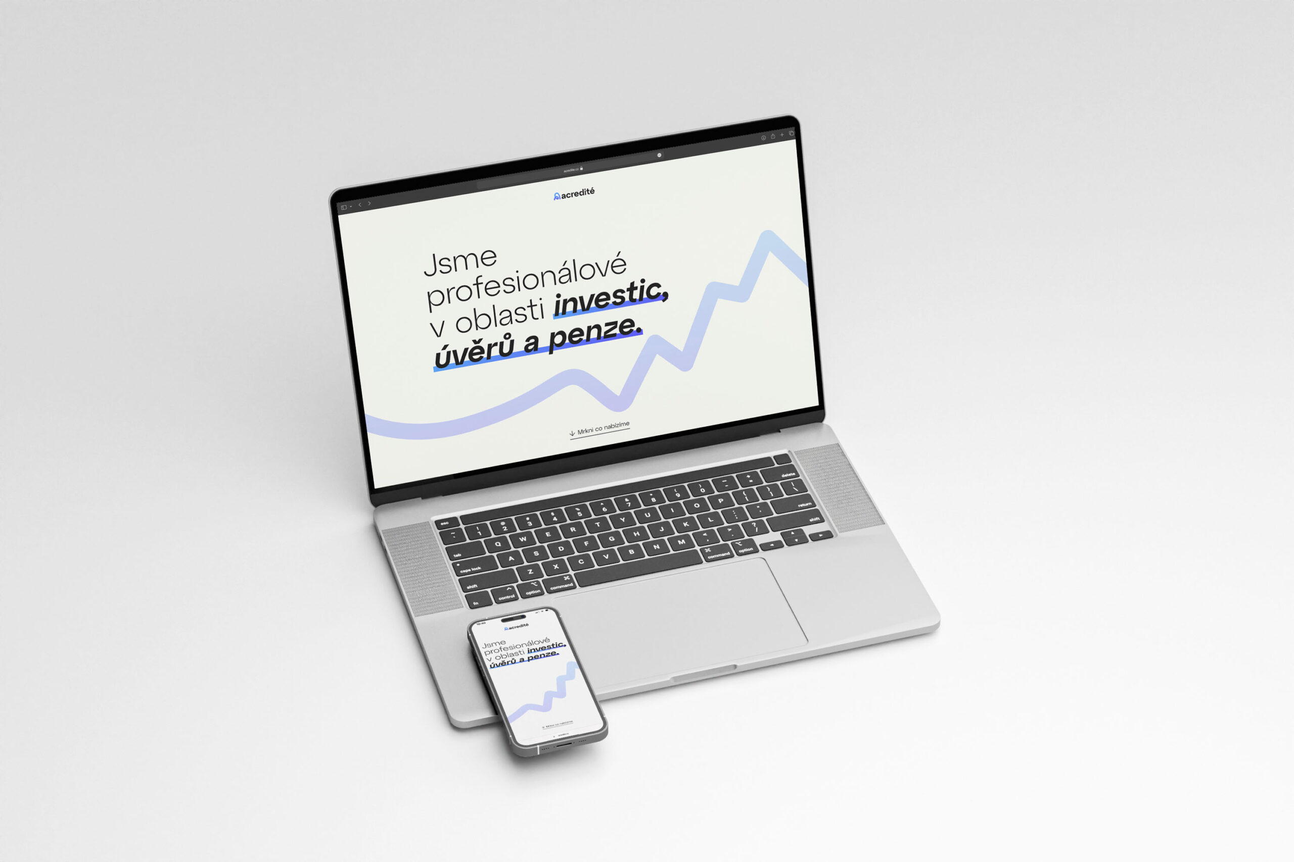
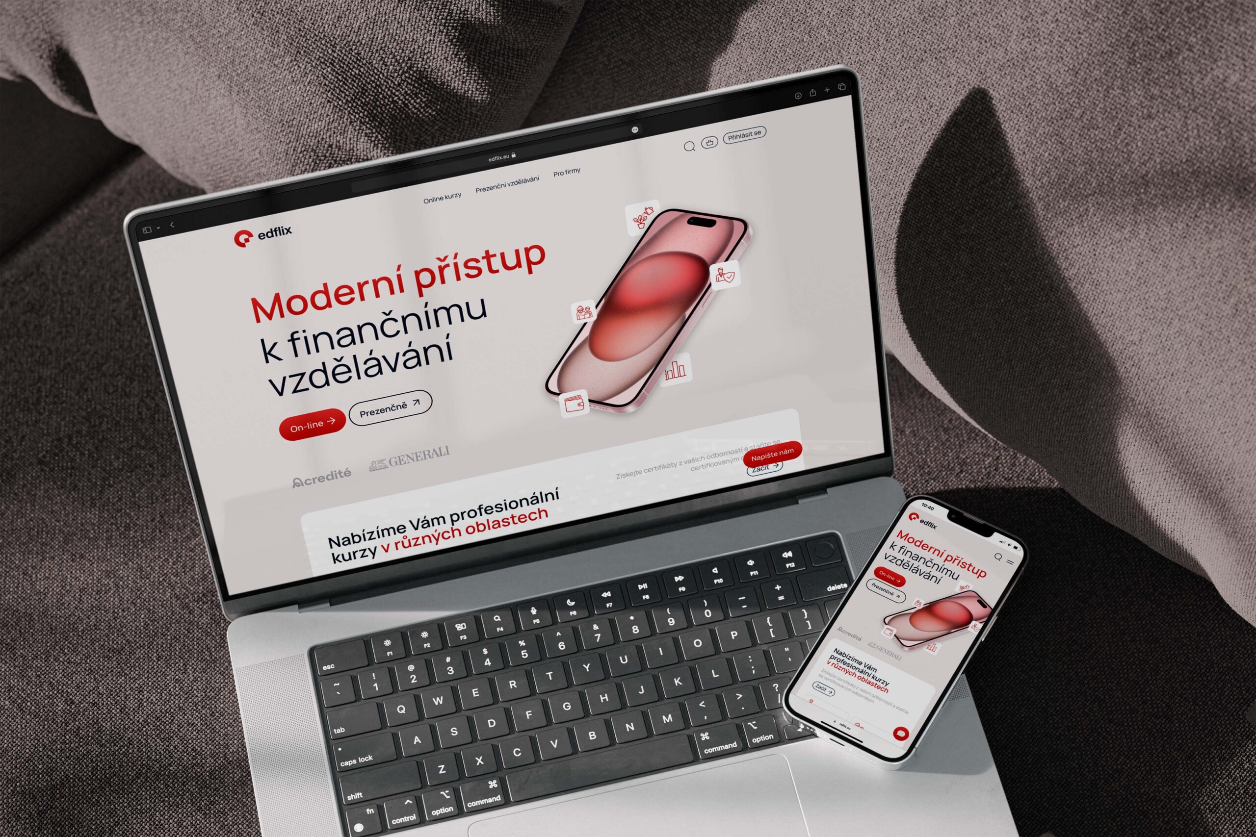
This project focuses on creating a website for ACREDITÉ, a sister company of EDFLIX. The site is minimalist in content and designed in a microsite style, which allows you to focus on its visual appeal and clear communication of key information.
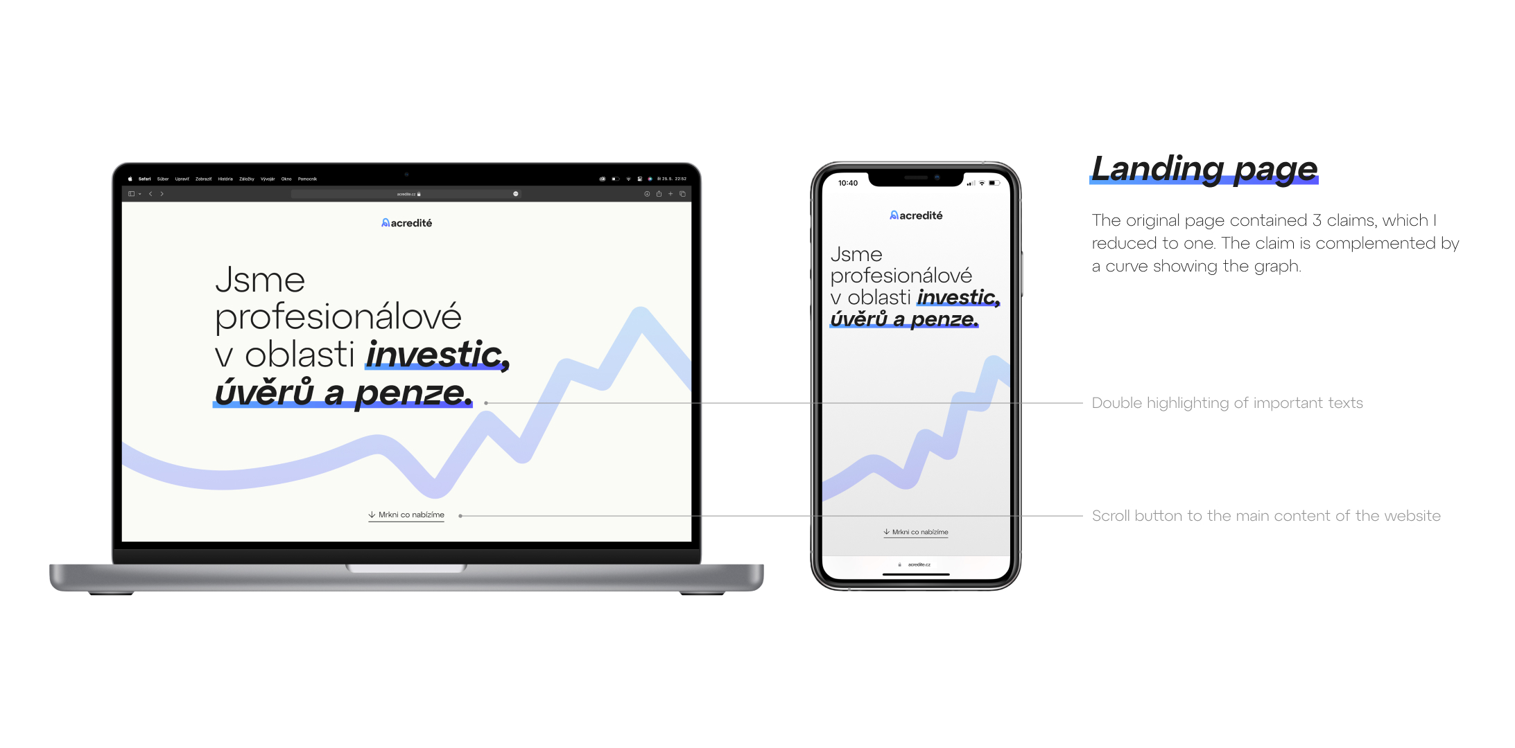
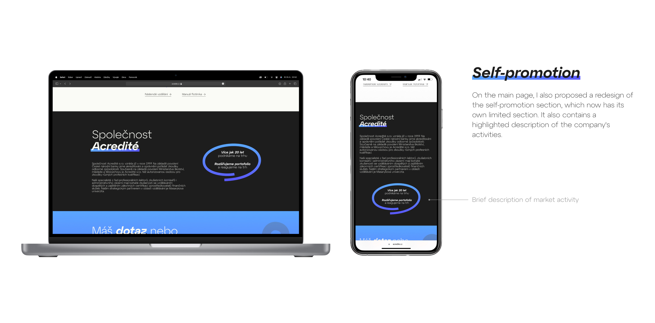
The main task was to create a redesign of the website and bring a modern visual style that will strengthen the brand identity. In the design, I focused on cleanliness and simplicity, while using vector elements to support visual hierarchy. The texts are emphasized by a combination of semibold italic and underlining, creating a clear and dynamic typography.
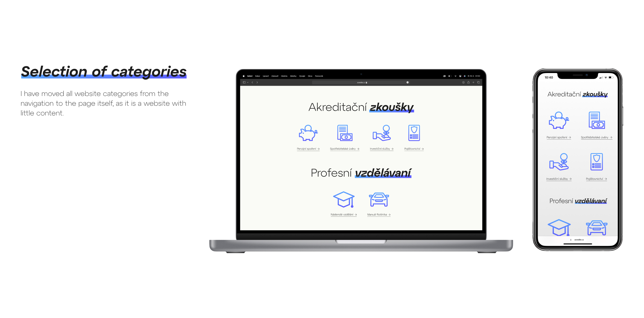
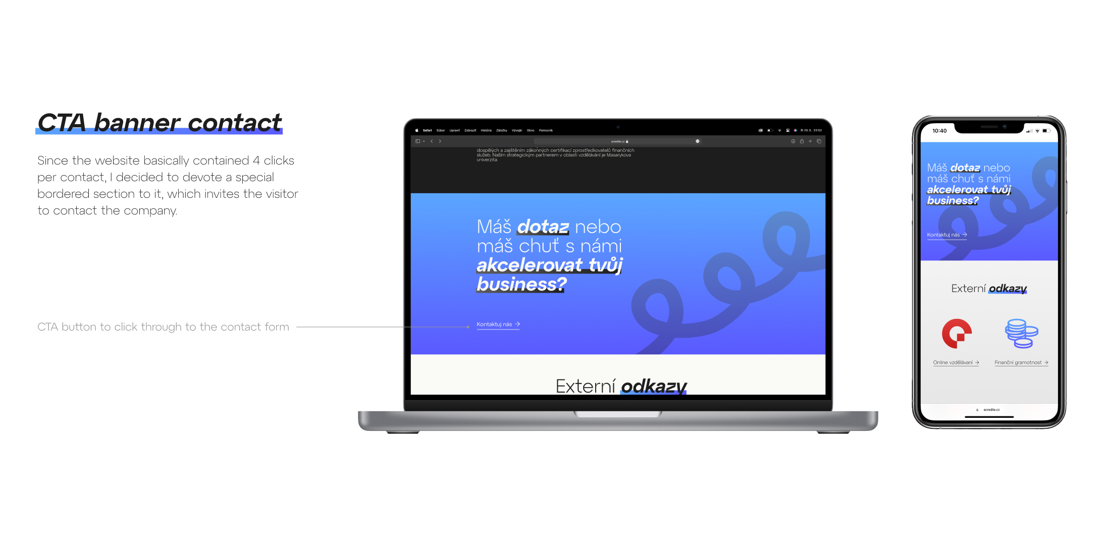
The visual concept is based on an open space without strict boundaries of individual elements, and instead of classic containers, I used underlining as a visual navigation element. The dominant color is blue, which evokes trust and stability, which is ideal for a company operating in the field of investments and finance.
The goal was to create a modern and clear design that would look professional and visually appealing.
DESKTOP PROTOTYPE: https://rb.gy/fa0kcj
PROTOTYPE PHONE: rebrand.ly/1djeh9n
