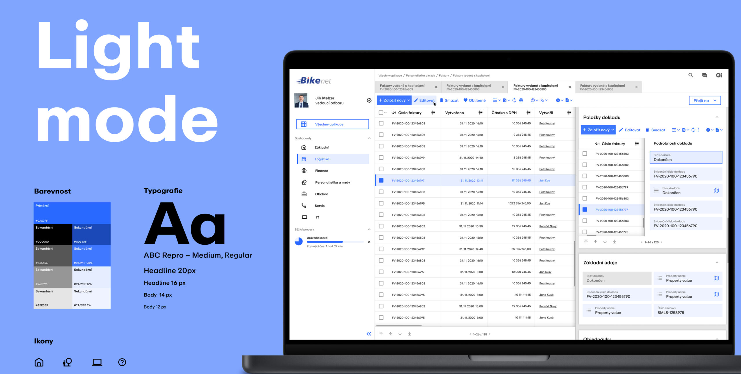
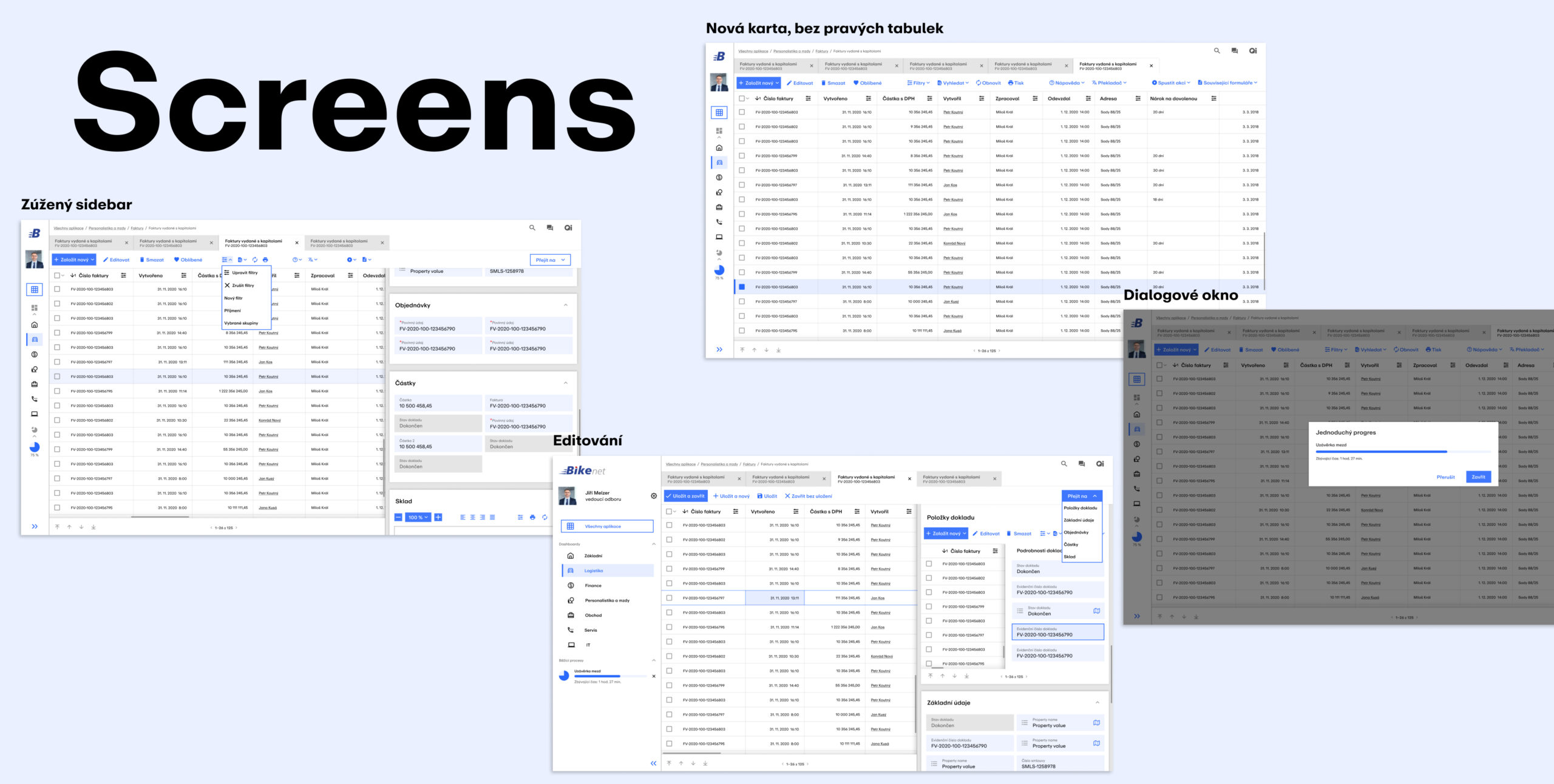
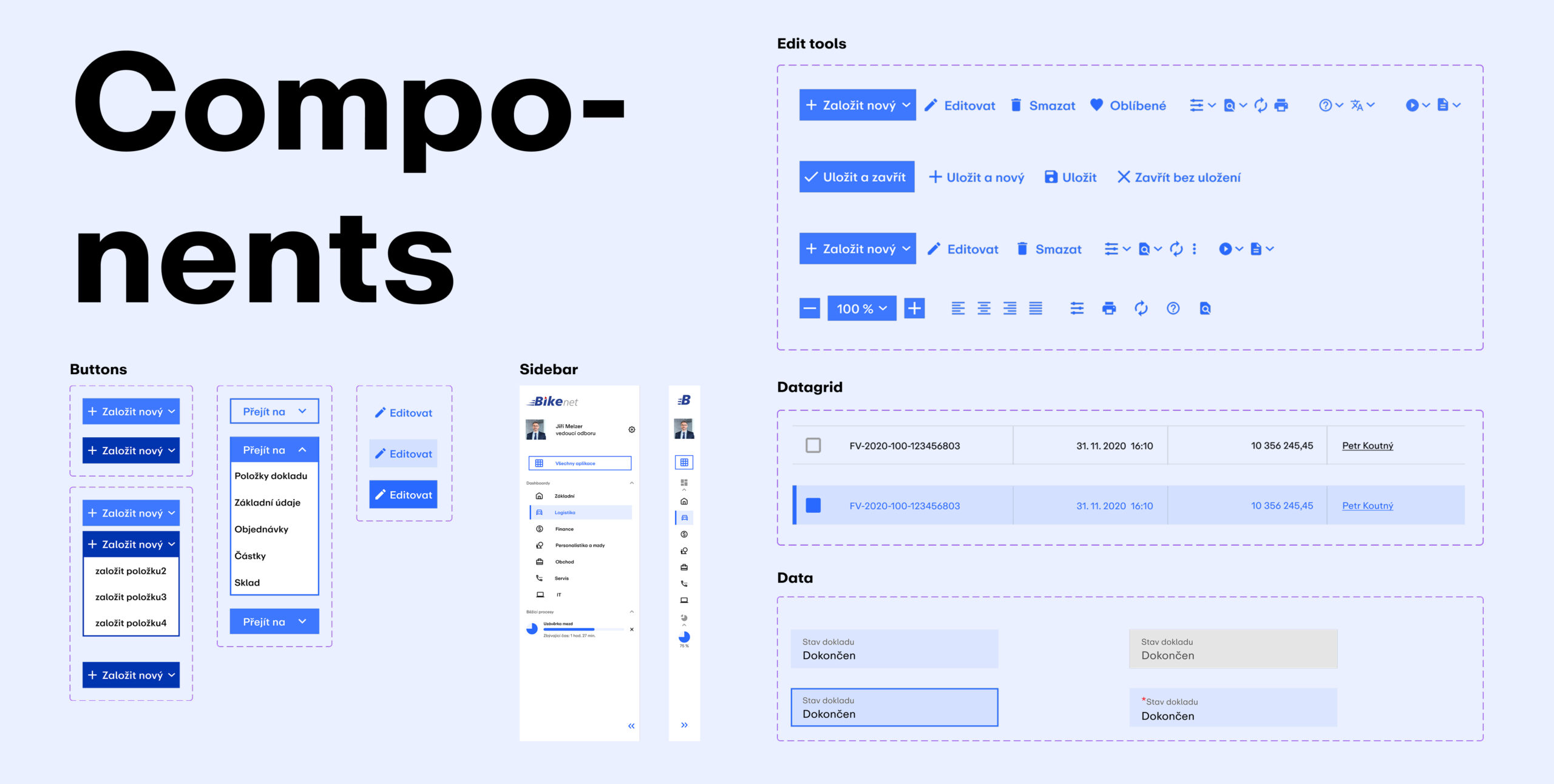
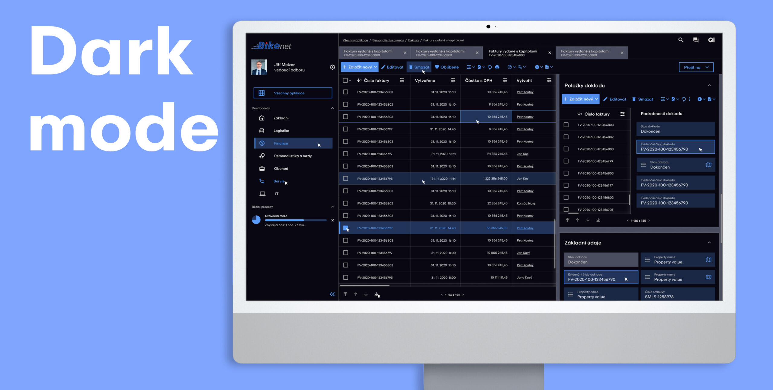
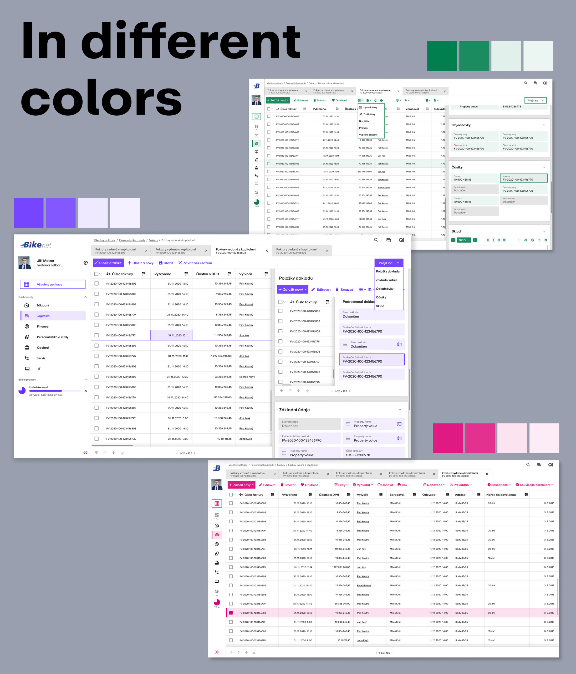
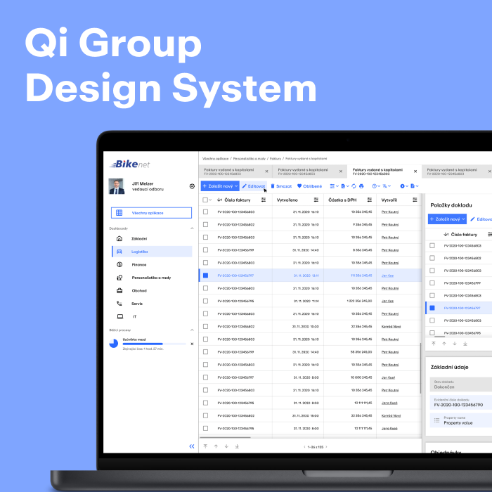
When redesigning the ERP system for Qi Group, one of the leading companies on the Czech market, I focused on visual simplification and improving user comfort without interfering with the existing architecture. I cleaned and aired the tables by narrowing the bars and reducing colors, and worked with shades of blue in various opacity for a calm and trustworthy impression. I used the geometric grotesque ABC Repro from Dinamo Typeface, suitable for a data interface. I applied a clear visual hierarchy in the design – primary buttons have a fill, secondary outline, less important ones are highlighted on hover. Interactive elements, such as editing in the table, are marked with a subtle undercolor or outline effect. The width of the sidebar can be adjusted, underlined information leads to a new tab, the datagrid reacts to hover. When editing, the given field and the entire row are highlighted, which improves orientation. Editable cells are highlighted in blue, active ones in darker blue with an outline, non-editable ones in gray. Mandatory data is marked with a red asterisk. The cluttered bar under the tabs has been replaced by a “Go to” button, dialog boxes, dark mode, and the option to choose a color skin in the profile (e.g. green, purple, pink) have been added.