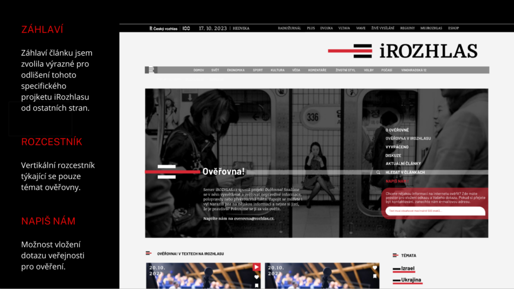
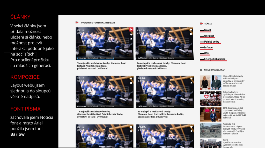
In the article header, I opted for distinctive elements under “Ověřovna” to differentiate this specific project of iRozhlas from other pages. The vertical directory focuses solely on topics related to “Ověřovna,” offering the option for public inquiries for verification. In the articles section, I added the choice to save an article or engage in interactions similar to social media, enhancing the user experience, especially for younger generations.
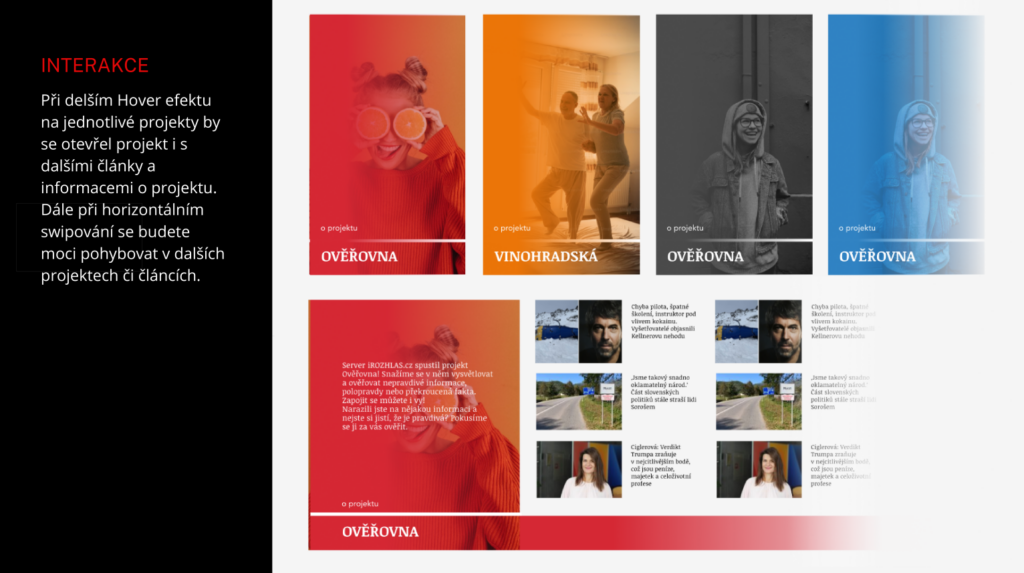
I standardized the web layout into columns, including headlines, retained the Noticia font, and replaced Arial with the Barlow font. During a more extended hover effect on individual projects, a project with additional articles and information would open. Horizontal swiping would allow users to navigate through additional projects or articles.
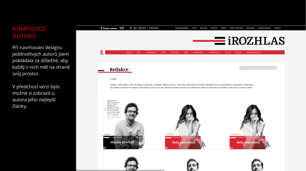
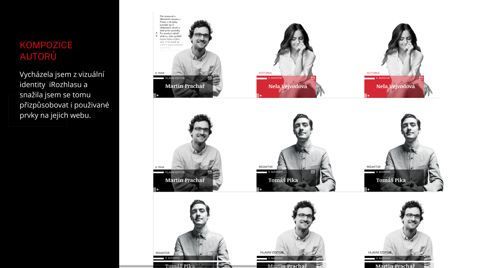
In designing individual author profiles, I ensured each had their designated space on the page. In the previous version, it was possible to display an author’s best articles. In the design process, I aligned with iRozhlas’s visual identity, adapting to the elements used on their website.
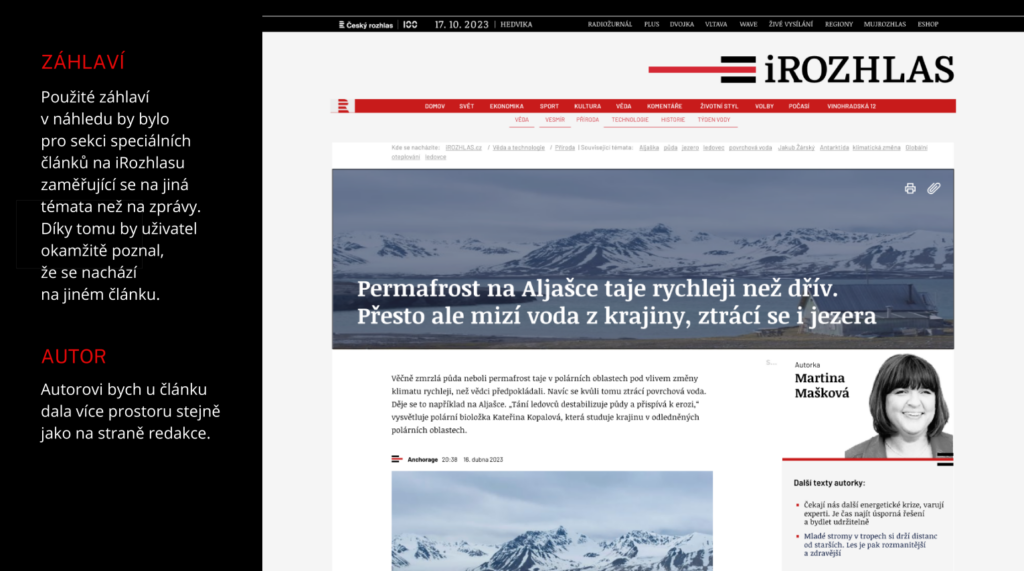
The header used in the preview would be for the section of special articles on iRozhlas, focusing on topics different from regular news. This would instantly signal to the user that they are reading a distinct article.
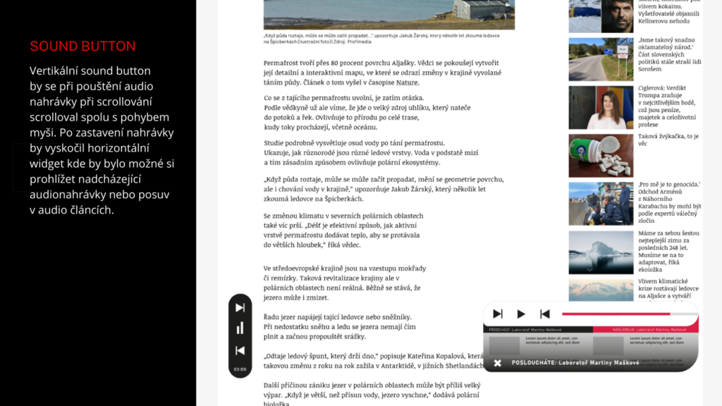
Authors would receive more space, similar to the editorial side. The vertical sound button would scroll with mouse movement during audio playback. After stopping the recording, a horizontal widget would appear, allowing users to browse upcoming audio recordings or navigate within audio articles.
