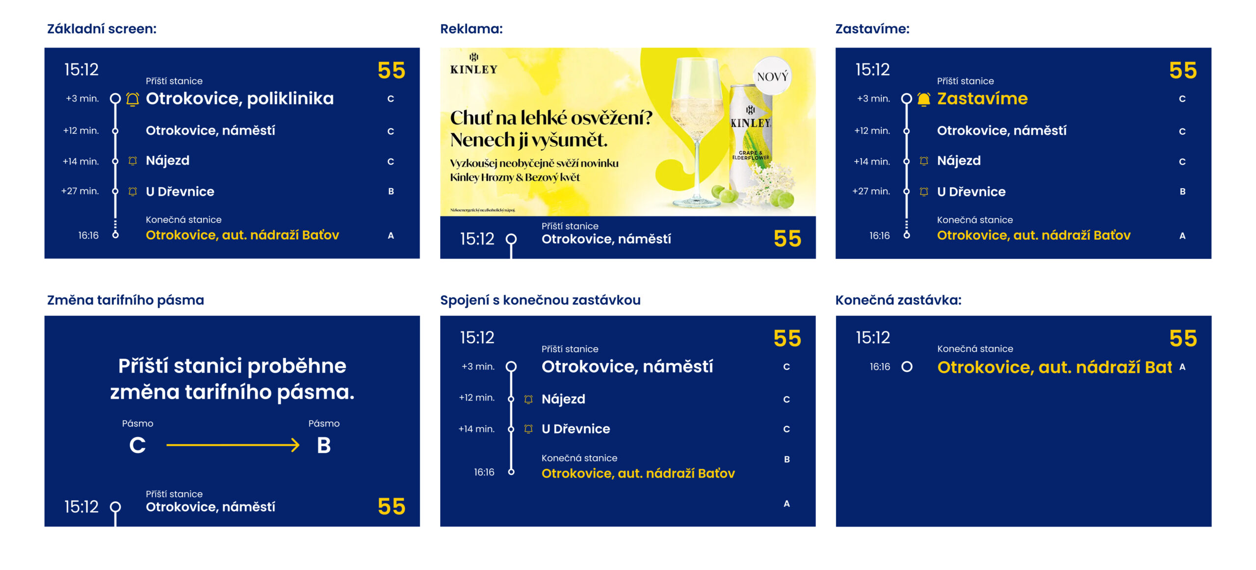
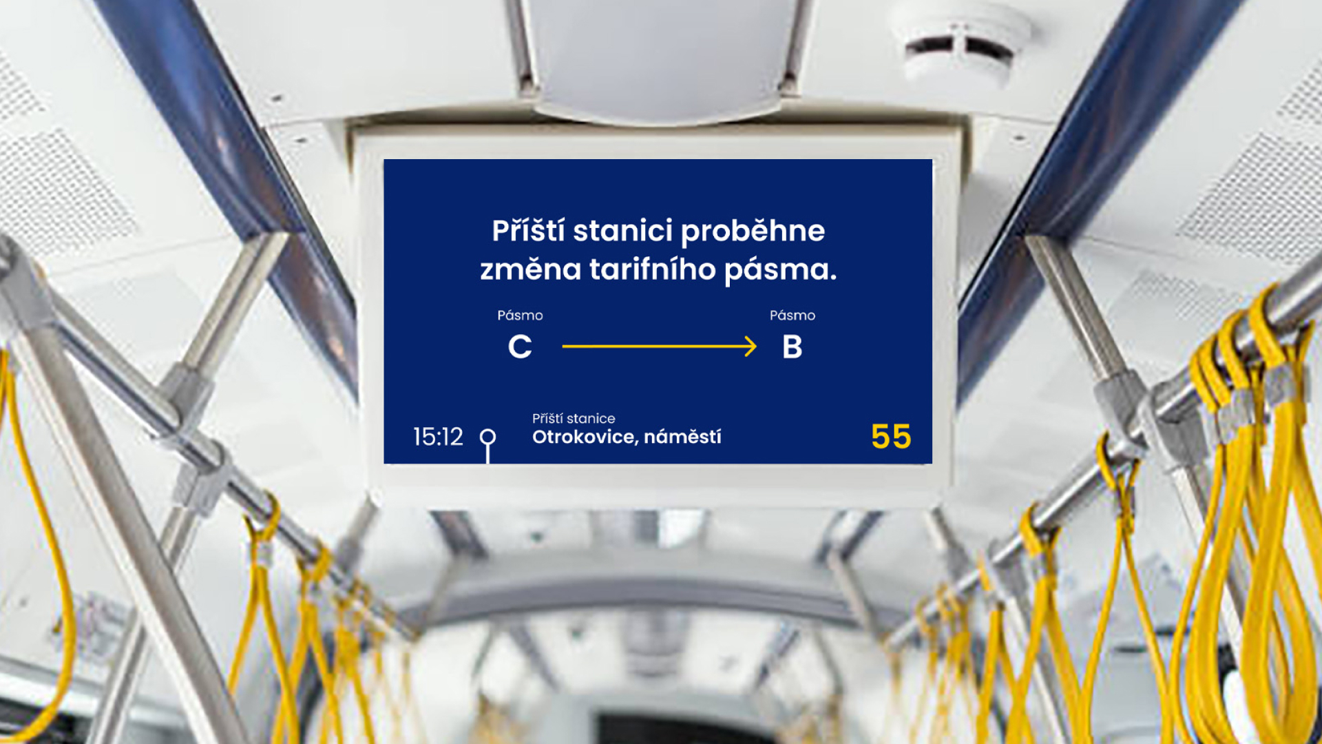
The visual design of the LCD display for the Zlín–Otrokovice Public Transport is simple and clear. Current displays are cluttered and hard to navigate. I focused on presenting key information in a clear and understandable way, using colors and font sizes to create an information hierarchy. The main screen always shows four stops, with the next stop highlighted. During advertisements, the stops slide down, leaving only the next stop visible. Request stops feature a bell icon that fills and animates when the “stop” button is pressed. When the bus is at a stop, the dot for the next stop is emphasized. The screen’s color scheme matches the visual identity of the Zlín–Otrokovice Public Transport.