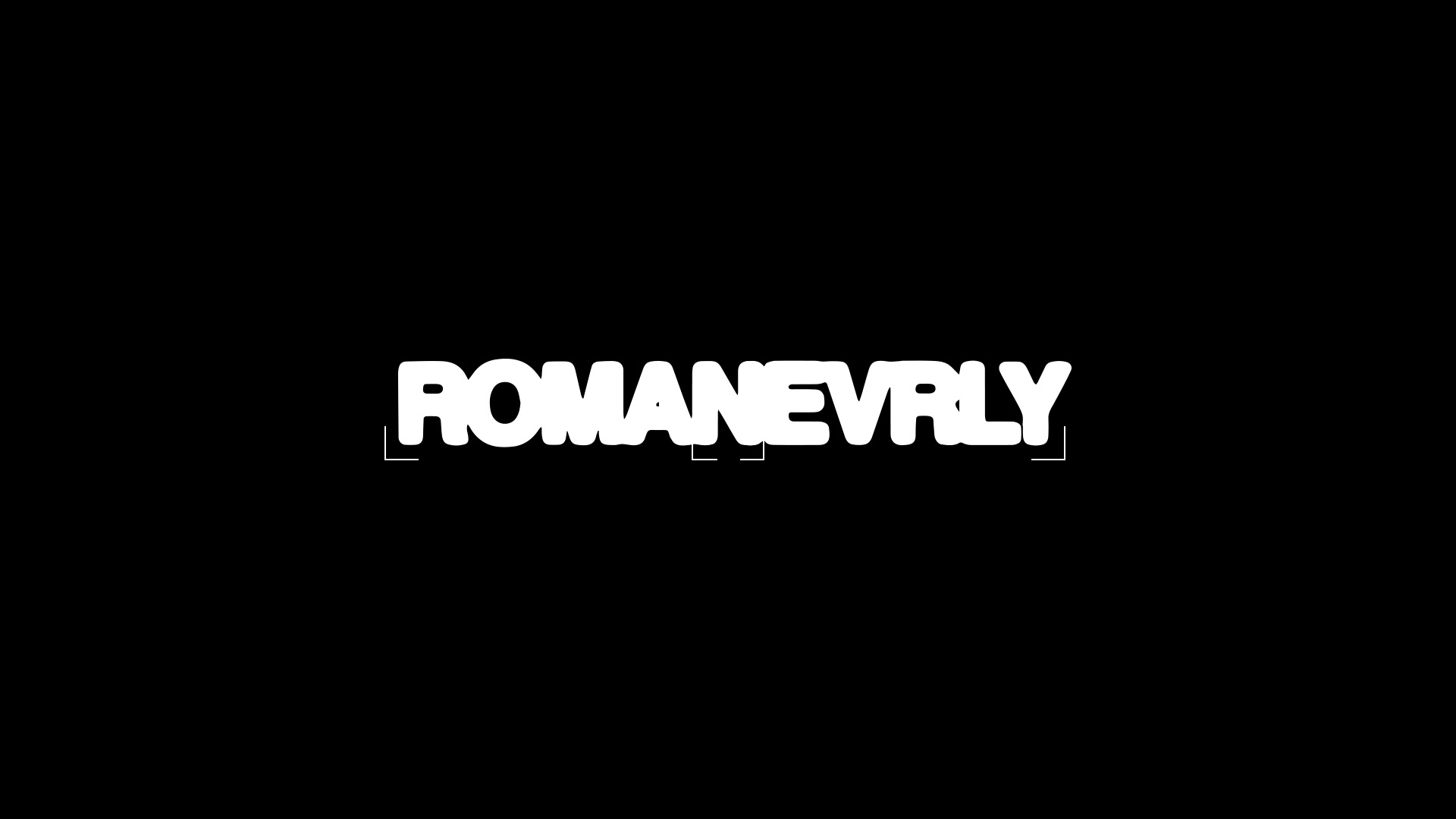
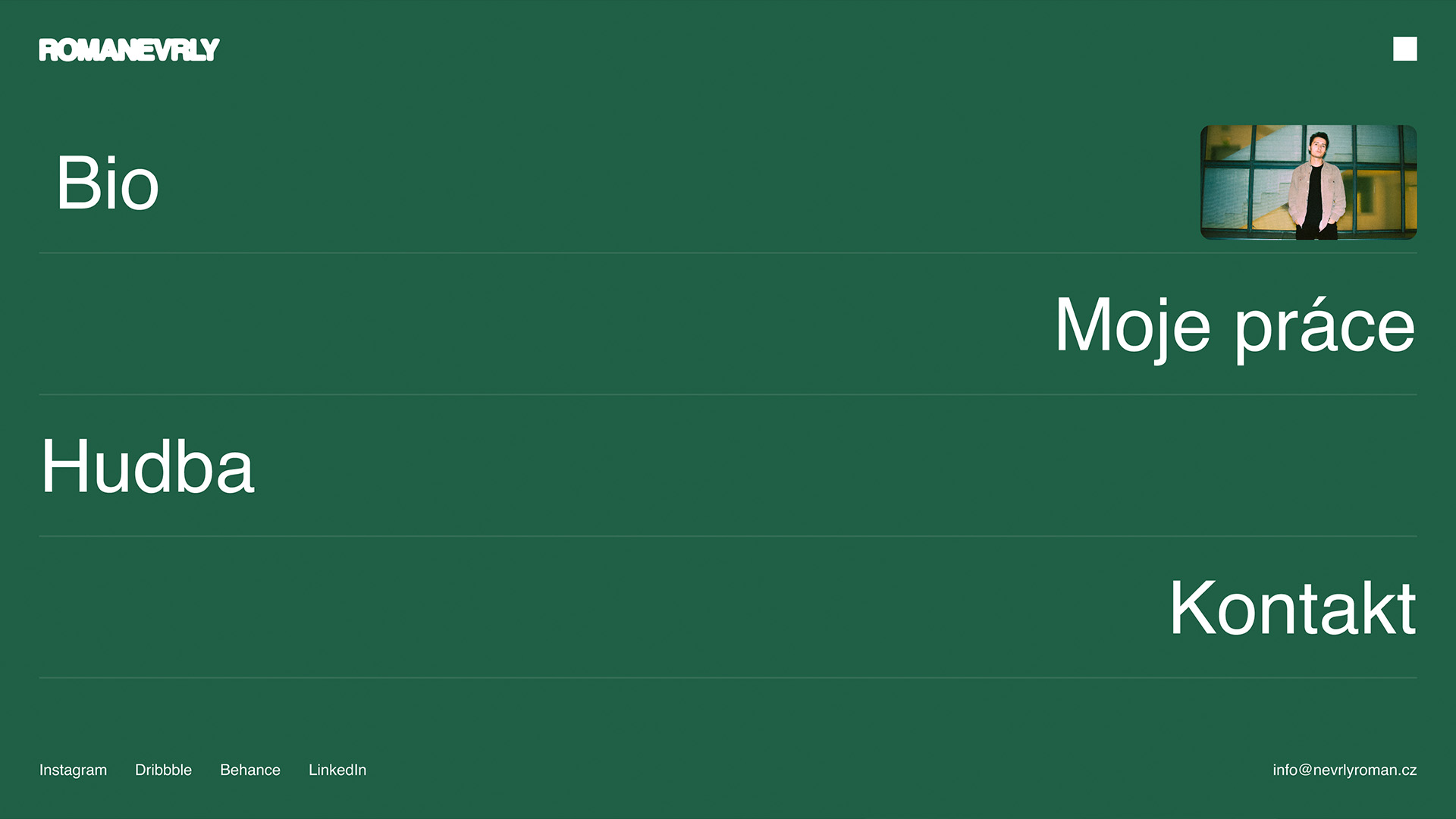
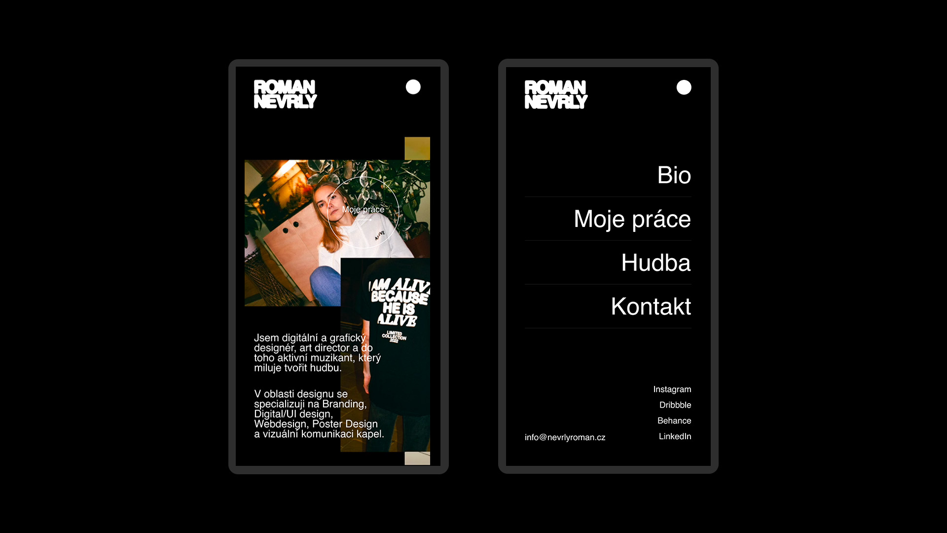
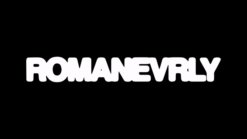
As part of my thesis assignment, I developed my own personal web portfolio to showcase my design and music work to potential clients. I base my personal visual identity on a dominant logotype, which is carried in an inky style. From the beginning, I didn’t like the whole combination of the name with two letters “n” after each other (ROMA “NN “EVRLY), so I decided to combine these letters into one: ROMANEVRLY. Even after removing one “n” in the whole phrase, both “Roman” and “Nevrly” remain. I directed the main visual of the site to colors that are close to me (black and black and white). I tried to get my sense of creation, simplicity, cleanliness and collage of photos into the design.