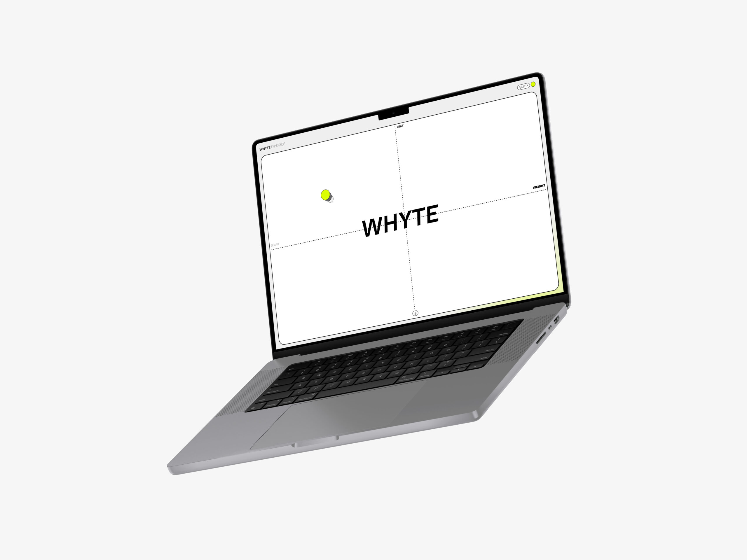
For my work, I was looking for a font that was extensive, not just in terms of font family. I found the variable font WHYTE, which allows users to set any weight, slant, and inktrap of the font. The inktrap was what caught my eye about this font and one of the reasons why I chose this font.
Since I chose the path of a more ordinary font and not an experimental one, I wanted to adapt the visual to it. The visual has a minimalist touch, clean surfaces with the use of blocks. I used two shades of gray, black, white, and to liven up the name “whyte” as a satire, I used neon yellow-green, which in my opinion gives the visual an excellent balanced and modern look.
For this theme, I mainly used Adobe After Effects to create interactive and animated elements, which are distributed abundantly throughout the website. I had hardly worked in After Effects before, so I used this topic to learn new skills.