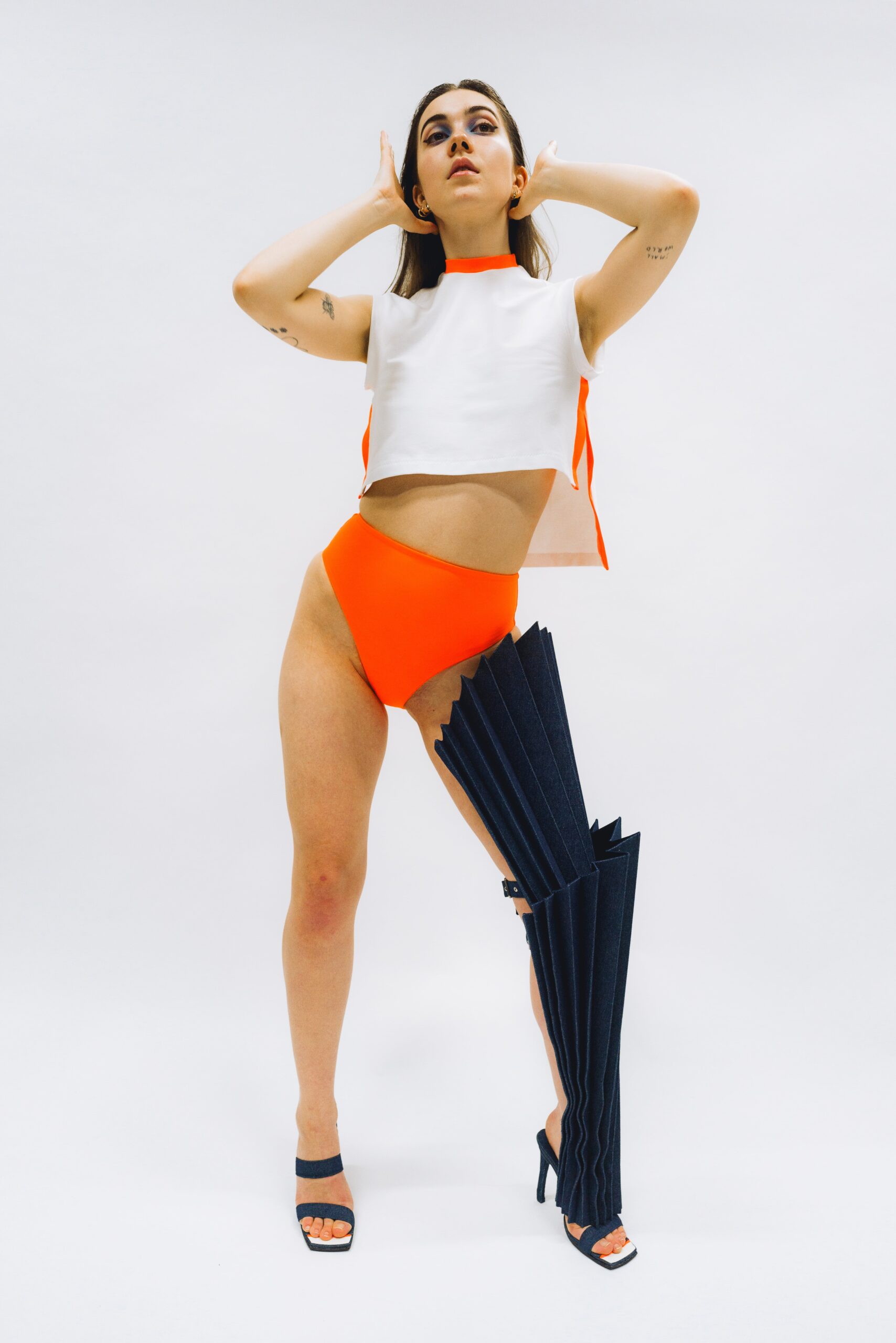
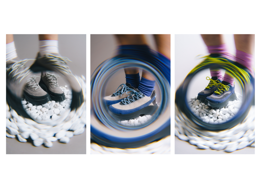
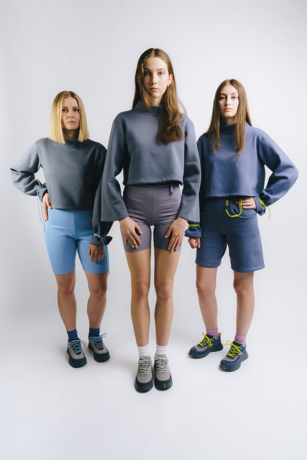
This thesis focuses on the design and development of a collection of athletic footwear and clothing accessories based on user preference research. The aim was to connect aesthetic values with the functional needs of real users and to create footwear that is not only visually appealing but also wearable and comfortable. The development of the collection was informed by data gathered through a questionnaire survey, the results of which influenced both the formal language of the designs and the choice of materials. The resulting collection emphasizes simplicity and clarity of lines, complemented by subtle details that enhance the character of each model. Part of the process included a planned collaboration with the Faculty of Technology at Tomas Bata University in Zlín for the production of molds. Due to time constraints, the collection was realized using 3D-printed sole prototypes. Nevertheless, the project represents a functional design concept with strong potential for further development and future production. The final outcome is an original collection titled 440 Stones, consisting of three models of athletic footwear accompanied by coordinated outfits made up of sweatshirts and shorts. The footwear models are conceptually connected, progressing from the most minimal and basic form to the most expressive and formally bold design. The collection reflects a deliberate evolution of design and a clear visual gradation. The entire collection is presented under the author’s brand BO.TY.
model 44074
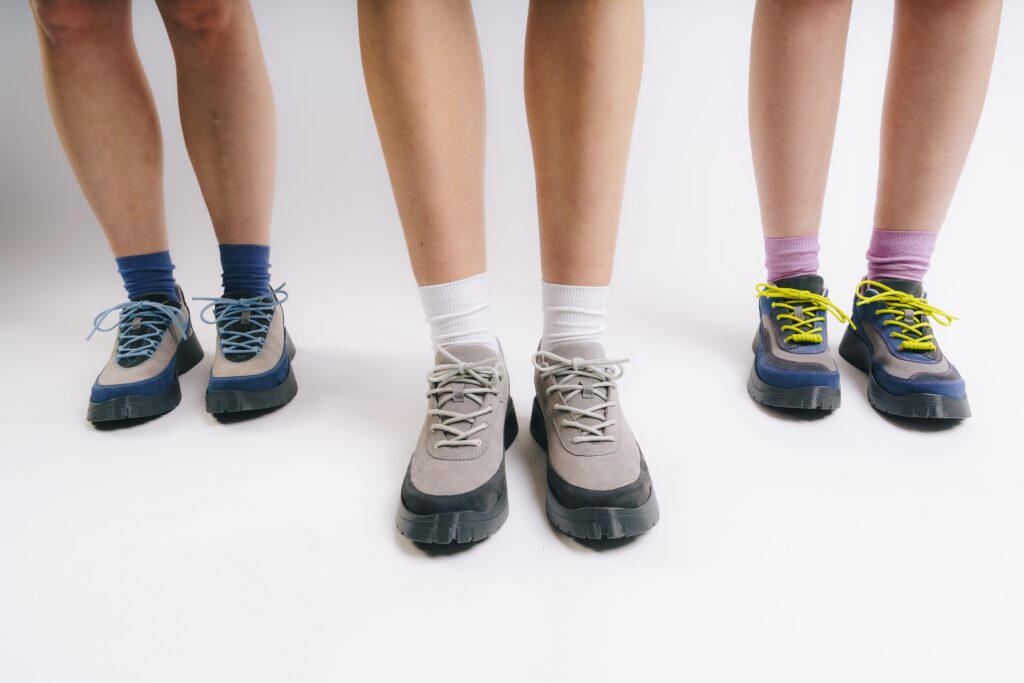
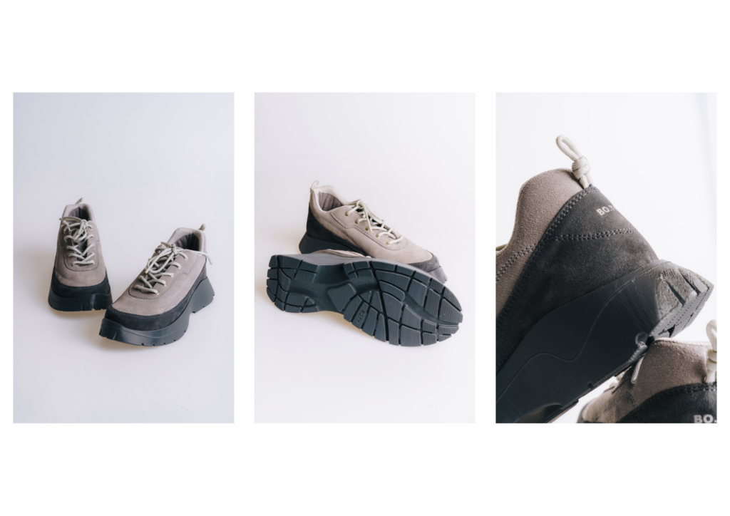
The first model in the collection represents the purest expression of the core concept. It was designed with respect to the preferences of the target group, who favor simplicity and understated lines. The design features a restrained panel structure and well-balanced proportions. The color scheme combines two shades of grey — a darker tone on the mudguard and a lighter one on the vamp, quarter, and tongue. This division symbolizes a pebble partially submerged in water. The minimalist look is enhanced by delicate decorative stitching inspired by the natural lines found on the surface of pebbles. The thread is tone-on-tone with the upper, creating a subtle yet distinctive detail.
model 44084
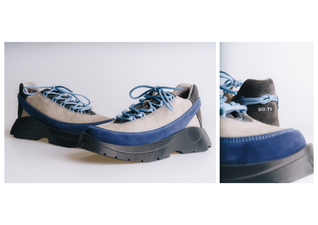
The second model marks a transition from a restrained design to a more expressive aesthetic, while maintaining a simple and clean visual language in line with the target group’s preferences. A new blue accent has been introduced in response to a portion of survey respondents who expressed interest in a touch of color. The blue provides a gentle contrast without disrupting the overall coherence of
the design. The mudguard is enhanced with a reflective silver foil that highlights the contours of the shoe while also serving a functional safety purpose. This blend of aesthetic and practical elements contributes to a balanced and thoughtful design.
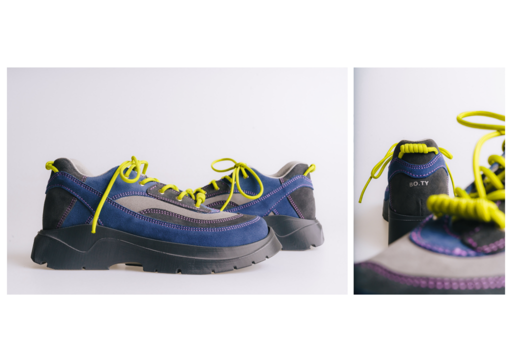
model 440154
The third model represents the boldest variation within the collection. Despite its more intricate paneling, it follows the same core construction scheme as the previous designs, ensuring visual and structural coherence across the range. The lines of individual components are more dynamic and distinctly shaped, resulting in a design that feels richer and more energetic. A bolder use of color is intentionally applied here, responding to a segment of respondents who expressed a preference for more vibrant and individualistic footwear. Although not the majority choice, this model aims to offer an alternative for those seeking a less conventional yet still aesthetically balanced design. The base color combination of grey and blue creates continuity with the earlier models. This palette is further expanded with green accents and purple stitching, adding a fresh character and pushing the model toward a more expressive visual identity, while maintaining harmony within the collection.
apparel collection
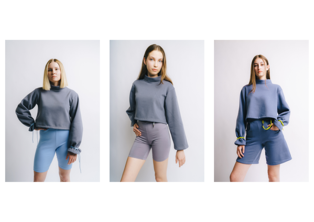
The apparel portion of the collection was designed as a natural extension of the footwear and includes
three hoodies and three shorts. These pieces relate to the footwear both visually and functionally. The selection of specific types of garments was based on a questionnaire survey in which respondents most frequently mentioned sweatshirts, jackets, trousers and shorts as common combinations with footwear.
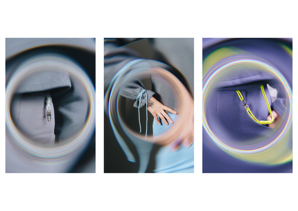
The aim of the clothing section is not to compete with the footwear, but to support its expression and visually unify the whole collection. The cuts are therefore simple and clean to give prominence to the details that link the different elements of the collection. The colours of the garments match the colour palette of the footwear. Each shoe model is assigned its own outfit, with which it forms a compact whole. The connection is supported by the repetition of design elements – matching colours, stitching or material accents. The result is a visually cohesive and variable solution that works as a whole or on its own.
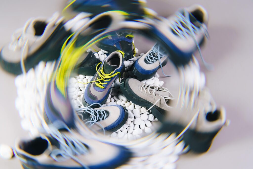
outsole
The outsole is not merely a design feature, but a fundamental component that directly affects functionality, comfort, and the overall behavior of footwear during wear. Even in casual footwear, such as sneakers, it is essential to combine visual appeal with practical performance. The goal was to design a sole that is both anatomically adapted and visually attractive. The development was carried out in collaboration with the Faculty of Technology at Tomas Bata University in Zlín, specifically with the Department of Manufacturing Engineering. As part of this collaboration, a bachelor’s thesis was created focusing on the design and production of moulds for sole manufacturing. Based on my design, the student developed a 3D model and technical documentation for the mould. However, since the moulds are still under development, the sole has so far been produced only as a visual prototype using 3D printing.
The brand name BO.TY originated as a linguistic play on words, combining the product with the local Ostrava expression “bo”, meaning “because”, and the pronoun “you”, in Czech „ty“. The resulting wordplay BO.TY = because you allows for open interpretation and supports a playful, personalized approach to brand communication—for example: BO.TY you want. BO.TY that represent you. During the logo development process, various typographic solutions were explored. The most striking version arranged the name into two stacked lines (BO. / TY) forming a square composition. However, this layout posed the risk of misinterpretation if the dot was used incorrectly, as it plays a crucial role—not as punctuation, but as a visual separator within the name. The final logo features bold, sans-serif capital letters to ensure clarity, readability, and timelessness. The chosen typeface performs well both in digital formats and as a physical application—such as prints or tags on footwear. Overall, the logo is designed with a focus on simplicity, functionality, and strong visual impact.