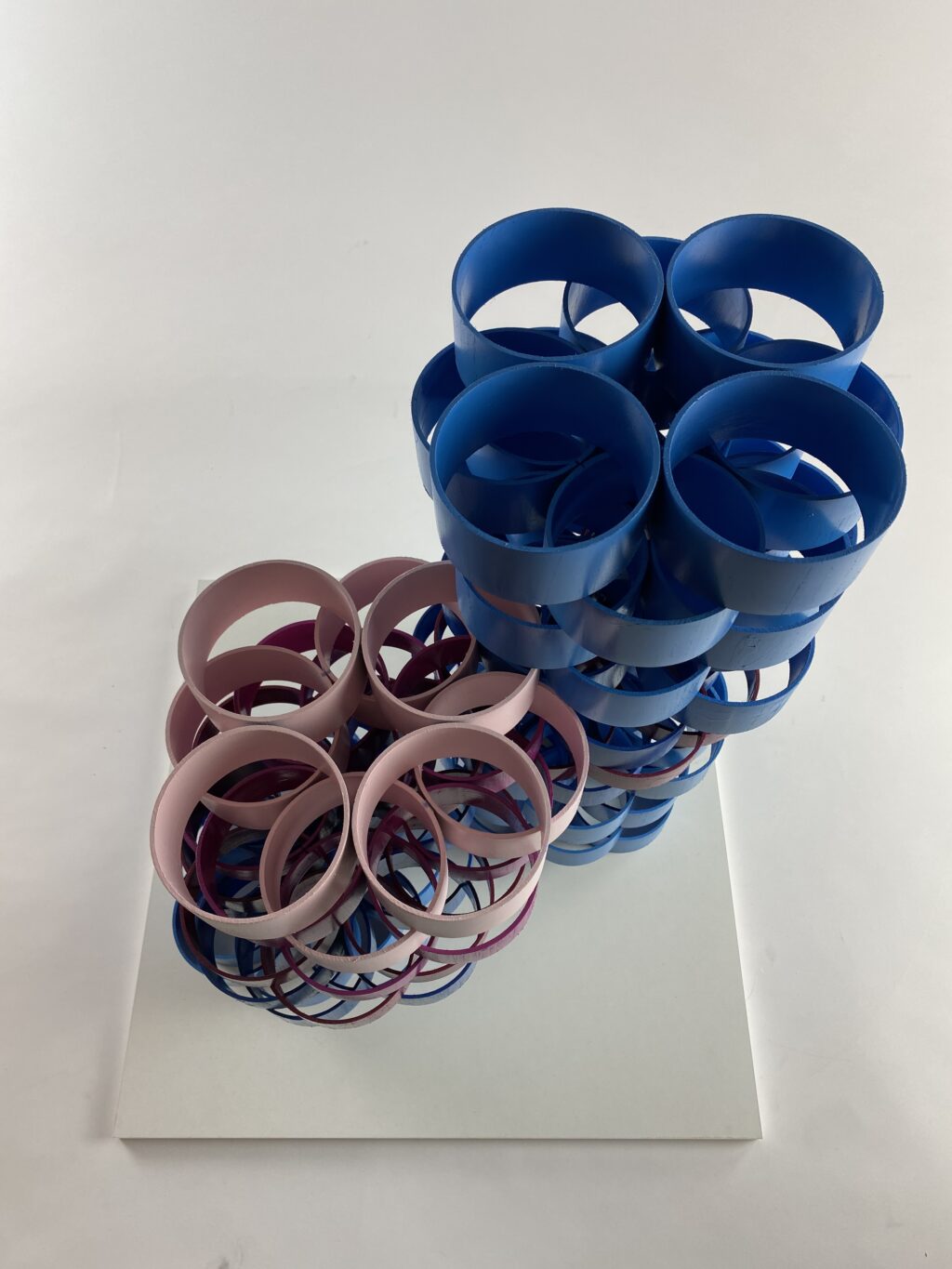
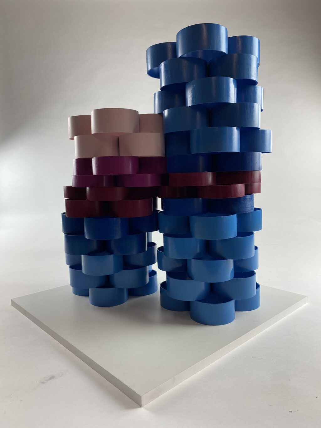
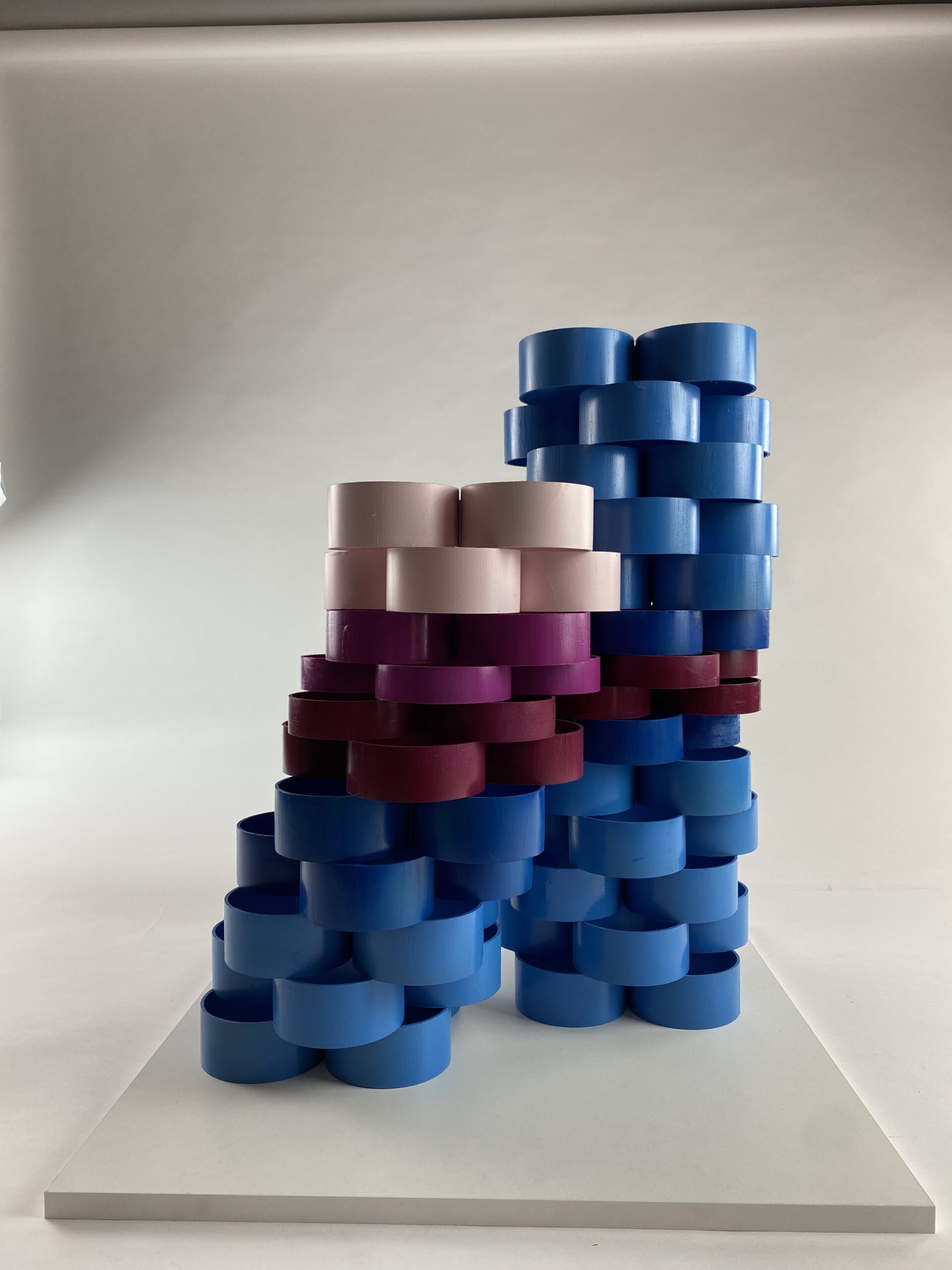
Although we think that some American college movies are far-fetched, they are not far from the truth. As this was my first term paper in college. So I let myself be inspired by something my studies welcomed, and that is alcohol. Therefore, I created a composition that depicts two men in towers built from circles. The first unstable tower depicts a drunken man, the second stable tower depicts a friend who takes care of him, holds him and pulls him home. I also supported this connection and basically this classic scene from life with color processing. Since there are two men in question, I chose blue as the color, while with the “drunk” tower we can see that it goes all the way to light pink. With this I wanted to show the contamination of the body with alcohol. In the case of the second sober stable tower, I have again shown in color the attachment that makes the unstable tower stand.

