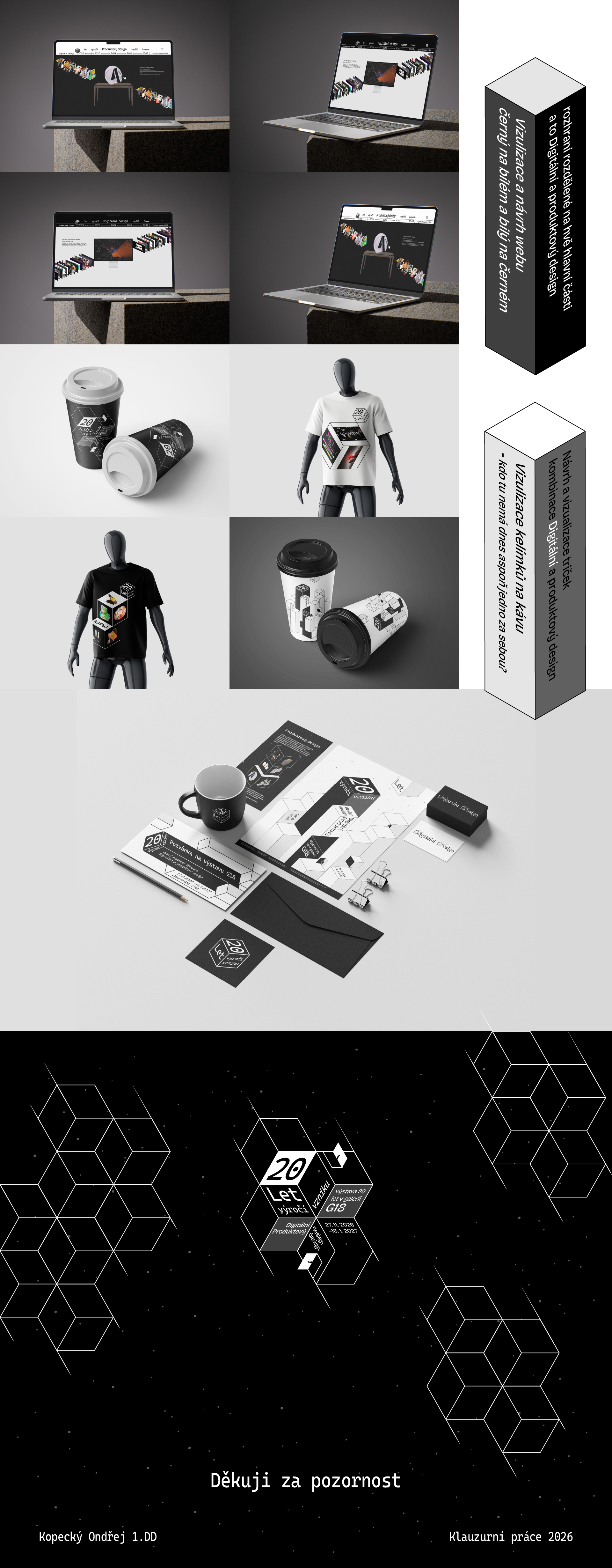
Anniversaries can be understood as an opportunity to look back at the time that has passed and to reflect on the past. This perspective also shapes my approach to the visual identity created for the 20th anniversary of the Digital and Product Design studio.
In terms of colour, I primarily work with a black-and-white palette and its tonal variations. Although this solution is deliberately restrained, it creates space for the students’ works themselves and for the core message of the project to stand out.
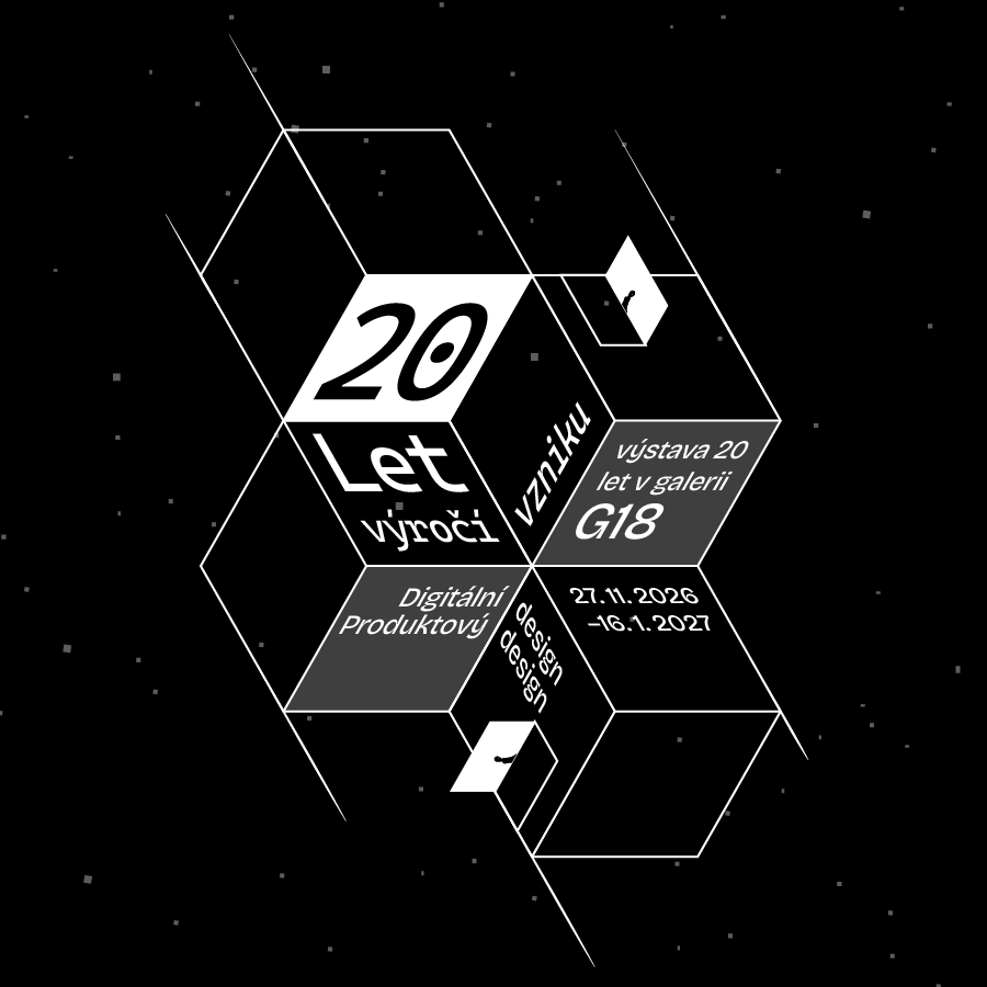
In posters, accompanying graphics, and printed materials, I work extensively with geometry and the motif of cubes. I perceive them as a strong visual element as well as a means of unconventional representation that feels conceptually appropriate. This approach also resonates with me in relation to the Baťa heritage and the design tradition of Zlín.
The website functions as a long timeline, divided into periods of approximately five years across the studio’s history. It serves as a cross-section of its development and presents works by both current students and alumni. The menu also includes information about the exhibition at G18 Gallery, which the website actively promotes while simultaneously extending and complementing its visual identity.