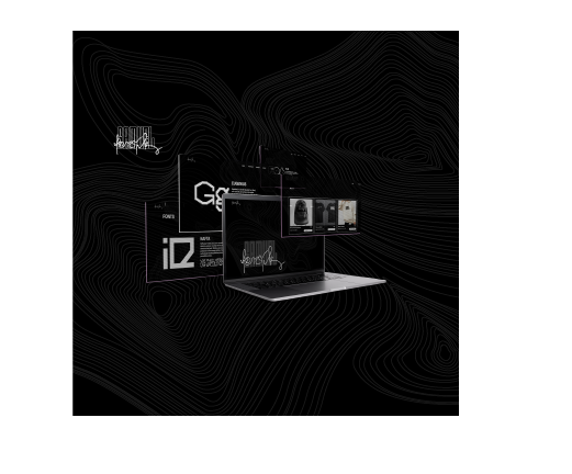
Visual Identity – Samuel Lončík
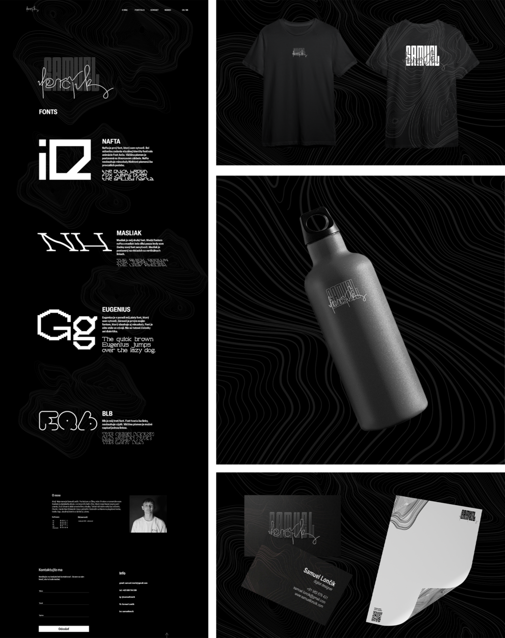
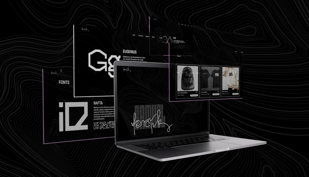
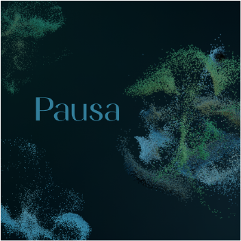
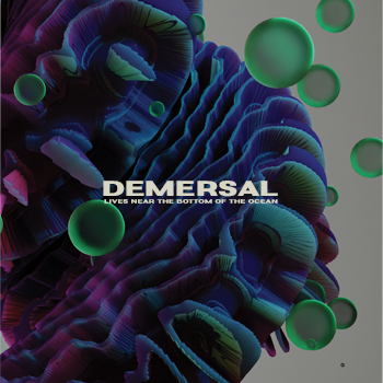
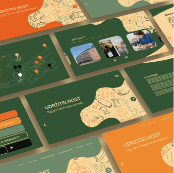
The task was to make a visual identity for a classmate. I drew Samuel Lončík. After seeing his work, it became clear that I wanted to make the visual in dark mode which Samuel would prefer more . At first the plan was to work with his author’s fonts, but later I reconsidered this visual and made it in minimalist style so that later Samuel’s works would stand out.
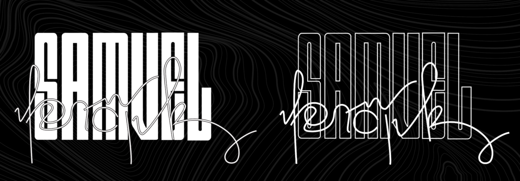
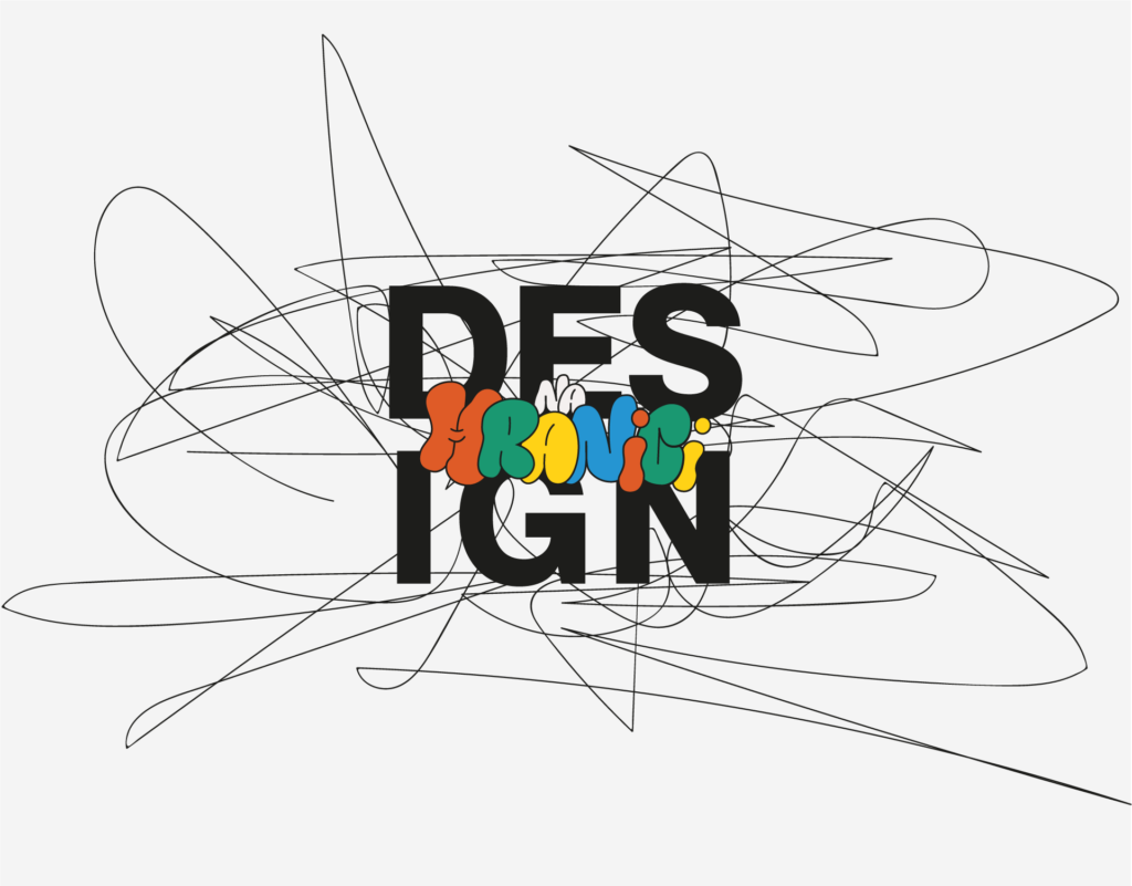
The logo is devided into 2 parts. His first name is created from the font that Samuel often uses in his work. For his last name I created a connected line that makes the name show that he is a designer. The combination of simple font with a line art font makes balance between minimalist and art.
