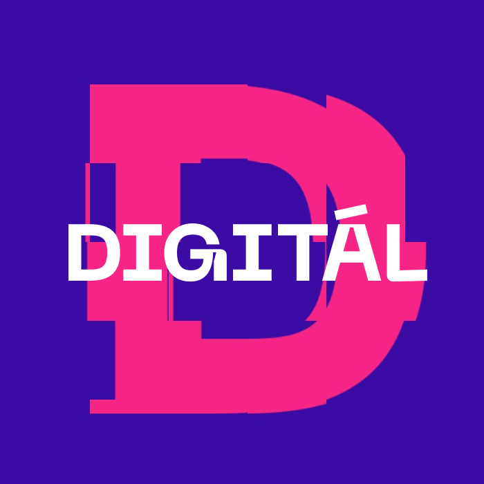
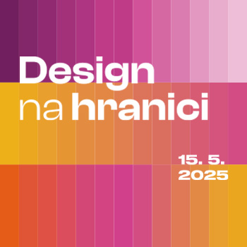
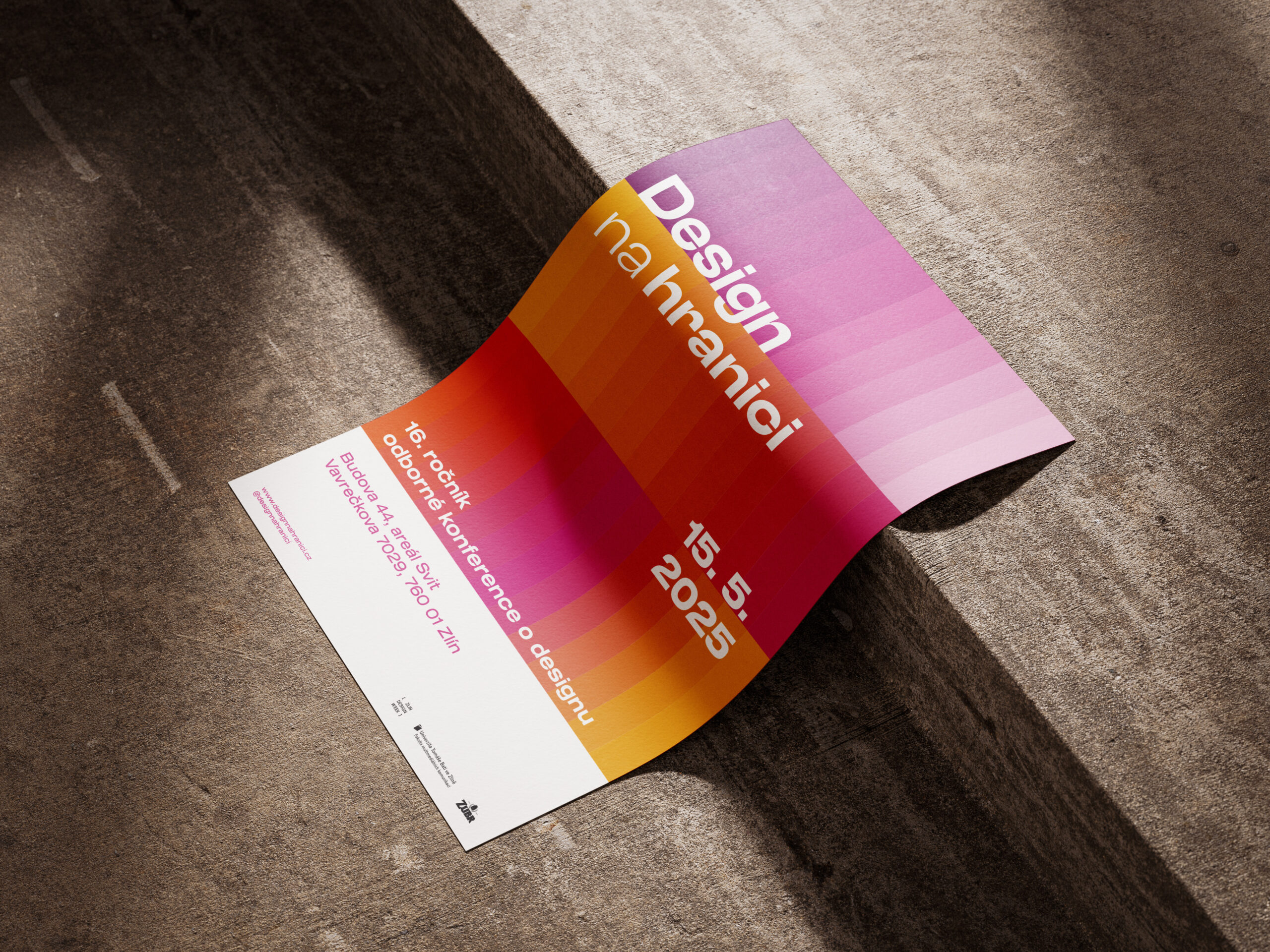
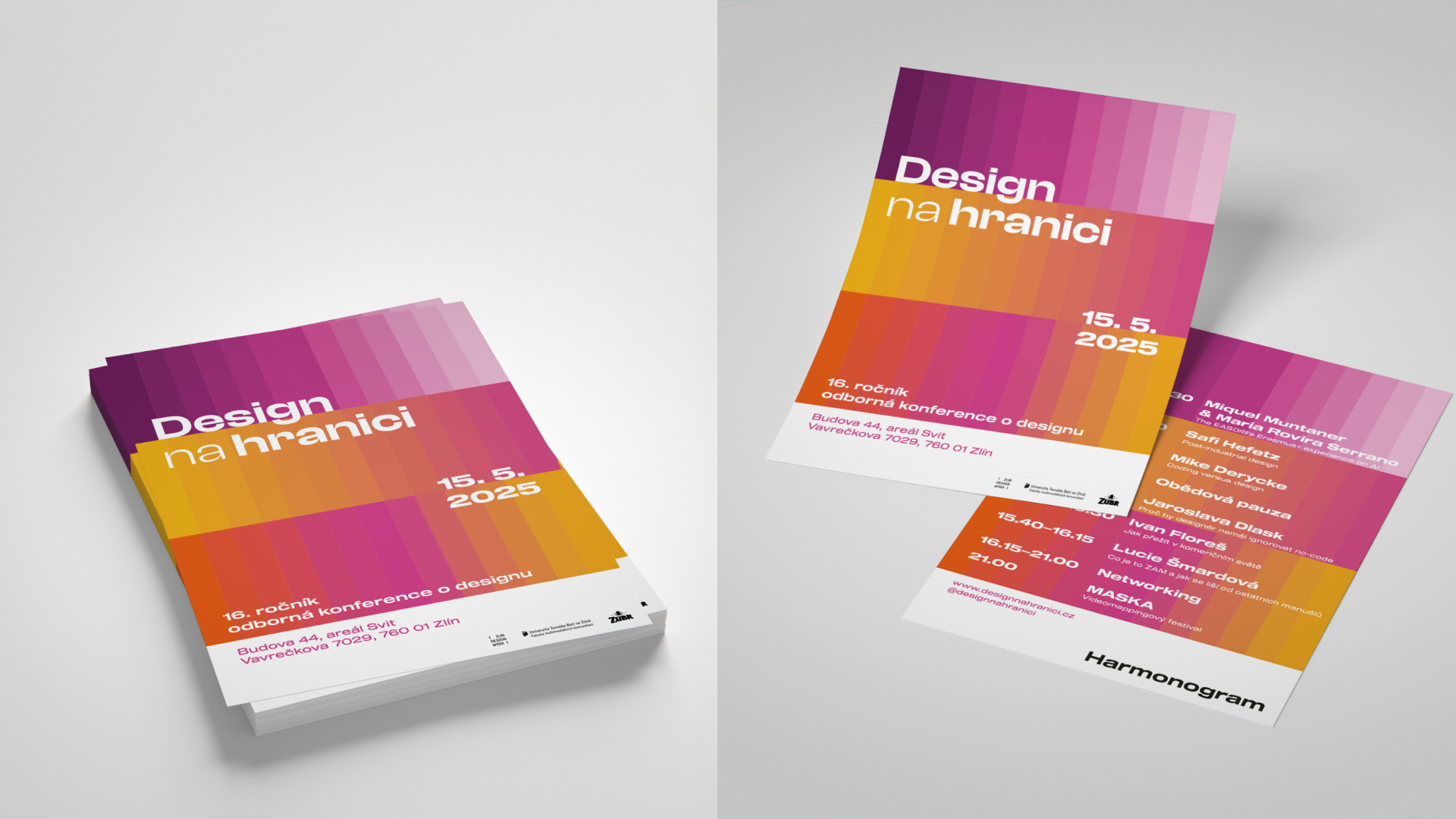
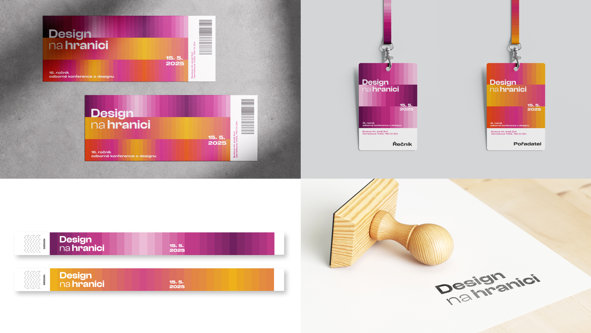
Visual identity for the 16th year of Design on the Border.
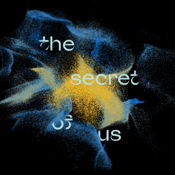
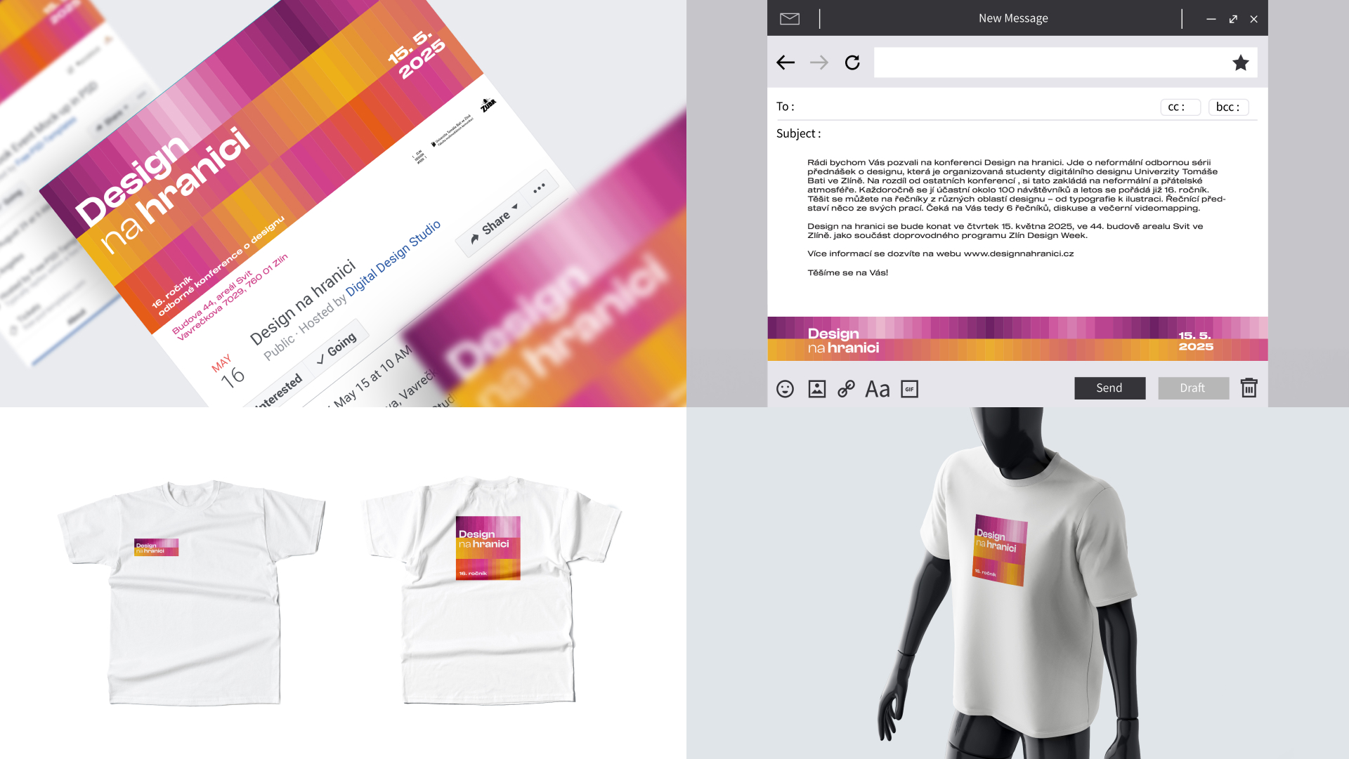
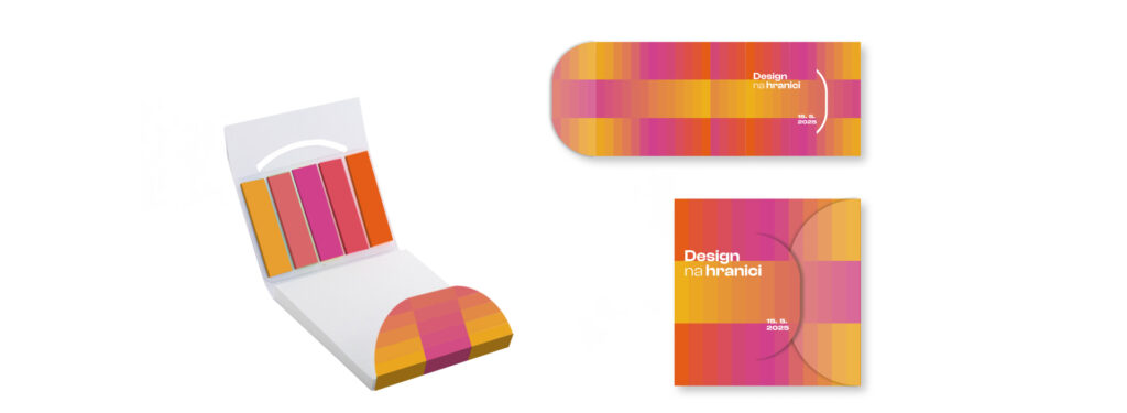
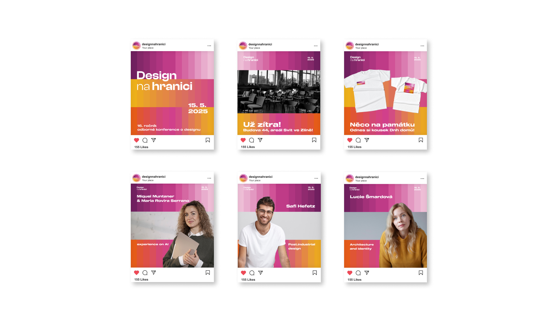
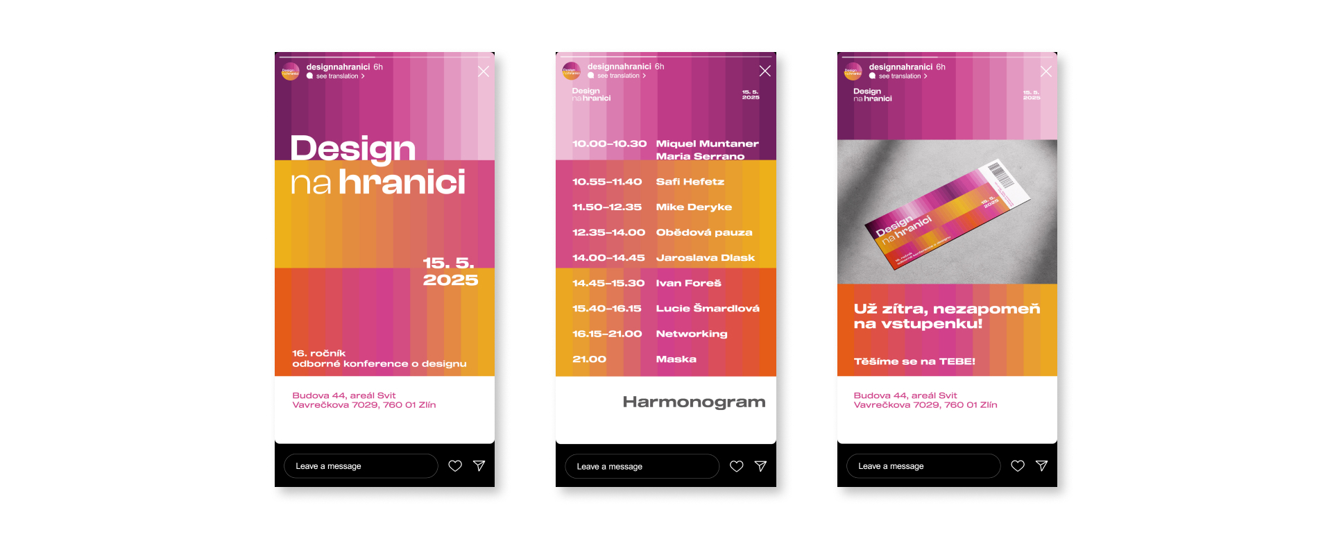
Design on the Border is a professional design conference that visually changes every year. In the design for the visuals of the 16th year, I was inspired by the bricks that describe Zlín and the “digital” palette of colors. I created 3 bands of color transitions that gradually go “from brick to brick”. I chose colors like purple, pink and yellow because these colors remind me of May and the conference is held in May every year. At the same time, the colors are colorful and cheerful, so they attract the human eye even from a distance and capture the positive spirit of the Design on the Border conference. When creating a creative souvenir, I thought of using the color palette for a small package of sticky notes, and I then used this idea with sticky notes on the website.
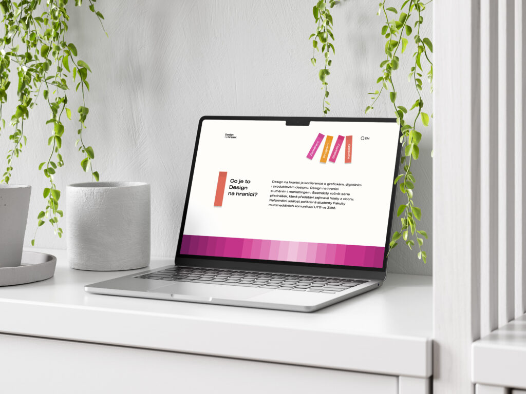
Website prototype here:
