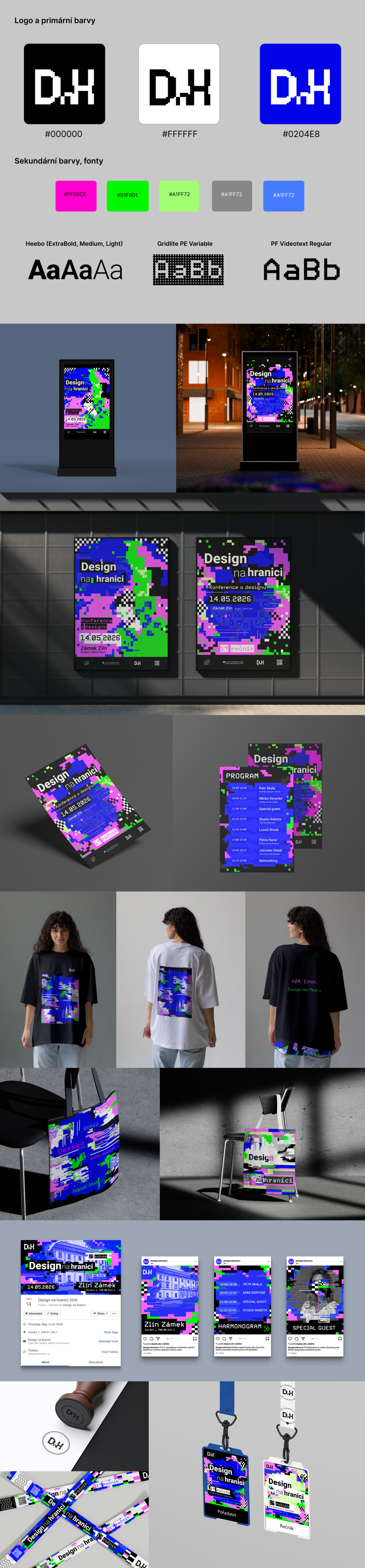
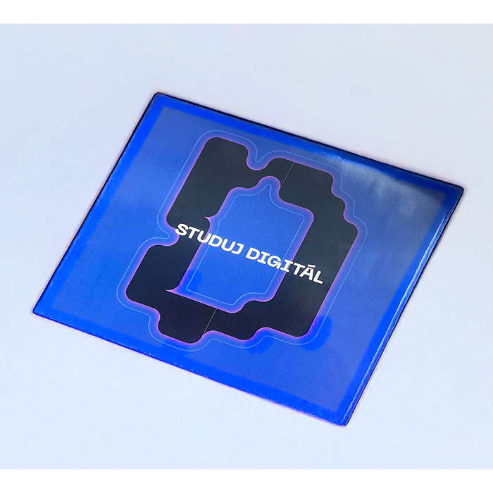
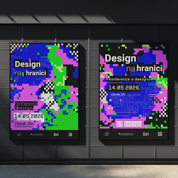
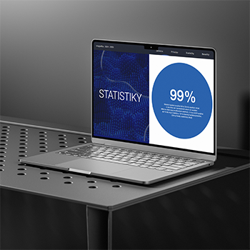
The visual identity is based on the aesthetics of digital errors – glitch effects, color test strips (so-called error bars) and pixelated fragments. These elements evoke broken screens, technical failures and visual noise that challenge the traditional idea of “clean” and “correct” design.
I was inspired by the German-Japanese artist Hito Steyerl and her essay In Defense of the Poor Image, in which she defends the aesthetic and informational value of low-quality, often damaged or compressed images. This approach led me to ask questions: Where exactly is the line between “good” and “bad” design? And who defines it? What if the very thing that seems broken, imperfect or “low-quality” hides a new aesthetic and a powerful message? And what if even “poor” design has its own visual power?