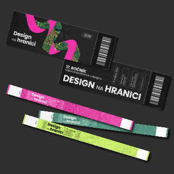
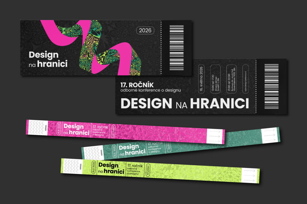
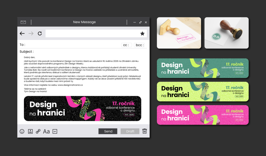
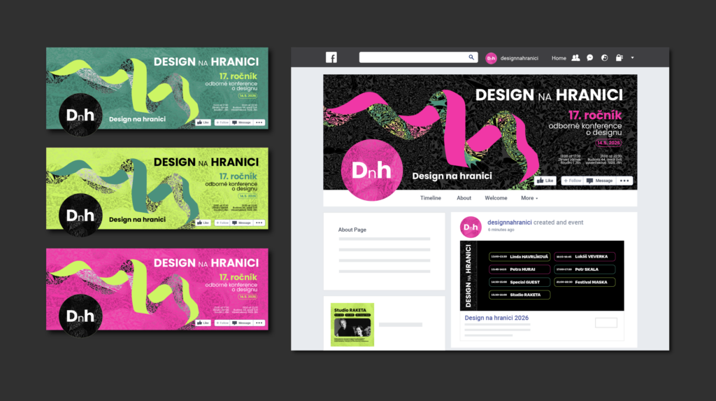
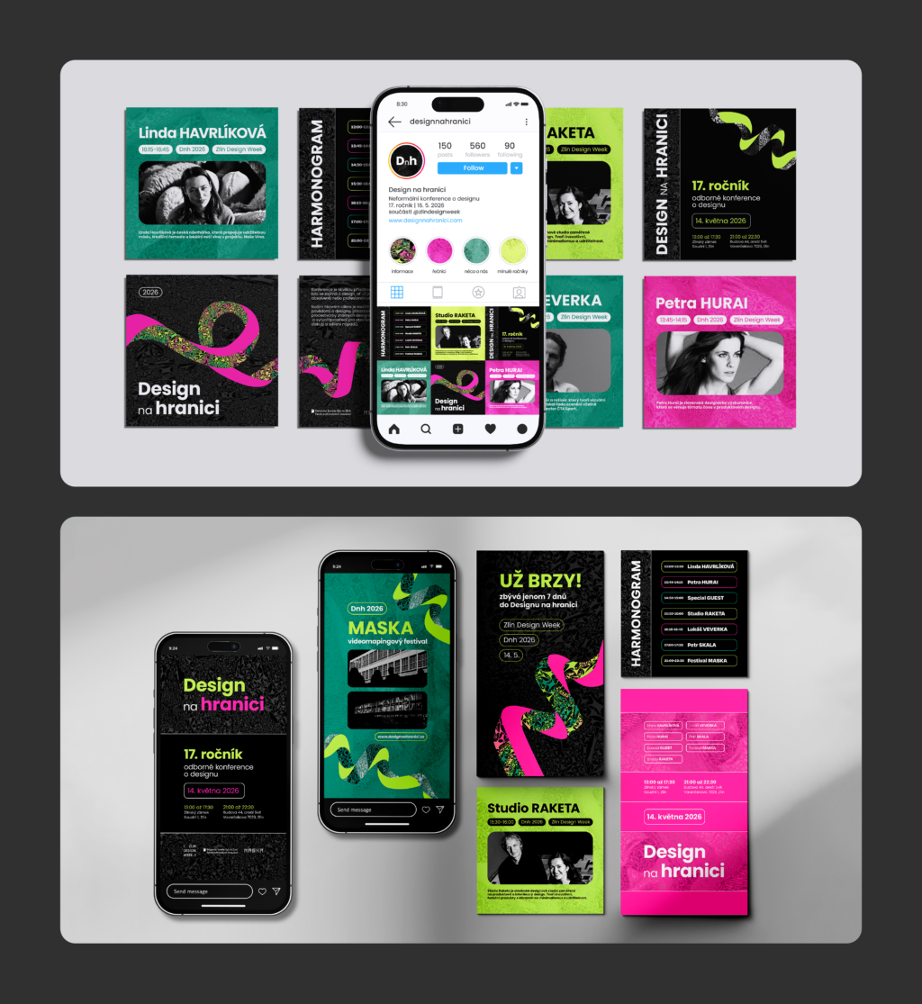
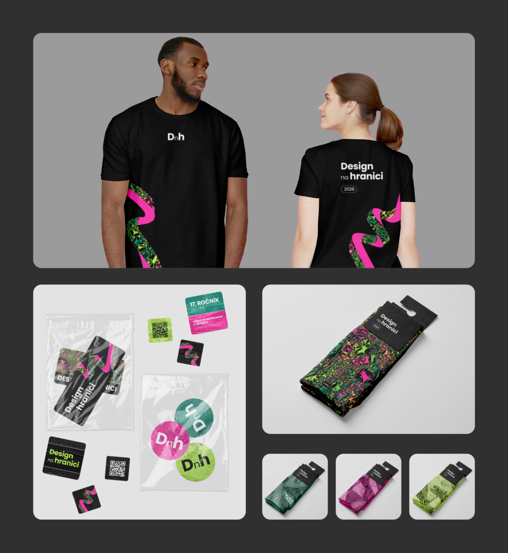
When designing the visual identity for the Design na hranici conference, I drew inspiration both from its name and from the time of year in which it takes place. I chose the color palette with the month of May in mind. I wanted the visuals to feel fresh, organic, and to reflect the spring atmosphere and energy.
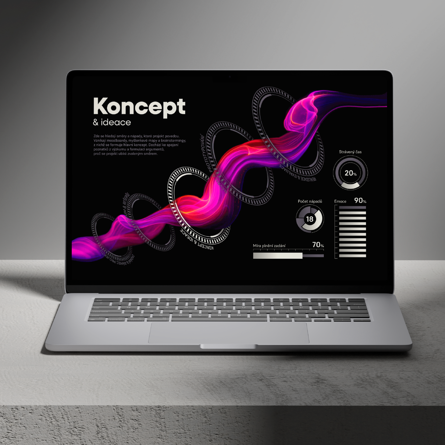
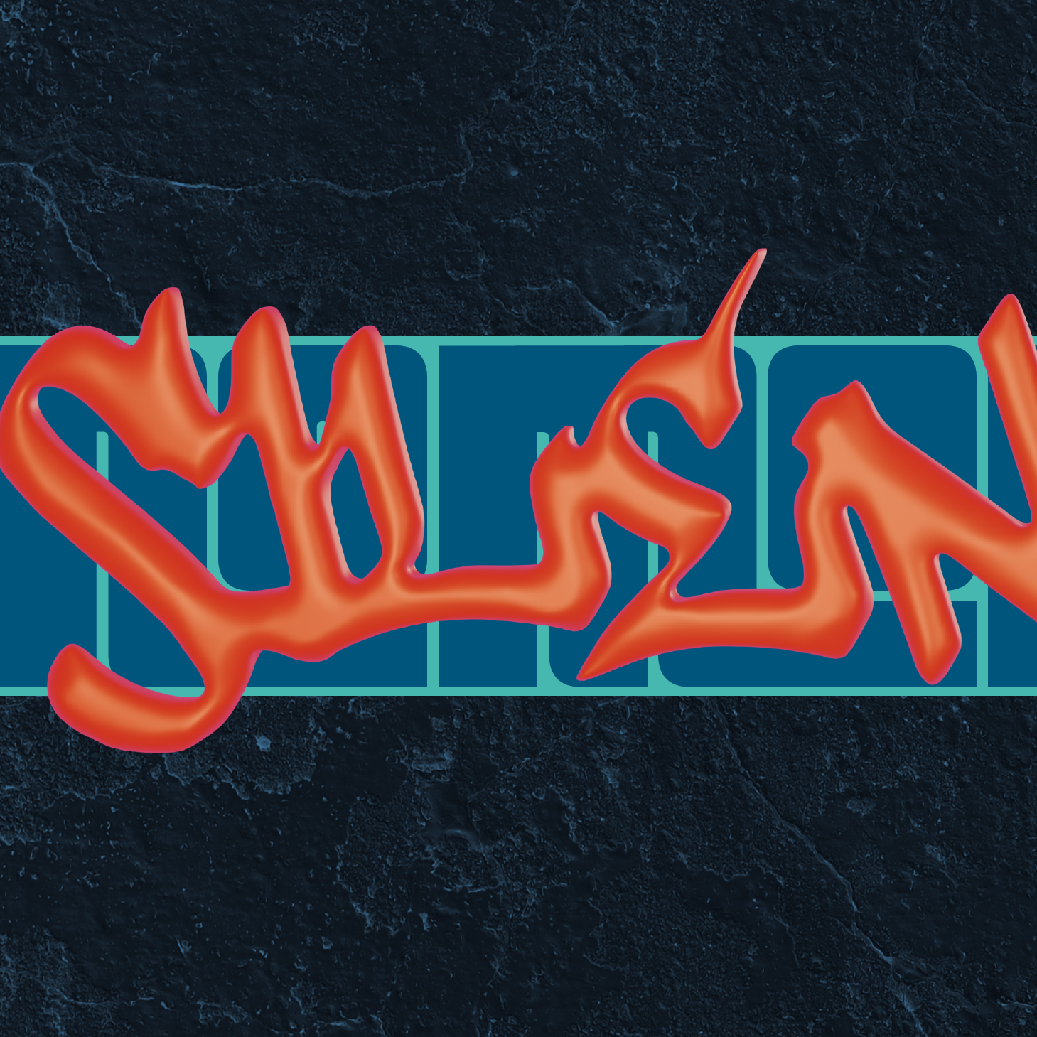
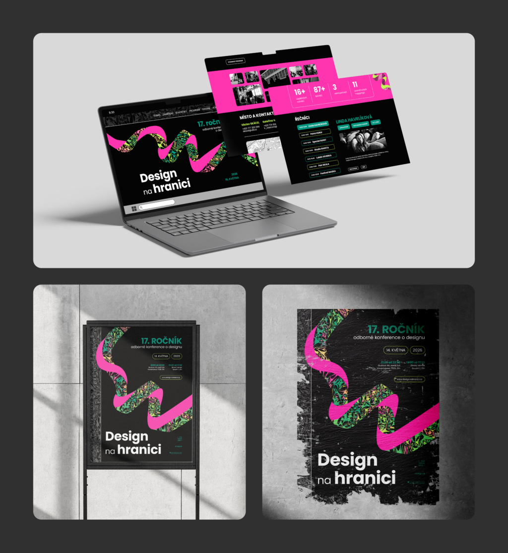
The central element of the design became a texture that I created myself. It originated from photographs that I vectorized and further edited to appear fragmented — as if broken into sharp edges. This fragmentation was a symbolic reference to the name of the conference, but also to the very essence of design itself: a composition of diverse fragments and ideas that come together to form a whole.
I used the texture in two main ways — either as a background for various applications or arranged it into a spiral composition, representing the flow of a designer’s thoughts. For me, this spiral serves as a visual metaphor for the creative process — from individual ideas to the final design.
https://xd.adobe.com/view/f14501bb-05f3-4056-b5e0-e330e0e939c9-a416/