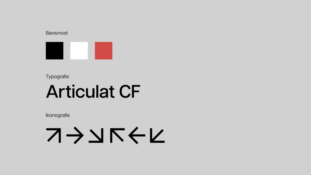
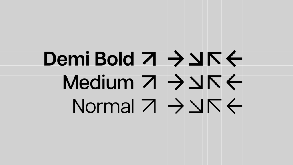
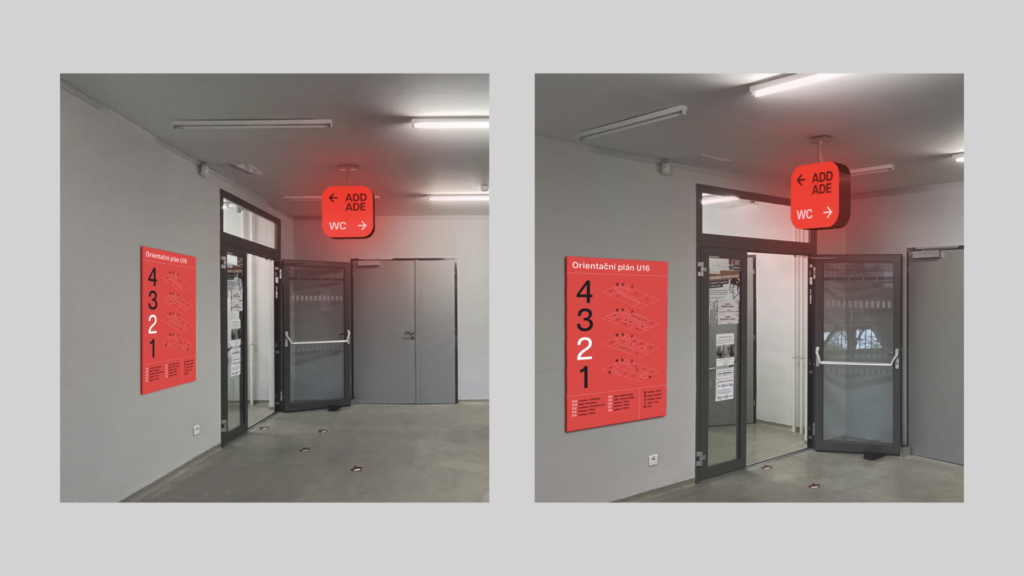
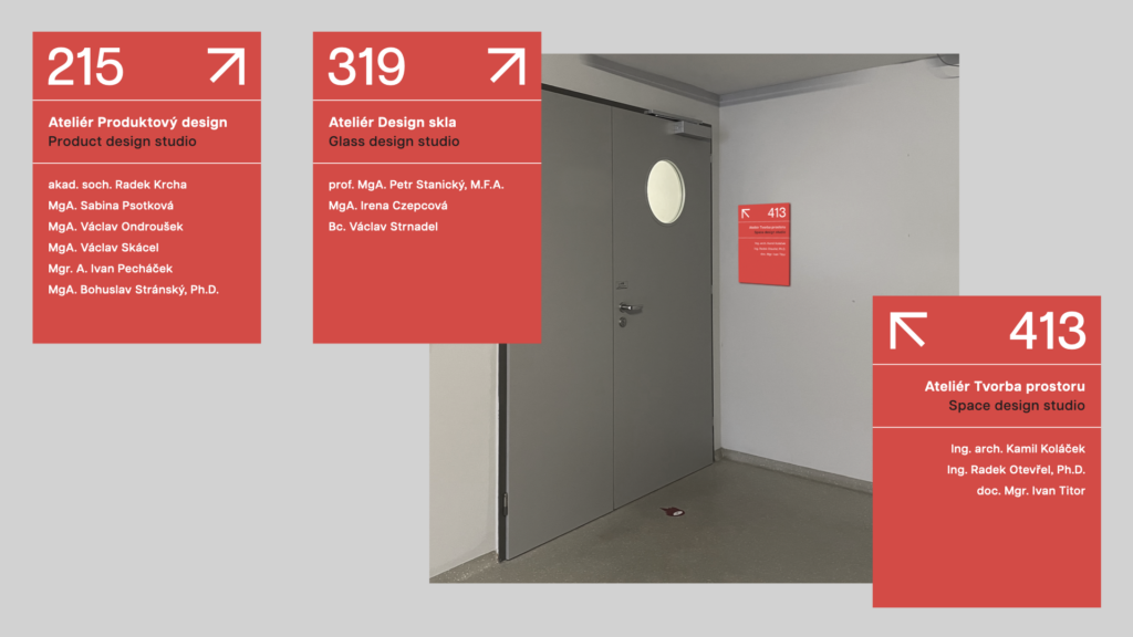
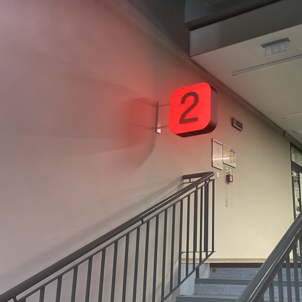
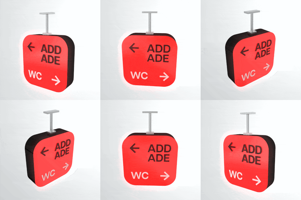
When I was given the task of designing a new orientation system for the entire faculty of multimedia communications, it was clear to me that there were many challenges with this task. One of the biggest challenges was to emotionally unite the two faculty buildings (U4 and U16), even though they are visually quite different. So I decided to revive my design for an orientation system with somewhat distinctive light panels, which would be difficult to overlook and at the same time so unprecedented that it would be immediately clear to everyone at which faculty they are. On the other hand, I tried to keep the overall visual very simple. I used a palette of three colors (black, white and red faculty) in combination with a neo-grotesque font.

