Design and application of a logo for an educational institution with a long tradition. When designing the logo, I put emphasis on concept and functionality. I took inspiration from elements of the original logo, which I stylized into the shape of a book and a globe. The result is a new symbol reminiscent of a comet.
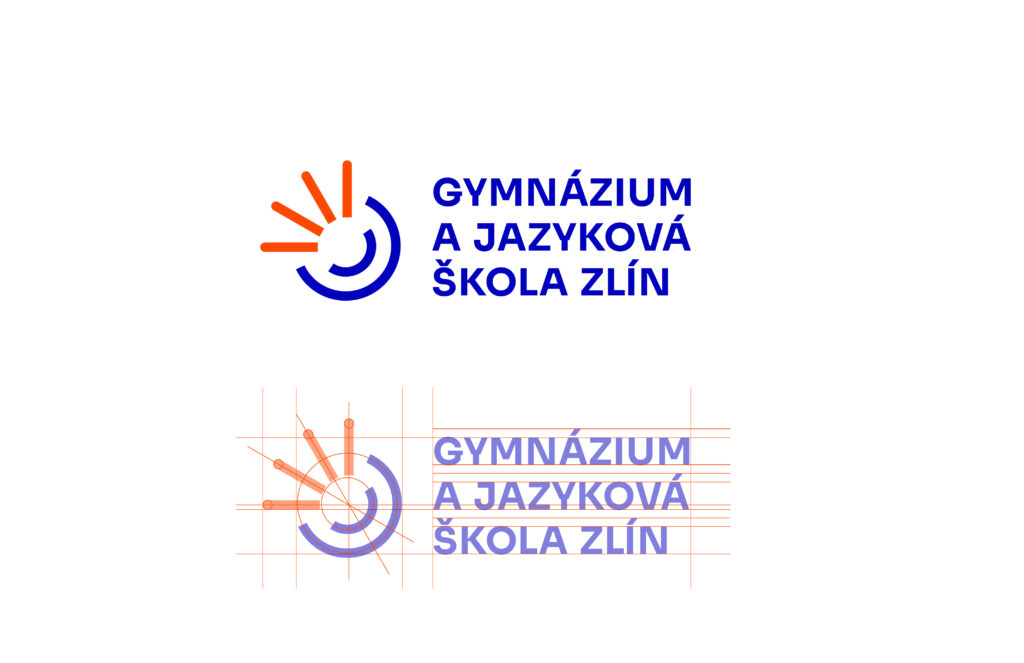
The colours of the logo are a revival of the colours of the original logo. Blue represents stability and credibility. Orange is energy and also reminds of the colour of bricks, which are typical for the city of Zlín. The name of the school is written in the grotesque, easy-to-read and timeless font Sora. The elements of the logo resemble rays, light emanating from a circle, expressing community. Combining them creates an abstract symbol depicting a comet, a metaphor for effort and success.