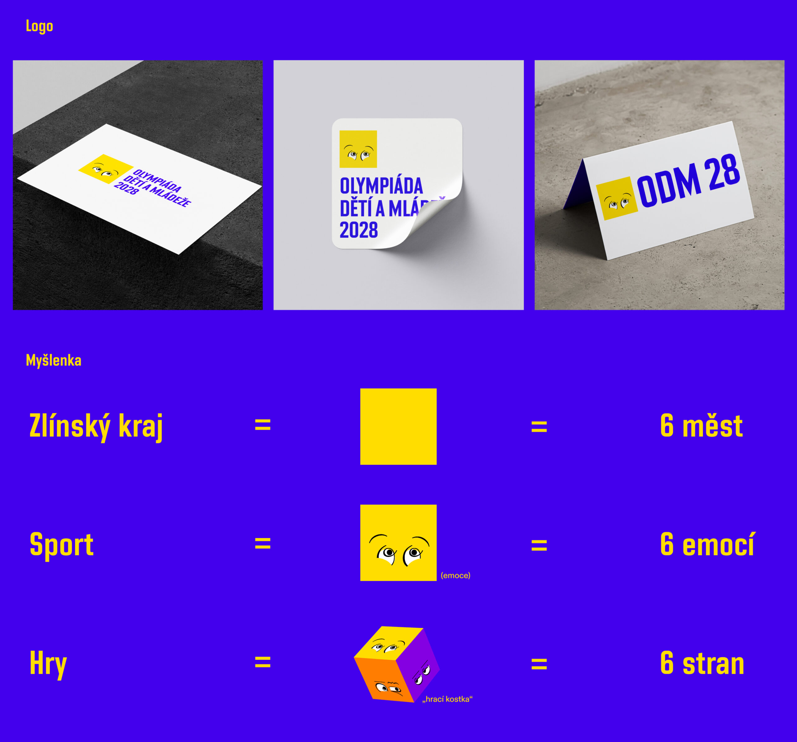
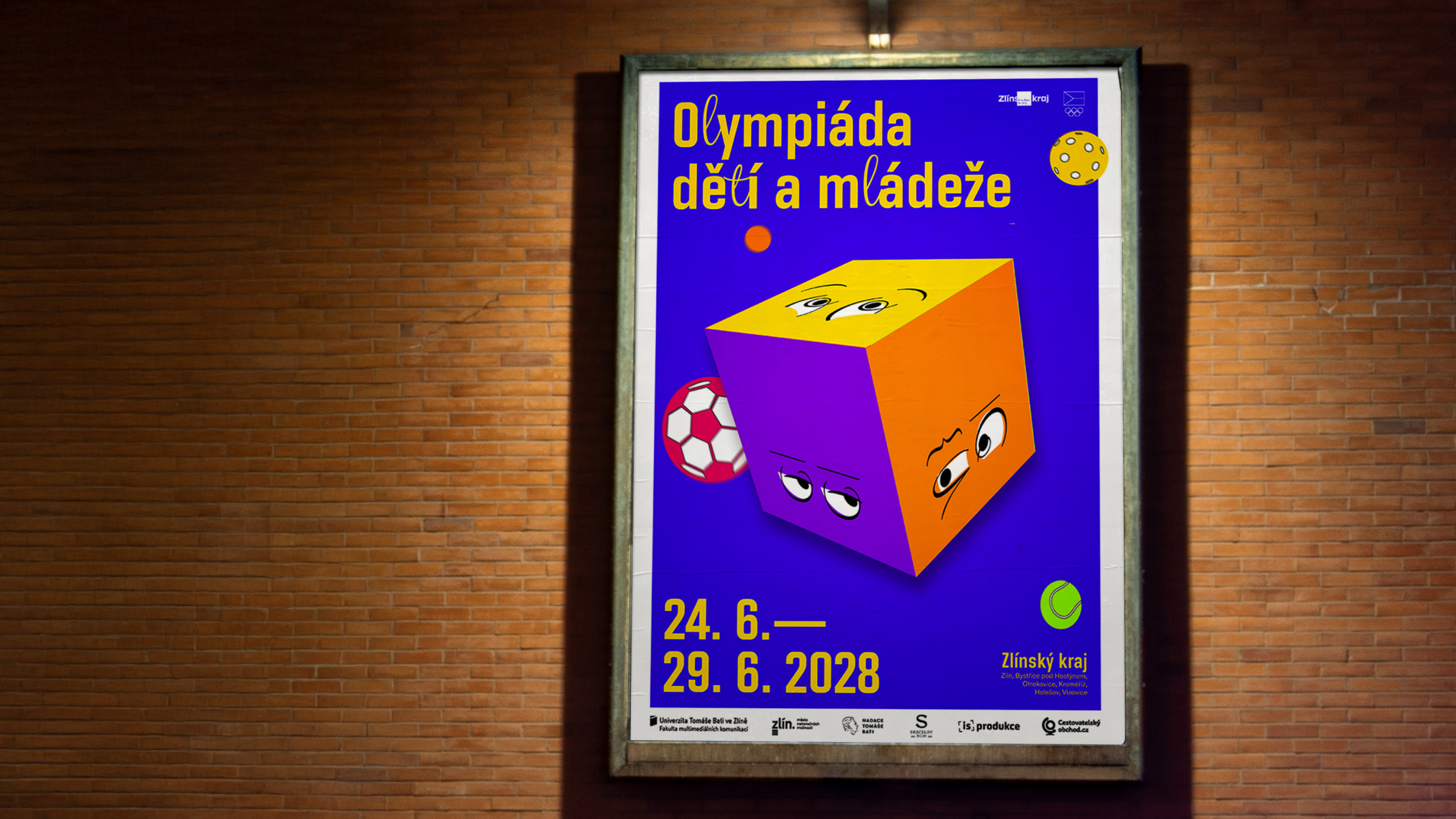
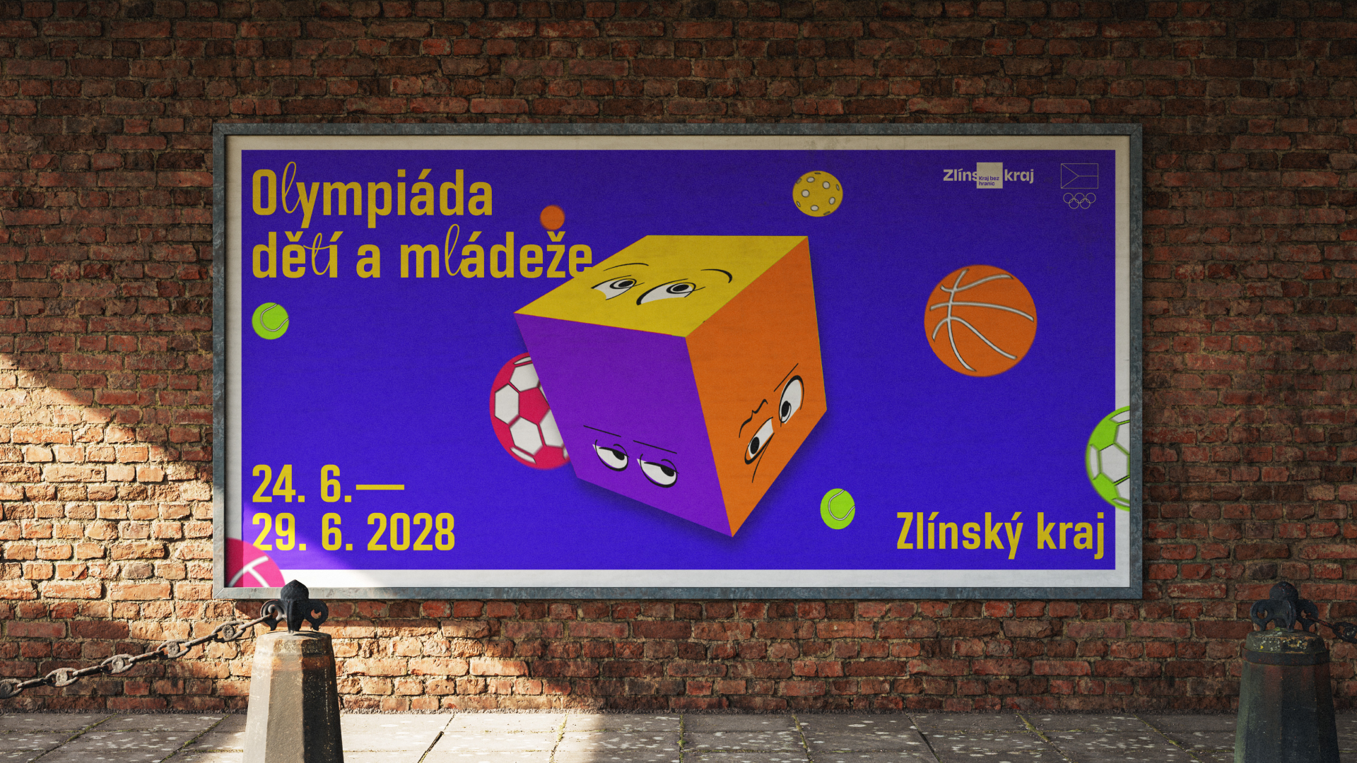
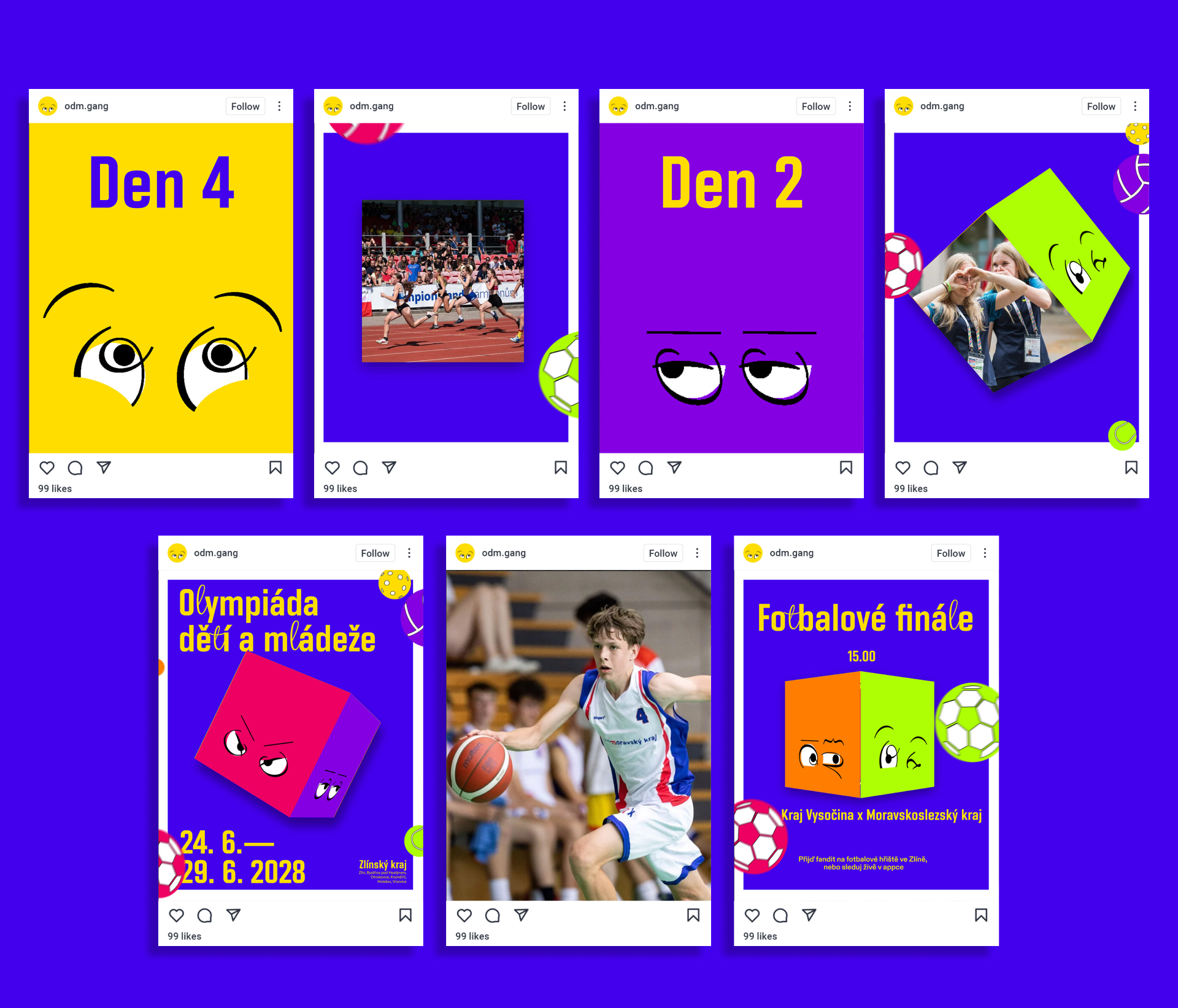
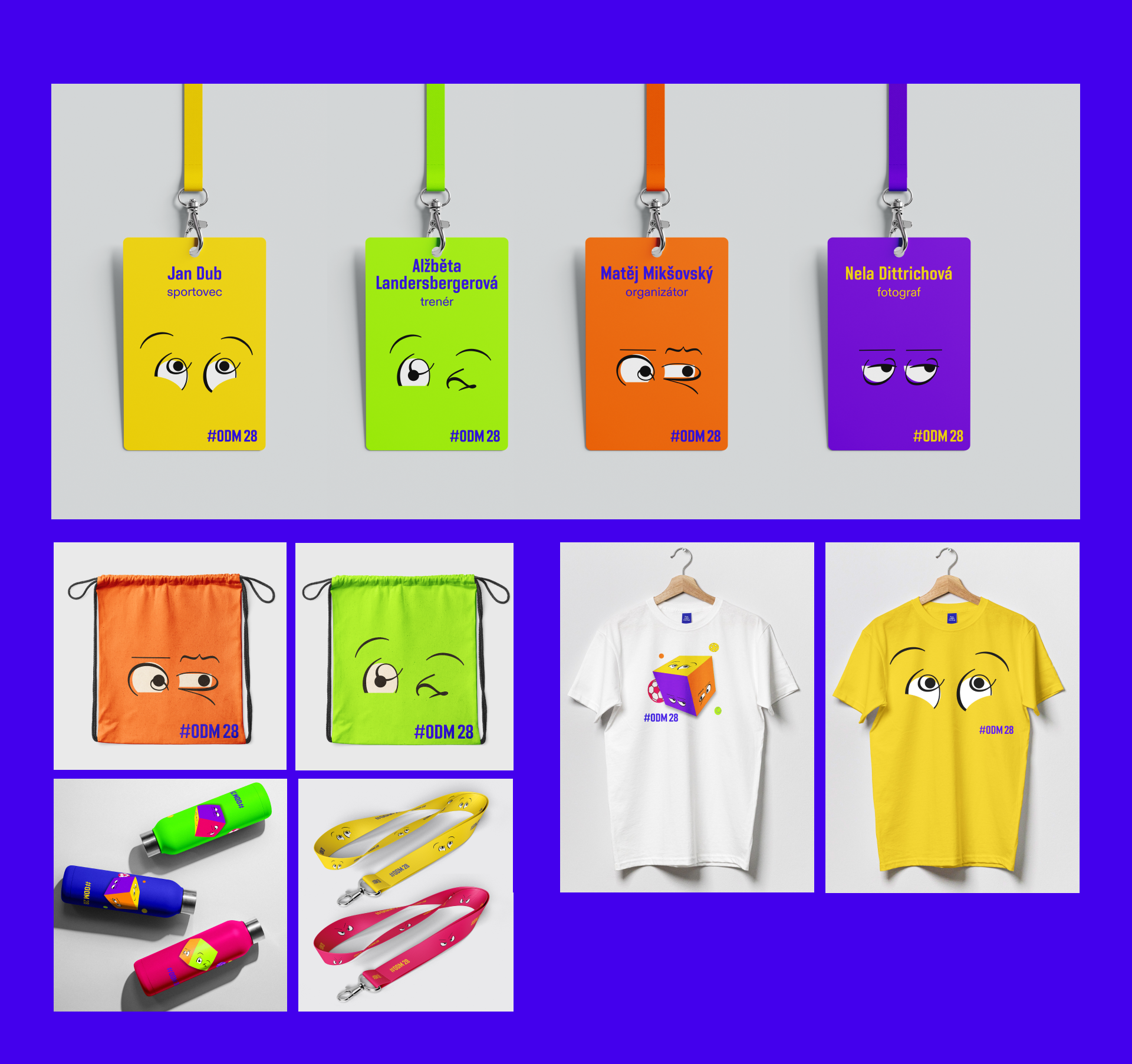
When designing the visual identity for the Children and Youth Olympic Games 2028 in the Zlín Region, I focused on connecting the region, sport, and the emotions inherently linked to athletic performance. The goal was to create a playful and “cool” identity that would appeal to children and teenagers. The core visual element is a square derived from the logo of the Zlín Region. This shape was combined with emotions, resulting in six expressive faces that represent the six cities hosting the Games. Together, these squares form a cube – a symbol of play, movement, and games. In the visual concept, sports equipment collides with the cube and sets it in motion, creating a dynamic visual interaction between sport, emotion, and movement.
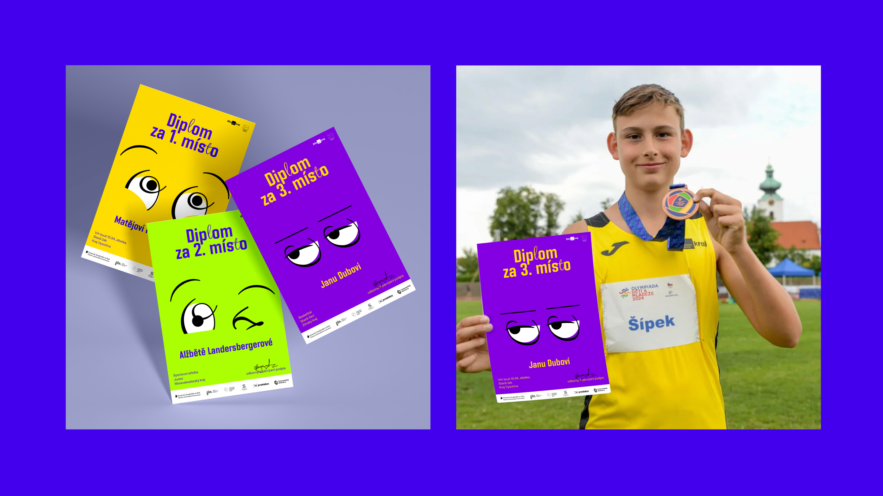
The color palette is based on the official Olympic colors, adapted into a more vibrant and playful version suitable for a younger audience. Black was intentionally replaced with purple, while blue and yellow serve as the primary colors, referencing the Zlín Region. The typography follows the official ODM typeface, subtly enhanced with script elements in the letters “l” and “t”. These script details are also used to construct the expressive faces. The result is a flexible visual system primarily built around motion, from which posters and other static outputs are derived. The logo has three variations, and the cube can also function as a photographic mask, allowing the visual identity to work both as a purely graphic system and in combination with photography.