As part of my diploma thesis, I focus on modern immersive technologies in relation to museology, museum education, and the concept of exhibitions in other cultural and scientific-educational institutions. The aim of my work was to describe the new field of Museum Experience Design and the possibilities of its implementation in museum and gallery practice.
Theoretical part
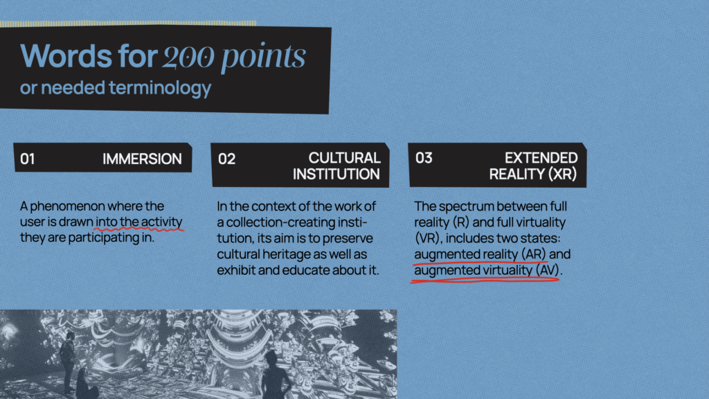
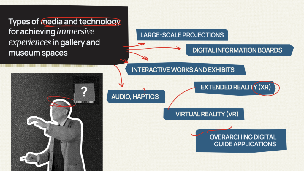
In the theoretical part of the thesis, I focus on current trends in museology and gallery management, digitalization strategies of cultural and educational institutions, available technologies for providing immersive experiences, and the principles of working with them.
Project context
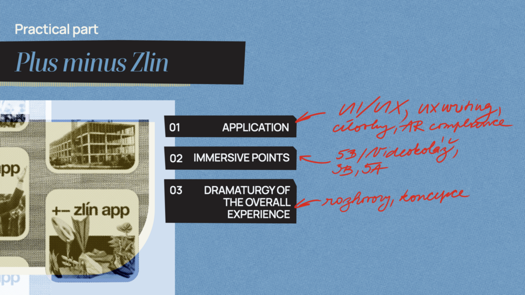
The new long-term exhibition “Plus Mínus Zlín” at the Regional Gallery of Fine Arts in Zlín is to be accompanied by a mobile application with augmented reality as an alternative way of exploring the exhibition. My diploma thesis deals with creating an overall immersive experience, the application, and some immersive points. It is also linked to the public contract announced for this task by the Zlín Region in October 2023.
I was able to participate in the project thanks to the cooperation with the agency Little Greta, which won the contract and invited me as a collaborator. The project has been handed over, and the application is expected to be released in the autumn of 2024, coinciding with the opening of the new exhibition at the Regional Gallery of Fine Arts in Zlín.
Application
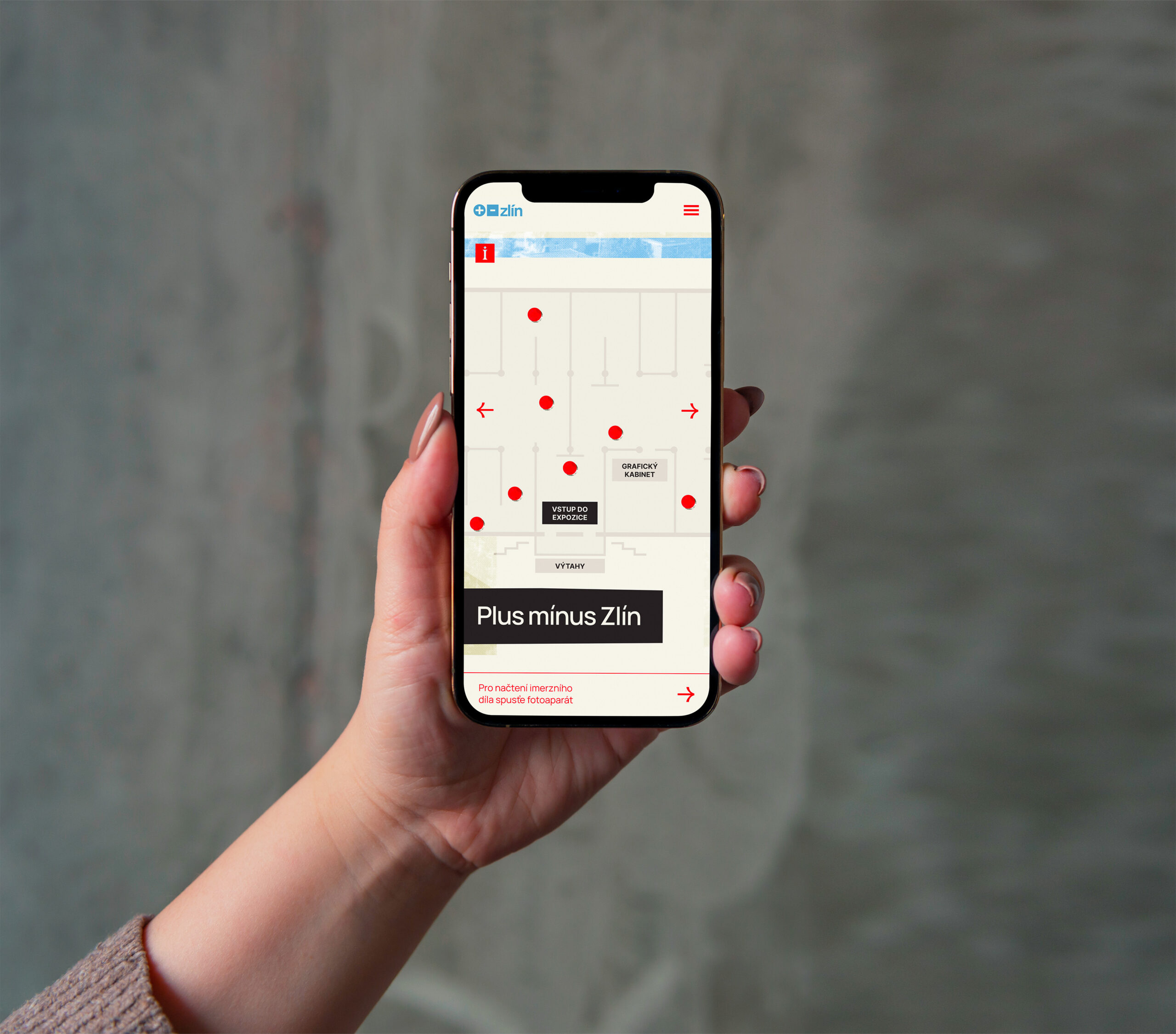
My main focus was on the application. Based on interviews with clients, target groups, and other experts involved in the exhibition, it was necessary to combine several approaches. The application had to meet educational aspects, be content-wise attractive for younger users, and at the same time intuitive and user-friendly for older gallery visitors. Moreover, it had to comply with accessibility standards for AR applications.
User flow
To develop a properly functioning application architecture, it was essential to maintain nonlinearity and the absence of a narrative — each immersive point works independently, does not follow another, and has no dramaturgy.
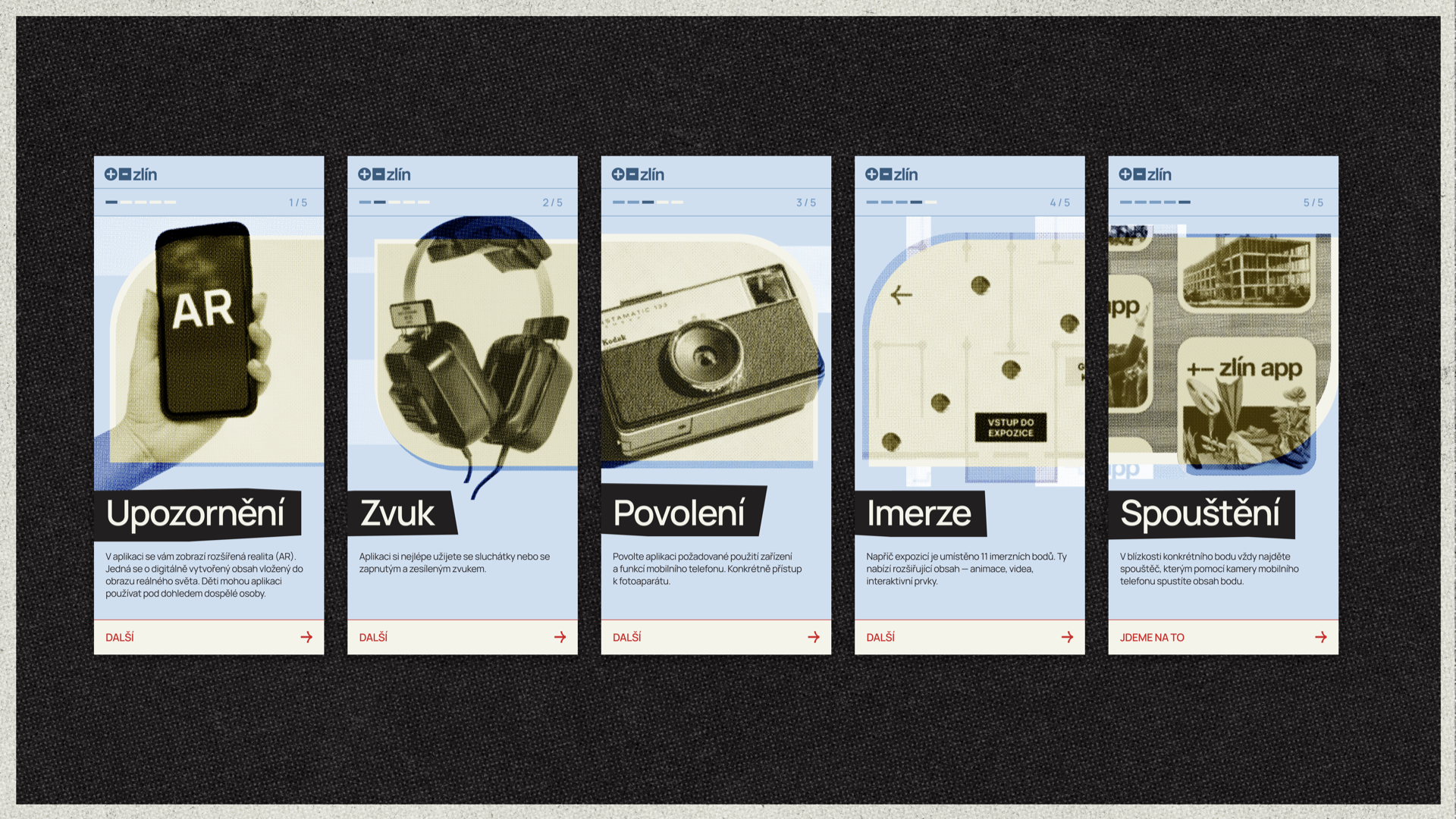
The basic user journey through the application thus consists of opening the scanning screen, loading a simplified card of the point, and starting the immersion itself. This framework is complemented by the “Learn More” function, which shows the visitor the complete card of the point — supplemented by an introduction and graphics. The user can then scroll up the card, revealing more context about the immersive point (e.g., details of the artist’s life, a description of the artistic direction, or architectural principles, etc.). The extended point card is available both after the first trigger load and after the immersion ends, serving both use cases — the curious visitor and the uninterested one who might seek more information later.

User interface
One of the more challenging parts of the project was integrating the appearance of the user interface with the artistic concept of the physical exhibition, which was created by Lukáš Kijonka, separately from the application and immersive points. Although the application was developed well in advance of the physical exhibition and its artistic concept, it had to visually collaborate with and reflect the exhibition. At the time I had to design the user interface, only the intended basic design language of the exhibition existed.
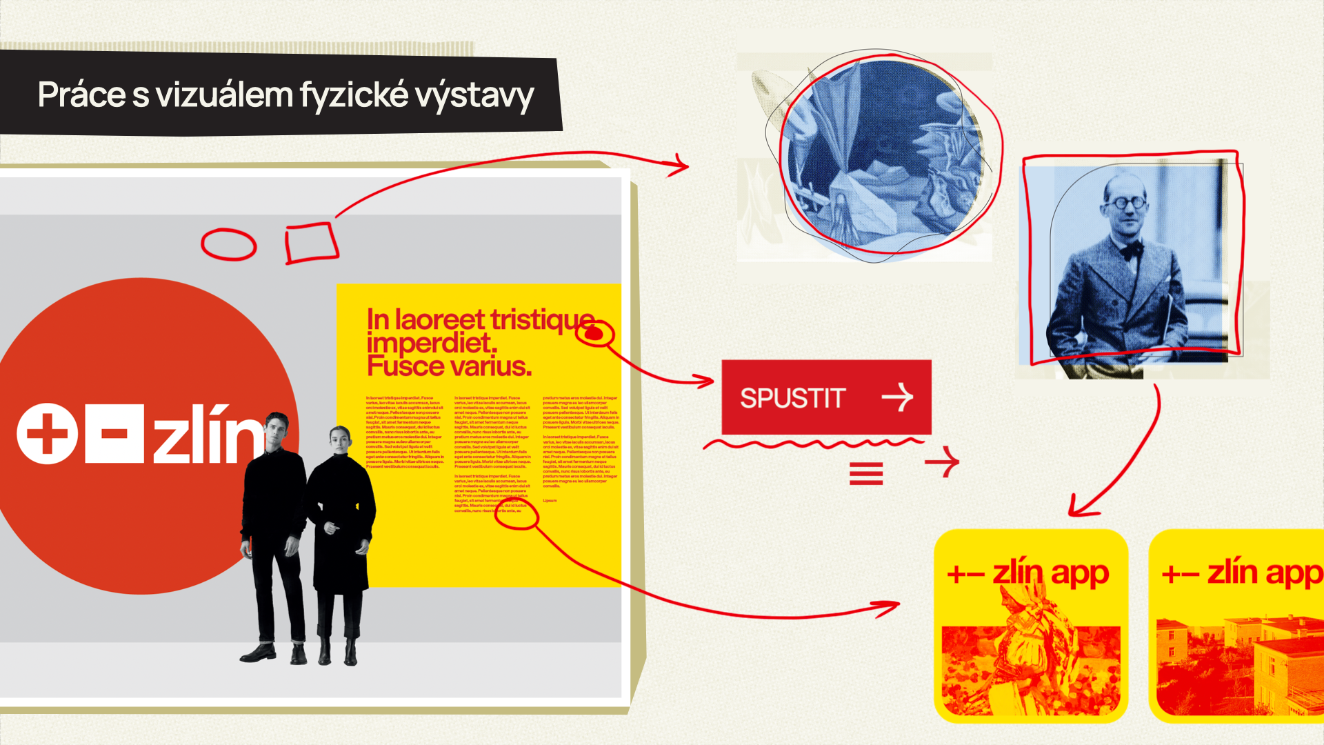
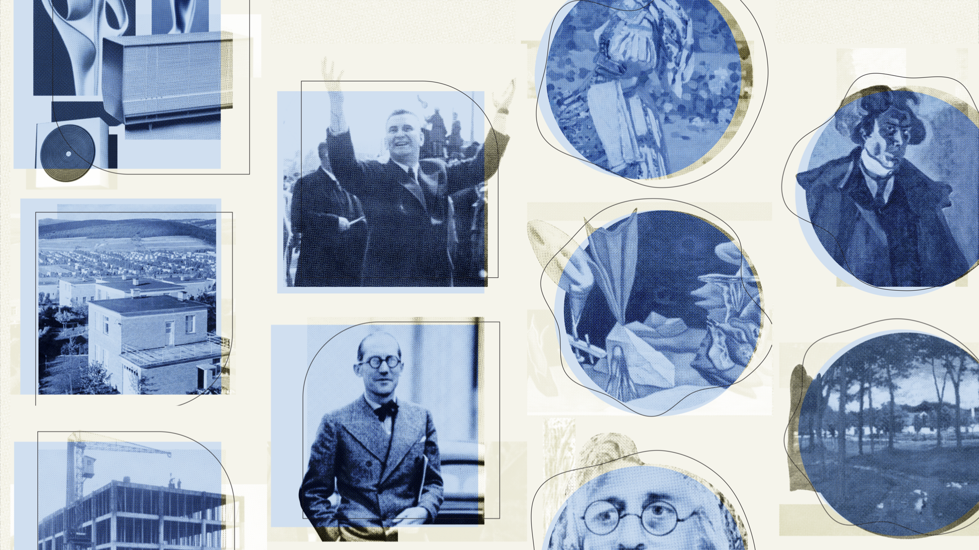
The UI design went through 4 iterations, with the final one featuring a combination with sky blue. I was mainly inspired by the aesthetics of risography, mid-century, and Czechoslovak poster design. The latter two fit well with the period described by the exhibition, all working creatively with photography, colors, and typography. Key elements also included collage, offset printing, and working with strong textures. The square and circle directly relate to the visual of the physical exhibition, complemented either by regular geometric lines (architecture and design) or organic curves (fine arts).
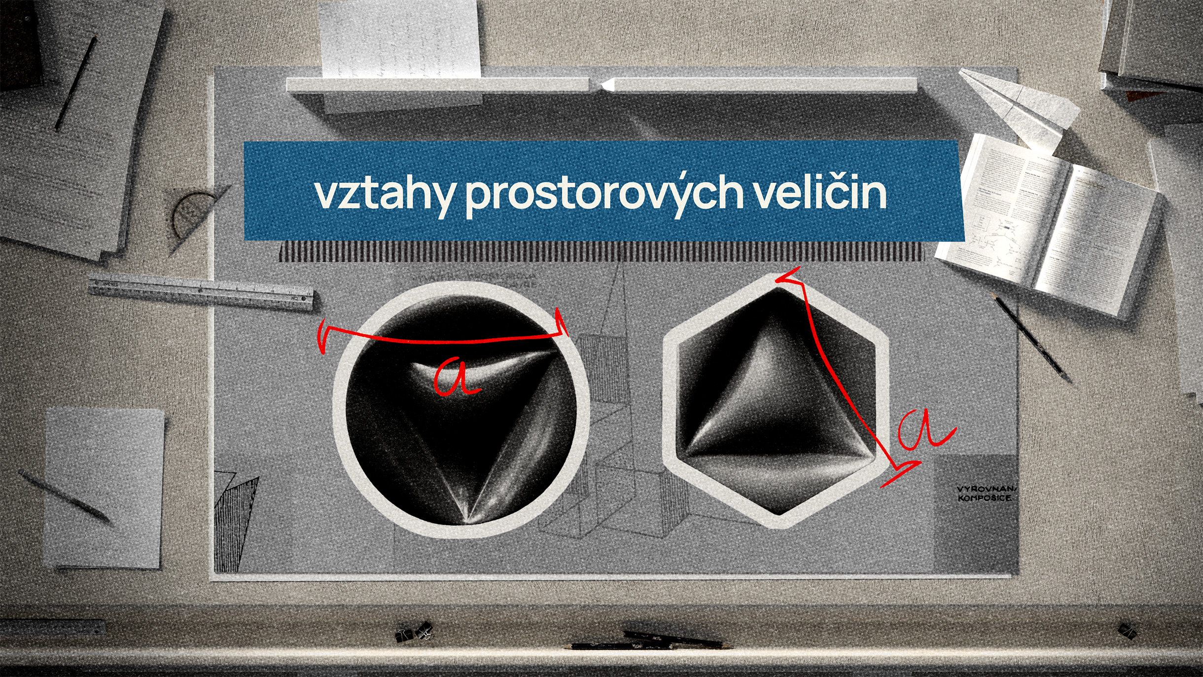
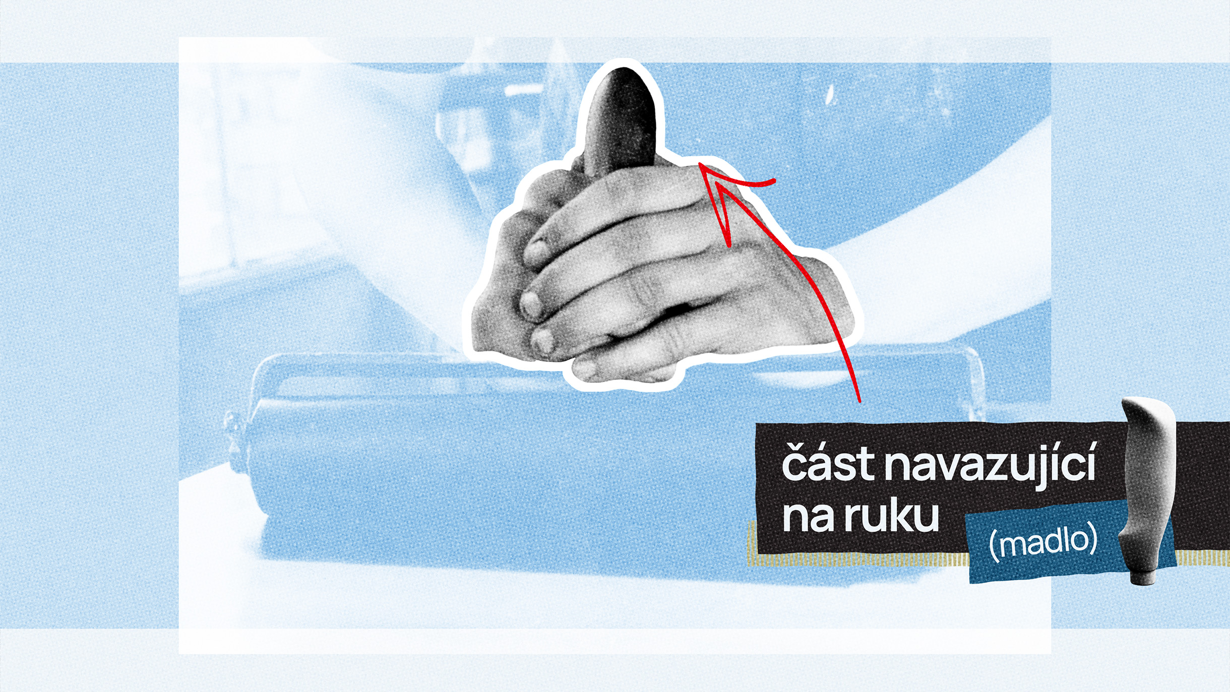
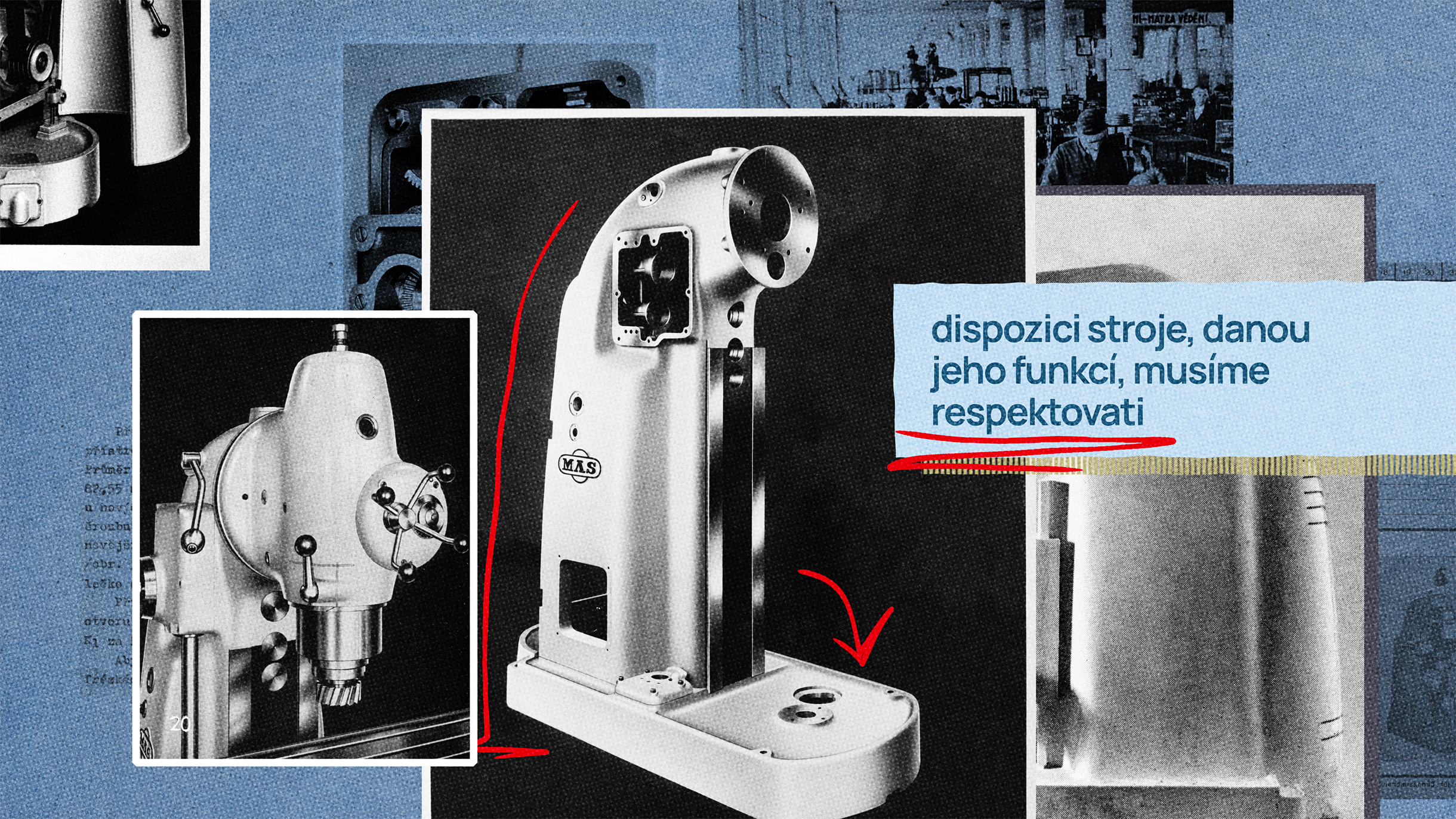
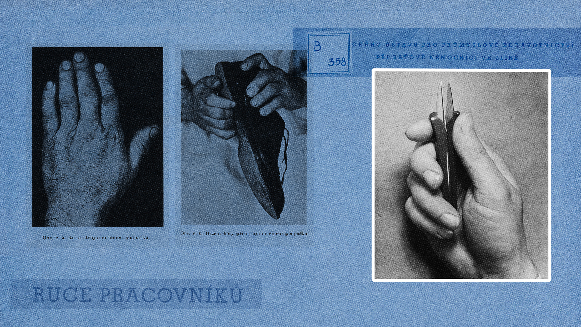
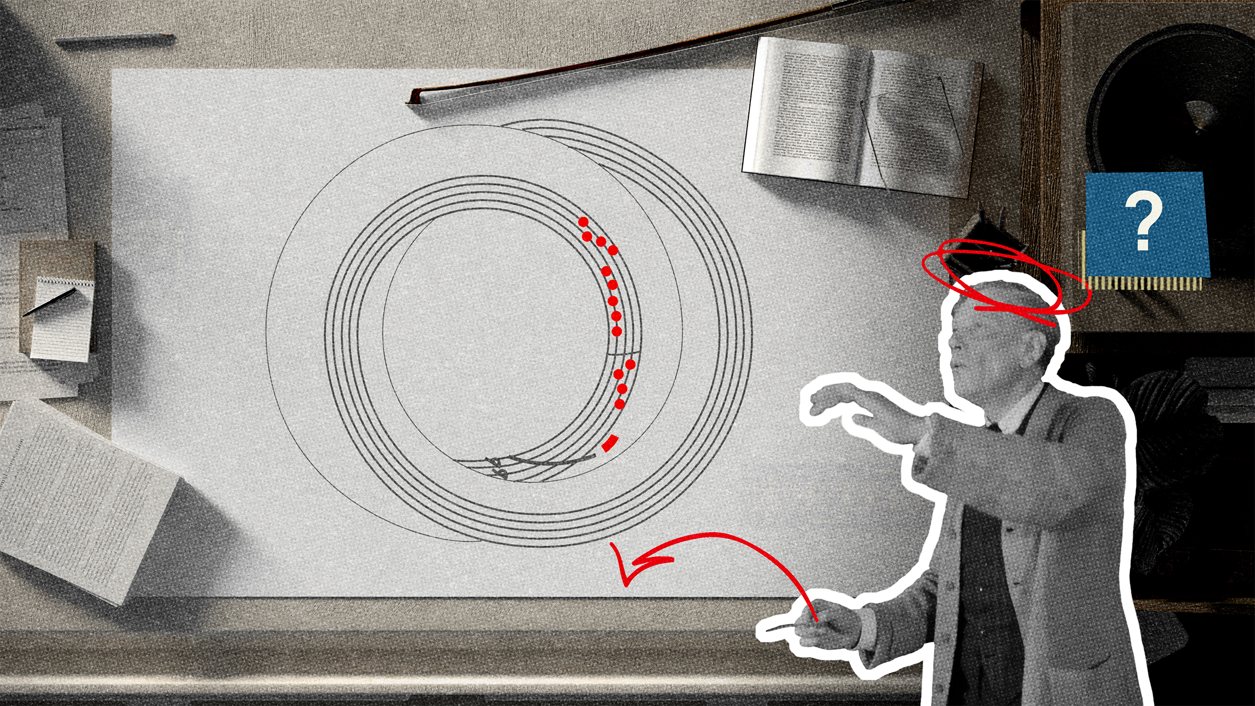
Videomontage Form & function
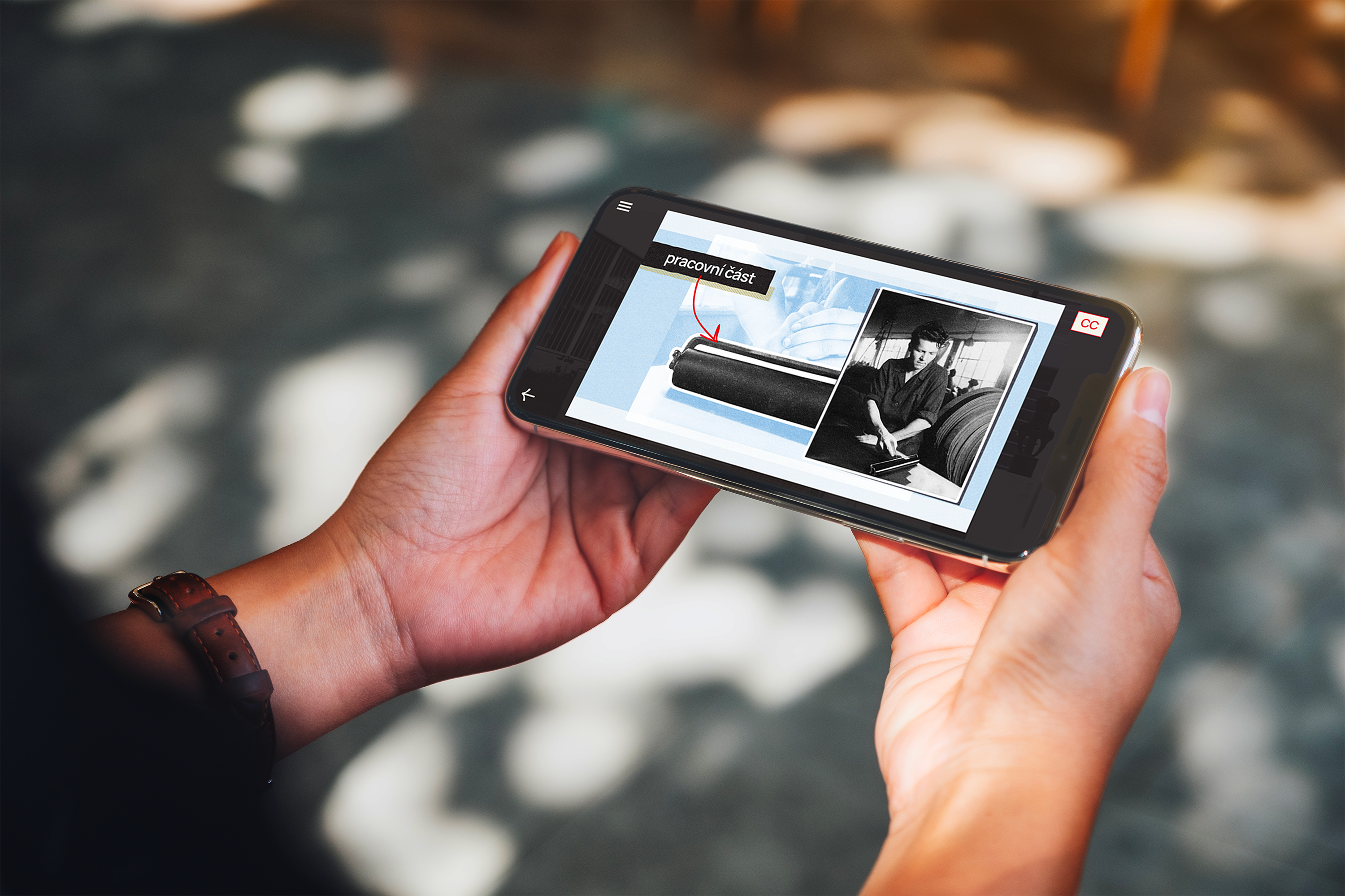
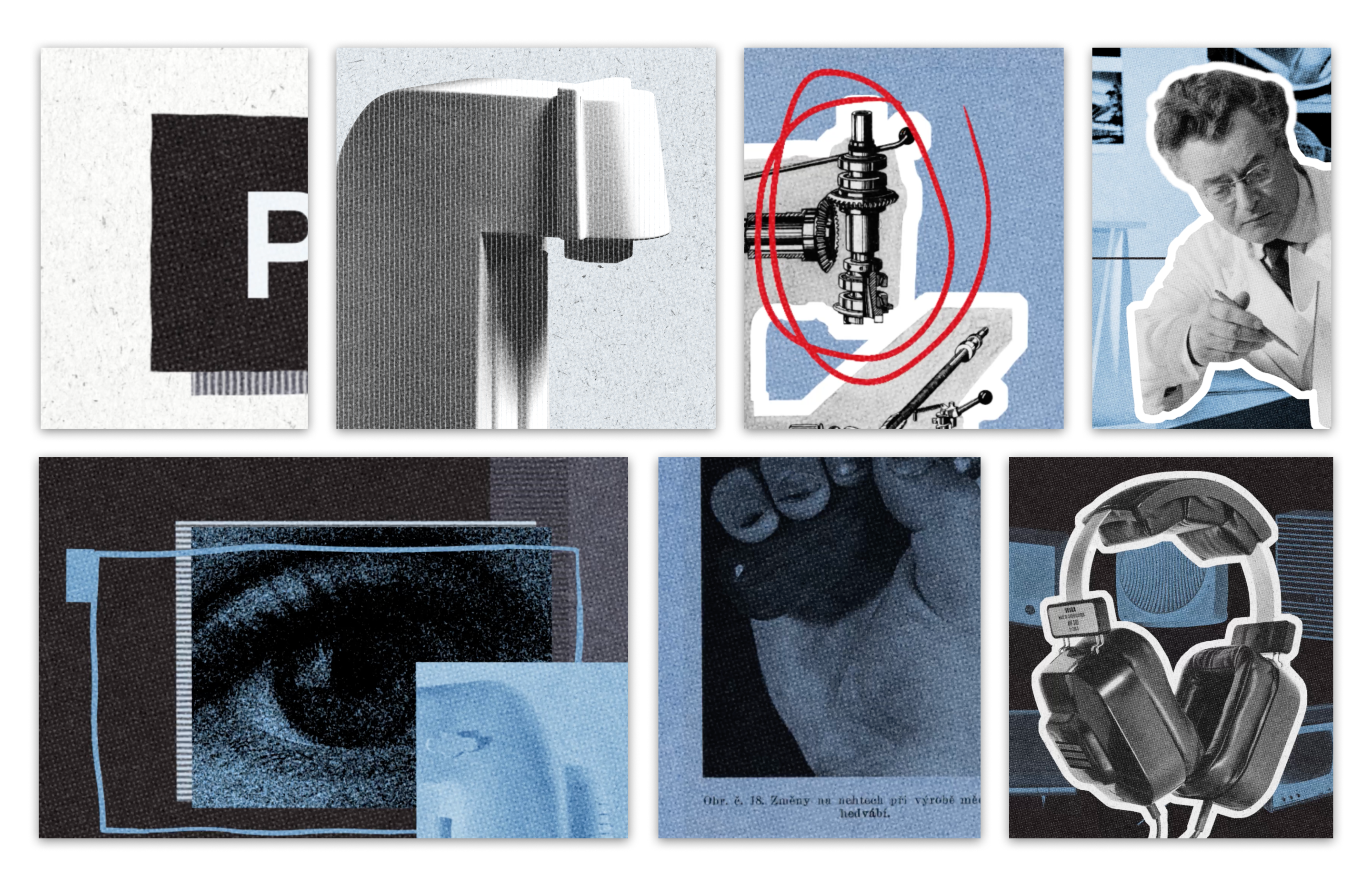
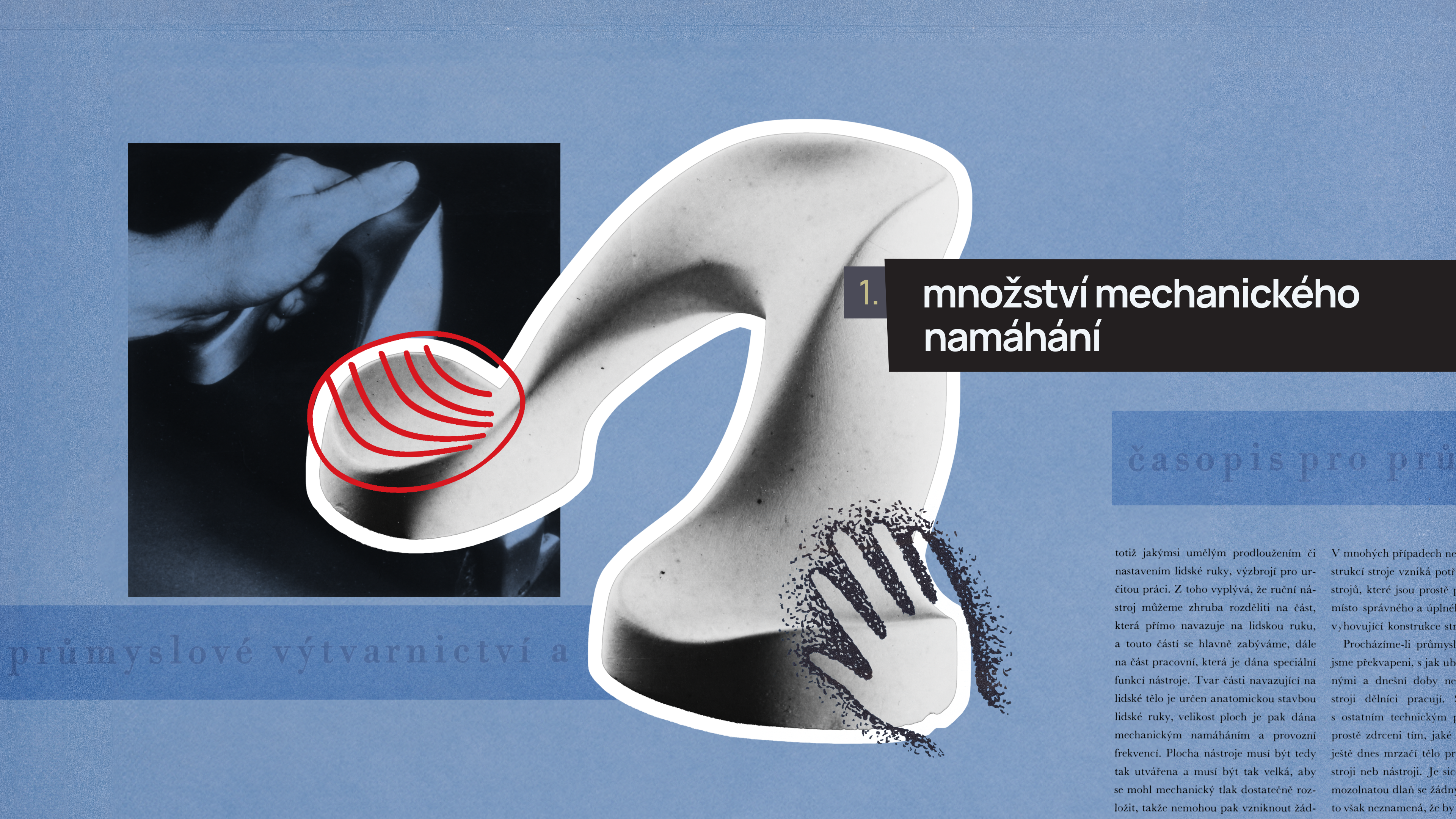
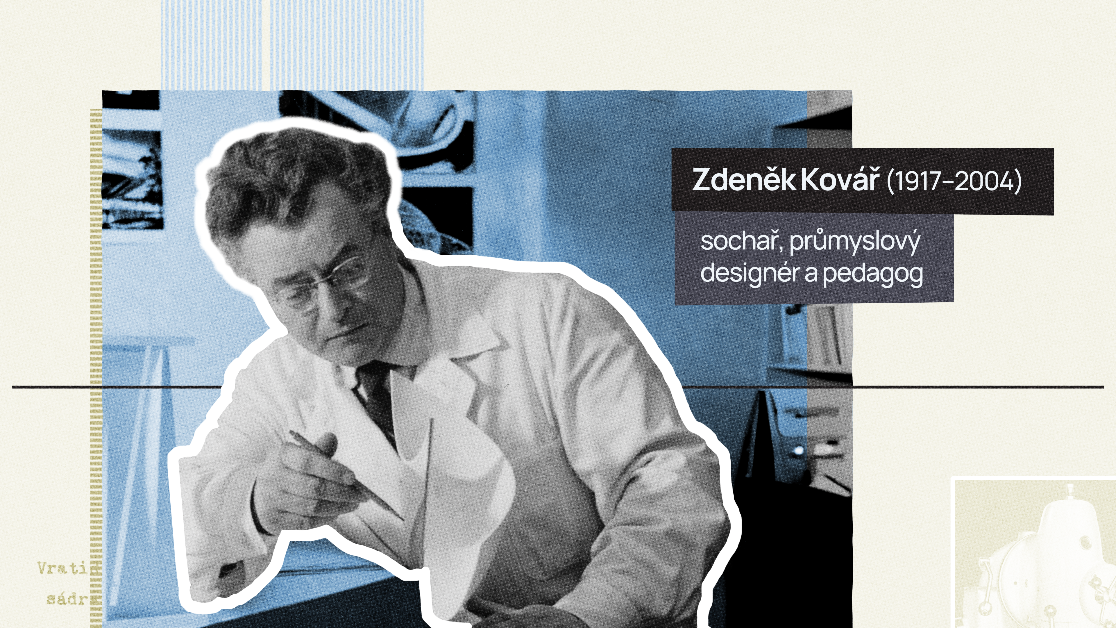
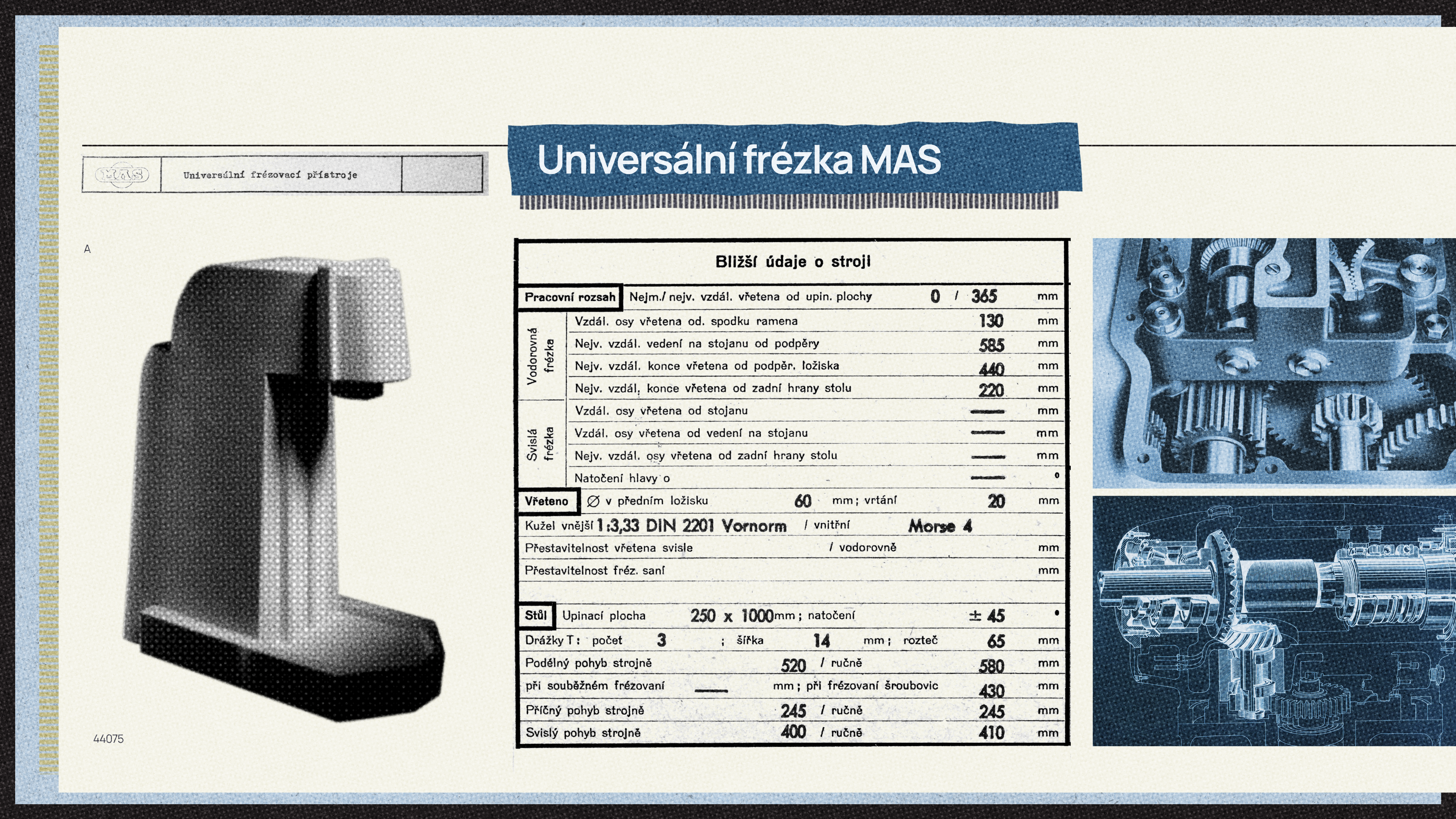
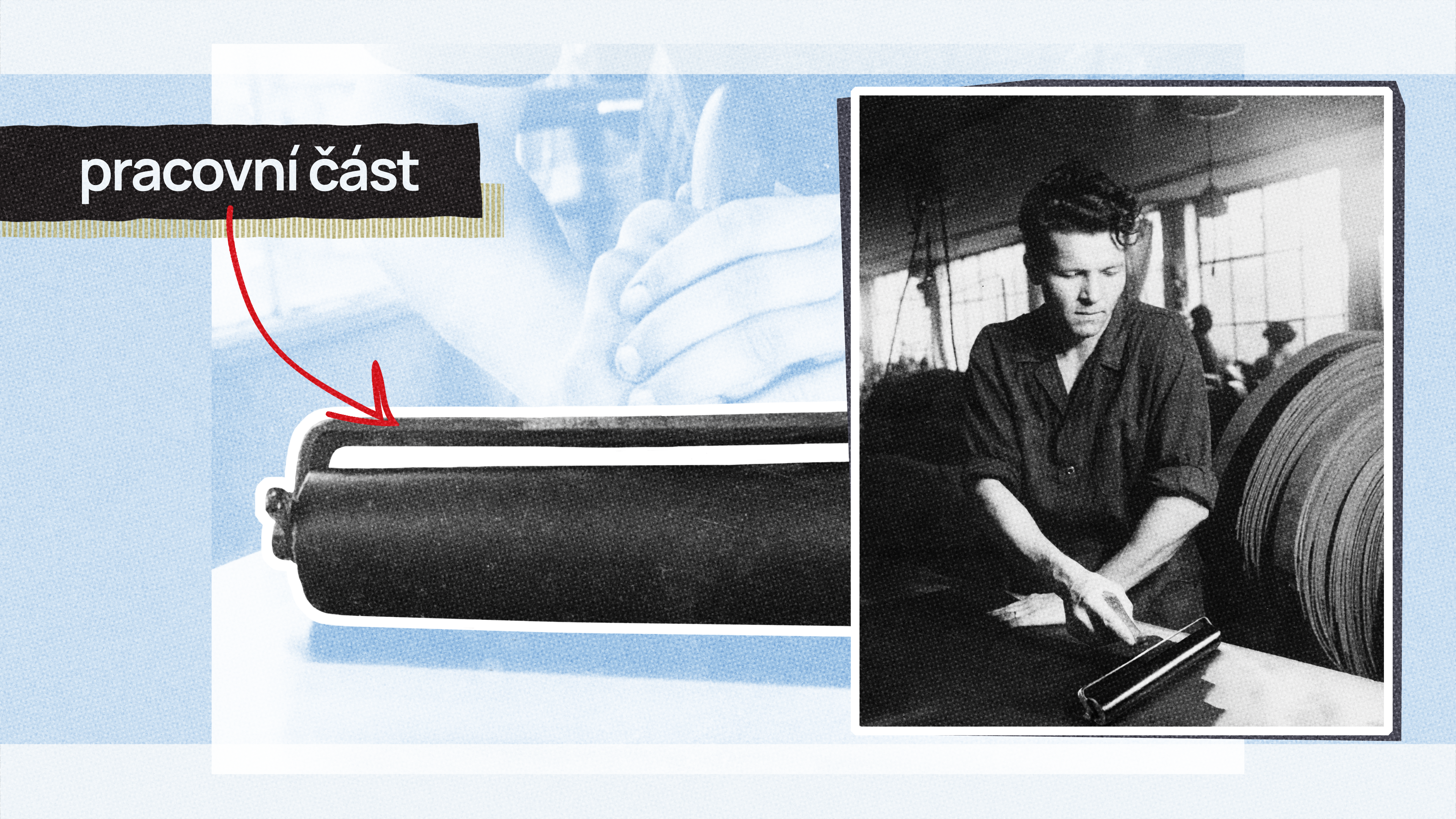
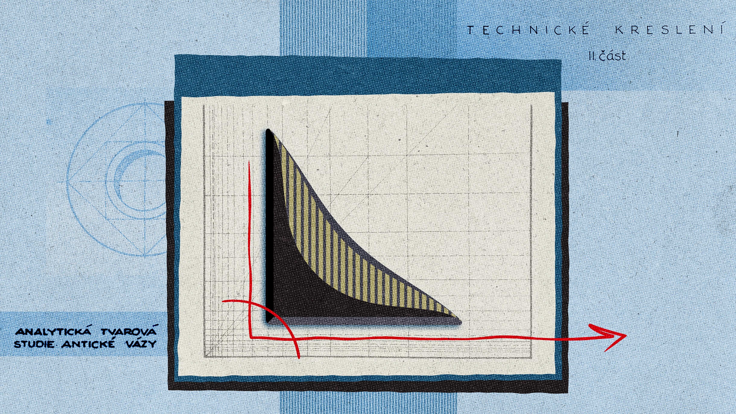
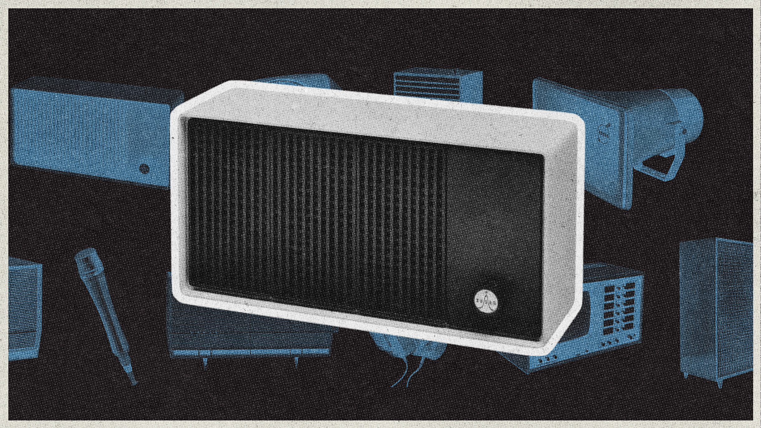
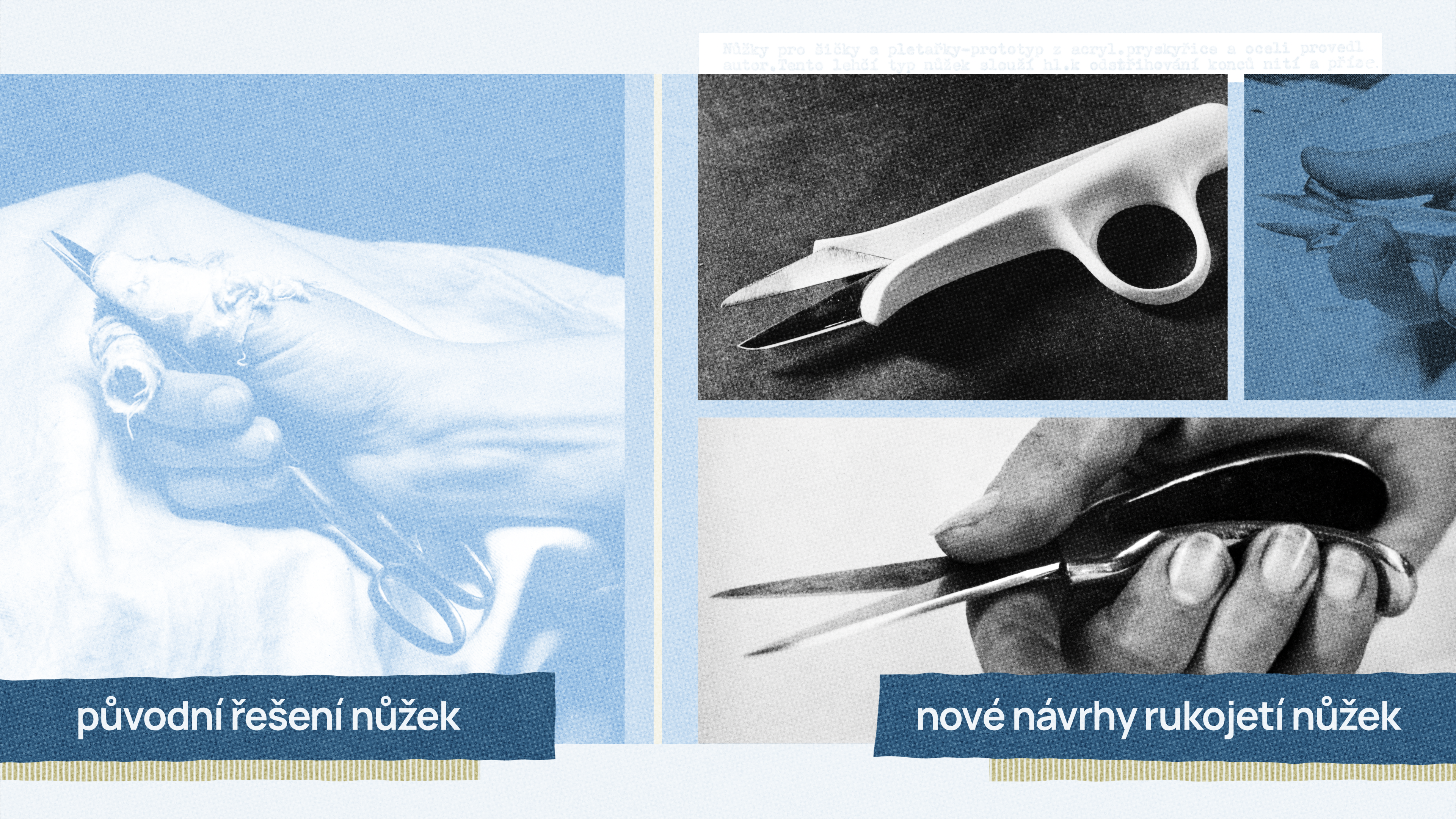
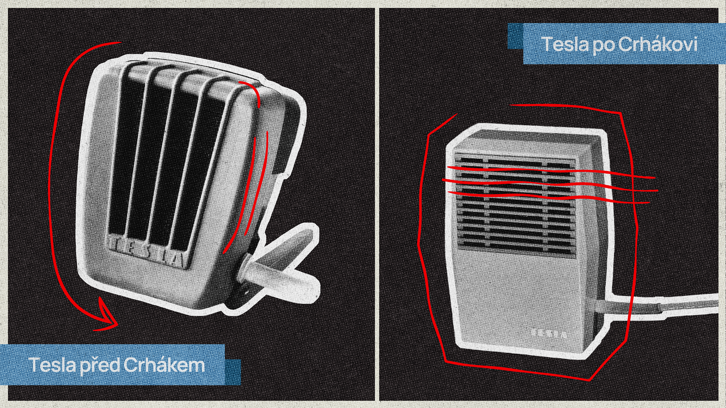
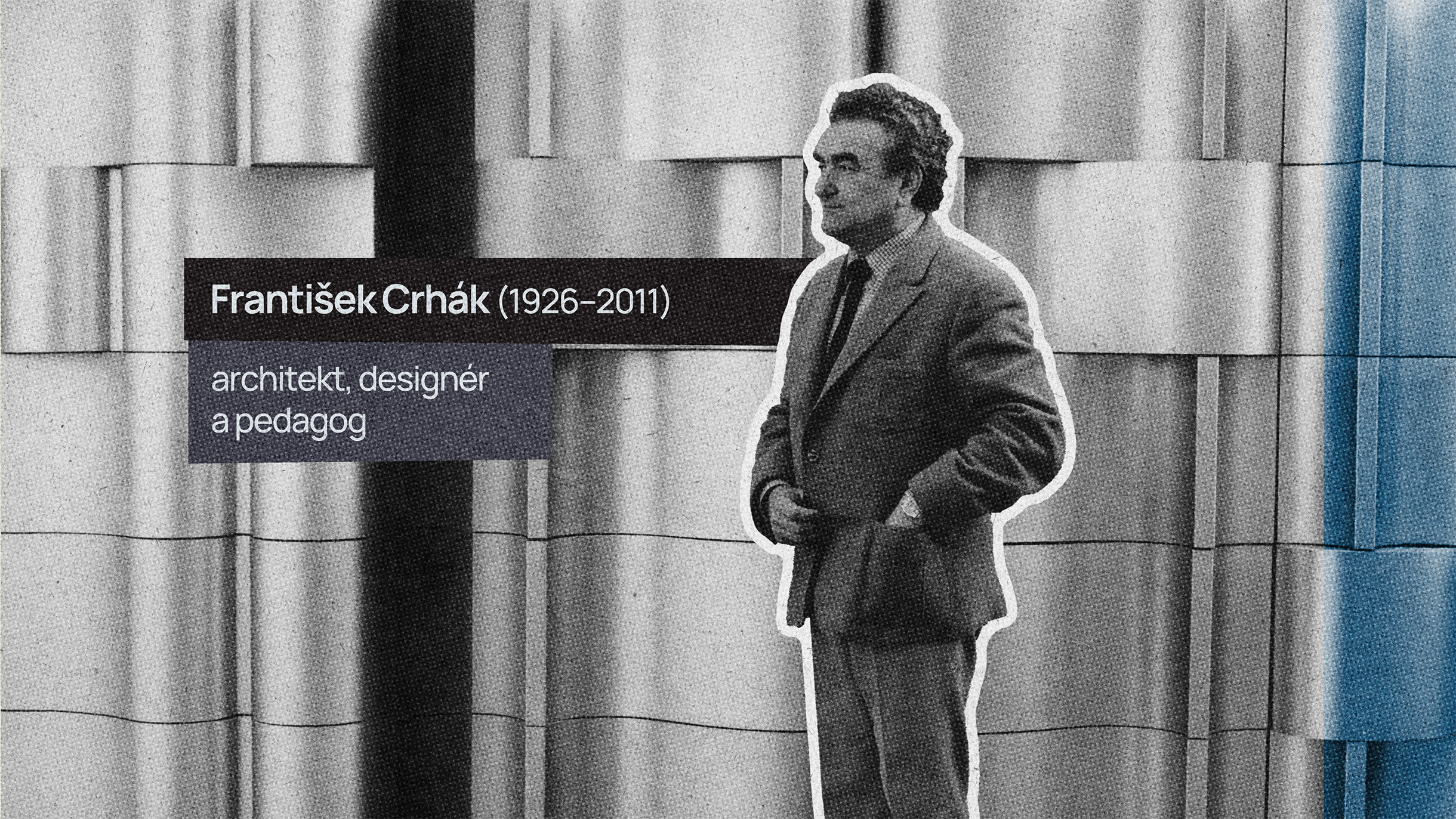
The new exhibition will also include a section dedicated to product design by Zdeněk Kovář and František Crhák, describing their different approaches to creation. This will be digitally complemented by a video collage.
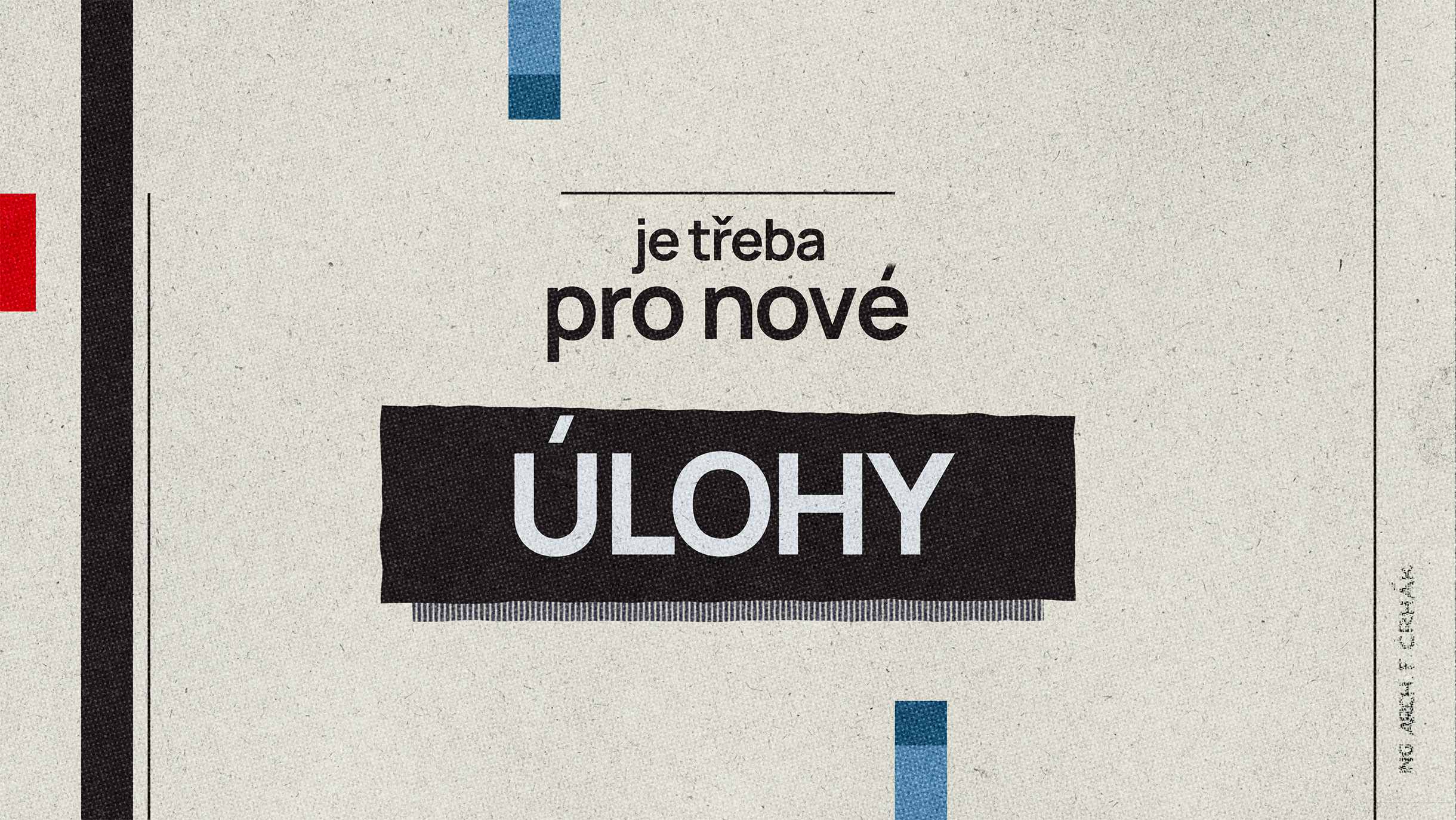
The script for “Forms and Functions” was compiled by Mgr. Vít Jakubíček from excerpts of texts authored by the mentioned creators themselves. Therefore, it is very authentic but also occasionally unclear due to archaic expressions, complex sentence structures, and abstract thoughts. It was necessary to carefully phase it and determine which phrases and word combinations would appear visually in the video.
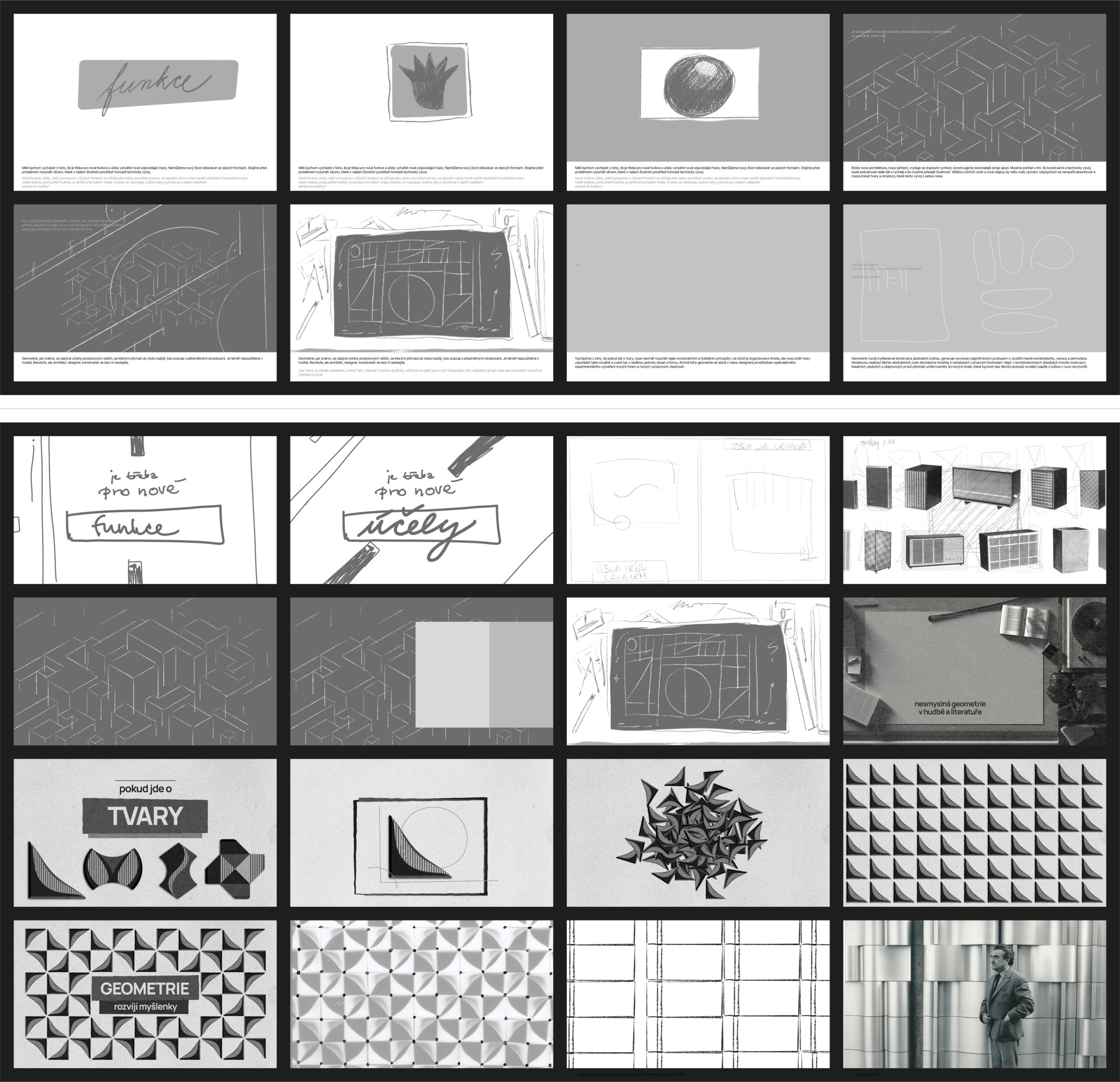
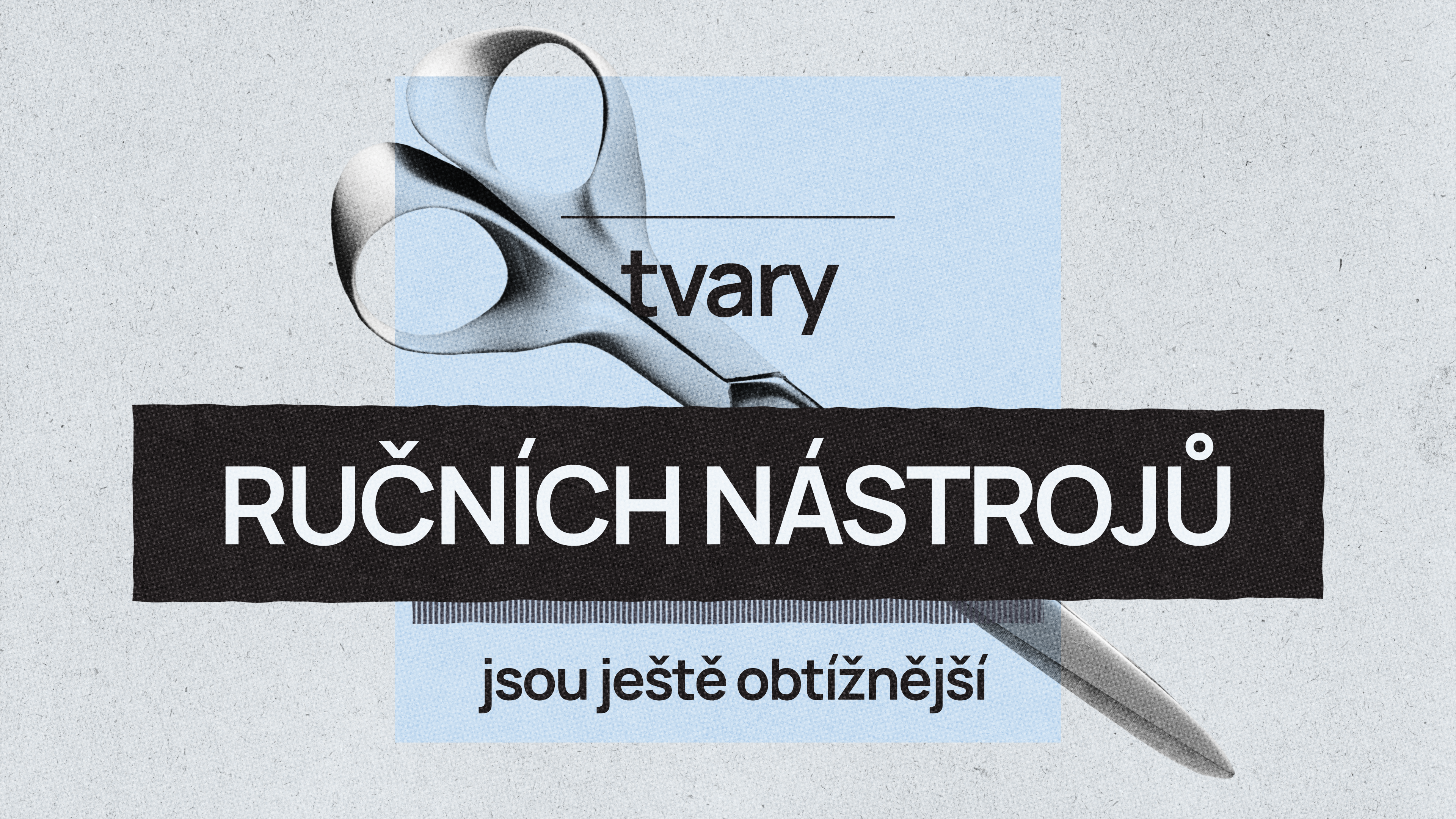
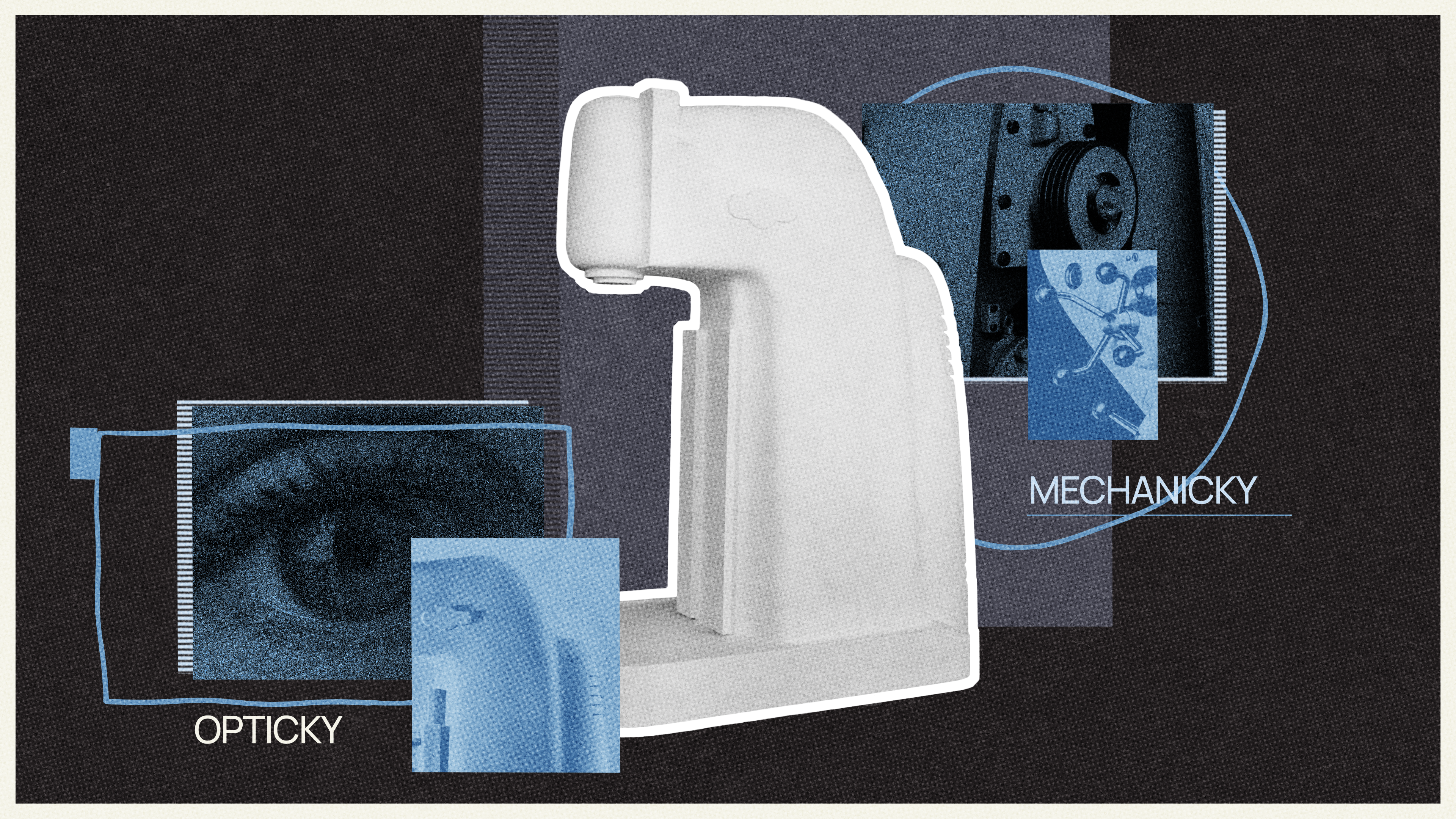
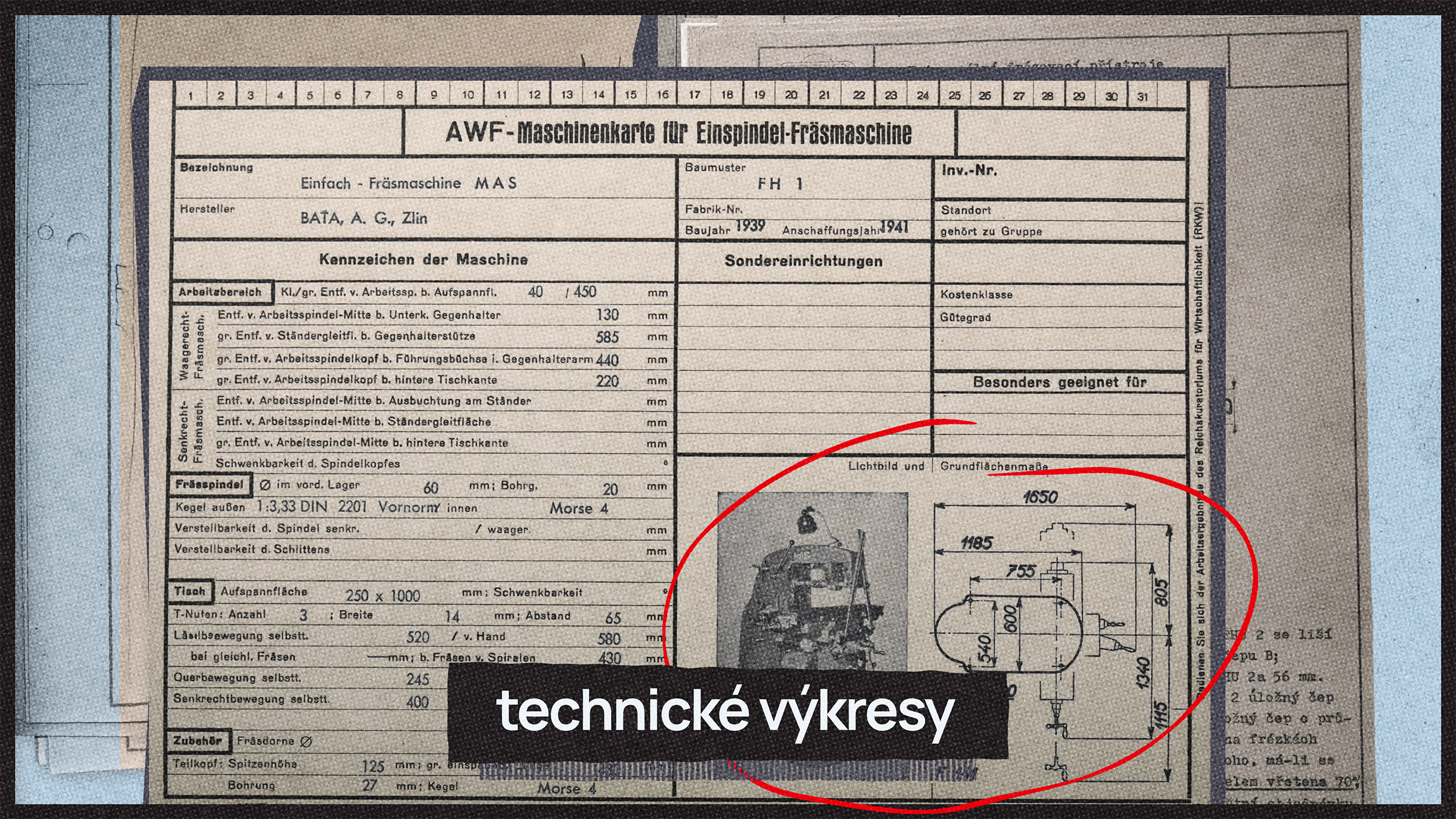
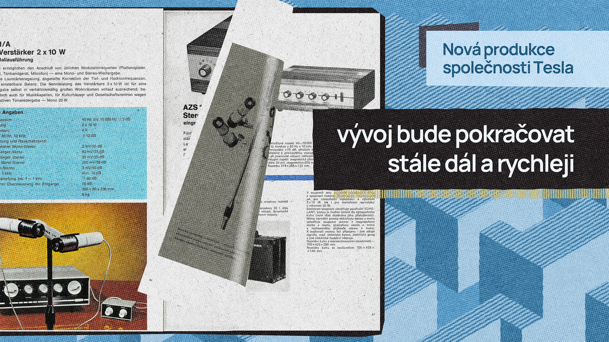
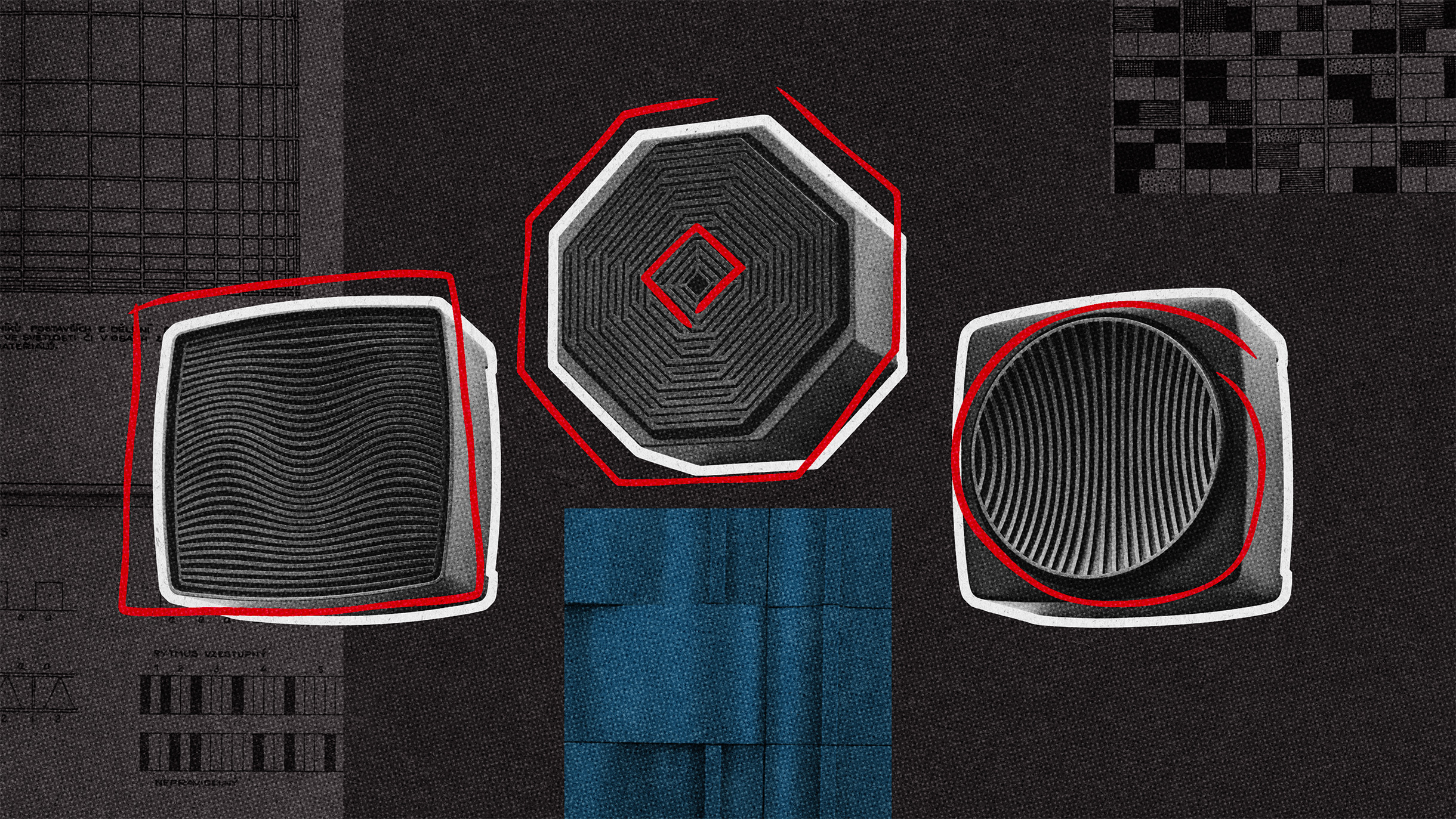
The storyboard for the video collage went through three iterations, with scenes gradually supplemented with new photos and graphics. First, we roughly defined how to portray the voiceover and then selected additional materials from photo archives to prepare the collage to be as visually rich and informative as possible.
The final video collage is nearly five minutes long.
Extensions and Further Use of Material
To increase repeat visitation, the Regional Gallery of Fine Arts in Zlín (KGVUZ) can also work with the newly created digital space on a short-term basis. For example, the application can be temporarily updated to include an additional immersive point related to a significant event, anniversary, or as part of a partnership (e.g., between the Regional Gallery and the Zlín Film Festival).
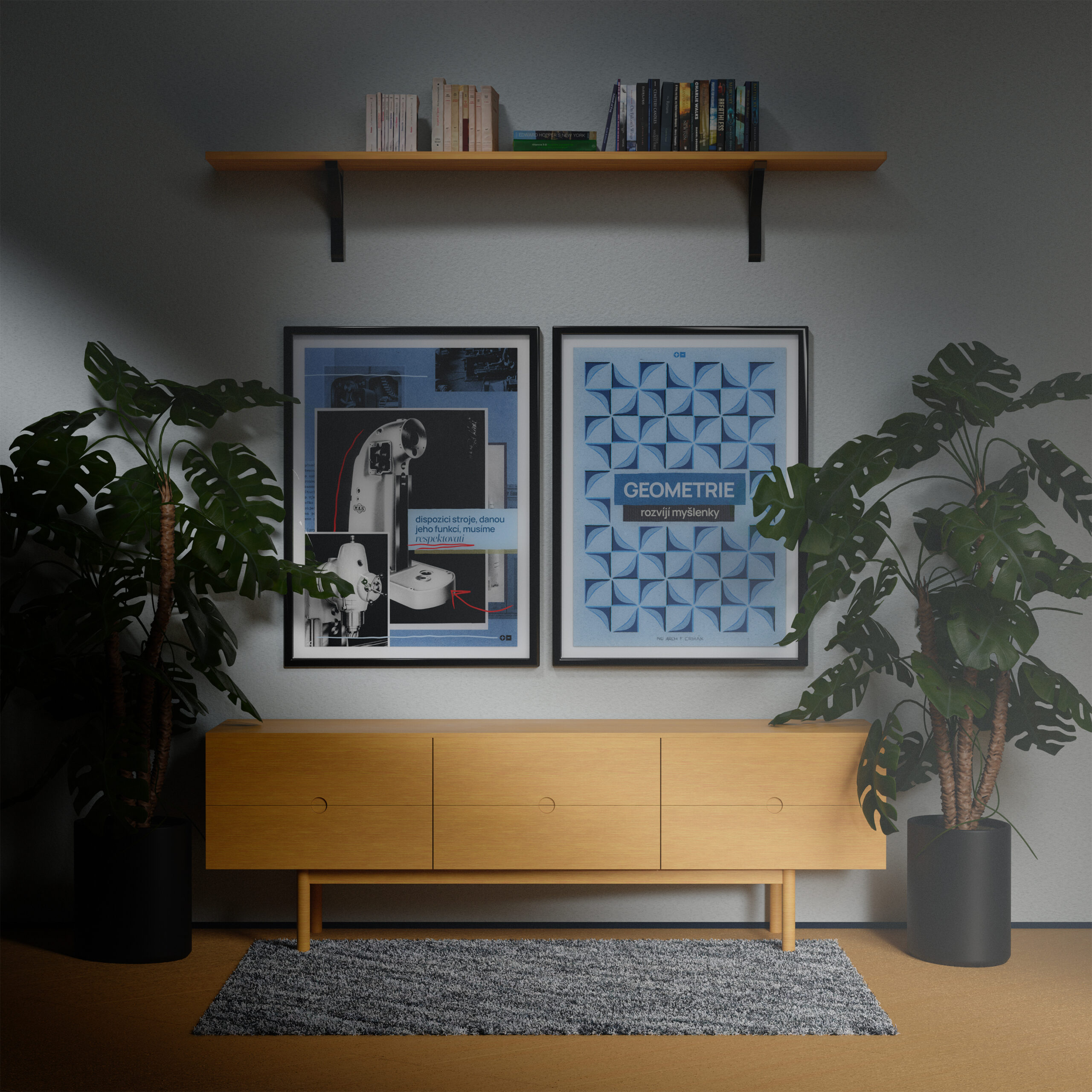
The digital content created for the application can also be used to create promotional materials. The gallery can release static images from animations and the video collage as a limited series of posters — in addition to their aesthetic value, the posters can be enhanced with augmented reality and, when scanned with the application, play a clip from the animation, thus further promoting and popularizing the new exhibition.
