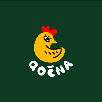
Redesign of the visual identity of the University Nursery School Qočna
The redesign project for the nursery school represents a comprehensive transformation of the visual identity with an emphasis on attractiveness for parents and clarity for children. The design is based on
the use of a bright colour palette and vector illustrations.
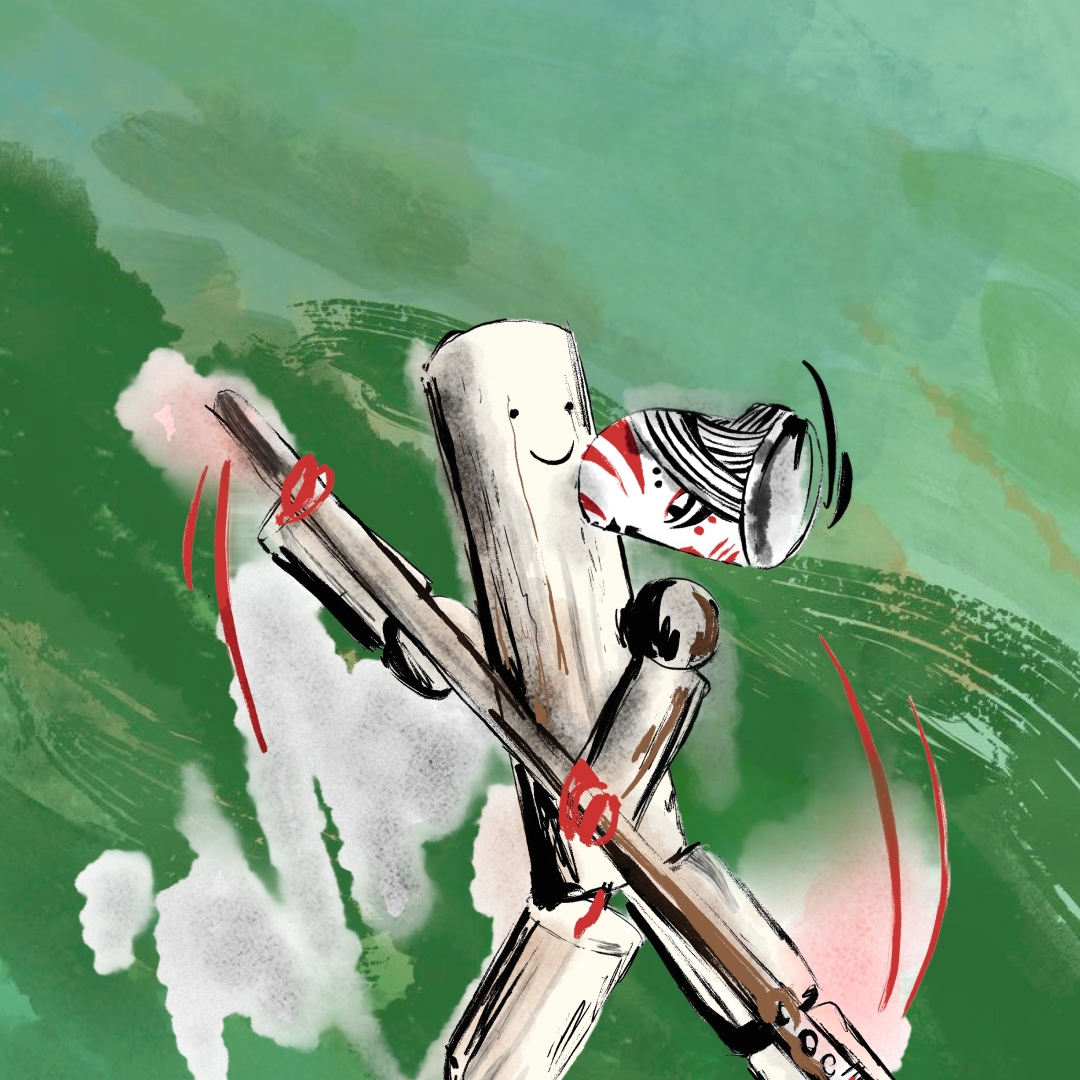
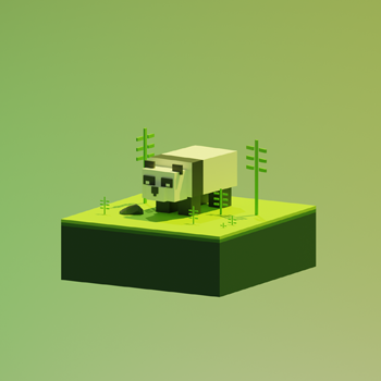
The new logo reflects the playfulness and joy associated with a nursery school where the main motif is
the mum Qočna. I have also created a series of pictograms for the garden spaces to support the educational and playful element of the environment.
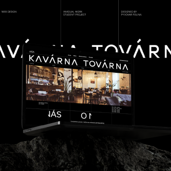
The aim of the website redesign was to create a unique design for an interesting viewing experience.
We also redesigned the structure of the site, making it more recognizable and easier to understand.
The result of the redesign is an overall impression that promotes a positive perception of the preschool by parents while creating an environment that is welcoming and appealing to children. The new visual effectively communicates the school’s values and strengthens interactions between parents, teachers
and children.

