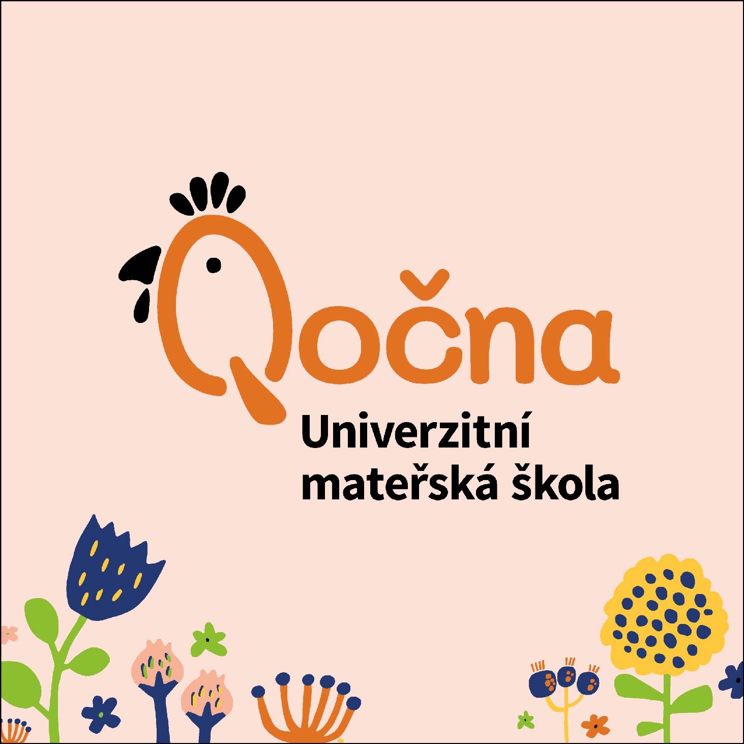
The new visual identity of the university kindergarten Qočna was created as a logotype based on the modified letter Q and the symbol of hen. The design includes not only a new logo, but also a website, business cards, printed materials and printing on other promotional items.
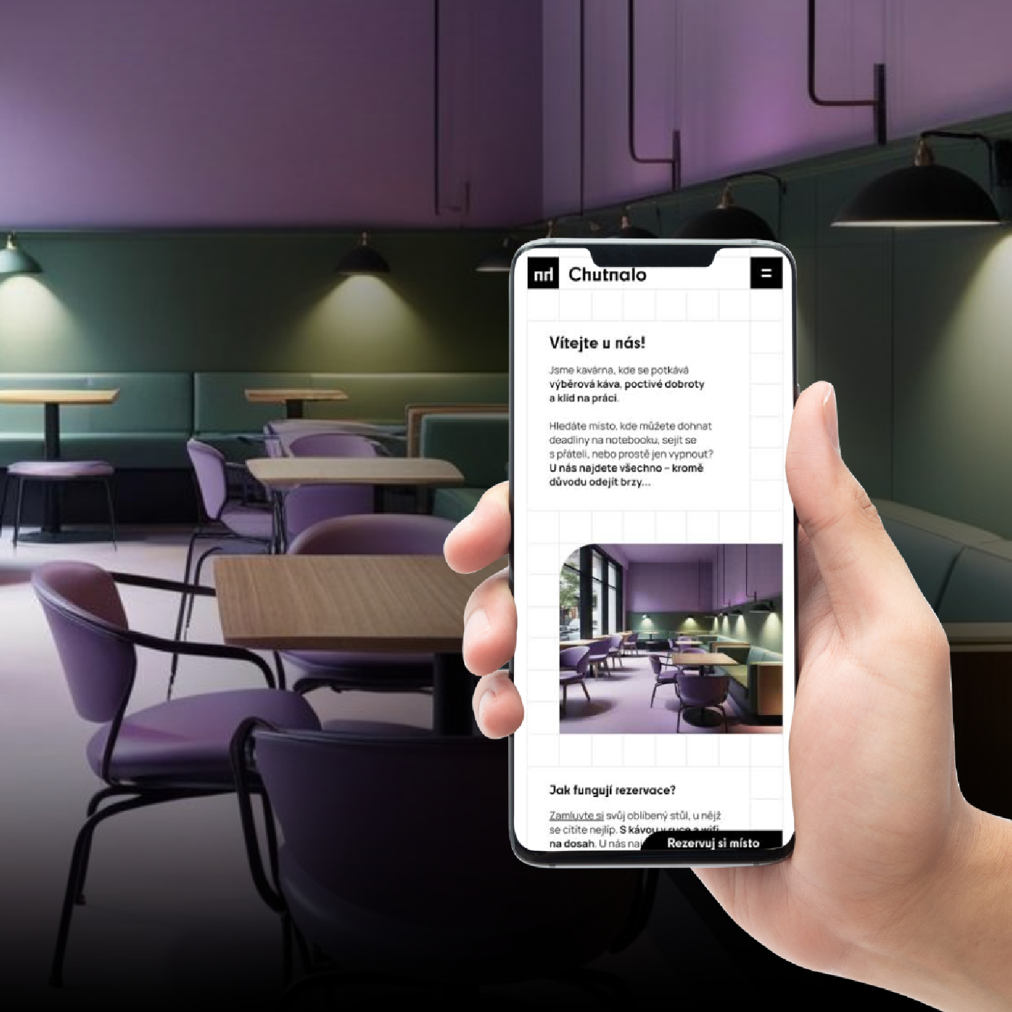
The Qočna website is primarily intended for those interested in placing children in kindergarten. They mainly expect from this page to find important information as quickly as possible. During the design, I was therefore looking for a compromise between clarity and a fun visual form. In order to achieve a unified aesthetic impression, I chose only two types of fonts within the visual identity – Delicious Handdrawn for headings and the Tomas Bata University font for longer texts.
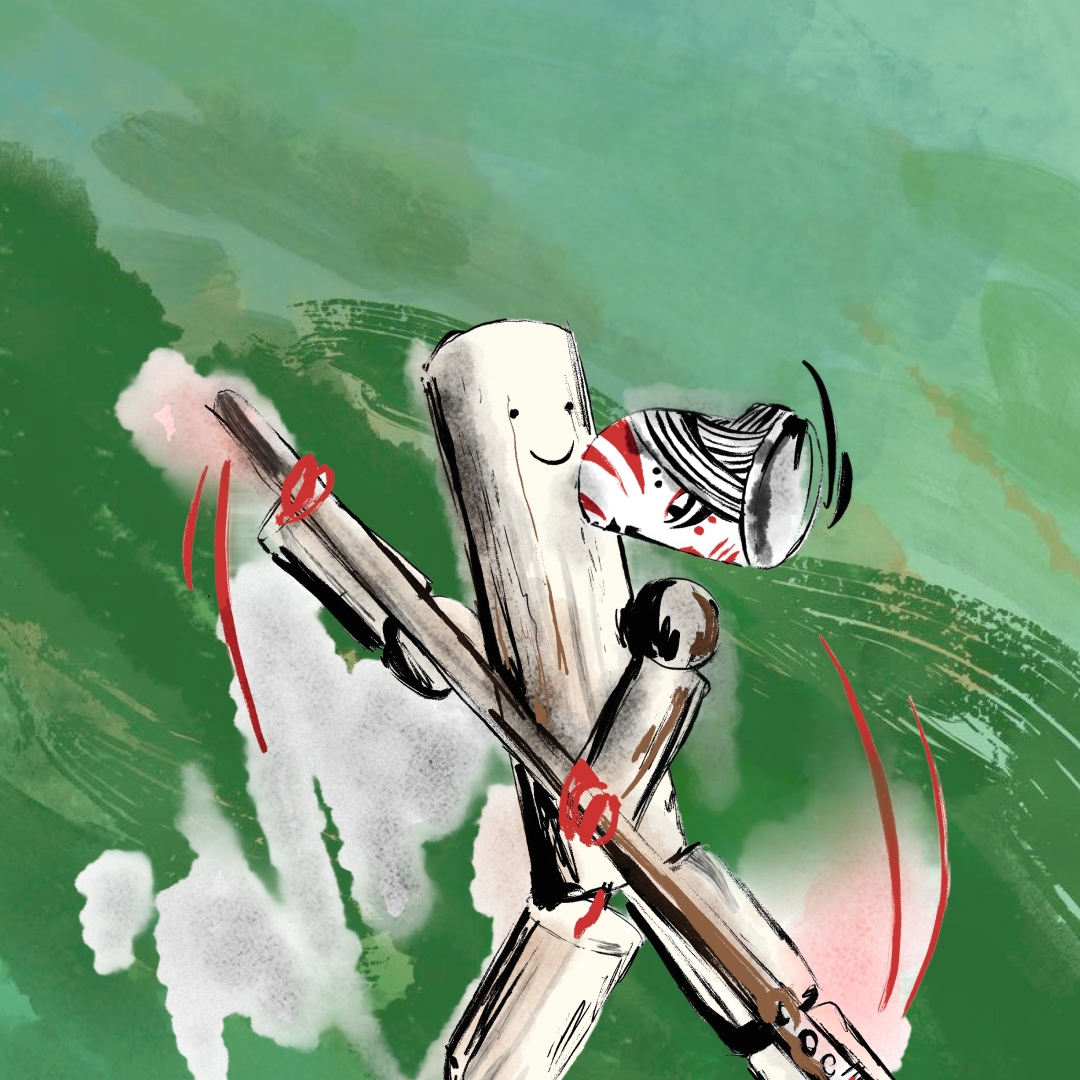
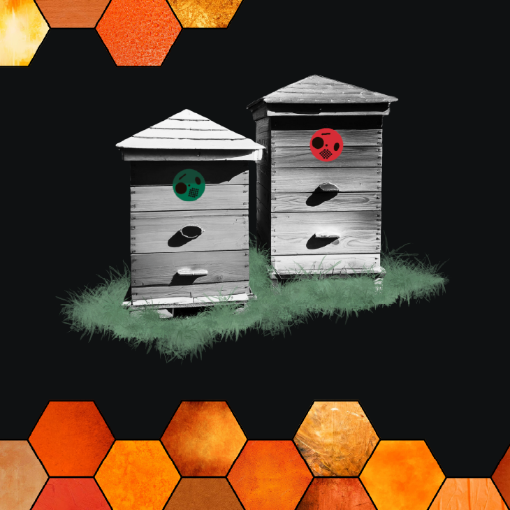
I also created pictograms for individual classes, including animals stickers, which are used to mark individual children’s lockers. Each class has its own specific type of chosen animals (domestic and wild animals, insects) and uses a fixed color palette. I add some illustrations of brightly colored flowers, which are repeated as cheerful motifs. They offer a multitude of usage possibilities, such as on business cards or small items. Important details are the rounded edges of all illustrations and pictograms, which help create the feeling of a nice and safe environment for children.

