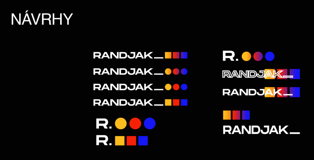
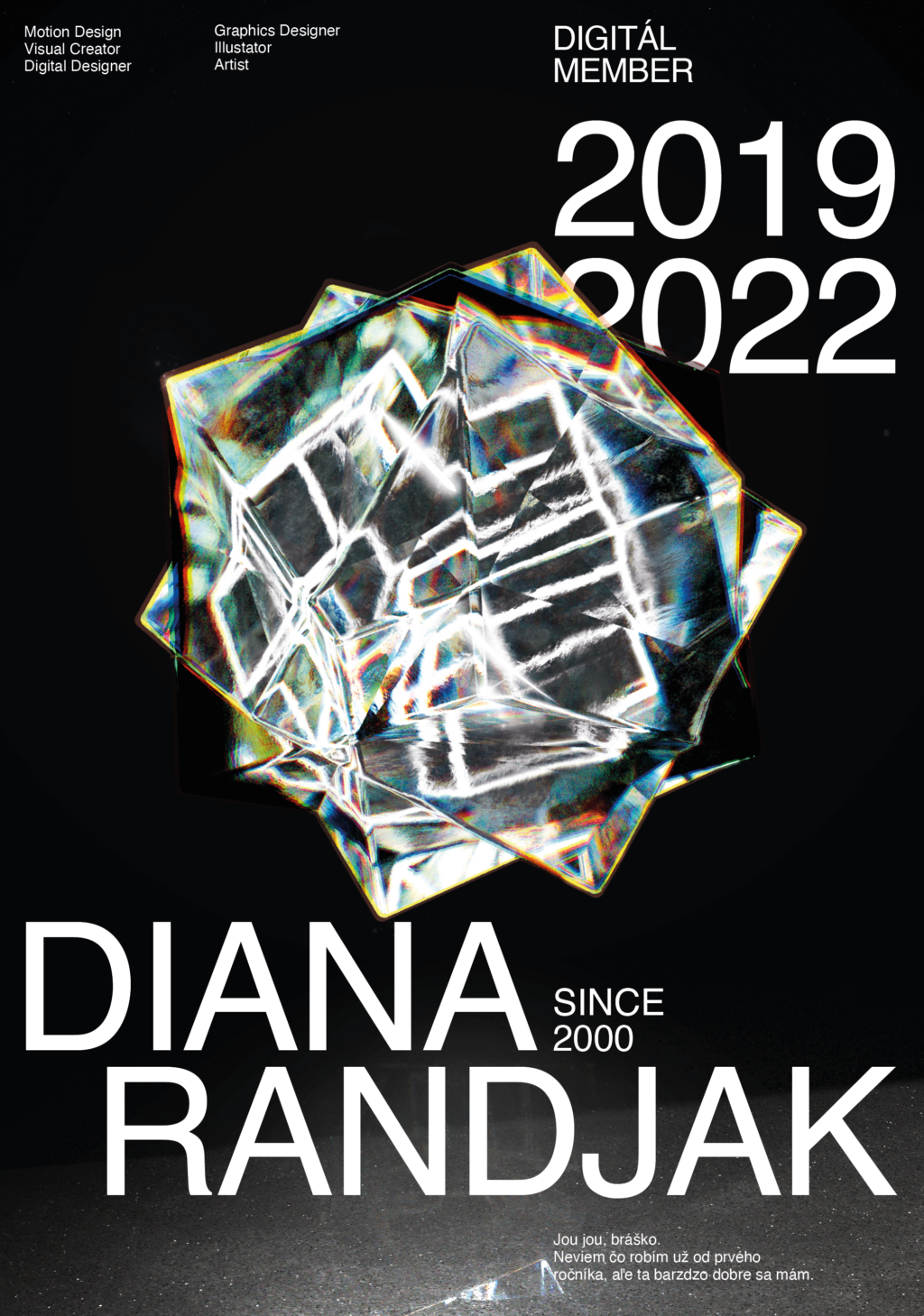
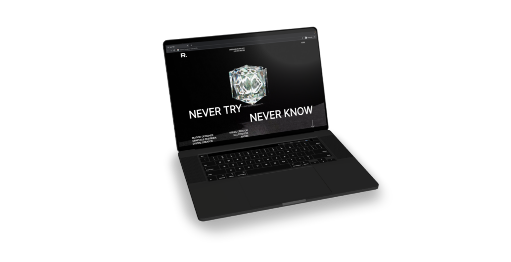
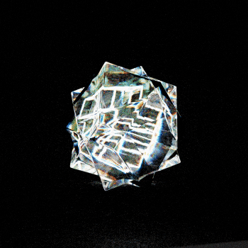
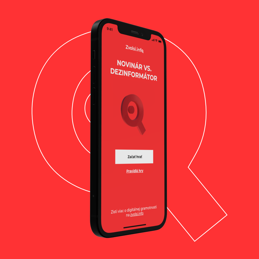
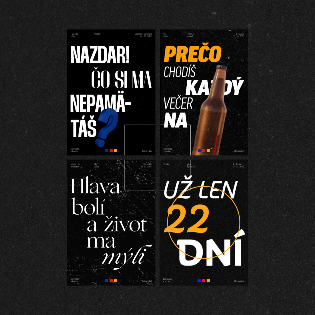
The look and feel of the site reflects the personal visual identity that I have formed over the course of 3 years at DIGITAL. It is based on a combination of the 3 primary colours of red, blue and yellow, which I take as the alpha and omega in all my designs and paintings. The look of the site itself is meant to represent the direction I would like to take in the future. Because of the fact that I enjoy something different every 5 minutes, I used a simple font that I can always complement with some other style. Since I didn’t want to use the 3 primary colors directly, I decided to create a 3D object in which light is refracted thanks to the glass material. This light creates colours with this effect, in a few tiny places. I always want to have a maximum of 5 projects in my portfolio that represent what I can do. The website is really built in a simple way so that the visitor doesn’t get lost in it, that’s why I put the contact details right in the main menu, so they don’t have to search for the contact details in another subpage.