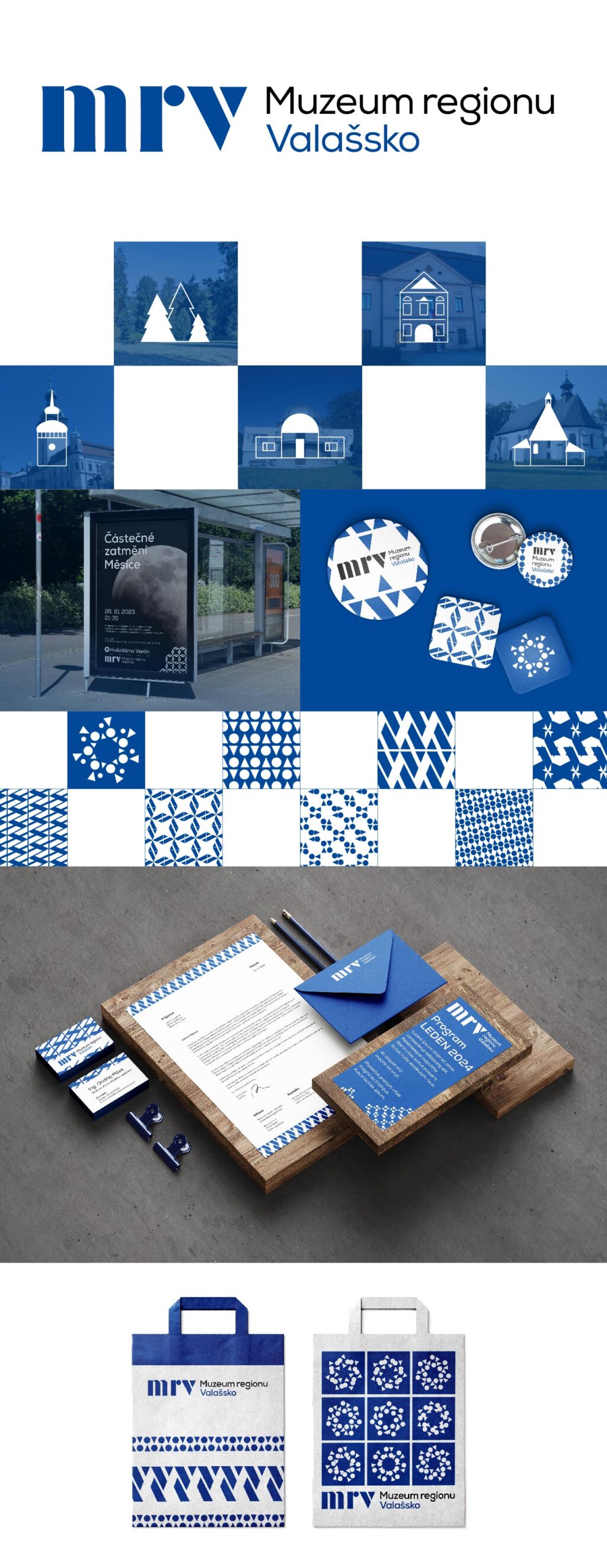
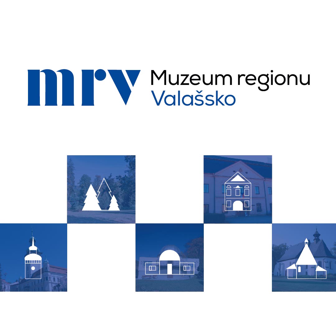
I decided to base the concept for the new visual identity of the Museum of the Wallachia region on a simple and easy to remember logotype. Just as the Museum of the Wallachia region connects history and the present in its events, exhibitions and other activities, I also decided to create a logotype that mixes the tradition of the past with the modernity of the present. The logo has several composition variants, either in a long or a shorter version, so that it can be used for any occasion.
Important elements that run through the entire style are geometric shapes taken from this logotype. The minimalist shapes of the triangle and circle can be further developed into complex ornaments and used for printing advertising items and souvenirs for visitors, business cards or posters. Putting together patterns in the colors white and blue is an unforgettable part of Wallachian culture. The iconic tradition of Wallachia — the blue print — inspired me in my work. Countless patterns were created and used on many items. The entire identity is dominated by the color blue, which also comes from the blueprint and unifies the entire identity.
To mark the individual buildings under the management of the museum, I designed pictograms that are based on the geometric style of the logotype and thus reflect the future direction of the museum.
