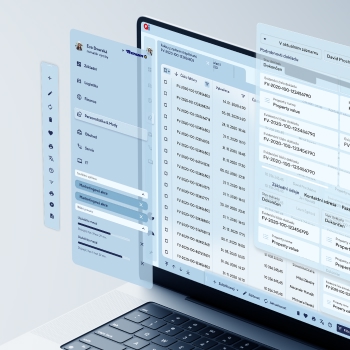
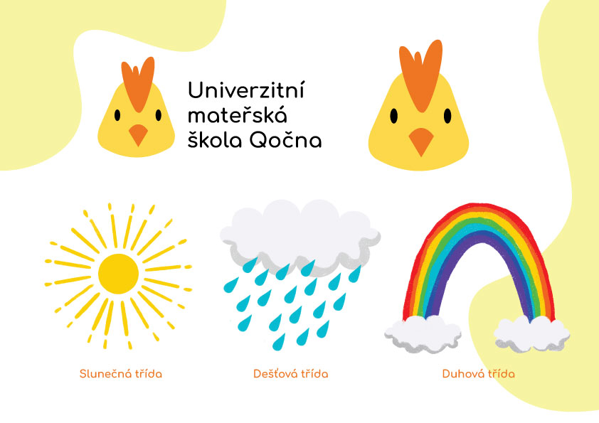
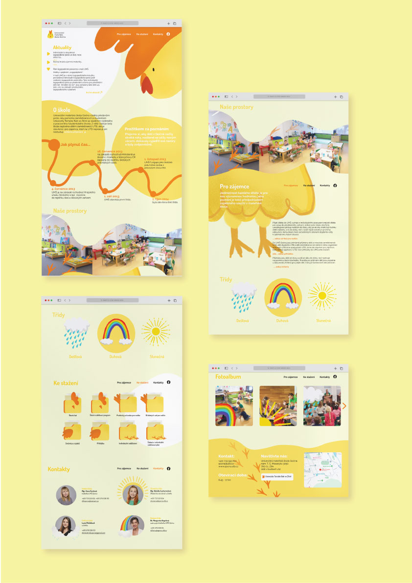
The goal of this project was to redesign the logo and website for the Qočna University Kindergarten. My whole visual is based on playful shapes and nice bold colors, because children should perceive color around them. The aim of the website is to make it as easy as possible for interested people and parents to get to know Qočna and how it works. The website contains all the information that interested people and parents need to know and they can find it very quickly on this page. When designing the logo, I based it on the previous logo of the institution and tried to modernize it in some way. Letterheads and pictograms are also part of the project.
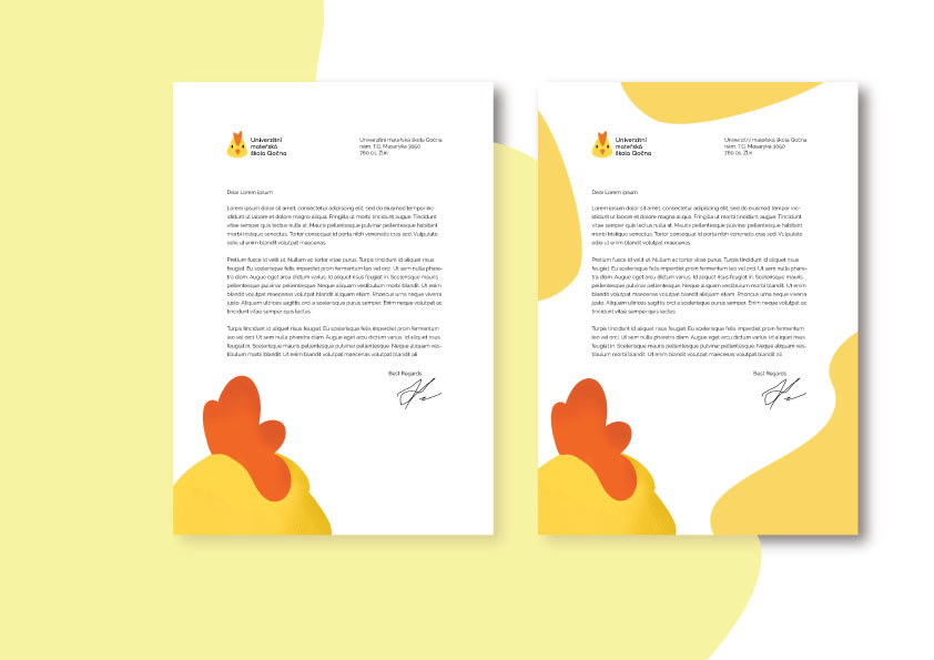
The letterheads have two versions. One paper is more sophisticated and suitable for various important documents and the other is more playful and suitable for various praises from the teacher or can also be used as a base for a diploma. Again, I based the colours and shapes on the logo and website.
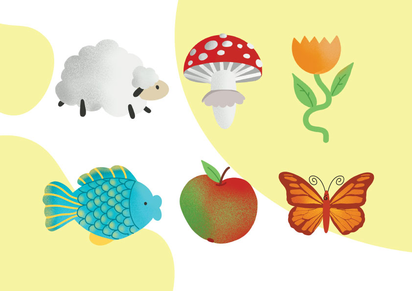
The pictograms are drawn in a simple pattern, complemented with a fine grain.
