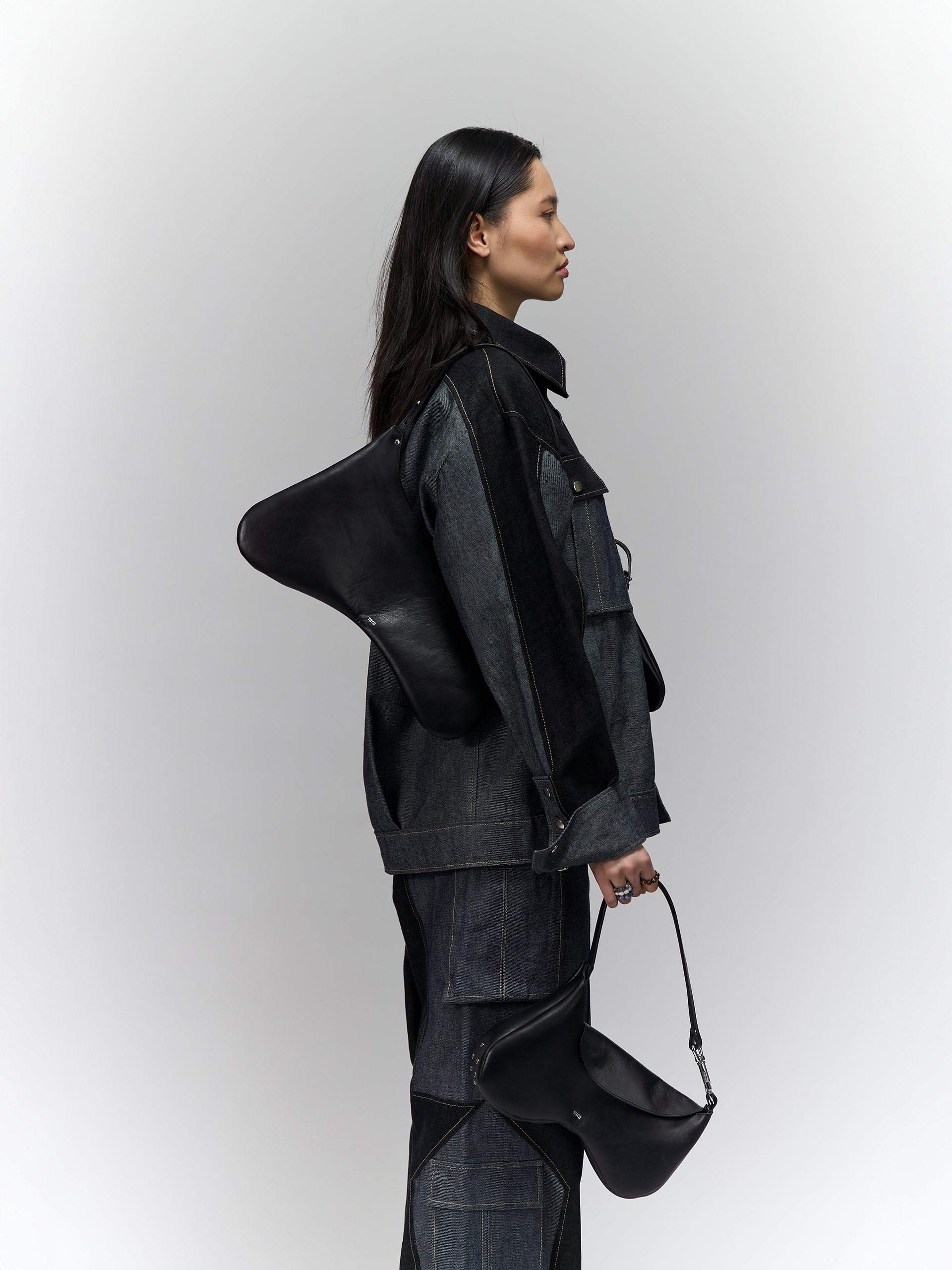
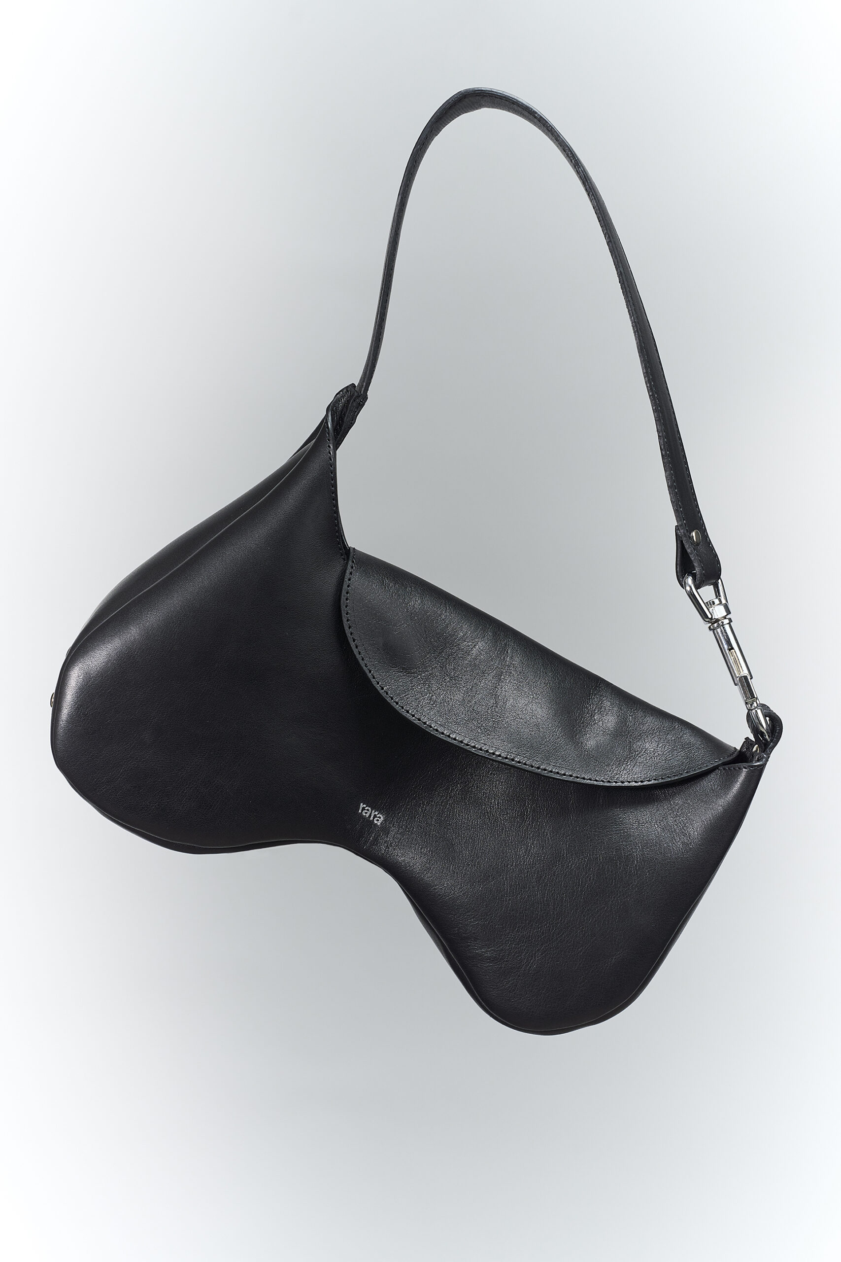
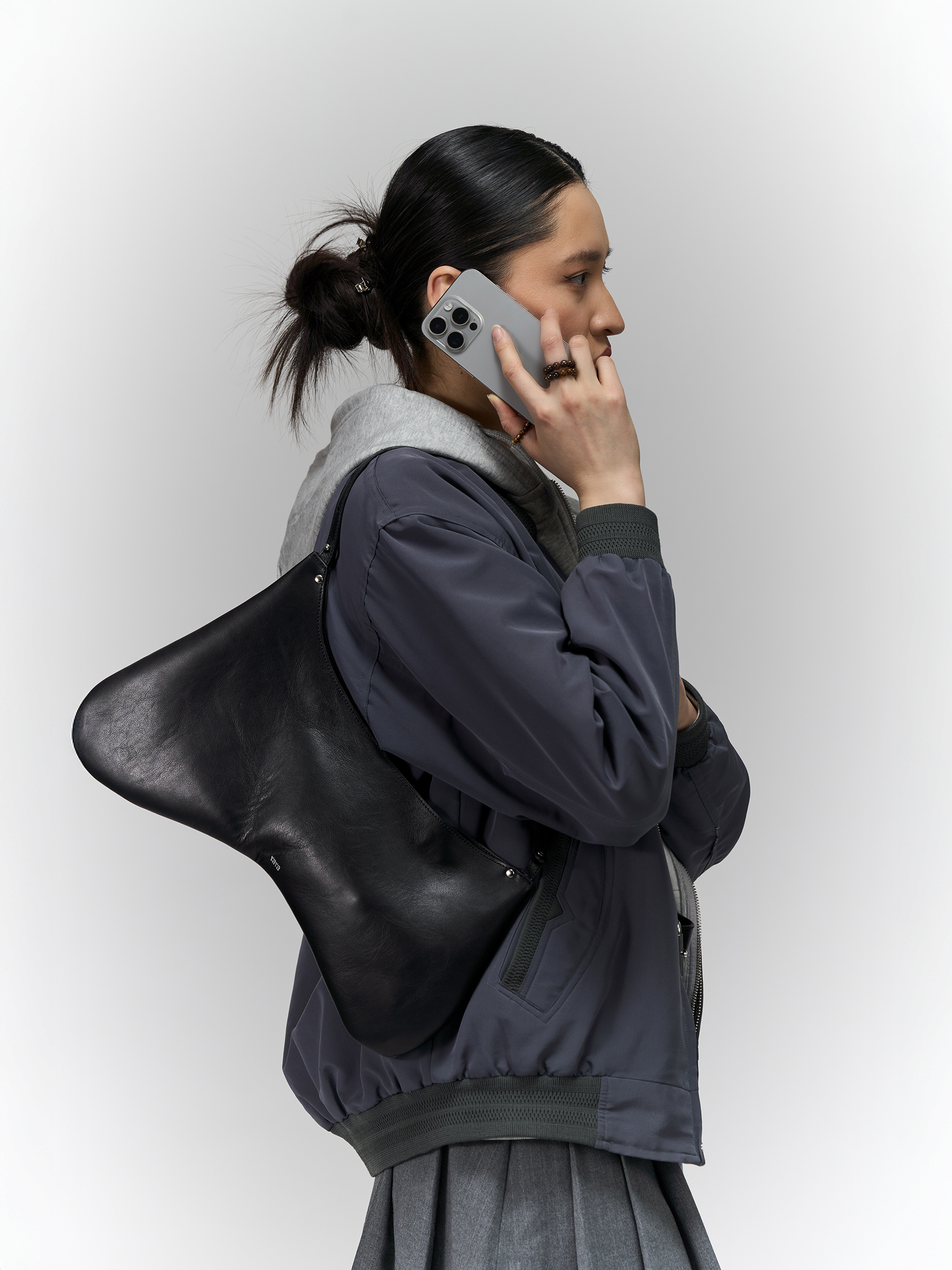
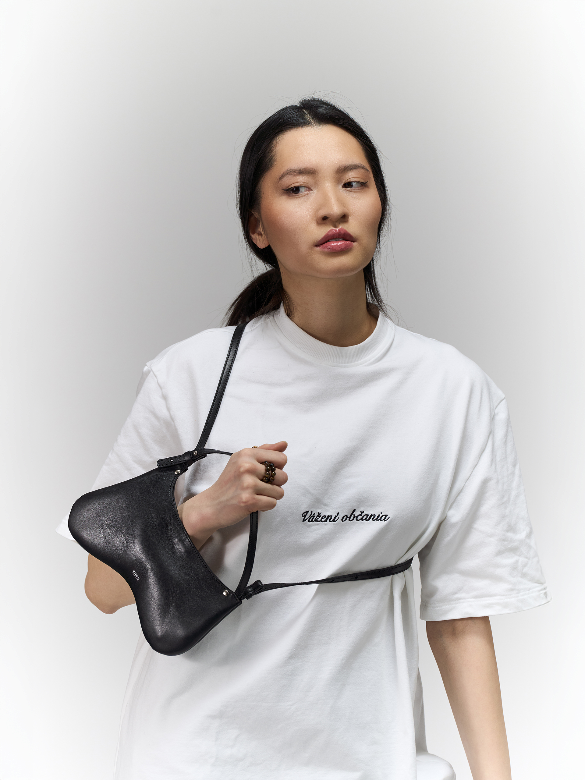
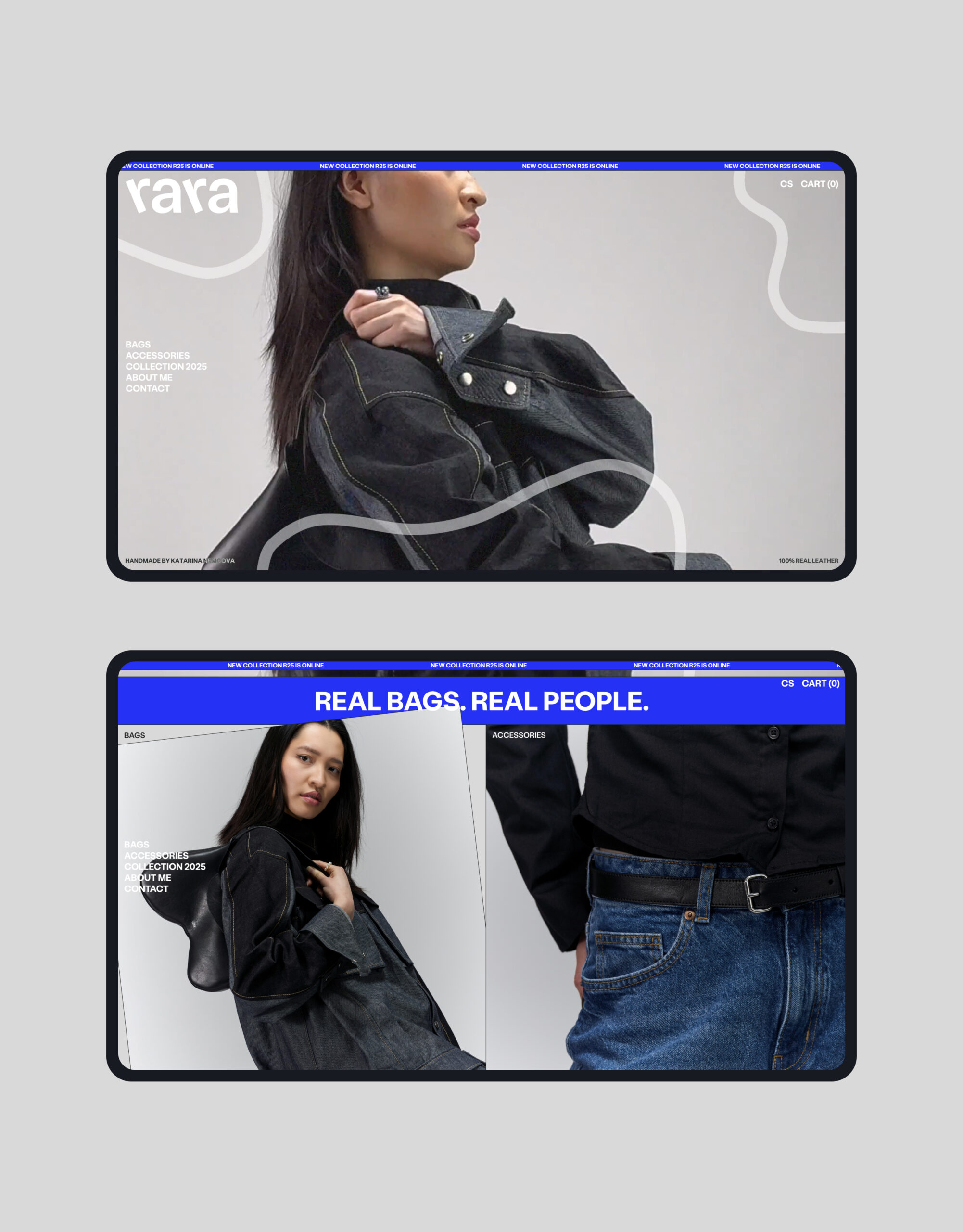
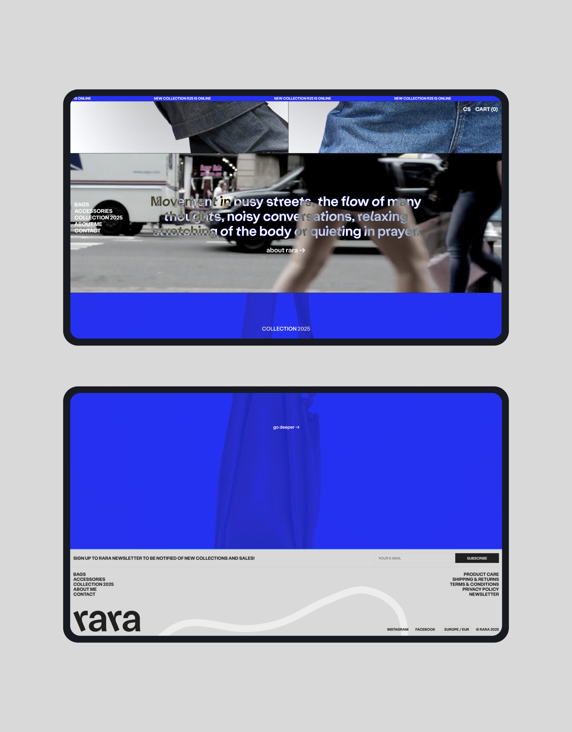
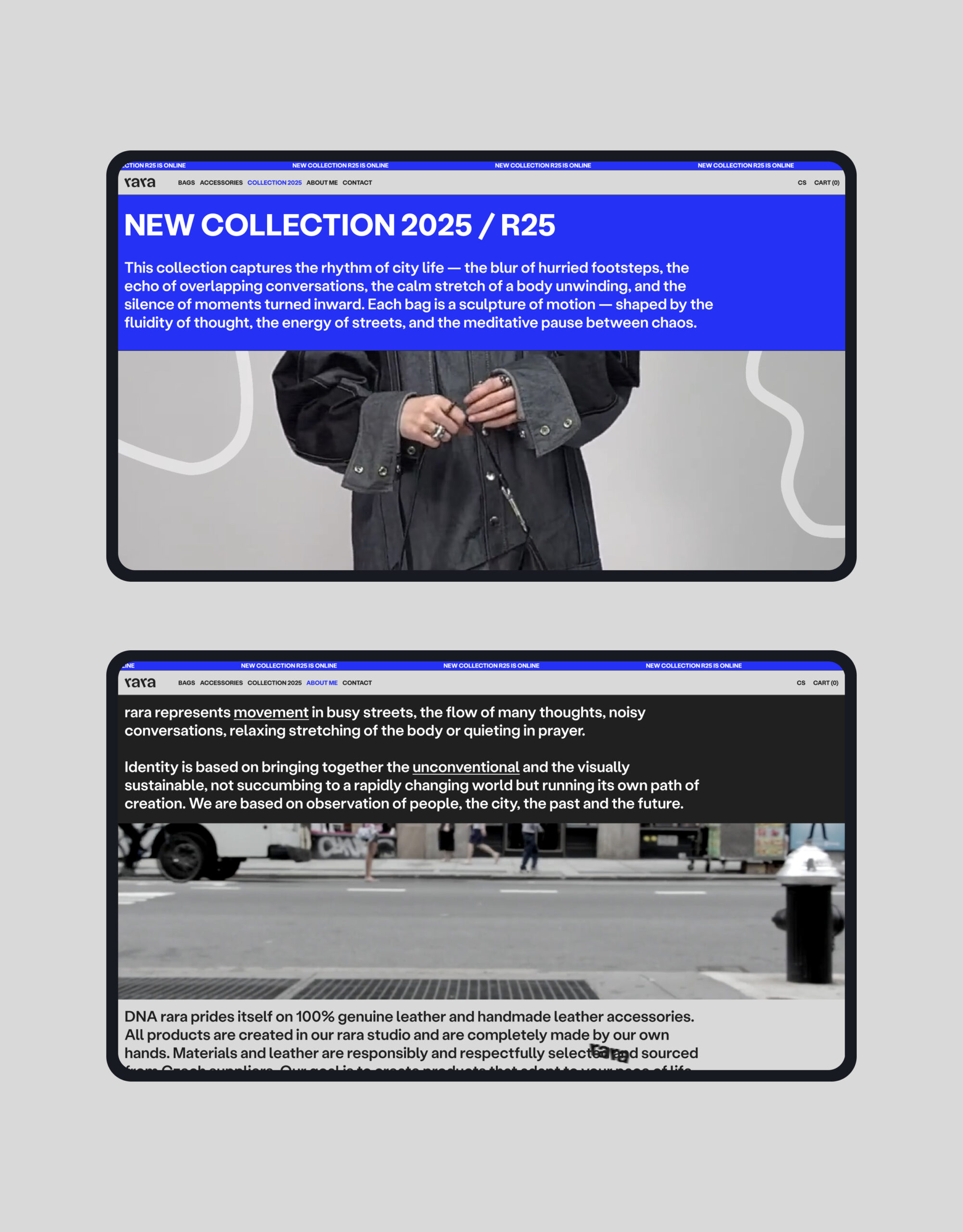
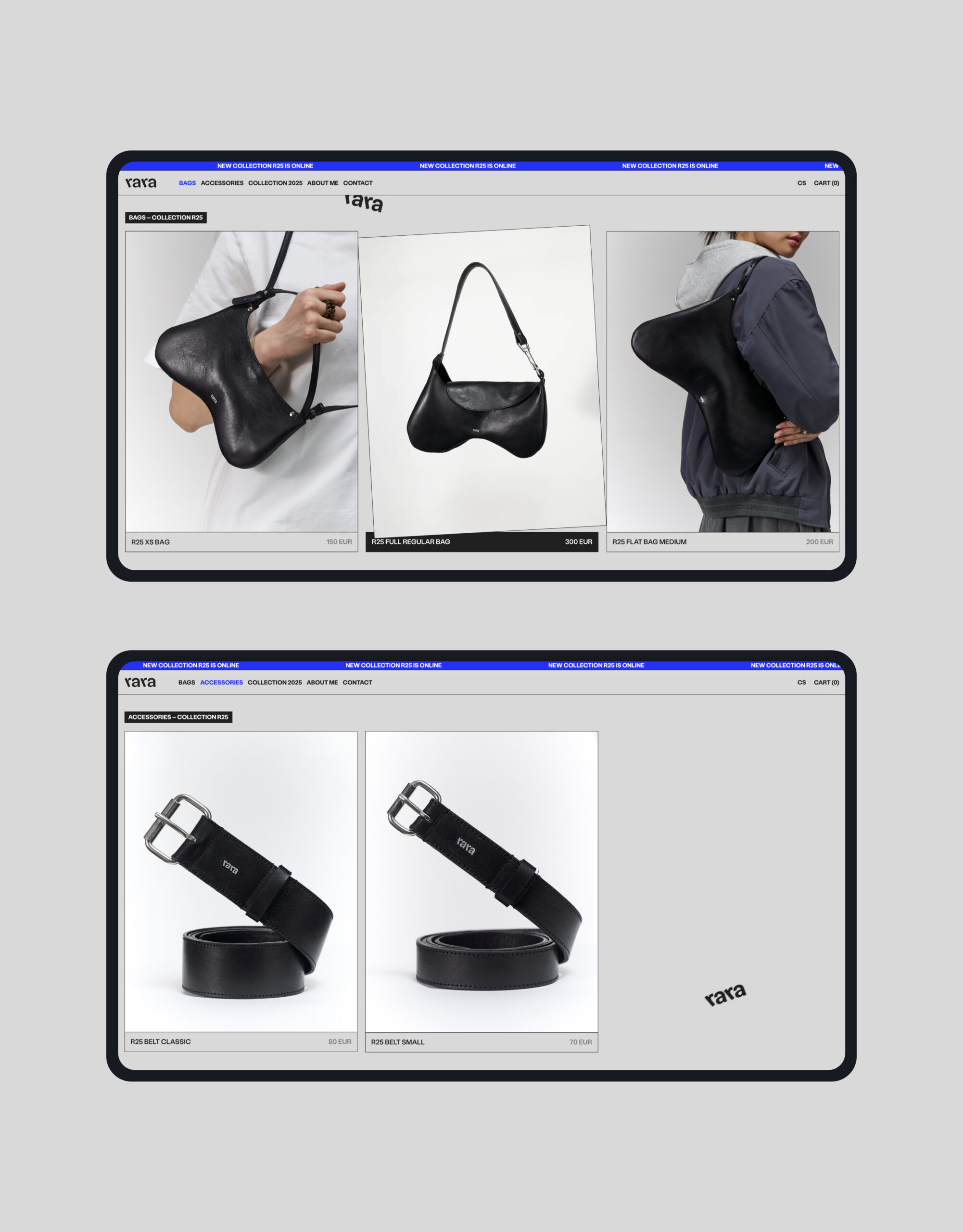
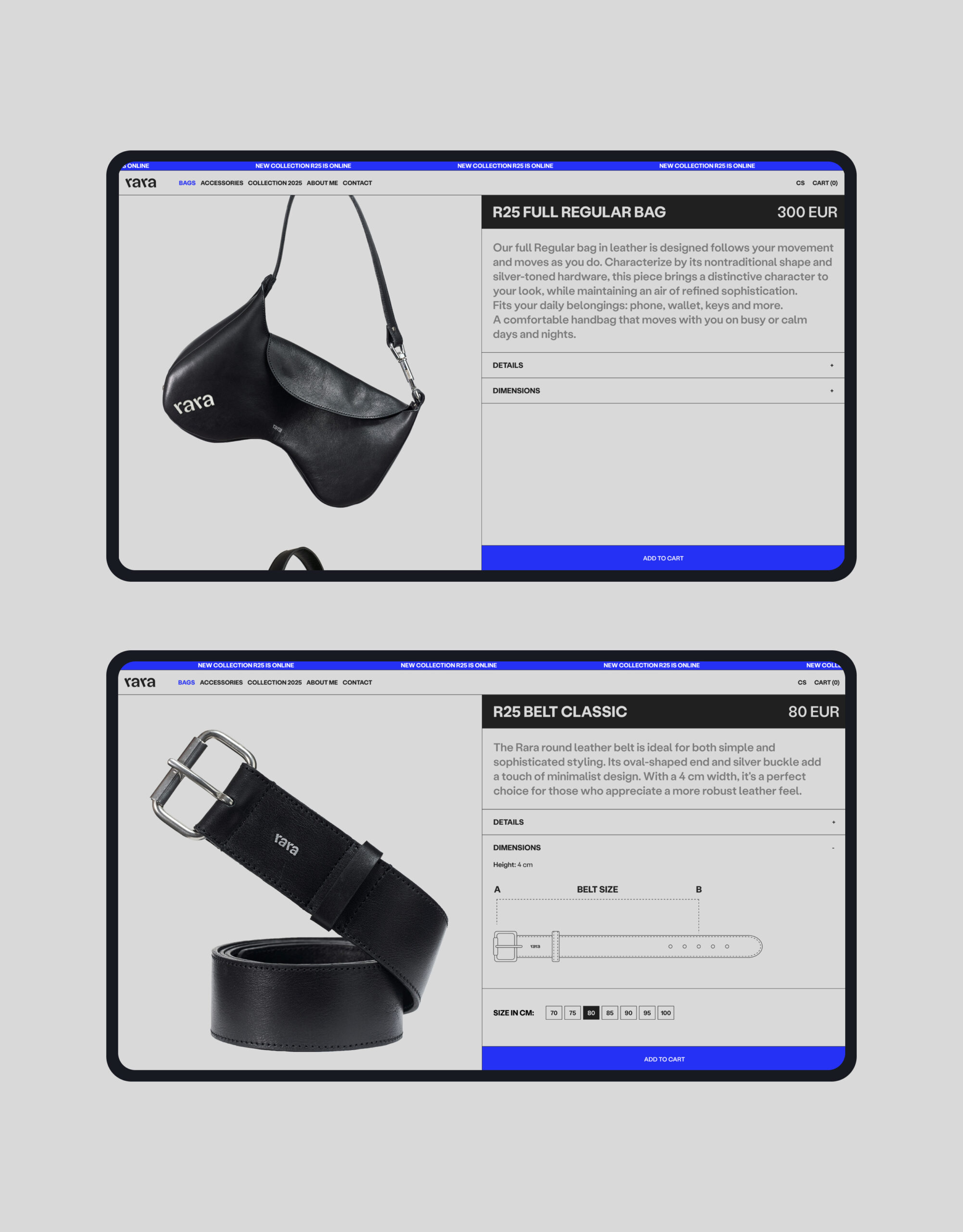
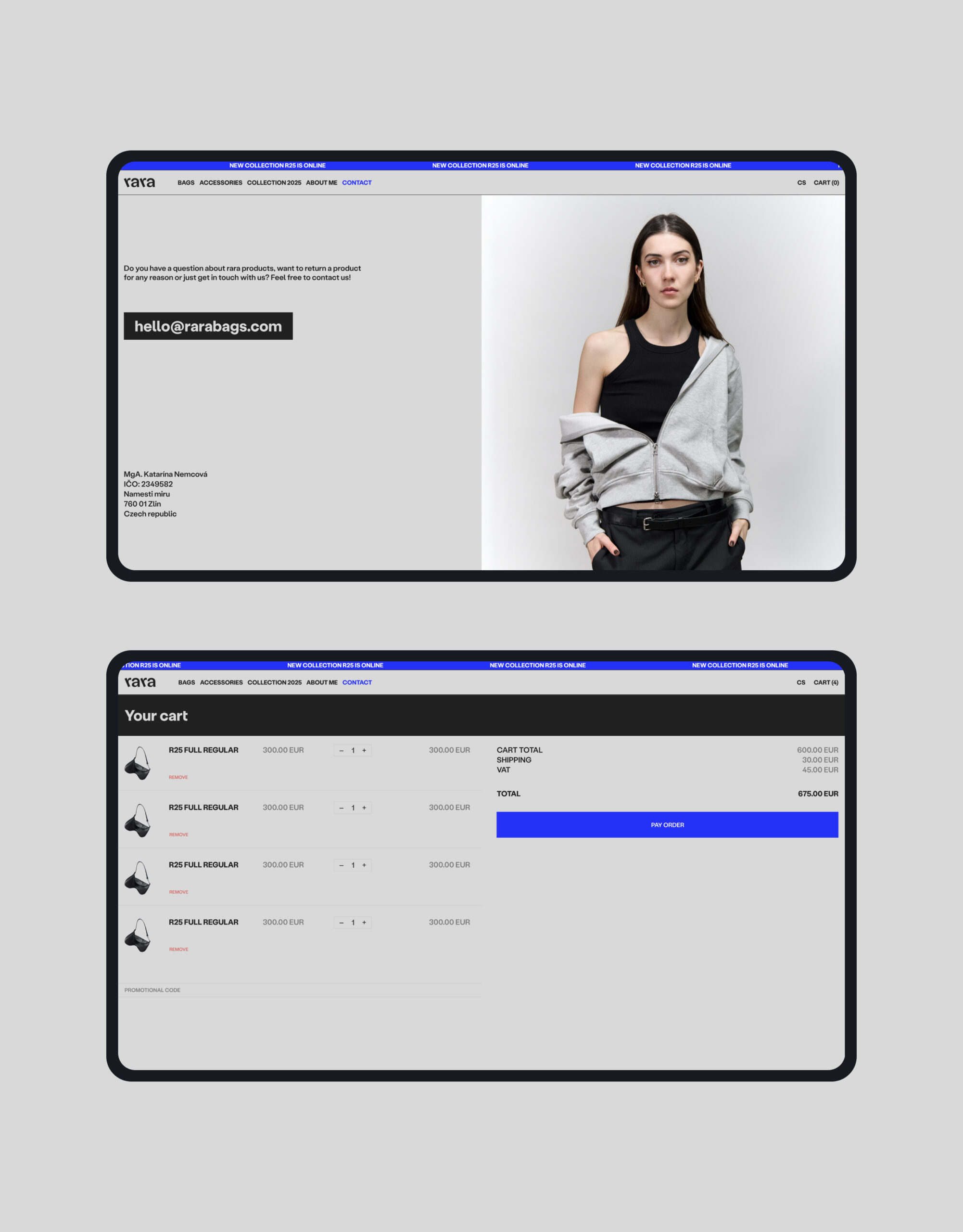
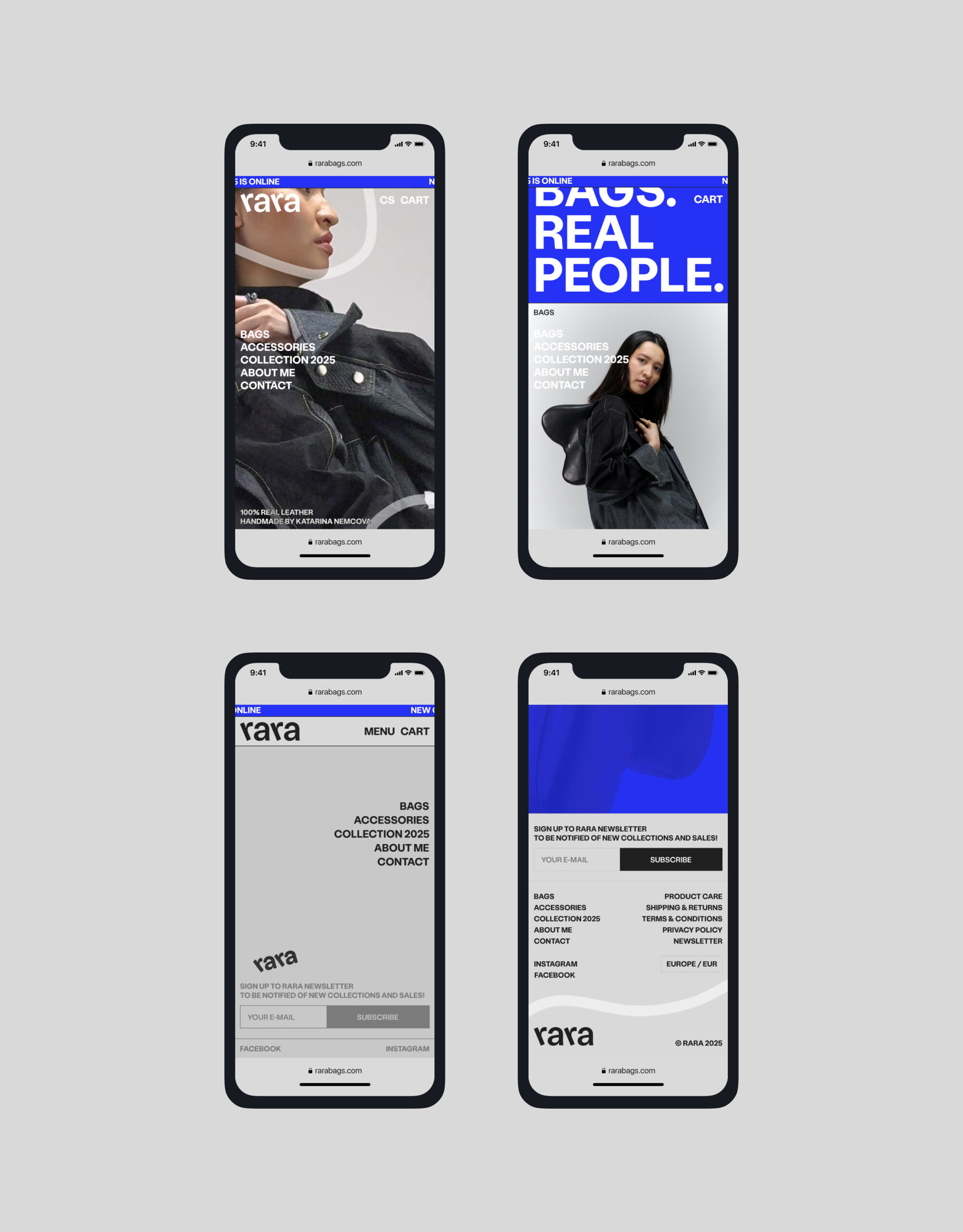
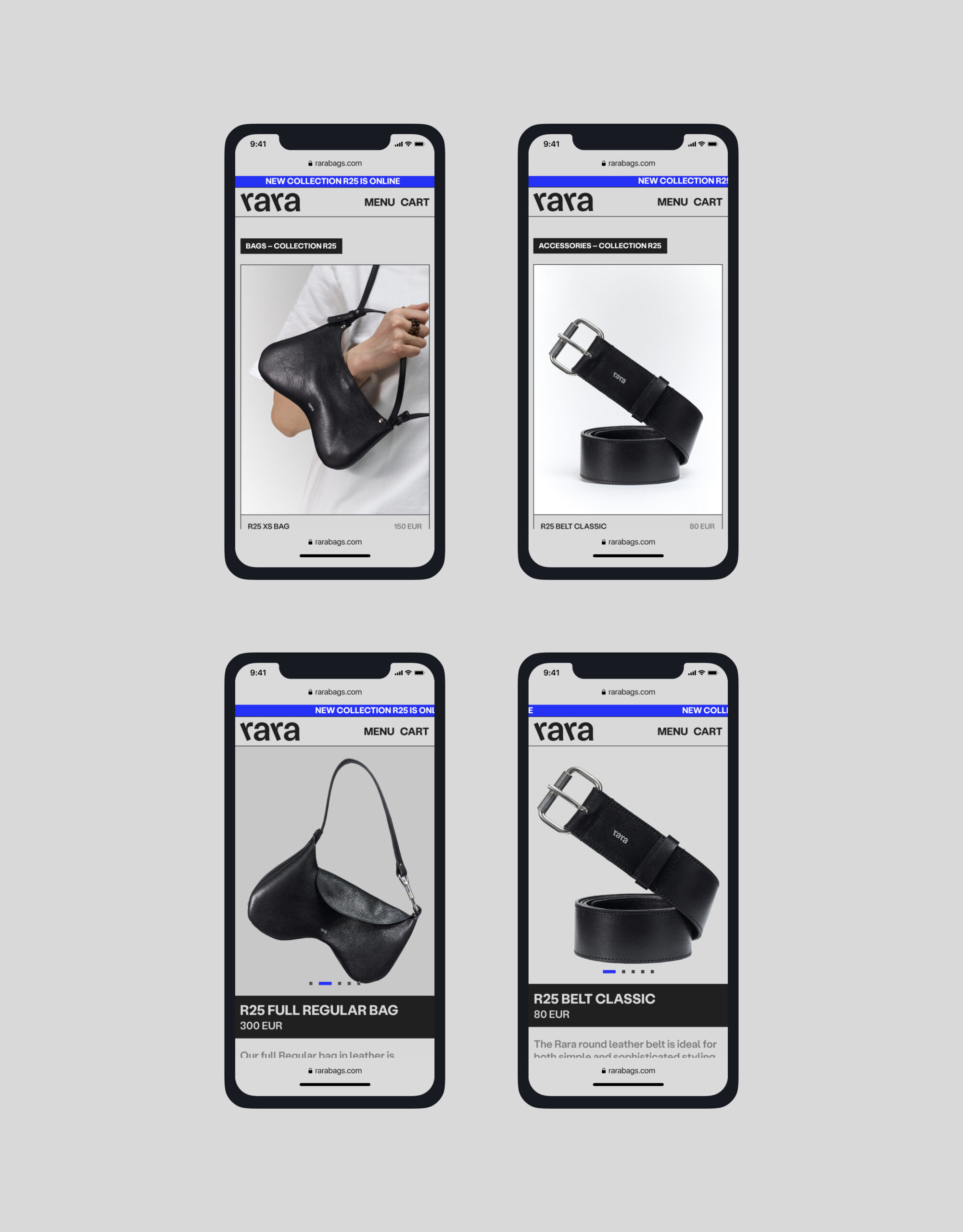
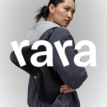
“rara” is a newly emerging fashion brand of handmade leather handbags and accessories, behind which stands the young Slovak designer Katarína Nemcová (among others, a graduate of the University of Tomas Bata in Zlín, studio of Shoe Design). Founder Katarína Nemcová says of her brand, “rara represents movement in busy streets, the flow of many thoughts, noisy conversations, relaxing stretching of the body or quieting down while praying”. “Rara” is unconventional, elegant and playful all in one. It prides itself on the finest materials, fine details and precise handwork. “Rara” is not afraid to be different. The name ‘rara’ refers to this – the feminine form of the adjective ‘raro’ means ‘exceptional’, ‘special’, ‘different’ in Spanish. And what sets the brand apart from its already established major competitors? One of the key aspects is the exclusivity of the production process. Each product is handmade, each is an original. The production takes place under the expert guidance of designer Katarina directly in her studio. Every piece passes through her hands.
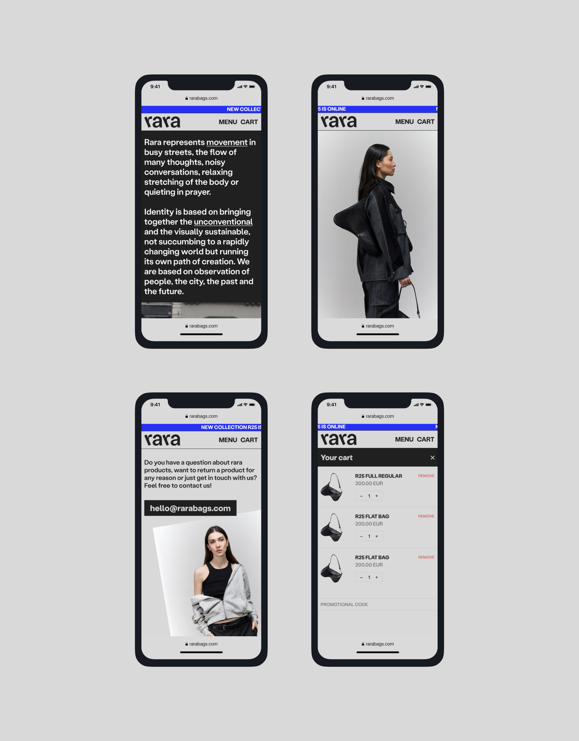
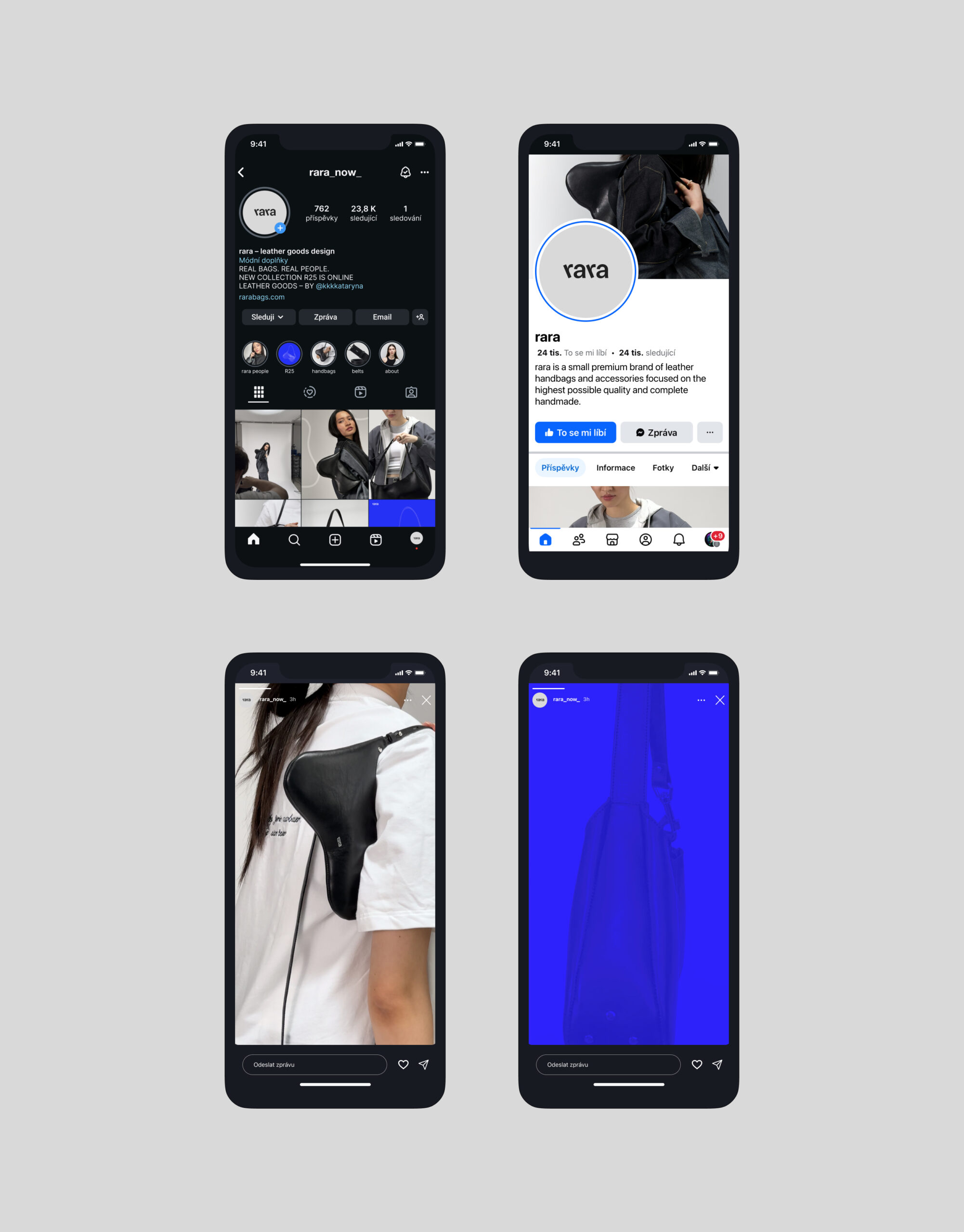
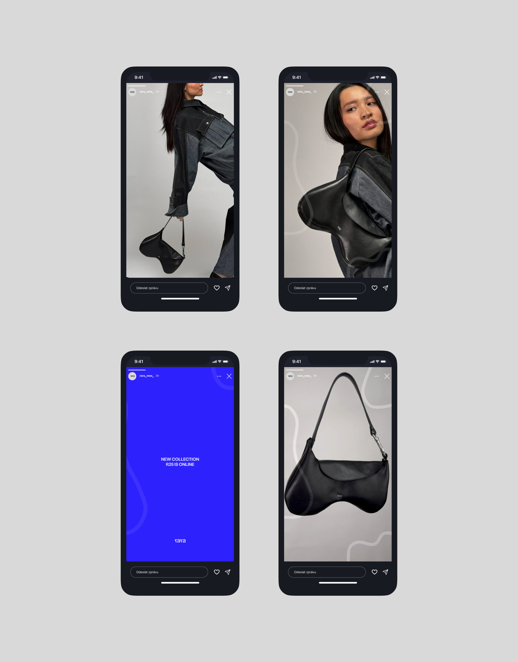
The work focuses on the complex design of the visual identity of a fashion brand, including the entire process of creation from the logo to the design of the e-shop. The “rara” of the products breaks out of conventional forms and provokes emotions and discussion. The visual identity emphasizes a combination of movement, playfulness and elegance. In addition to the logo and e-shop design, the work also deals with the design of applications in various communication and promotional materials.
A distinctive typographic logo that has clearly distinguishable elements. The letters ‘r’ use italics, which are characterised by an oblique base cut and are commonly used to highlight text. It acts as a distinctive visual element in the logo and helps to make the brand more visible. In my design, the letters are slanted in the opposite direction (i.e. to the left as opposed to the typical slant to the right). This refers to the ‘off-centre’, ‘difference’, ‘movement’ and ‘self-direction’ of the brand. At the same time, two identical letters in a regular rhythm symbolise playfulness, repetitiveness, regularity. The letters ‘a’ represent elegance and order, solidity, timelessness and functionality. This is facilitated by the symmetrical shape of the letter and the regularity of the alternation. The resulting name looks both modern and playful thanks to the alternating slope of the individual letters. The logo depicts dynamism and movement in contrast to simplicity, minimalism and stability. The alternating slope of the typeface creates an optically visual rhythm and gives an informal and relaxed impression. At the same time, the visual balance and coherence of the logo as a whole is maintained (the individual letters are close enough to each other and do not give a chaotic impression). The modern grotesque used is based on the font from Christian Jansky’s KOMETA workshop.