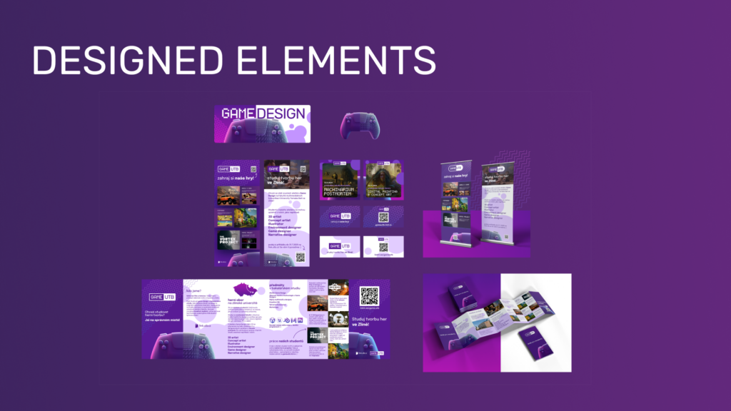
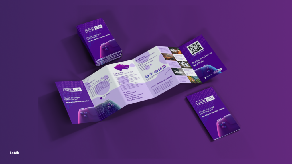
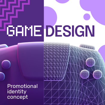
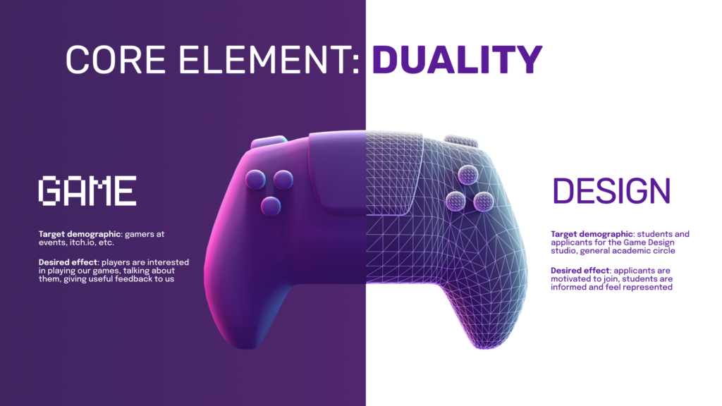
I conceived the thesis assignment for the Game Design studio as the creation of a new promotional identity for the studio.
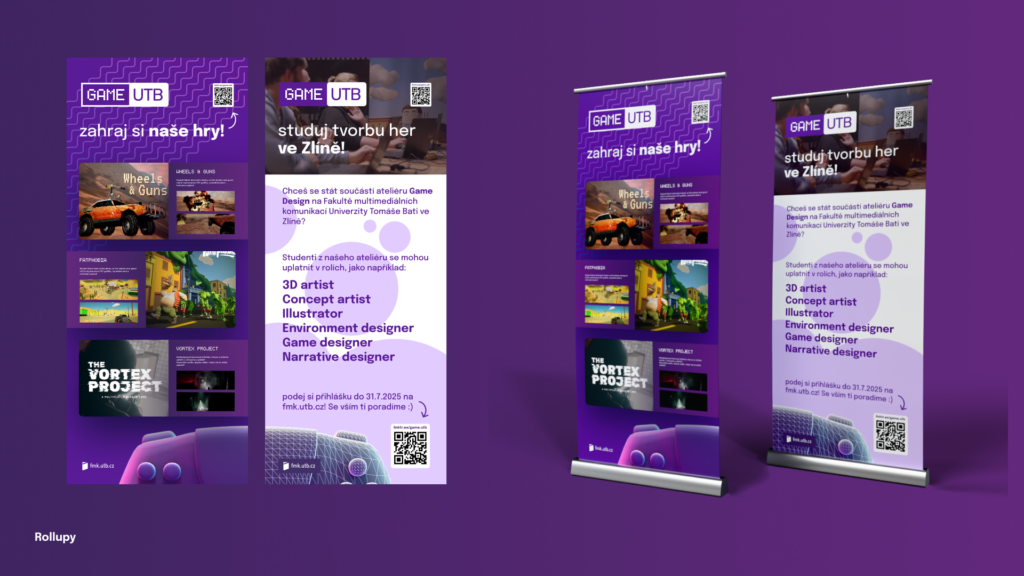
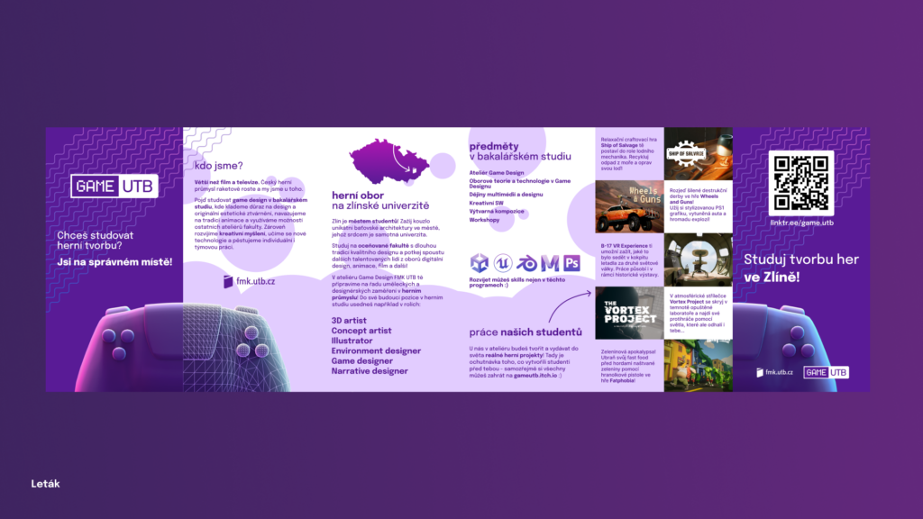
It is aimed at a double target group: Firstly, gamers from the general public interested in playing our student games, and secondly, students or prospective students who are more interested in practical information and playing the games themselves is not their main focus.
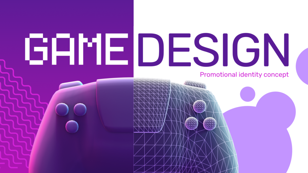
The promotional identity reflects this duality visually: it is a combination of two complementary contrasting styles, each of which is also associated with one half of the studio name and logo:
GAME is the part designed for gamers and the non-student public, and reflects video game aesthetics, relaxed shapes and eye-catching colours.
DESIGN is the section for applicants and students, and evokes a more technical, sober aesthetic that is still complemented by playful decorative elements.
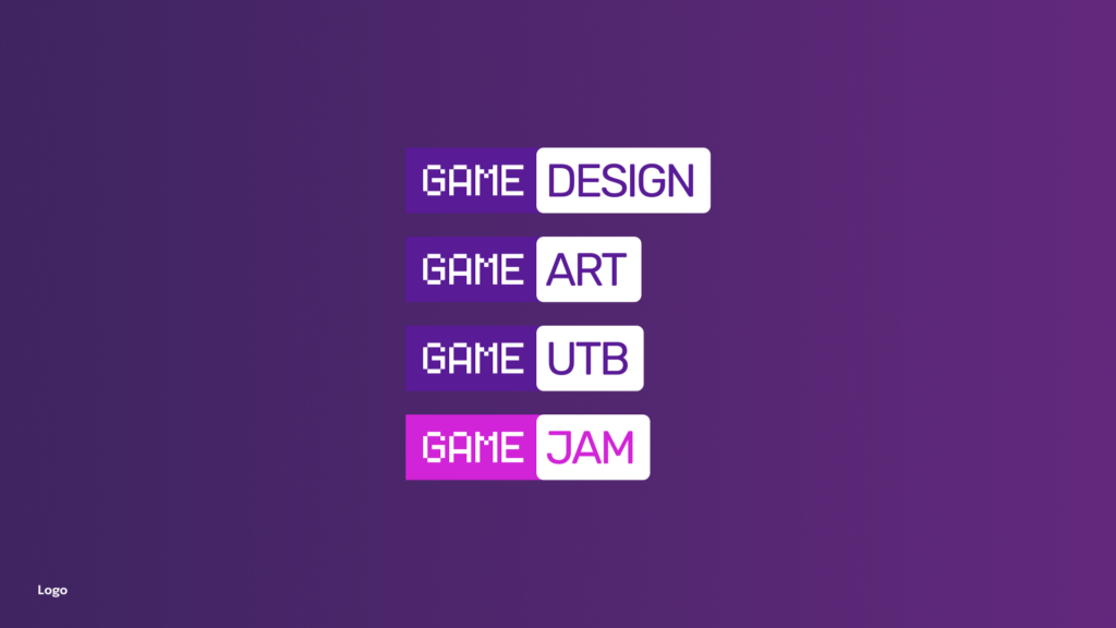
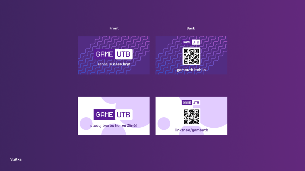
The GAME DESIGN logotype is a combination of these parts and also contains a variable element: the word DESIGN can be replaced with other appropriate terms to create sub-logos of GAME ART, GAME UTB, GAME JAM, etc. for presentation in different contexts. This is partly to avoid too much association with the discipline of the game designer, which is not the main or only focus of the studio.