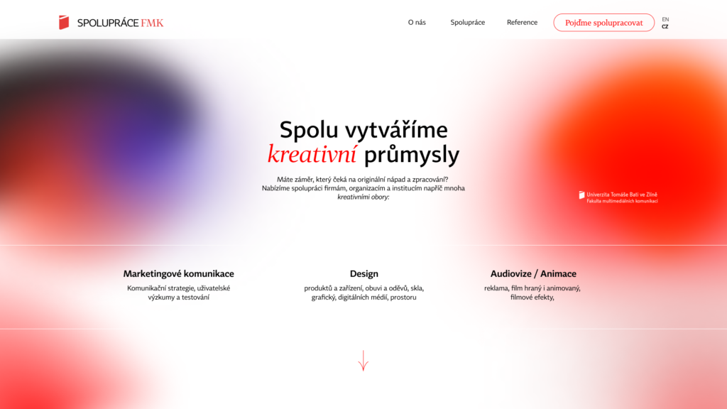
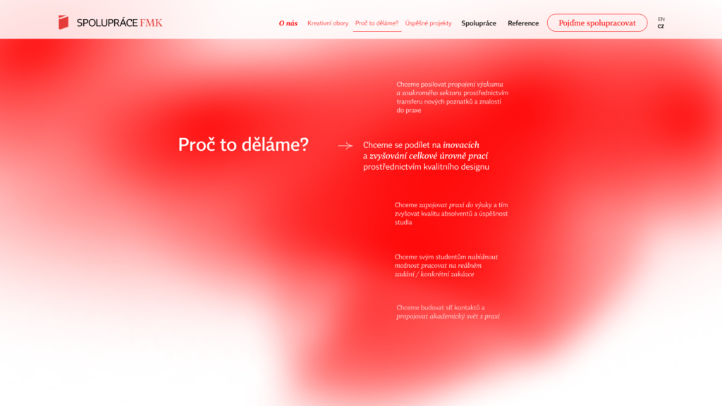
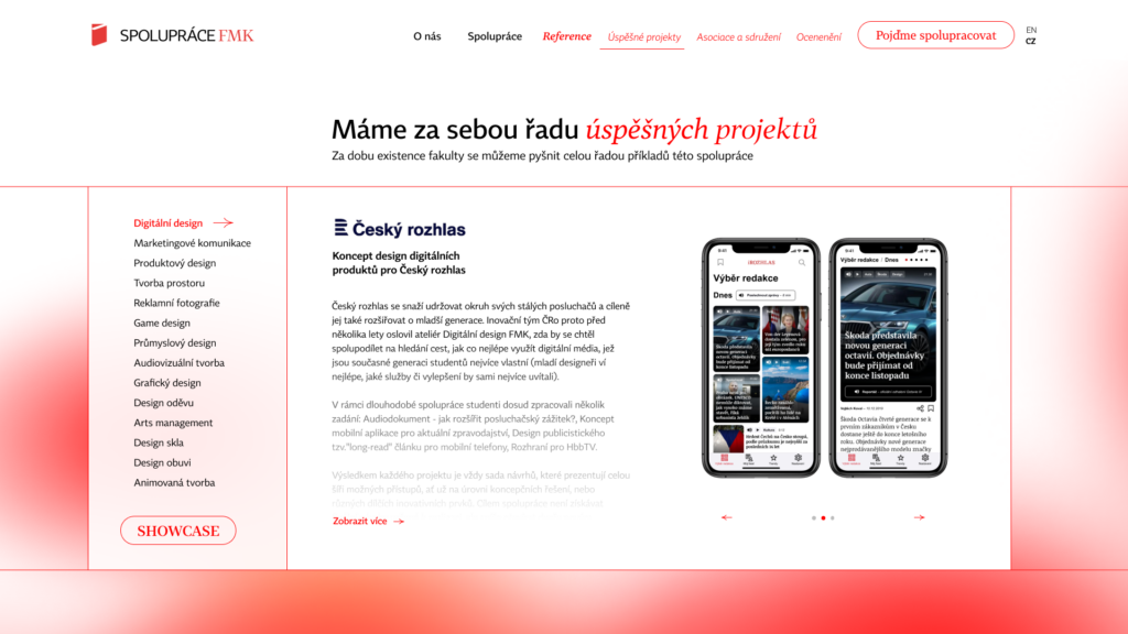
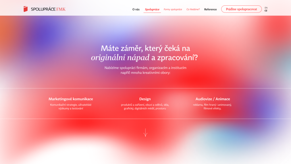
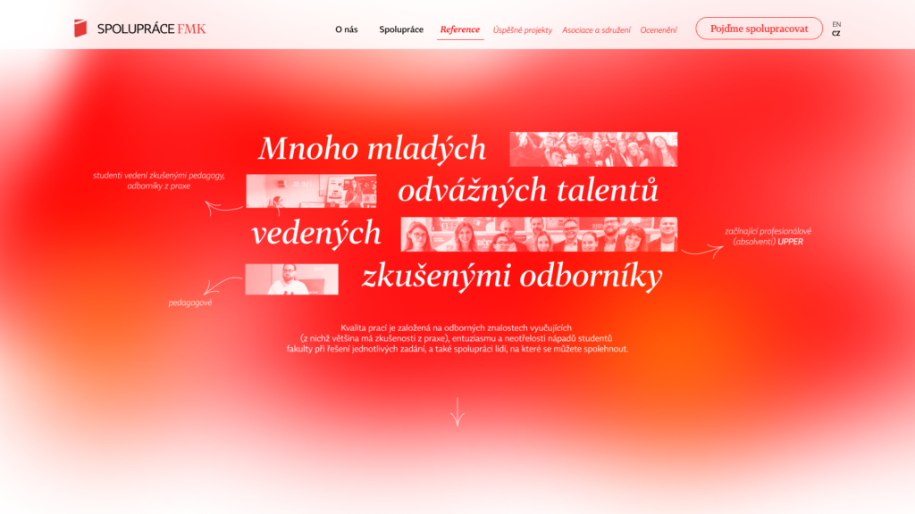
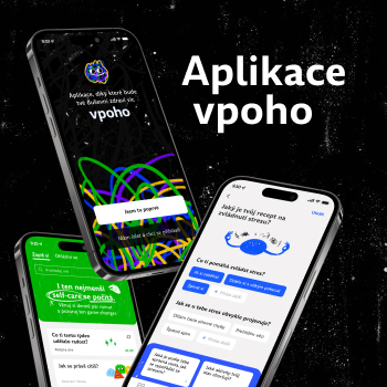
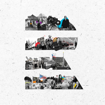
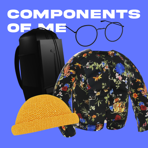
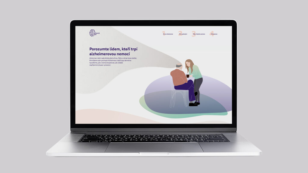
Microsite Cooperate with FMK aims to connect talented young designers with companies, organizations and institutions and offer the opportunity to collaborate on interesting projects. Students of creative fields can not only bring a fresh wind of enthusiasm to the project, but also a lot of new, fresh and innovative solutions. This is exactly what I wanted to reflect in the visual of the website.
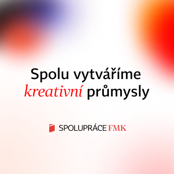
For the main visual elements, I chose soft fresh gradients tuned primarily to the red and white colors of the faculty. However, there are other colors and their shades representing the companies and organizations. Such foreign elements, which with their assignments, spice up the work of the students. The collaboration can then be colorful.
As for the typography, I combined the serif and sans-serif variants of the Czech superfamily font Tabac for its practicality in highlighting and linking individual information but also for its aesthetic features.
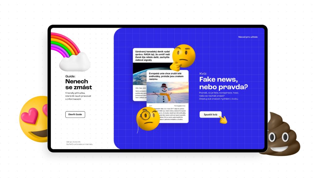
With my visuals I tried to support the content of the message as much as possible and to be consistent with it throughout the website. My goal was a youthful and dynamic-looking website with an emphasis on information architecture, which would attract the potential partner and make it easy to find everything they need to know about the cooperation.
