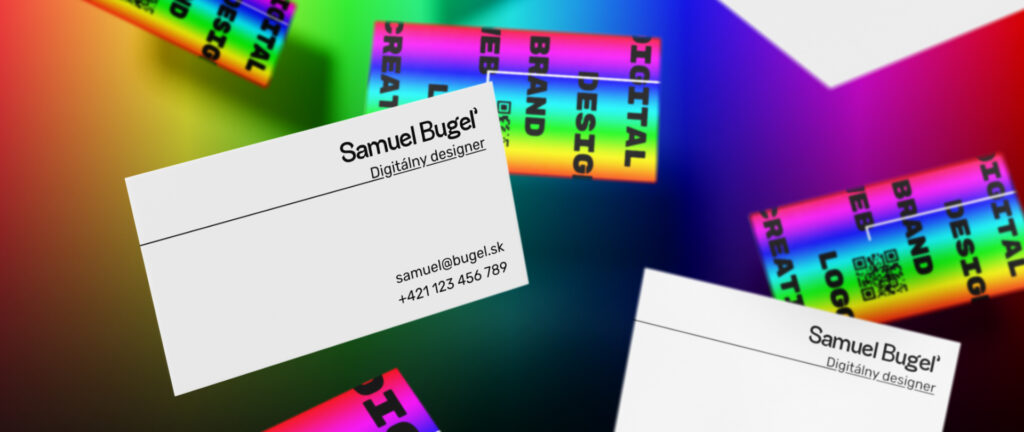
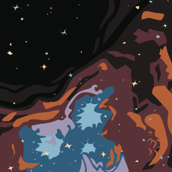
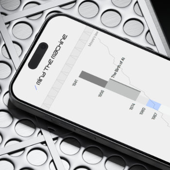
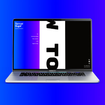
Creating a visual style of an art portfolio brings a significant problem. How to harmonise the color palette of the presentation with the color palette of the presented work? It’s usual for artists to choose a simple strategy of using only white and black tones. In this project, I set myself a goal, to think through how to get more vibrant hues into the solution.
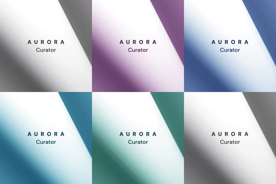
Let’s ask ourselves a question. If we forget the concept of black and white, what colors match the numerous shades of various works of art? Thinking about the question, one strange solution arose in my head – all of them.
I followed up with developing the idea using a prototyped portfolio website for Samuel Bugeľ. Using html, css and javascript codes a space is created that changes its appearance smoothly and steadily. The color stabilizes only after selecting one of the presentations. The whole animation is created procedurally, which means that it is possible to add other new work with any color and the transition will always be smooth.
This assignment also came in handy for the possibility of improving my knowledge of the languages mentioned above.
The idea of proceduralism is highly fascinating to me. I incorporated a small “easter egg” into the code. After clicking on the big name, the text on the tab will begin to move. The length and content of this is again completely customisable.


