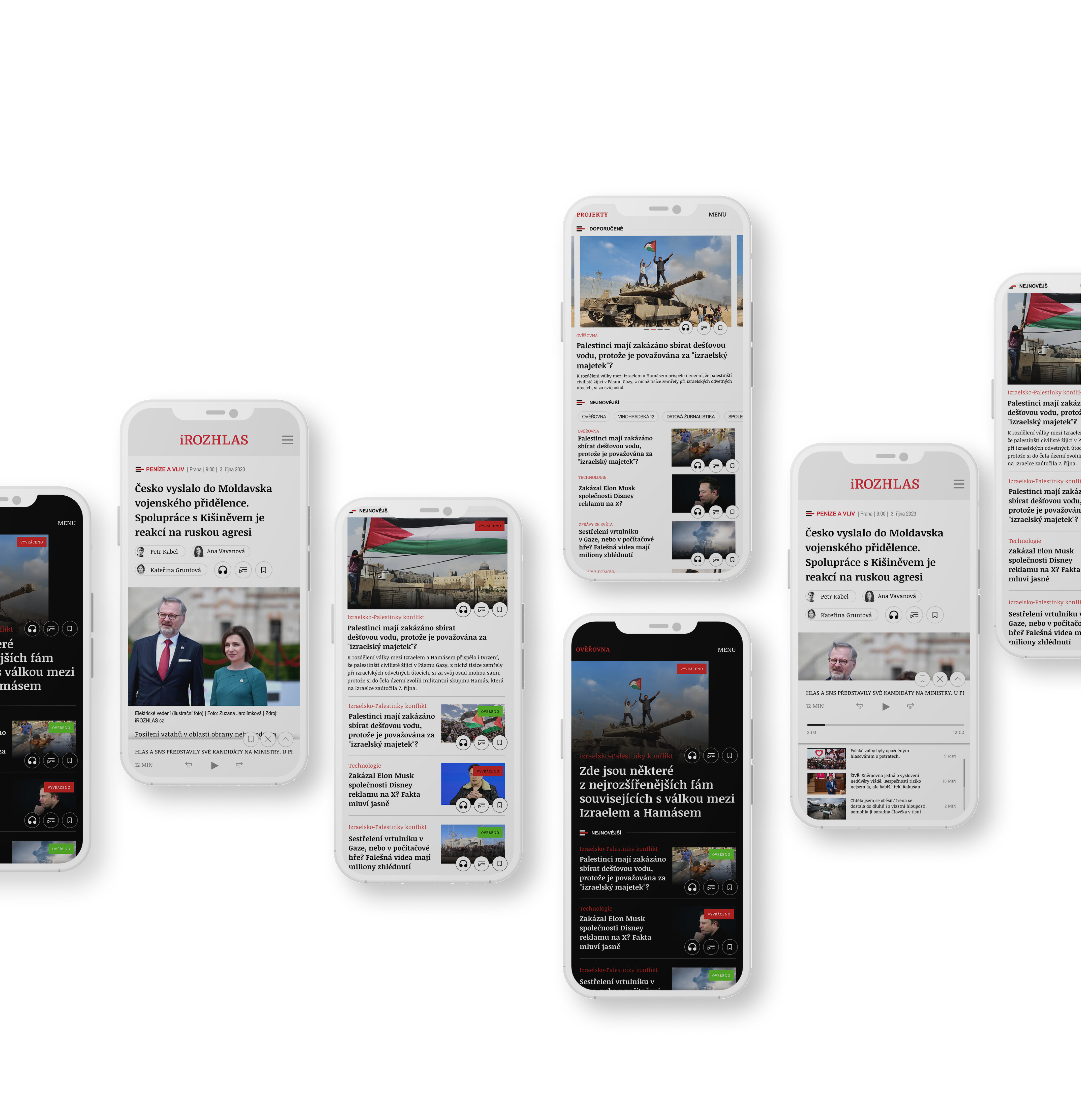
iRozhlas is the internet news server of Czech Radio. The original design of the site had a traditional look with an emphasis on typography in a classic web style. This design required redesign for some elements, such as the outdated player button, the homepage of the Ověřovna project and the signpost for journalistic projects under iRozhlas. When creating the new design, I tried to work with my own initiative while respecting the predefined rules for the functionality of the site. I took care to be cautious given the demanding target audience that is used to the current look of the site.
Ověřovna
The homepage of the Ověřovna project was almost completely free for creative work, as the original design of this part of the site lacked its own visual identity and hierarchical structure for sorting information into individual topics. So I designed a new visual identity with the option to view either “selected article” or “4 other news items”. Scrolling takes users to each topic. At the bottom of the page, there is an option to contact the Verification team, and below that, personalized news is displayed
iRozhlasLabs
This part of the project is a signpost for individual iRozhlas journalistic projects. The homepage provides an overview of news and entry to each project, each with a selection of interesting articles.
Článek + Media Player
Media player required an update because it was acting as a player
I drew inspiration from modern designs with queueing and other features. The new player is located on the article page, where I made minor changes, such as an improved breadcrumb menu and a rounded element to display author names as well as an element with the option to save a post or listen to music.
For each page I created a responsive design that can be seen on mobile Mockups.
