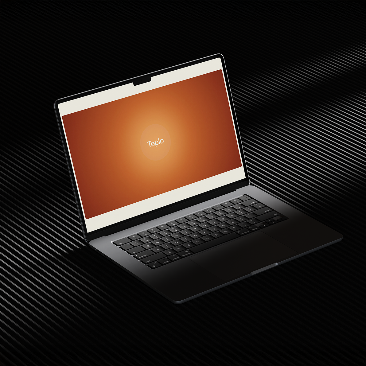
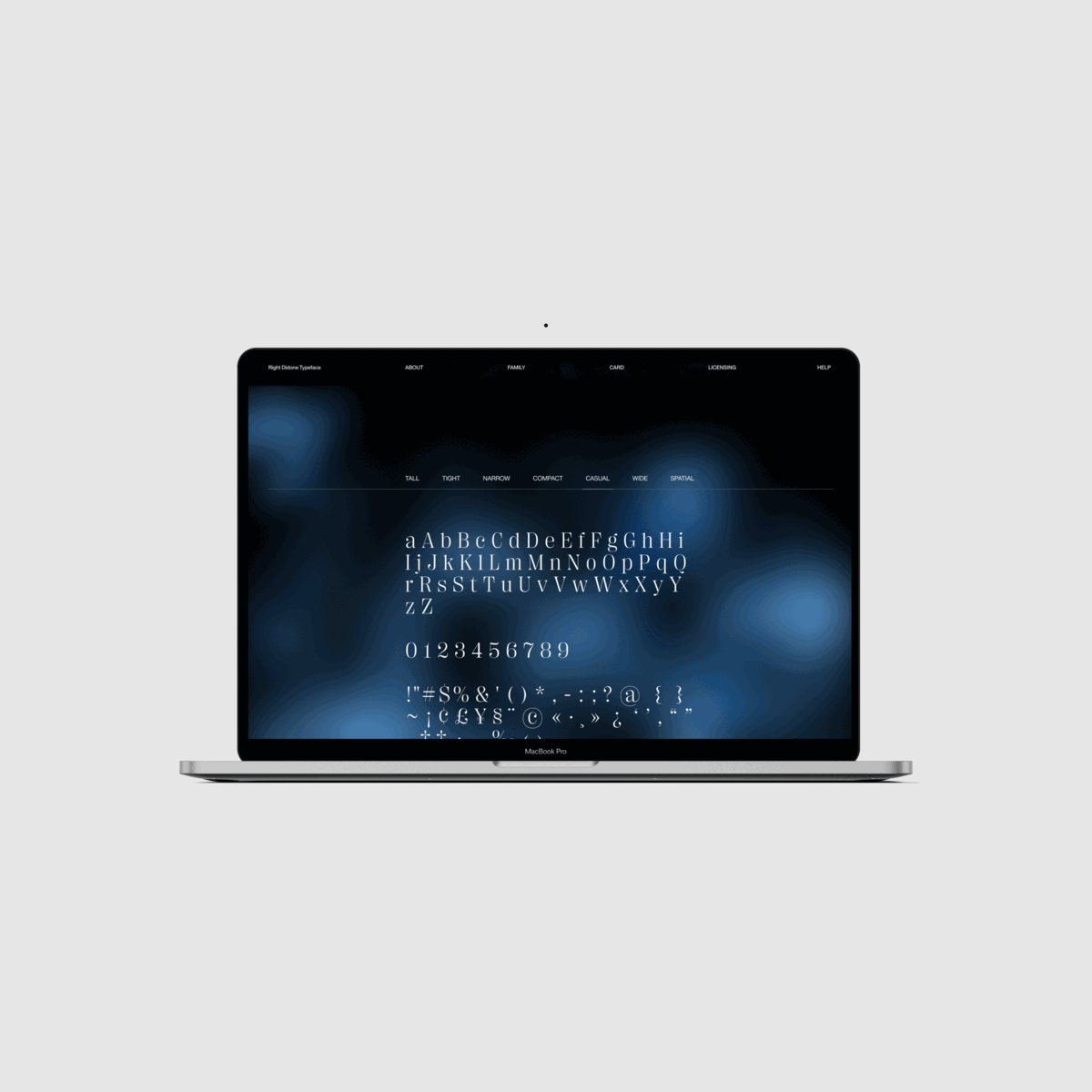
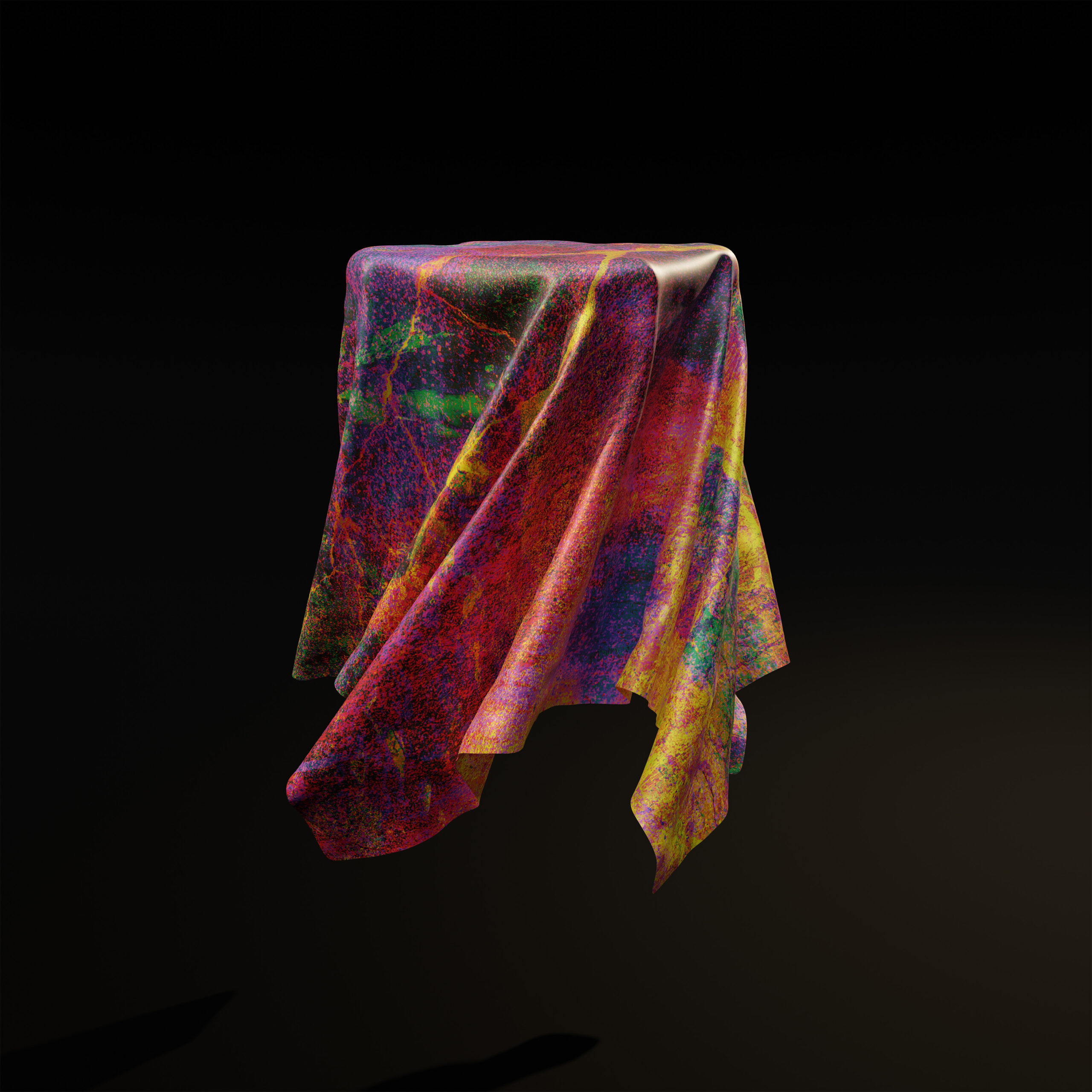
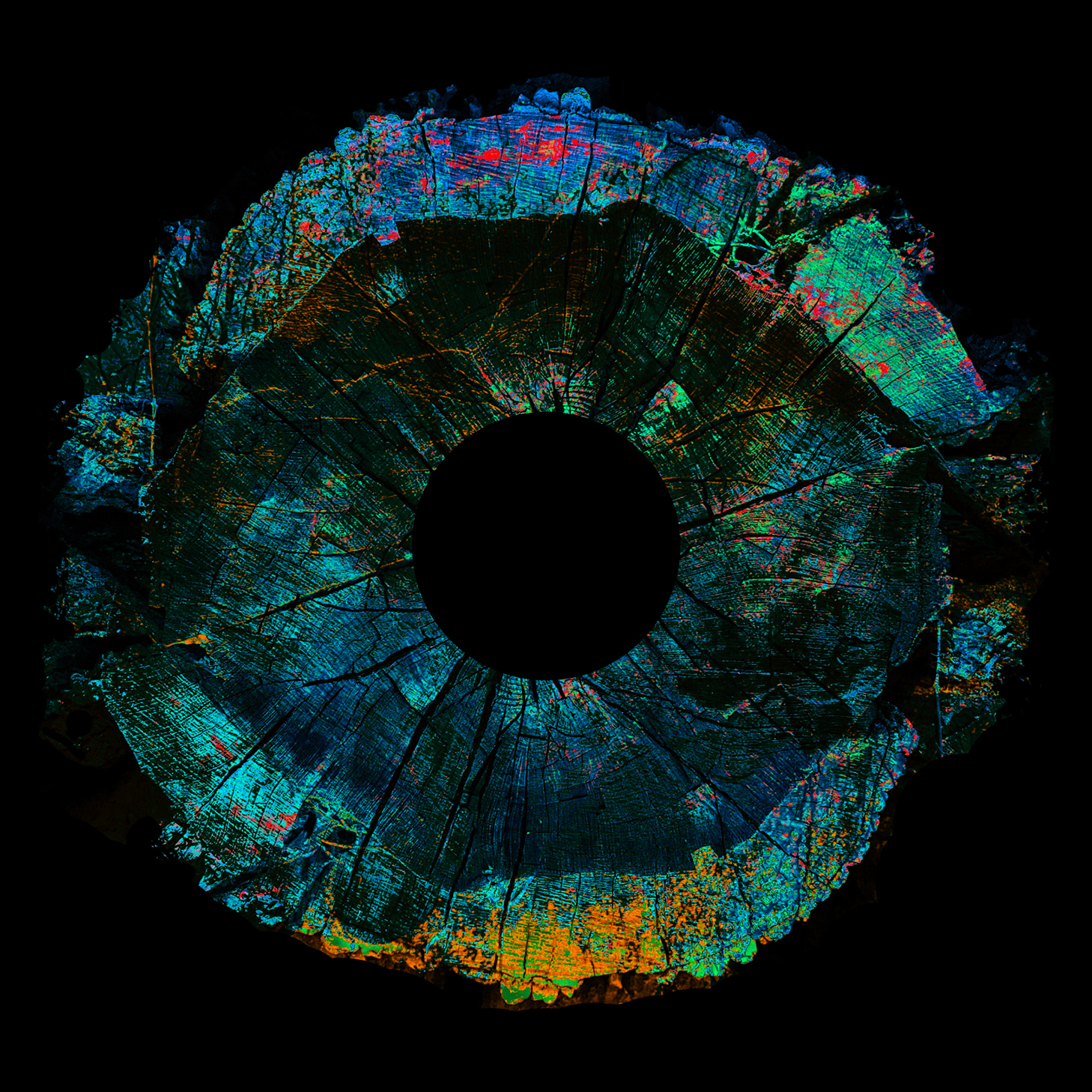
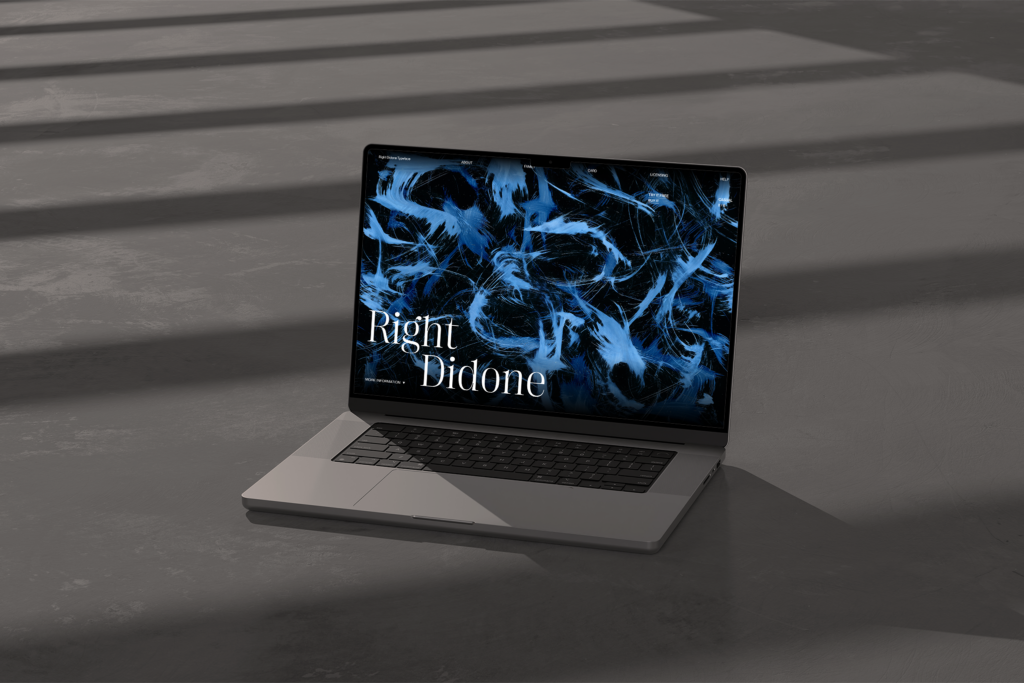
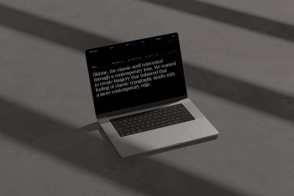
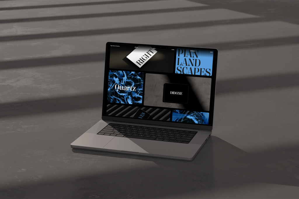
The work started with creating four abstractions. I used acrylic paints, brushes, and hair curlers to reflect the style of the chosen font. Then, I designed a website to introduce and showcase the typeface with examples and mockups. The website includes interactive features like adding your own text, adjusting line spacing and letter spacing, aligning text to the left, justified, or in columns, and comparing different font styles. The whole page is animated to be easy and pleasant to use.
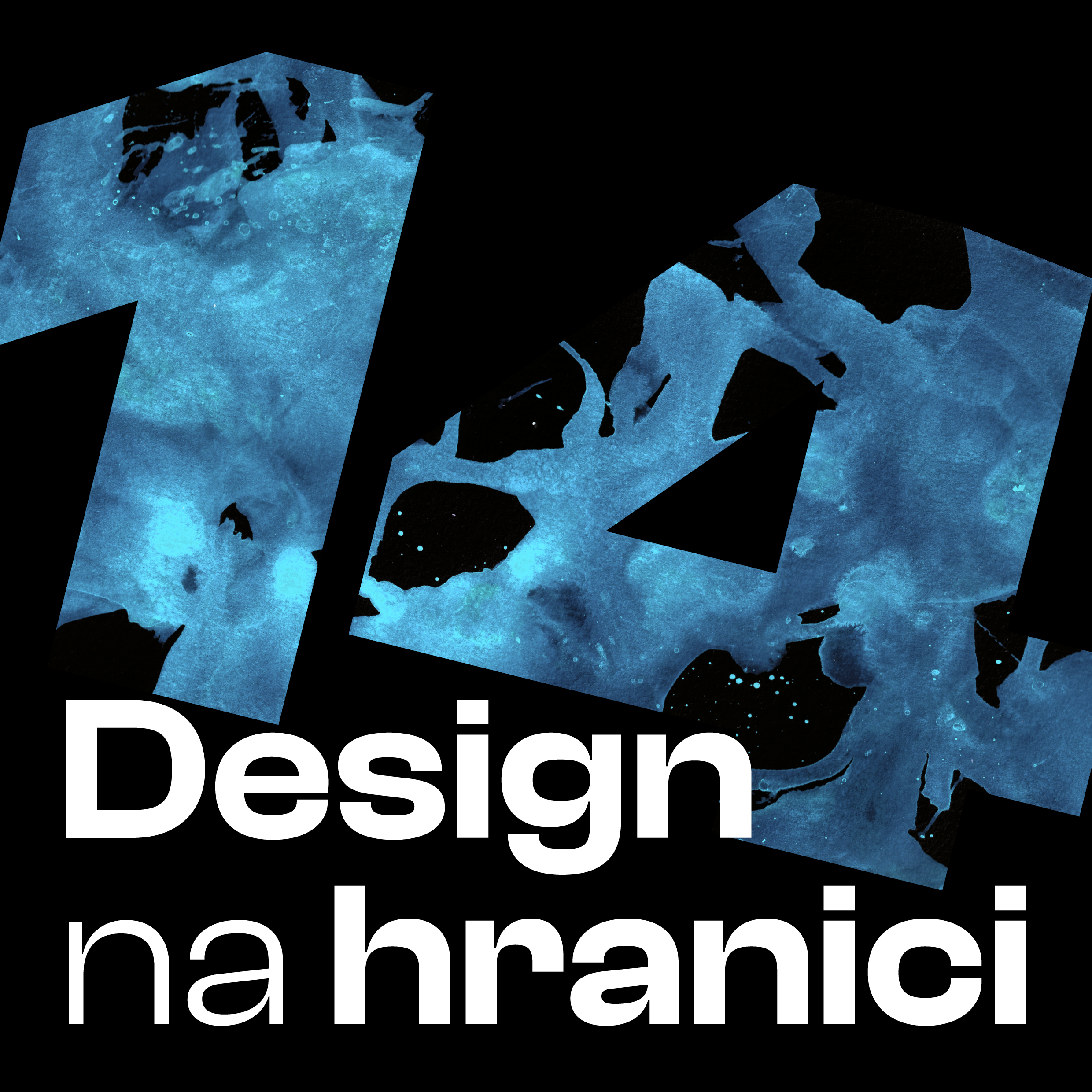
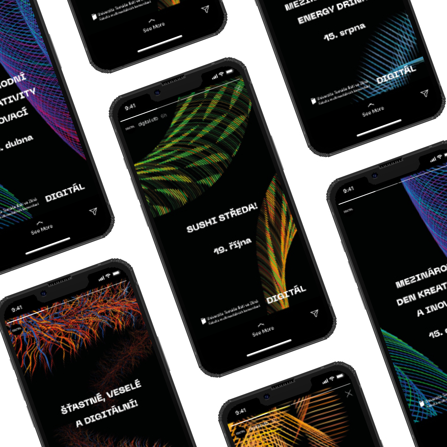
K této klauzuře vznikl také animovaný plakát. Ten ukazuje rozdíly mezi jednotlivými rodinami a k nim příslušné abstrakce a úvod webové stránky. Plakát je animovaný v programu Adobe After Effects.