In August 2022, I joined czech non-profit organisation česko.digital as a volunteer, where I worked for the whole winter semester as a UI & UX designer in the project called Moudrá síť. The output of my semester work is a mapped part of the last four months of work on the project where I participated as a designer.
What is the Moudrá síť project about?
It’s an online web platform that aims to connect seniors with digital assistants (younger people) that seniors can turn to whenever they need help with new technologies.
In general, the project aims to improve the digital literacy of seniors and build a new digital infrastructure to provide digital education for seniors across the Czech Republic and regardless of the seniors’ and digital assistants’ addresses. The service will be for free for seniors 60+ in Czech Republic.
The idea of educating seniors in digital technologies was born in 2015. A team called Moudrá sovička was formed around it and started doing trainings, workshops and courses for seniors. Gradually, a community of more active seniors started to form around the project, and they are now involved in the project themselves and are now great helpers in testing the Wise Network service.
My role as designer on the project
I didn’t work on the project as a designer just by myself. I was in a team of other volunteers (managers, designers, developers, thinkers) who had the time and inclination to contribute their working skills in their spare time to create something that would make sense in the community.
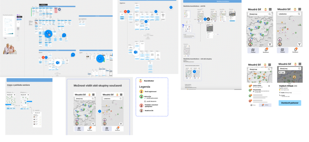
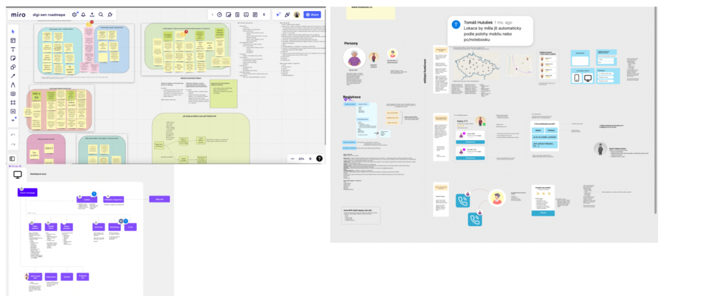
In the early stages of the project, I along with the other designer-colleagues, were mainly concerned with the form and defining the overall functionality of the service. Which tools to use, what paths to take and what to draw inspiration from. Then we divided the work and started working on wireframes with a mobile first mindset. And we discussed everything carefully every week.
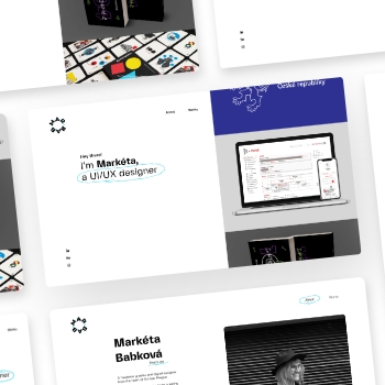
My activeness as a designer was evident from the initial brainstorming, to the first swallows of prototypes, to user flows, wireframing, UX and the visual identity of the project.
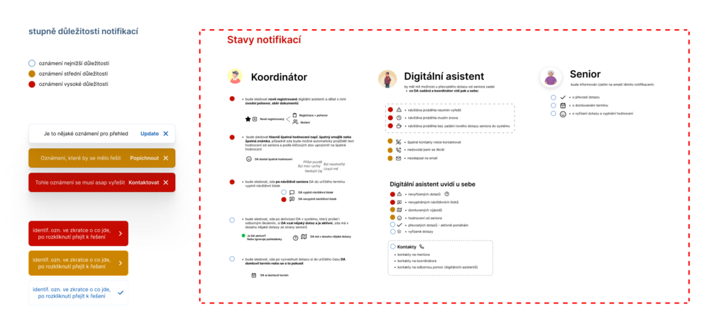
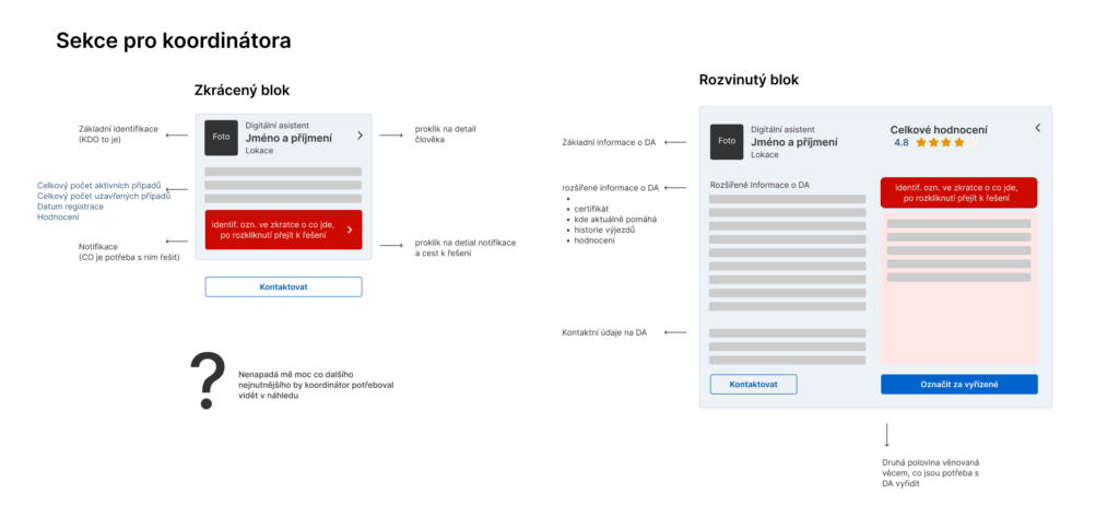
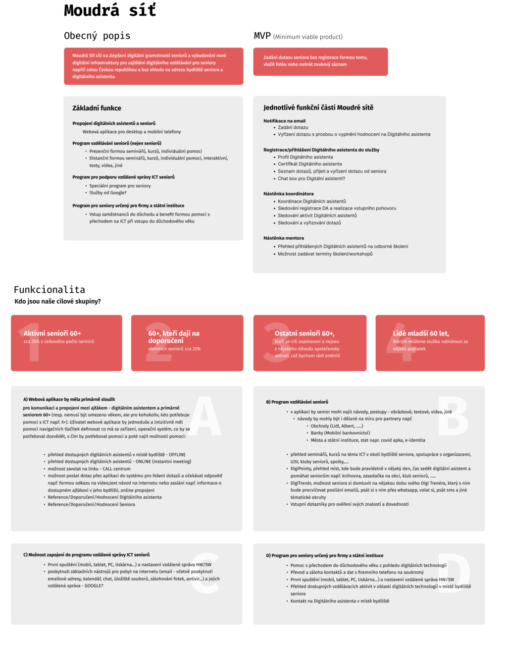
Specifically, my first tasks were to focus on the coordinator’s bulletin board, which organizes volunteers, seniors, and mentors. My goal was to design a functional and elegant solution that would help facilitate such a coordinator’s onslaught of new digital assistants, address potential claims and issues arising in communication between digital assistants and seniors, training, and more. However, after some time of designing such a system, we came up with a universal solution to an already existing CRM that could be applied to the other administration around that necessarily touches the digital assistant and the senior in addition to the coordinator. For this system, I was involved in determining the functionality from the coordinator’s side, and then creating clear notification statuses.
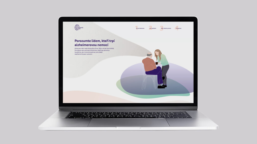
Subsequently, it was necessary to create a temporary website, moudrasit.cz, to serve the formal purposes of the organization. So I created a functional temporary website with using WordPress with the DIVI template.
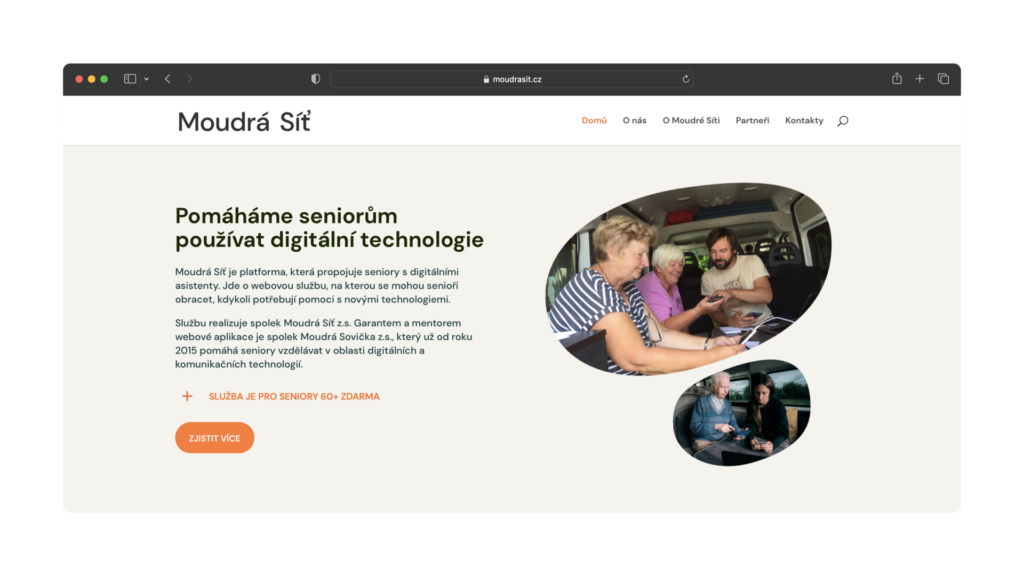
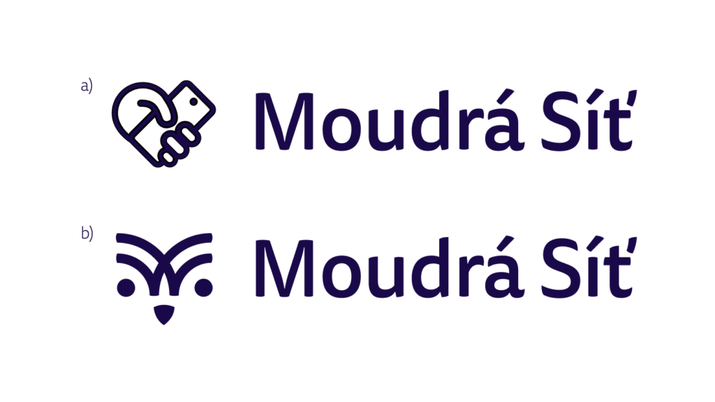
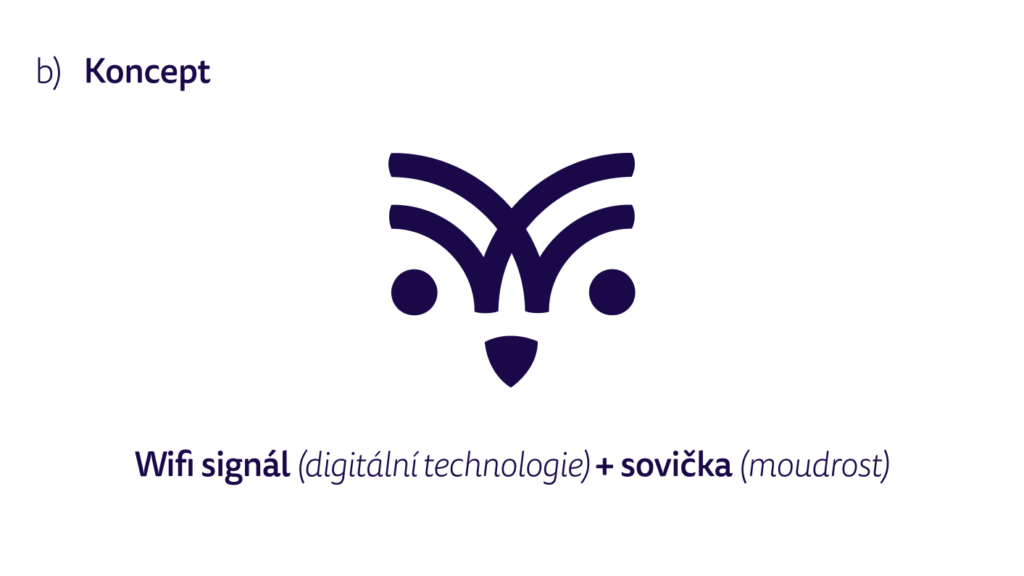
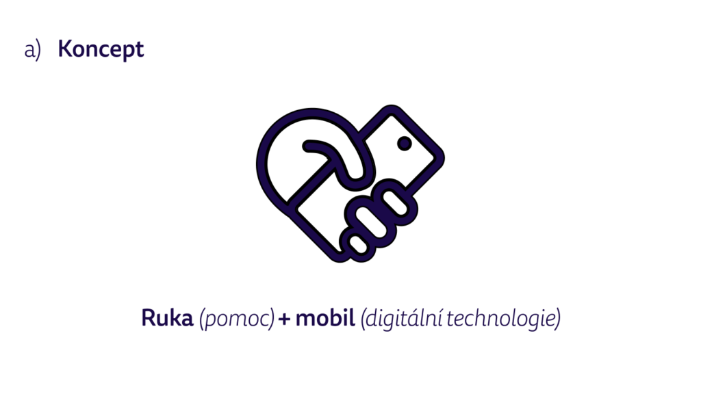
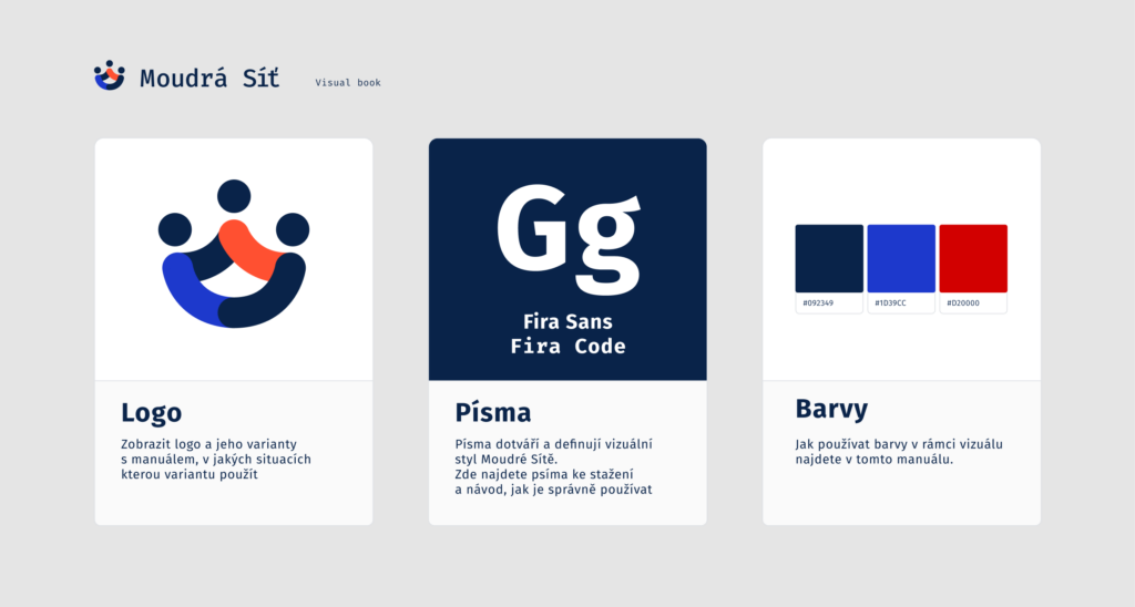
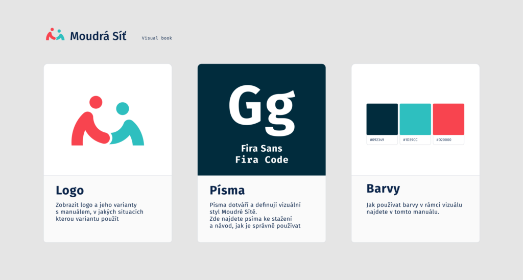
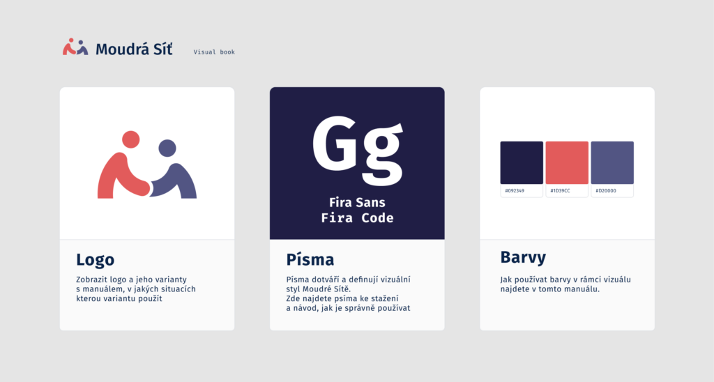
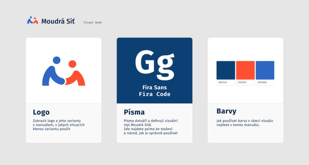
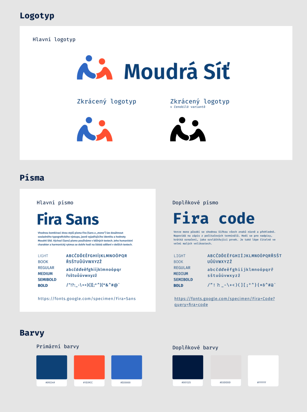
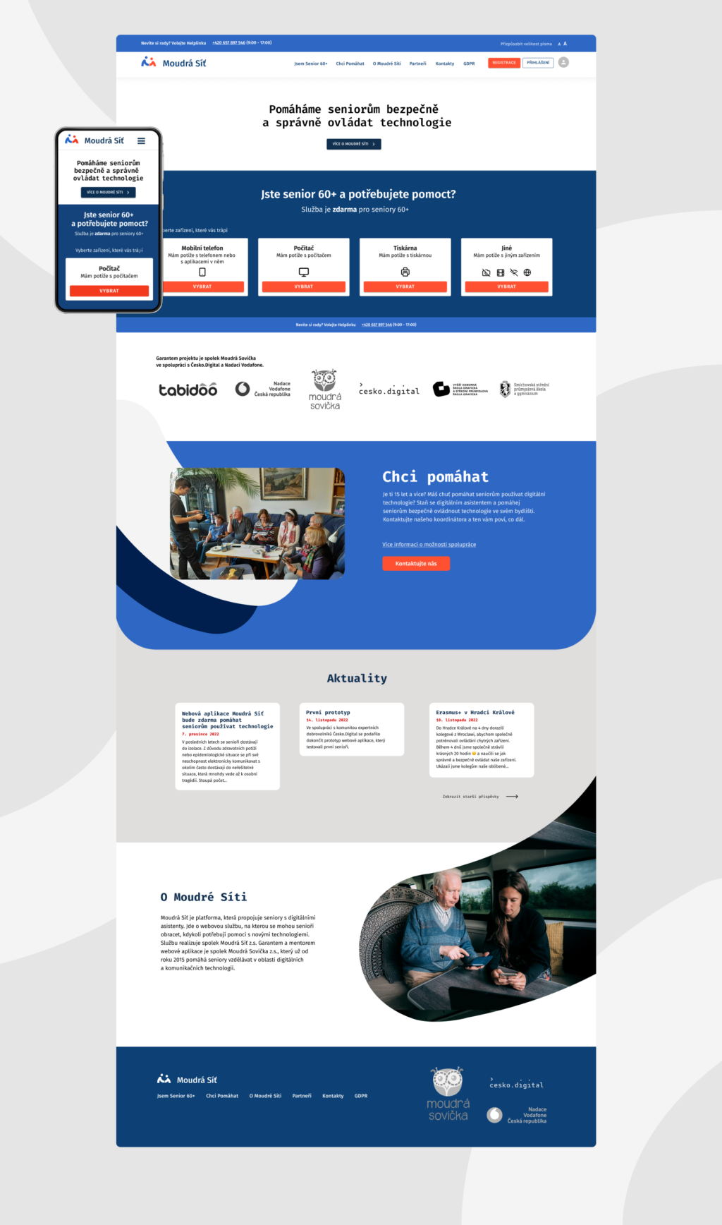
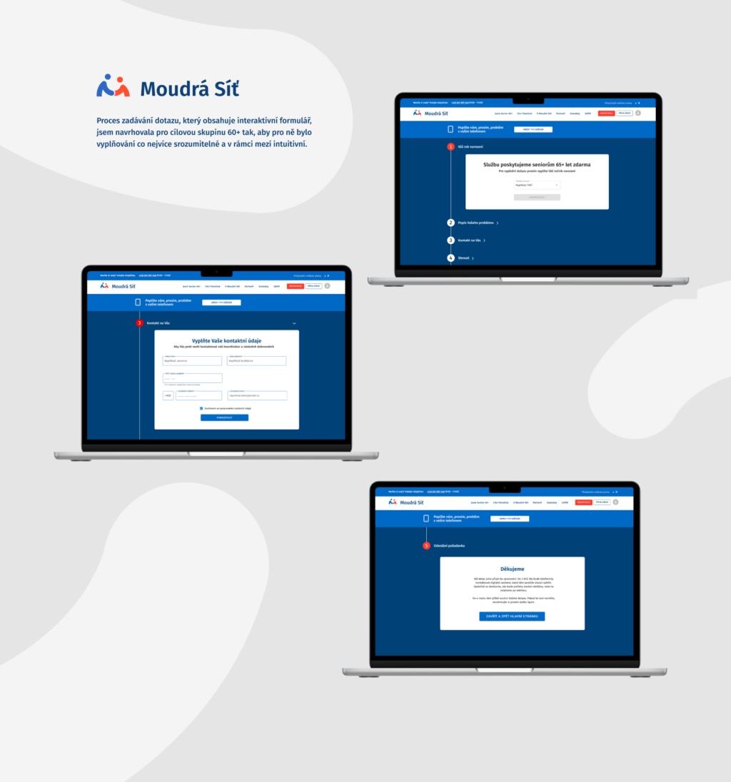
Then was right the time to create a logo and functional visual identity that would work not only on the responsive website, but also across the entire project. I created the first two designs, but the product owner couldn’t identify with them, so I created another visual identity design that I discussed extensively with the entire team. In parallel, I discussed with the developer and selected a suitable UI library that we could use on the project and save time spent coding each component. We consulted together on the UI components and the suitability of the interactions for the target audience.
What did the project give me?
Working with Czech Digital and the entire Wise Networks team gave me incredibly valuable experience and insight into how a team should work. The work was efficient, although most of the time it was just about finding appropriate solutions to partial problems. Even so, I feel that project management is very well taken care of at Czech Digital. The teamwork was based on mutual respect and respect for the fact that we are all doing it actually voluntarily in our free time.
I met a lot of interesting and capable people, although only through the Slack and Google Meets platforms. I’ve learned some new tools to work efficiently, such as Miro, Atlassian, Tabidoo, Jira, Divi, Cofluence for documentation, and expanded my knowledge of WordPress and overall website building. During the collaboration I also learned how to use Figma even more effectively.
What is Česko.digital?
Česko.digital is a non-profit organization that brings together volunteers, mainly from the IT field, who in their free time help the public sphere (non-profit organizations and the state) with digitalization and innovation and make the Czech Republic a better place to live. Their goal is to strive for maximum use of digital technologies for the benefit of society. And with the involvement of more than 5000 people, they are leaders in expert volunteering in innovation and digital technology in Europe.
But beyond the dry-sounding volunteerism, it’s also a vibrant community of top developers, designers, producers, analysts, marketers and strategists who, in their spare time outside of work, are still helping non-profit organisations and the state to change the Czech Republic for the better.
The organization primarily develops ideas that help improve life in the Czech Republic through IT. They have no commercial alternative and are sustainable. So you won’t come across a project that doesn’t make sense.
Project ideas are carefully selected and discussed in the first phase, and their potential, social impact and level of sustainability are evaluated. A team is then assembled from a network of active volunteers to work together to develop the project.
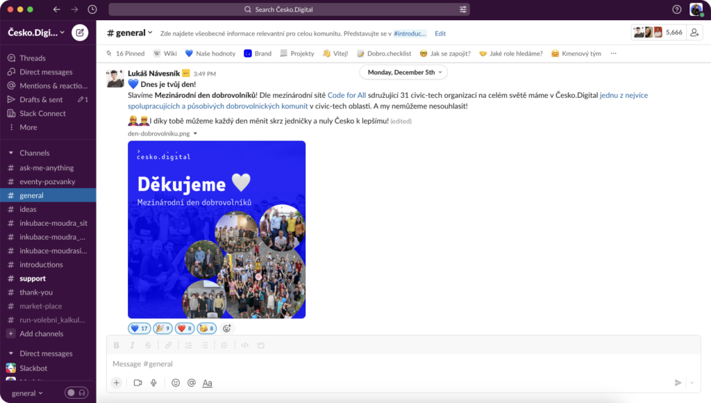
Česko.digital works primarily in a remote-first way, so it is not a problem to join a project from anywhere and at any time. Volunteers meet on the online platform Slack, where all communication takes place.
