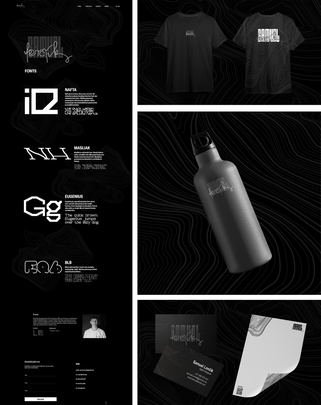
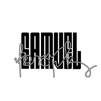
The visual identity for Samuel Lončík was designed to best reflect his personal aesthetic and approach to design. After reviewing his work, it became clear to me that the visual concept should be primarily based on “dark mode”, which is a key element of his style. Initially, I planned to incorporate more of his custom typefaces, but I ultimately opted for a minimalist approach that would allow his work to stand out.
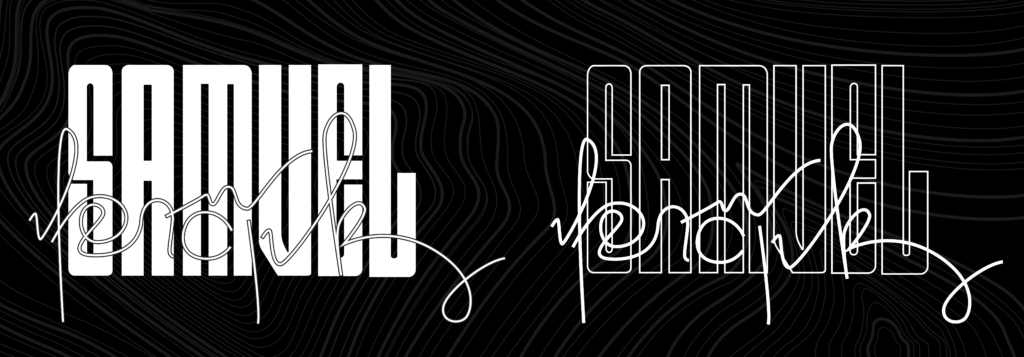
The logo consists of two parts – his first and last name. The first name is set in a typeface that Samuel frequently uses in his projects, creating a natural connection between the identity and his design style. In contrast, the last name, “Lončík”, is crafted as a continuous line, symbolizing his meticulous and thoughtful approach to design while also breaking up the simplicity of the primary typeface, adding visual interest. This concept is further reinforced by a complementary graphic element in the background, which enhances the overall identity.