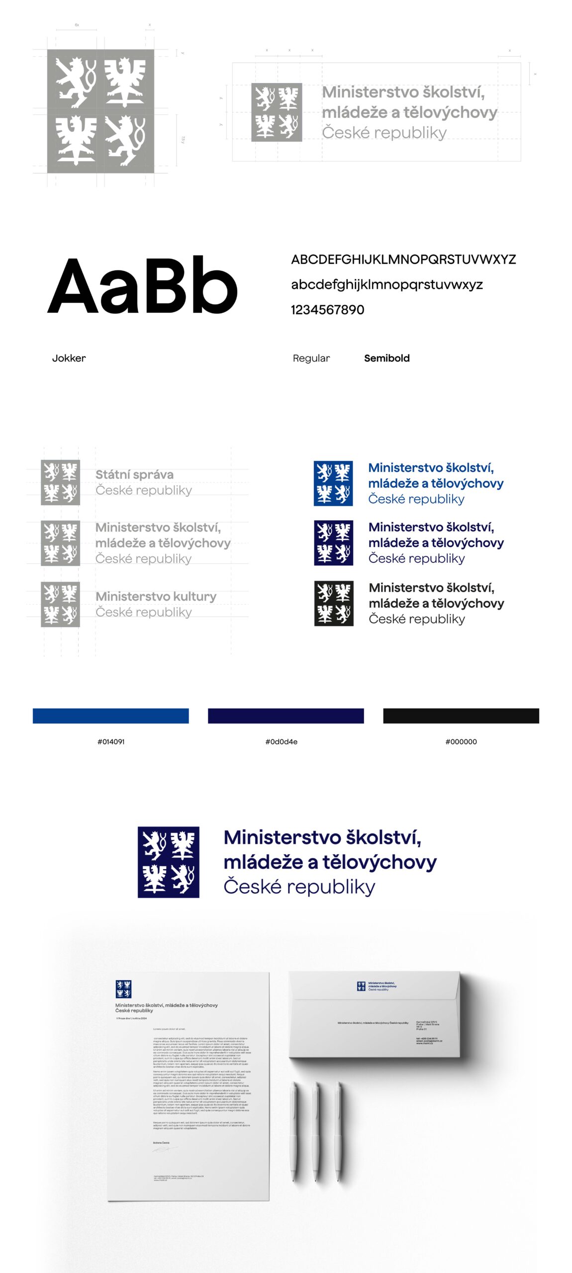
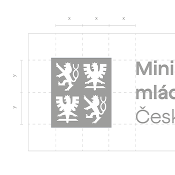
Within the Identity project I focused on the creation of a visual identity of the Czech state administration. My main focus was to transform the state emblem into a more modern form. By gradually simplifying and updating it, I created a new version that better matched current aesthetic and graphic trends. For the typography I chose a font from the Czech studio Displaay, whose founder is Martin Vácha. Specifically, I used a heel-less font called Jokker with a raised x-height, which is ideal for a variety of sizes and purposes and was therefore the obvious choice. In doing so, I combined a modernised piece of Czech history with a contemporary element of typography. For the colours I took inspiration from the colours of the Czech flag, especially blue. This thematic choice complemented the overall impression and emphasised the national identity in the visual expression of the report.