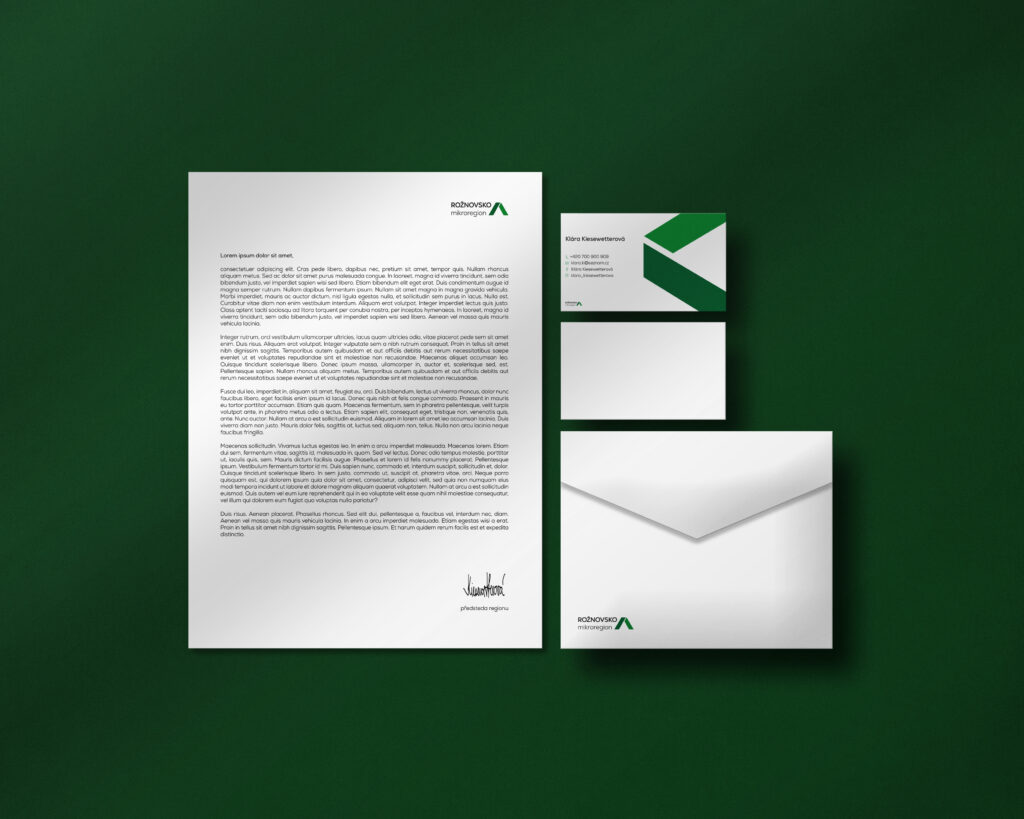
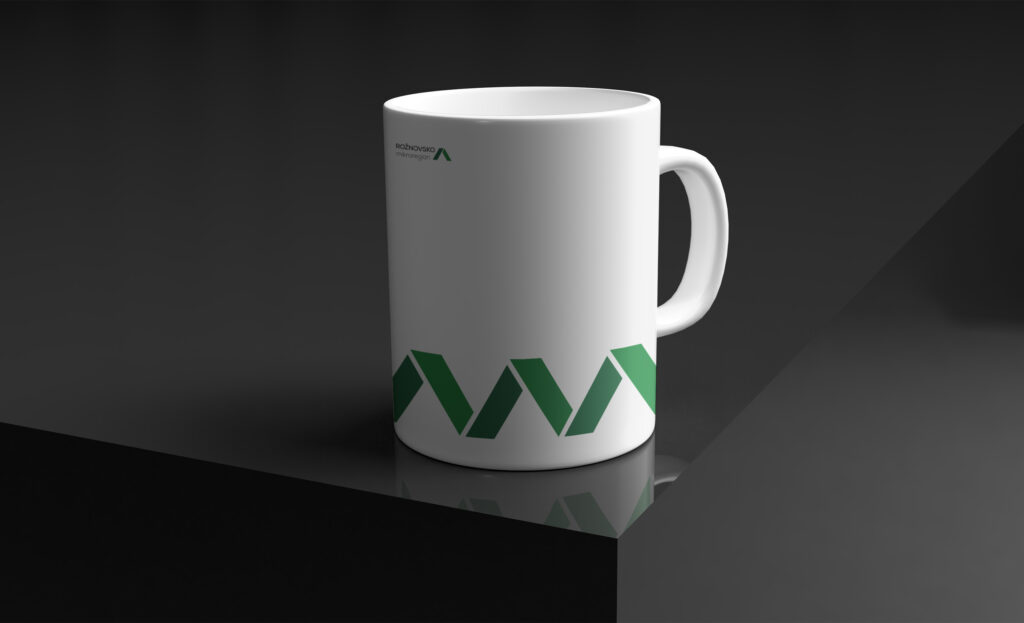
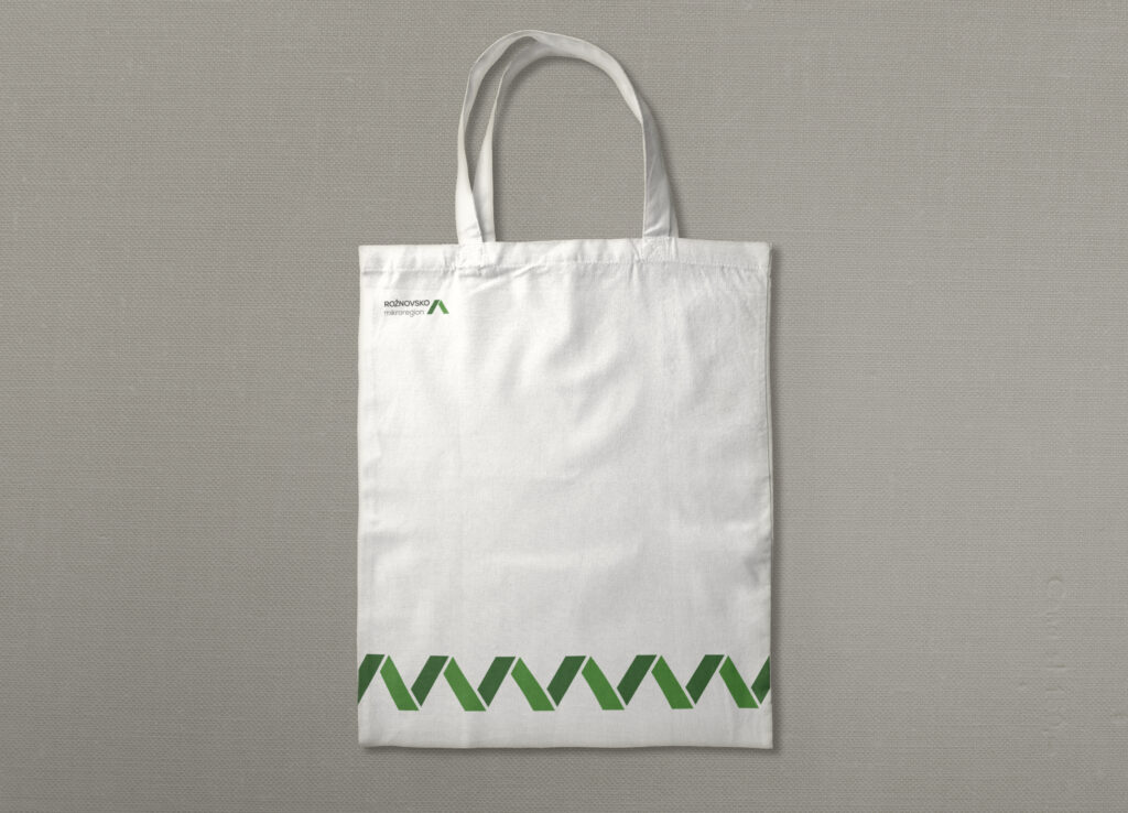
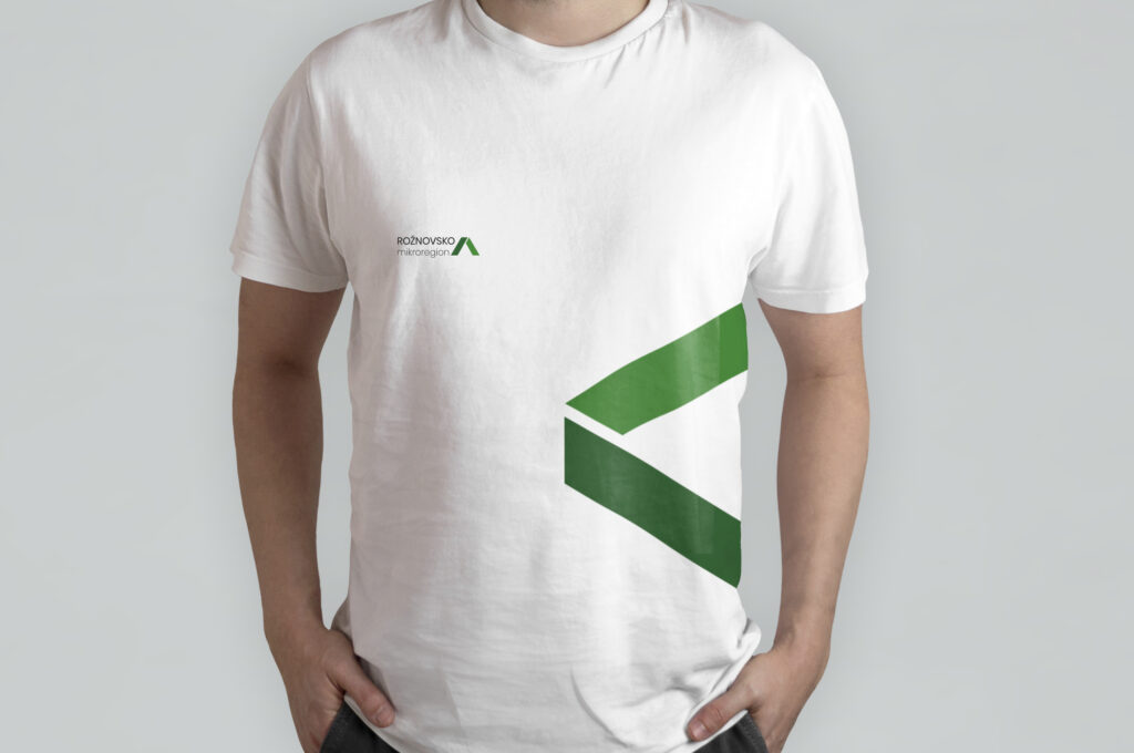
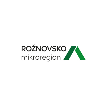
The logotype is inspired by several “symbols” of the Rožnov region. In the shape of the logo there is a hidden shape of a folded folk bow, the roofs of Rožnov log cabins and the silhouette of a mountain as a reference to the Beskydy Mountains. The entire area of the region also has the shape of a triangle/arrow, so we can combine this information in connection with the logo. The shape consists of two converging stripes, with one of them beveled to make the idea of a folded folk bow clearer. The text Rožnovsko microregion is attached to the logo itself to support the name and its establishment in promotion and in society. However, the logo can work without a text title. The font is called Nexa and its license can be purchased in all cuts for around 5,000 CZK. It can be downloaded for free in three basic cuts. I chose the color in reference to nature, which the microregion tries to maintain and attract its tourists to. The two shades of green bring the image closer and give the logo the impression that it is a region that is connected to nature.