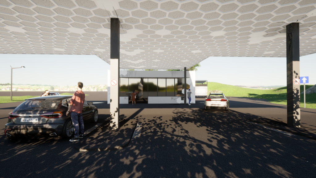
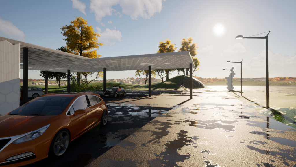
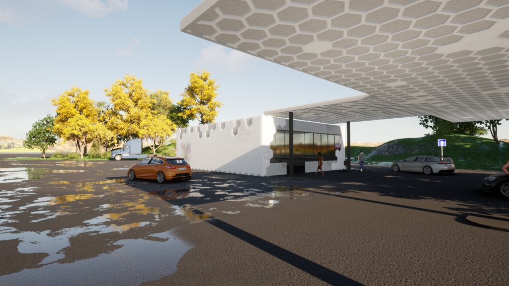
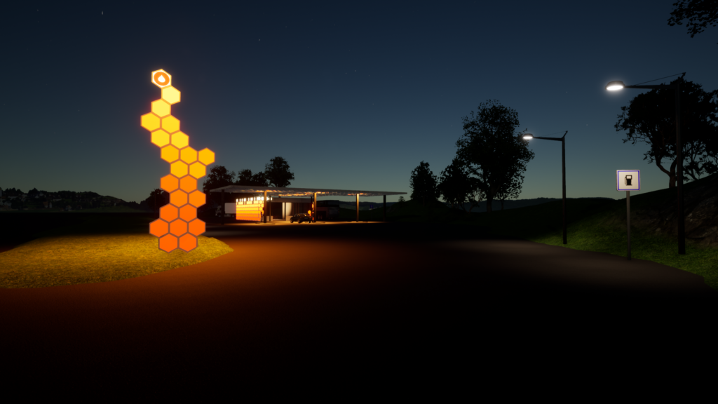
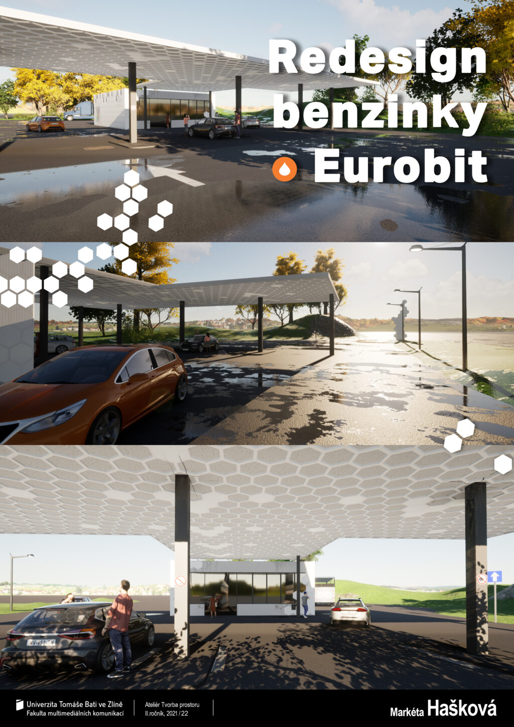
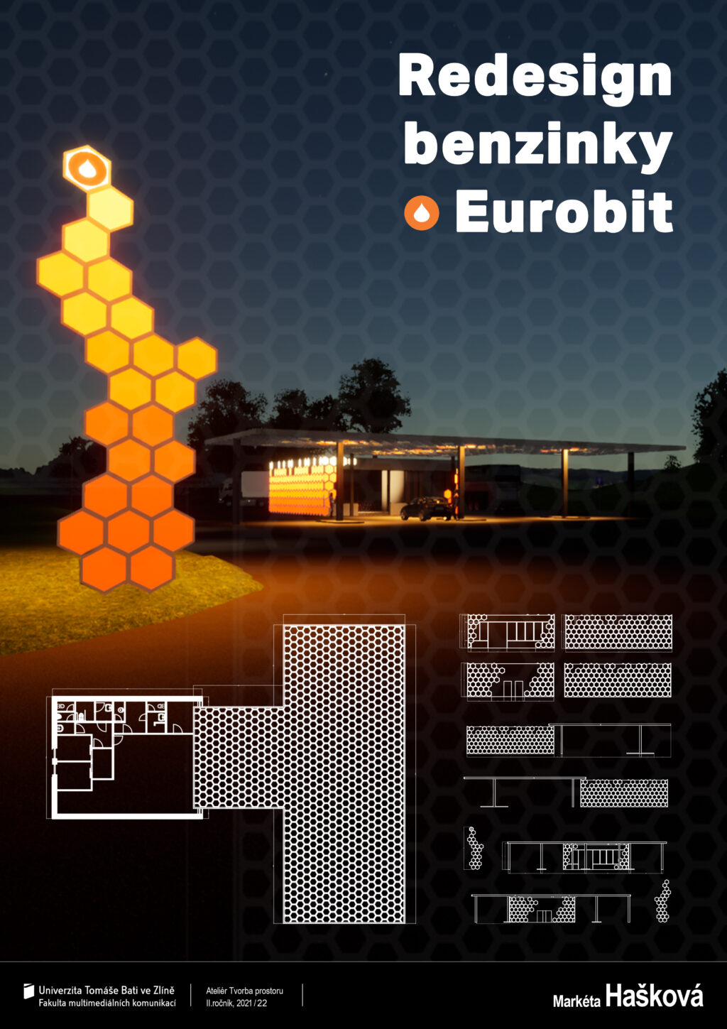
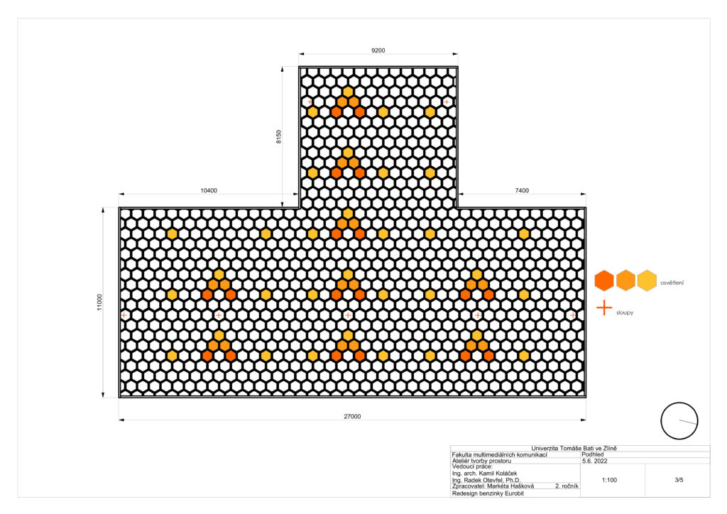
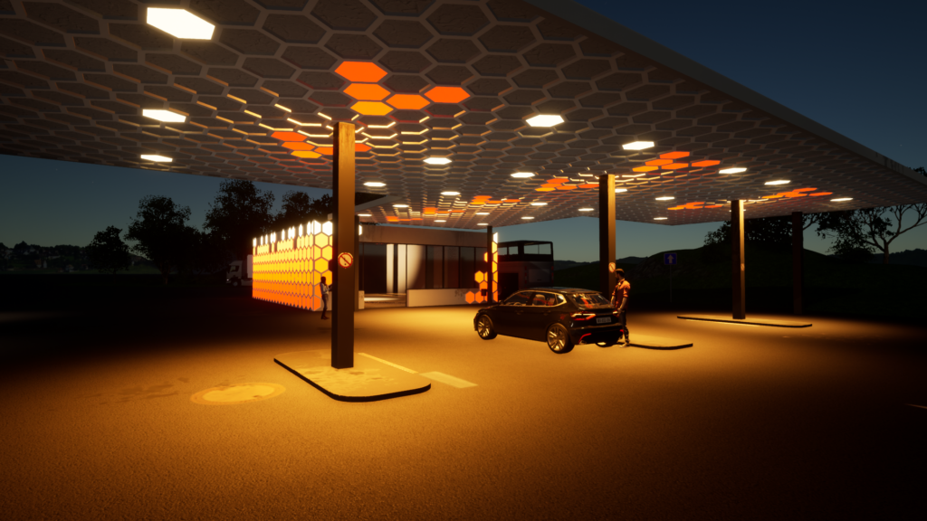
The design of the Eurobit gas station revolved around hexagons from the beginning, as it was a cooperation with Montage 24 in Zlín. This company deals, among other things, with the cladding of buildings and among their own projects is the Honeycombs facade system, which is used in this design. Initially, the hexagons were also intended to serve as facade cladding, but their next layer also served as a trellis for greenery. Over time, this idea proved not to be a very practical solution and the trellis was abandoned. This left only the full hexagons, which needed to be developed further. The main Eurobit colours are bright orange, white and anthracite. However, the colour of the proposed gas station depends on the time of day. During the day the hexagons are white, the petrol station is clean and attracts attention with its minimalism. The anthracite window frames and the pillars of the shelter are in contrast. As night falls, the hexagons on the kiosk light up with a colourful transition of orange, and the ceiling of the shelter, which is resolved by a sort of grid of hexagons, illuminates the pumping points in the shape of arrows, which imaginatively guide you inside the building.
