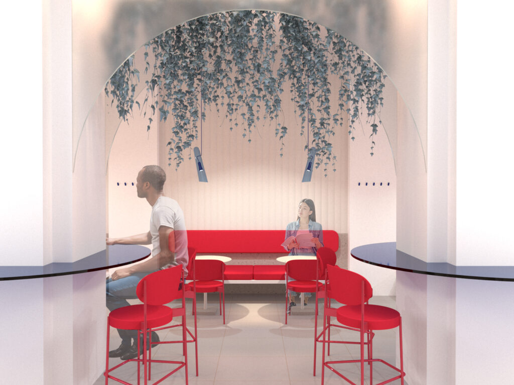
The task was to revitalize the interior of the faculty, especially the café and relax zone.
Operational and layout solutions
The aim of the layout was to create spaces with plenty of space, comfort and privacy. Three main axes were created. The first axis – a passageway with a bar and benches. The second axis – the café itself, offering various seating including wheelchair users. The third axis – a relaxation zone with a children’s play area. Part of the relaxation area was raised by two steps, which helped to visually divide the long narrow room where one partition was knocked out.
The total proposed space offers seating for about 50 people.
Architectural design
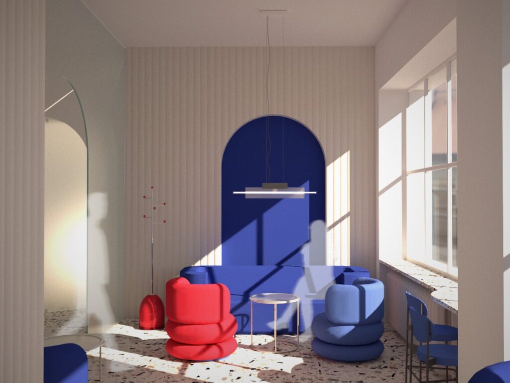
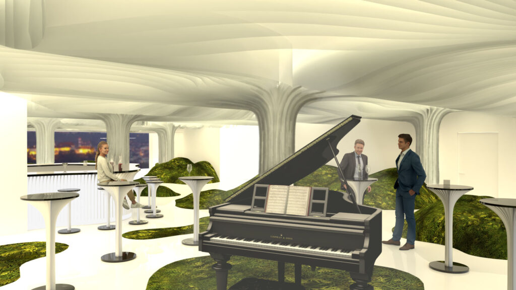
The main motif of the design is the arch. The inspiration comes from the arched arcade of the faculty and from some of Kotera’s original designs. The rounded shape also creates a contrast to the rest of the building’s interior, where a rectangular grid often appears.
Thus, in the café area, arches were added between the original columns. The arches are filled with milky glass, which guarantees privacy but also light access from the corridor.
Material solution
The intention was to create a clean, bright space that would relate to the generous faculty spaces and attract attention with new elements.
The floor surface is made of terrazzo tiles. Furthermore, the interior is dominated by milky glass, through which the colours of the café chairs and armchairs shine through. It is the furniture that acts as a colour accent, along with the complementary lighting.
