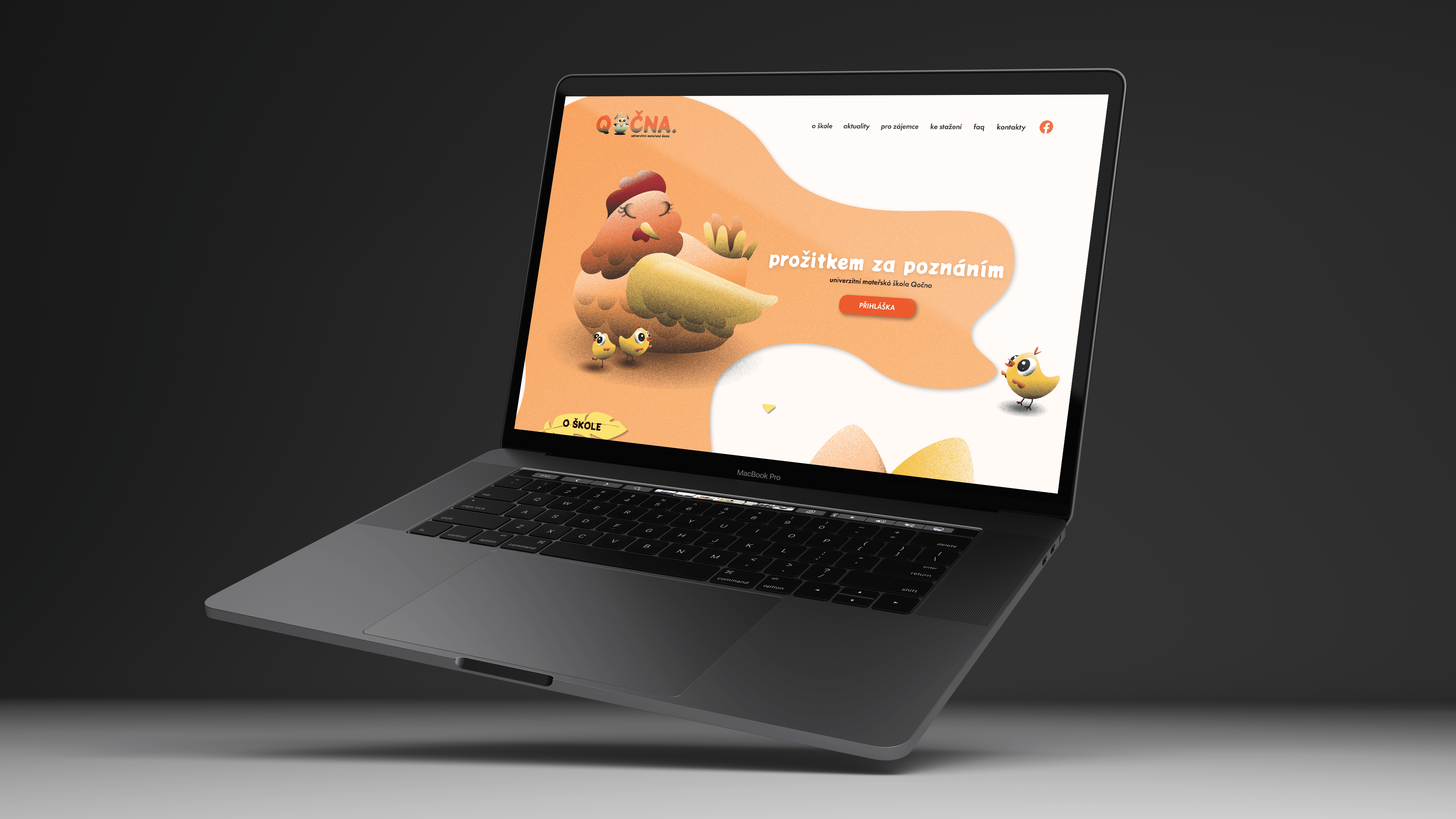
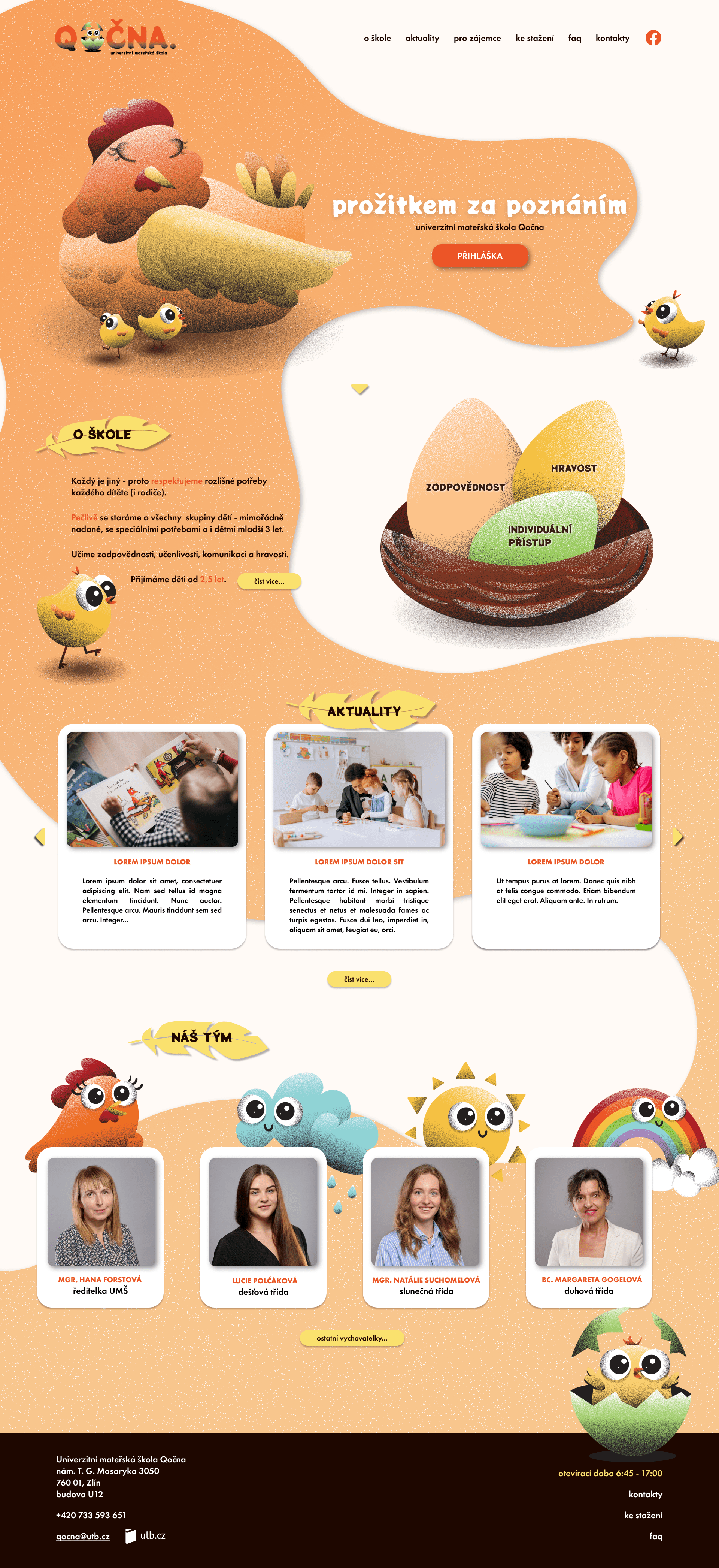
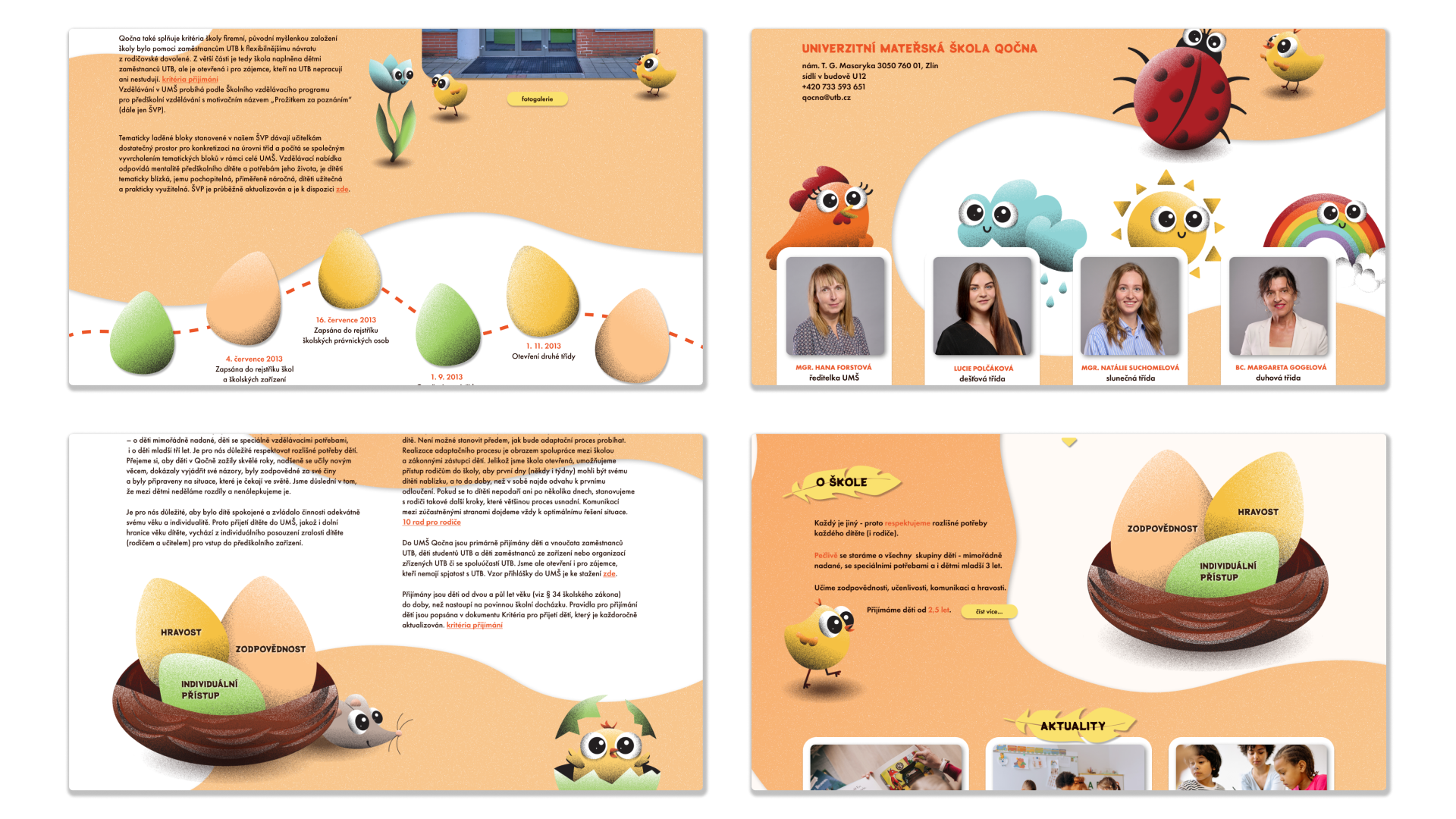
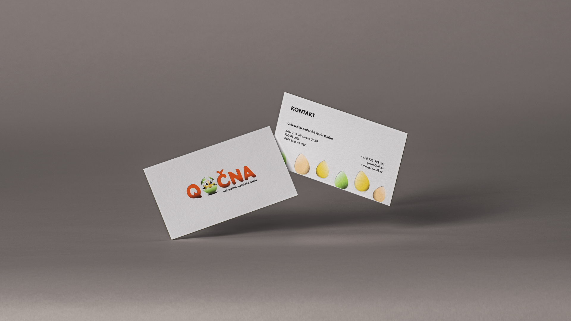
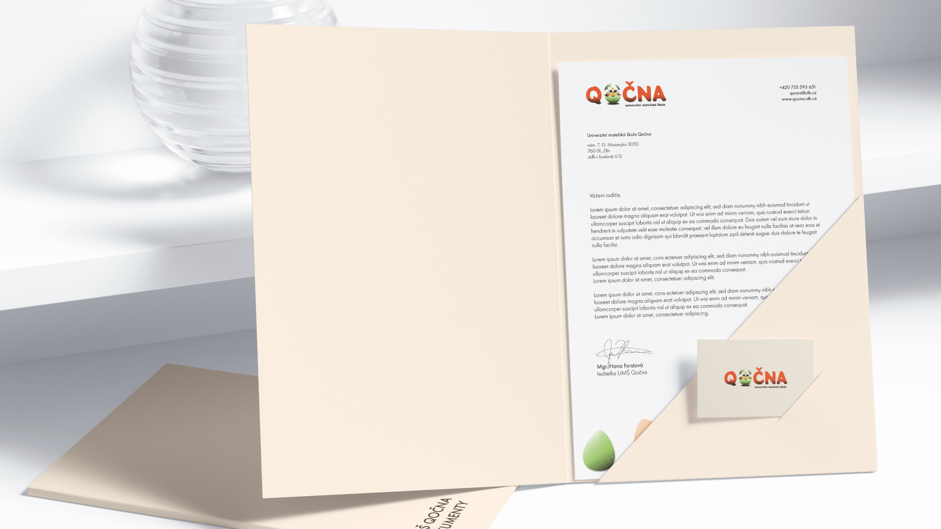
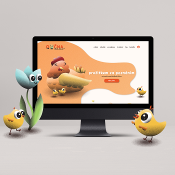
The visual identity for the Qočna kindergarten revolves around the crucial role a kindergarten plays in the growth of children. The logo symbolizes a process of growth and development, strongly conveying that the kindergarten is a key element in this journey. A hen, inspired by the kindergarten’s name – Qočna, serves as the central theme in the illustrations, symbolizing care and safety.
Keeping simplicity and accessibility in mind, the website caters to parents seeking information about the institution. Visual elements, including the color palette and style, craft a cohesive, warm, and welcoming impression. Overall, Qočna kindergarten’s visual identity captures a distinctive character and underscores the importance of its role in every child’s life.