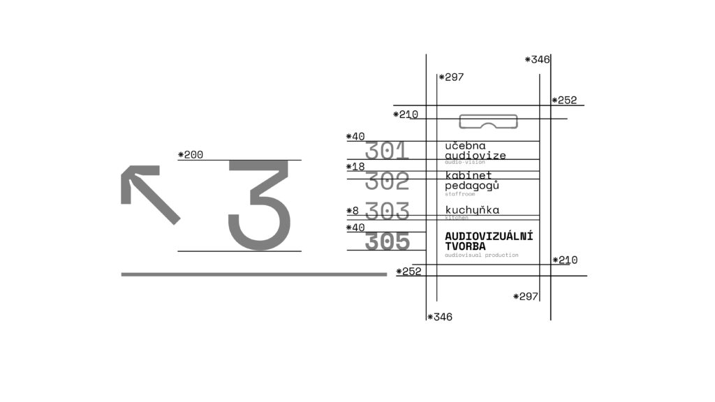
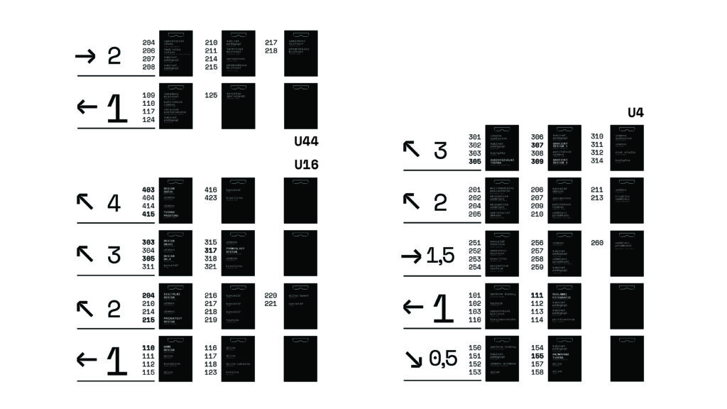
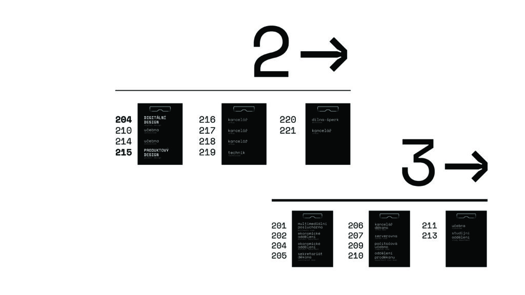
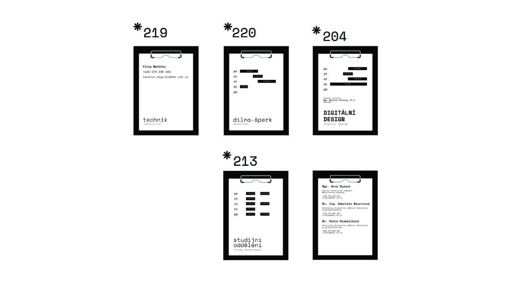
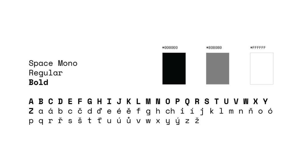
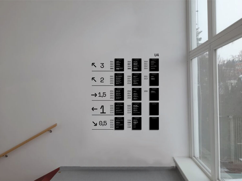
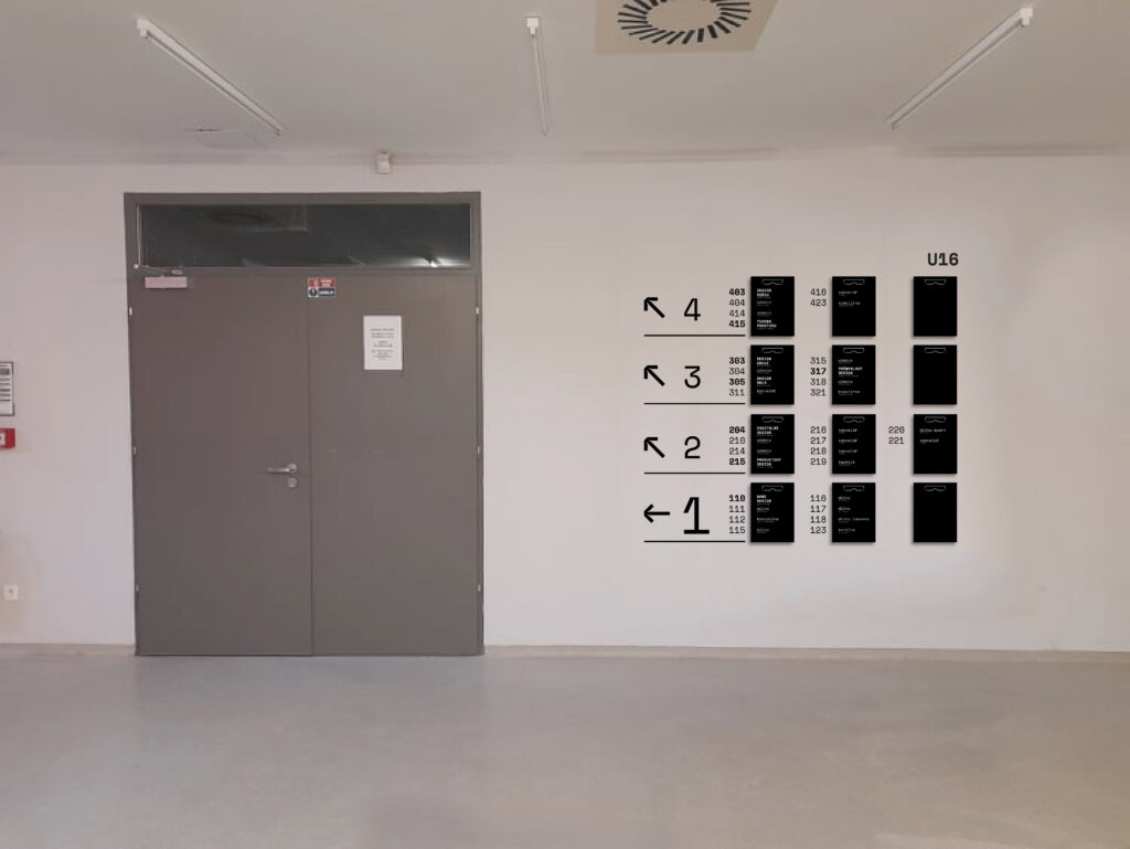
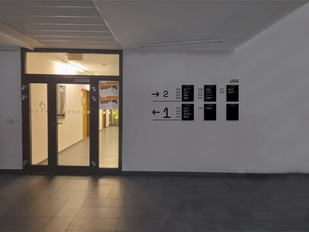
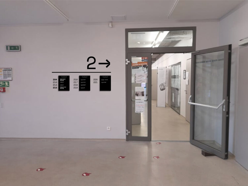
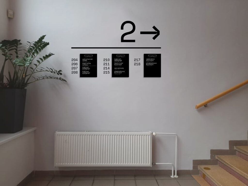
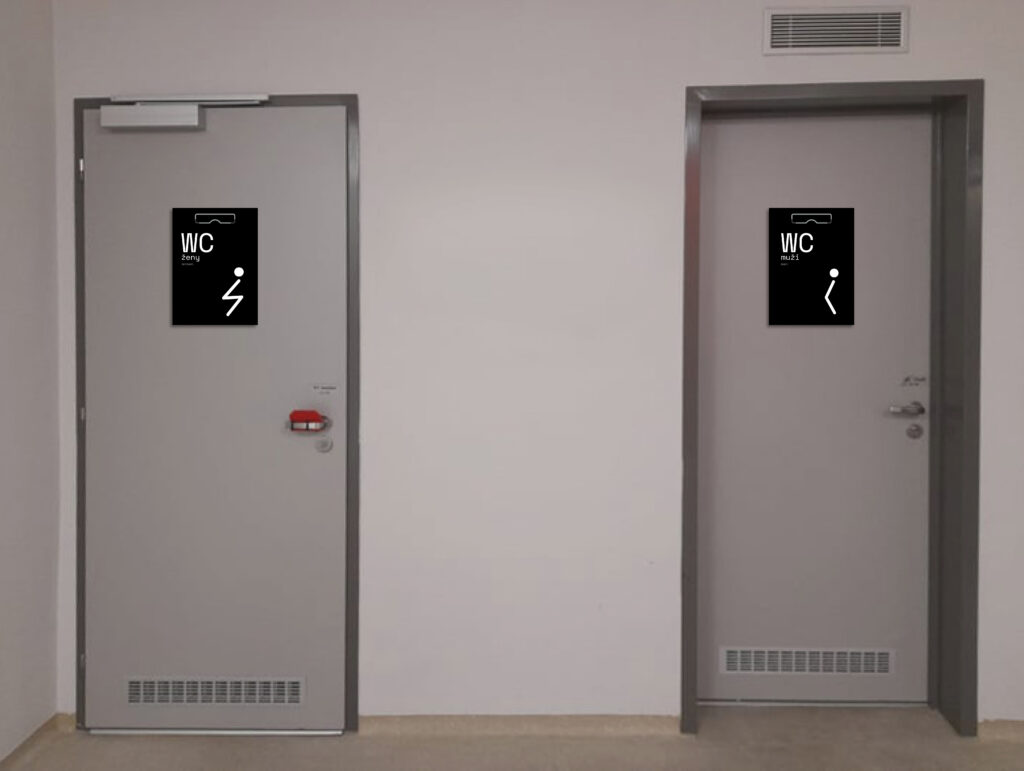
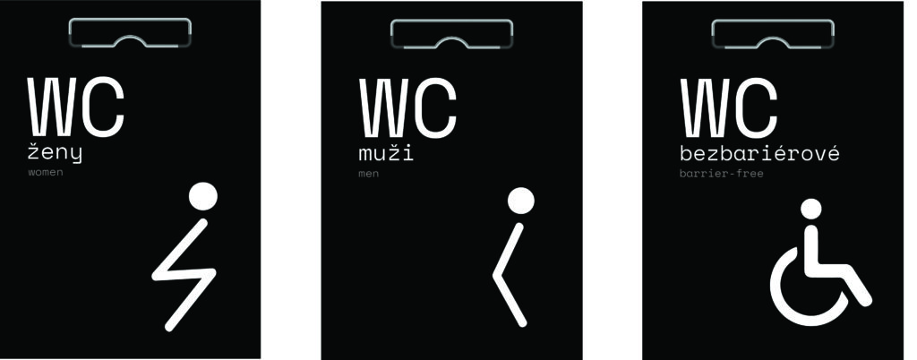
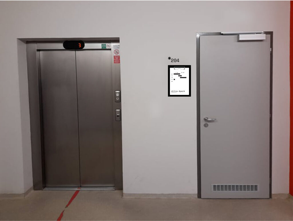
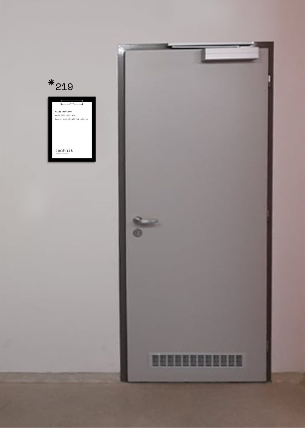
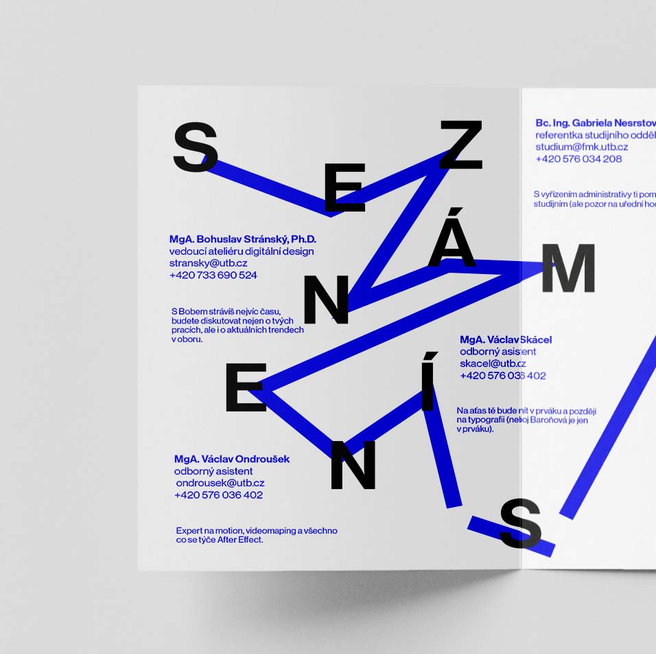
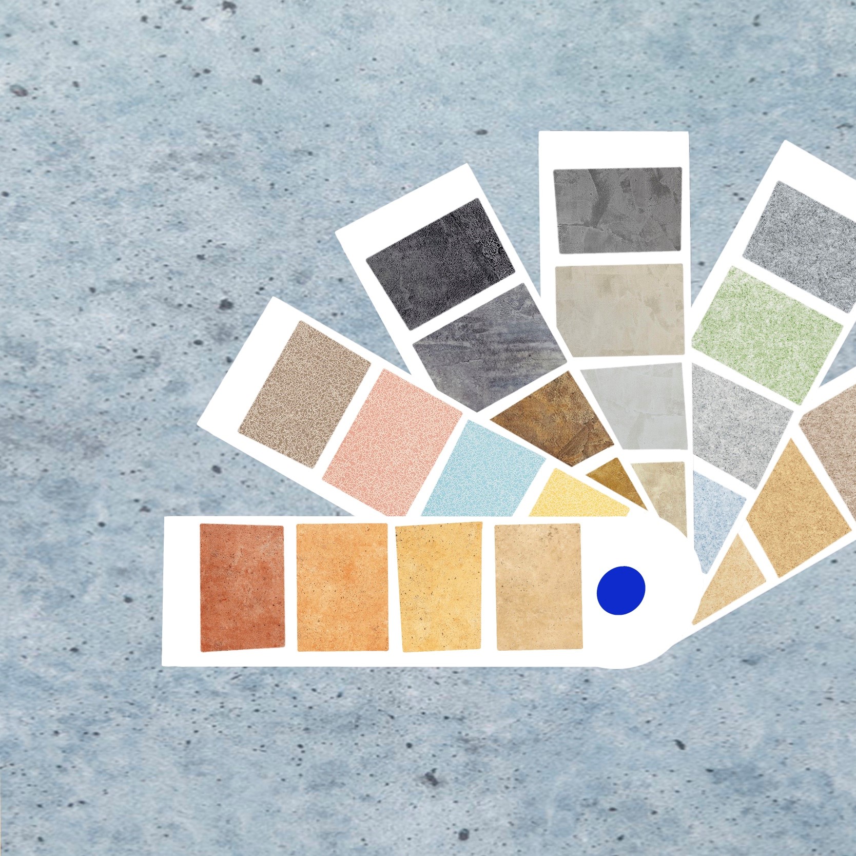
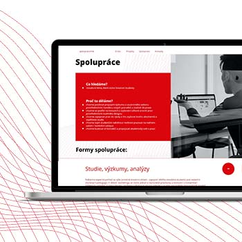
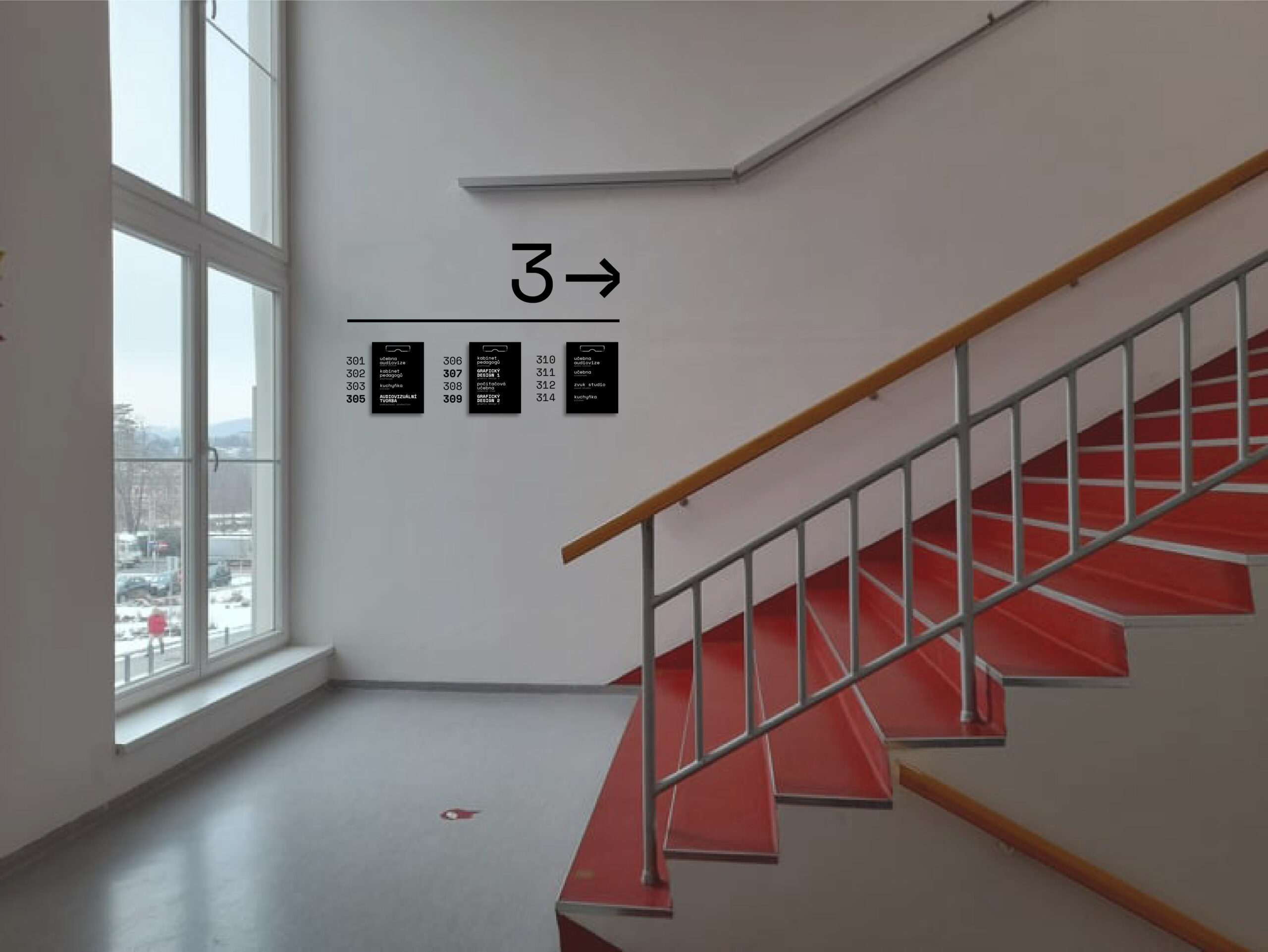
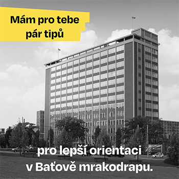
When entering the orientation system for the Faculty of Multimedia Communications, the aim was to visually connect 3 buildings and orient the student as well as other visitors to the university. Orientation should start at the entrance to the building, so at the beginning of each building I chose a large and detailed signpost, which contains the largest information floors and room numbers, there should be distinctive studios and less distinctive classrooms or lectures. My information system is based on the principle of variable volatile and constant permanent information. For information, hard pads with an A4-size clip are used to easily change the function or occupancy of the room. They are used in offices that change consultation hours each semester or when changing schedules in classrooms. Conversely, constant information such as floors and room numbers are made of plastic carved numbers. I chose the color black and white using gray for the English version of the texts.
