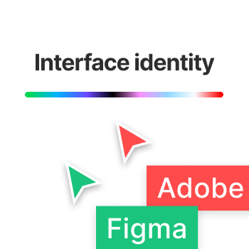
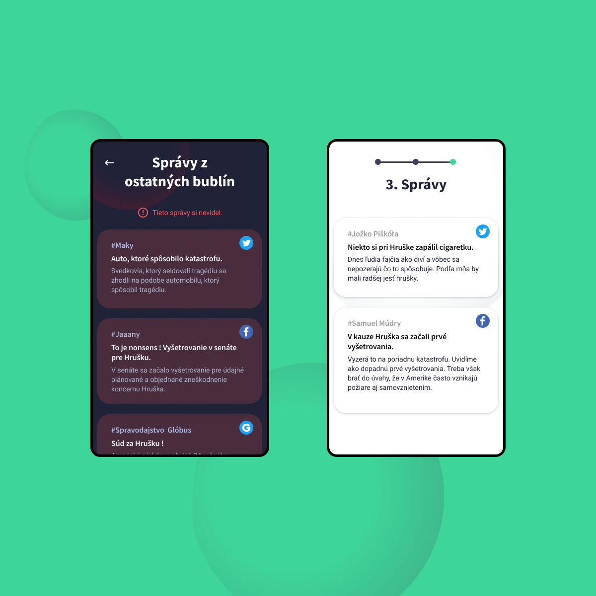
What is the power of user interface and brand identity? I tried to answer this question with a witty, satirical depiction of the rivalry between Figma and Adobe Experience design software. UI identity is made up of lots of elements that few of us are aware of. Most of the time, we don’t even notice the interface because that’s its main role. To be intuitive, unobtrusive and functional. An interface’s identity is made up of the brand’s visual style, communication, user interface, interactions, animations, bugs, sounds, and much more. They are strong, but at the same time very unobtrusive. In everyday use, they leave us with strongly anchored stereotypes. We know what a particular element in the interface means, when to use it, and how we can work with it.
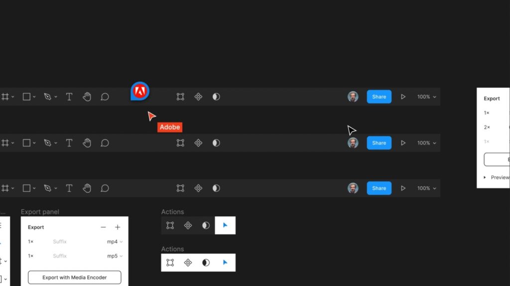
In this project, I used some of these characteristic stereotypes for Figma and Adobe. With their help, I created a video story. The plot is based on the controversial purchase of Figma by Adobe. The whole UI design world is waiting to see what Adobe will do with Figma.


