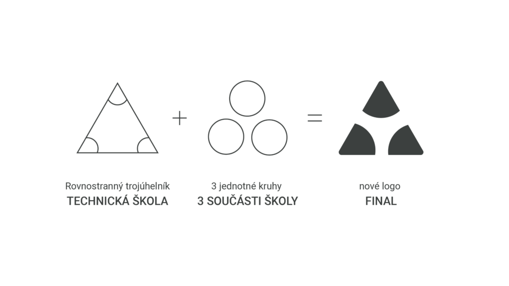
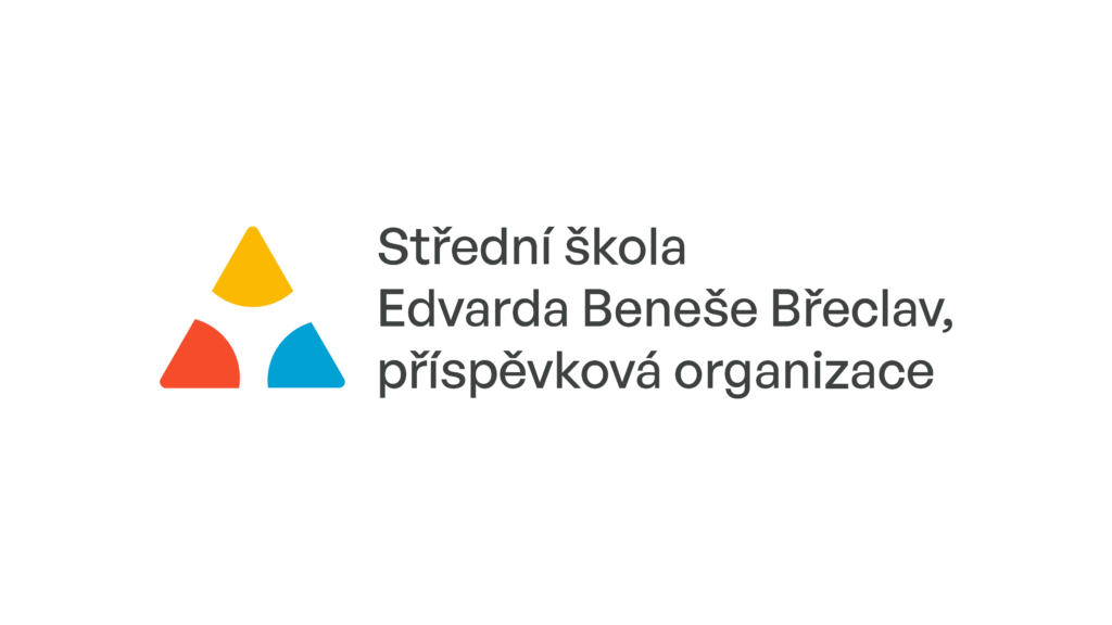
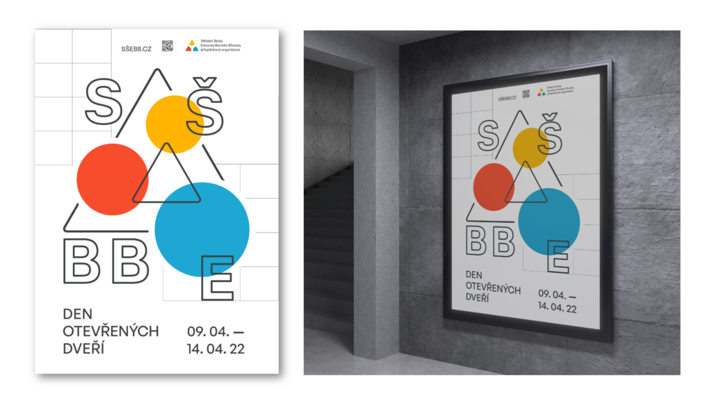
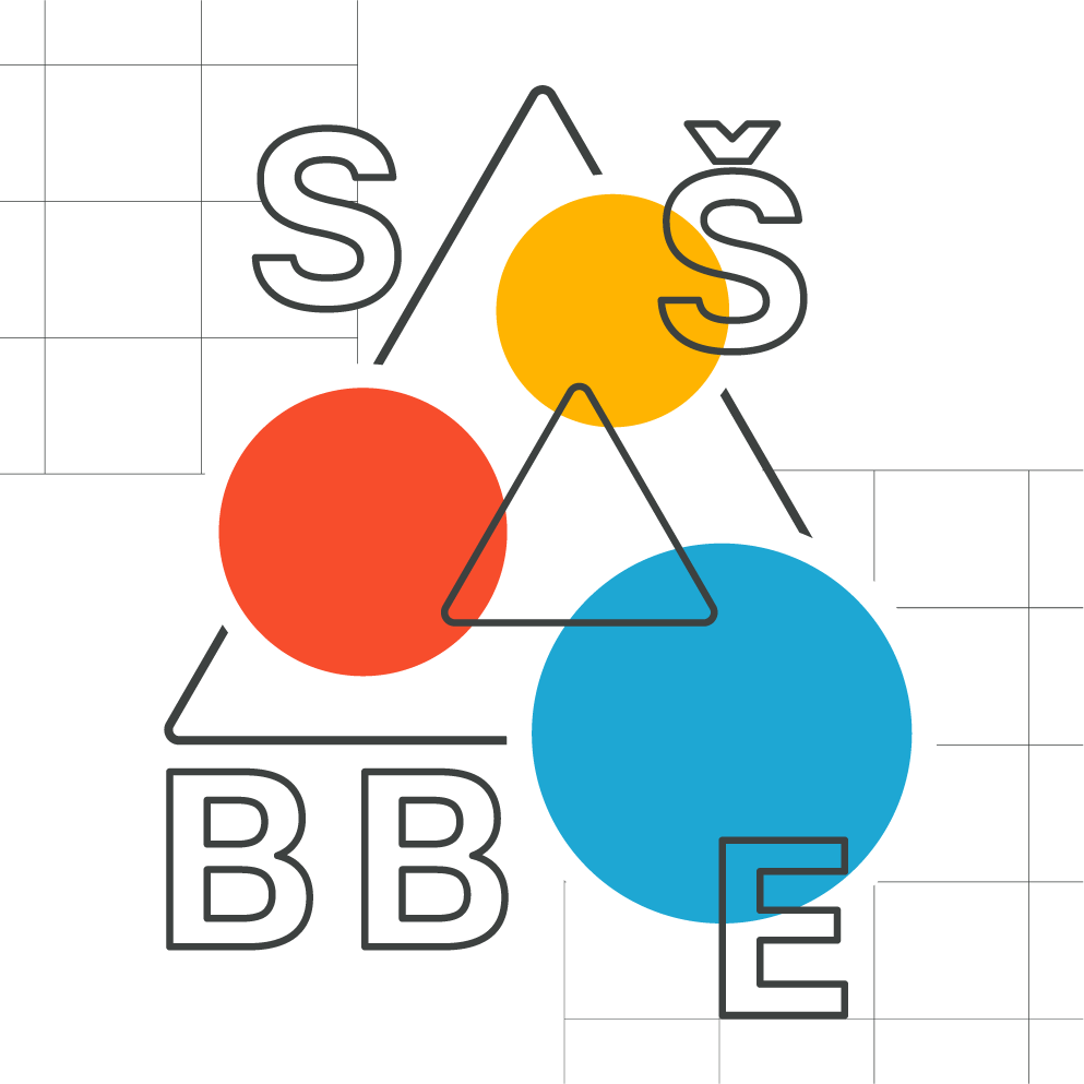
The concept of the visual identity of the Secondary Technical School Edvard Benes (SŠEB Břeclav) was created with a logical structure, focusing on reflecting the unity and integrity of the school.
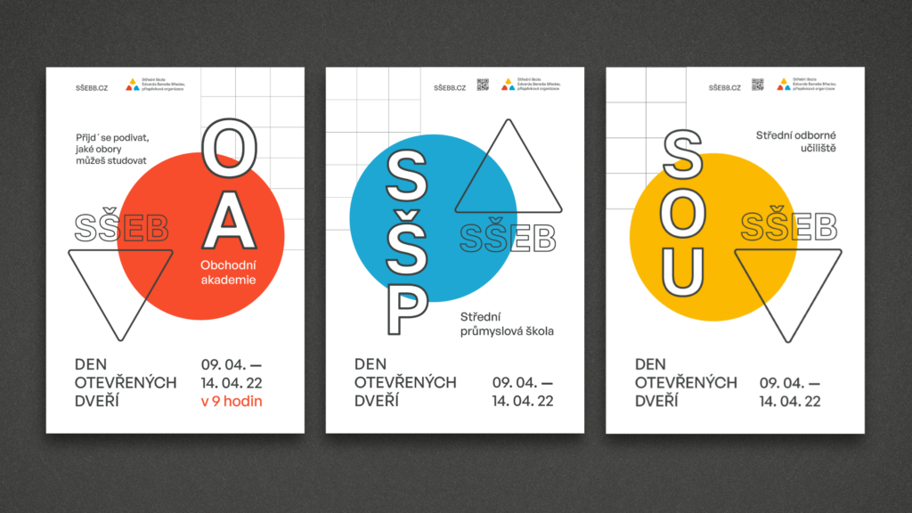
The school consists of three “parts”: SPŠ (Střední průmyslová škola) – Technical High School; OA (Obchodní akademie) – Business Academy; SOU (Střední odborné učiliště) – Vocational School. While various fields are taught there, the majority are technical disciplines.
Logo concept.
Mathematics serves as the foundation and is taught in all fields. Therefore, I decided that an equilateral triangle would be an excellent symbol of unity. Three corners – three circles – three parts of the school.
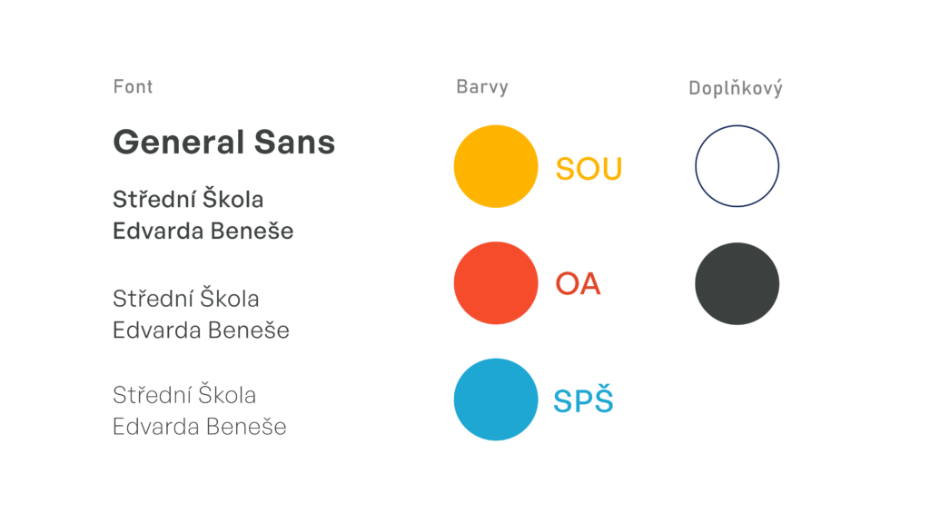
Colors.
Business Academy: Red symbolizes desire, struggle, business, resilience, and willpower.
Vocational School: Yellow is associated with electricity, akin to electric current, and is connected with mechanics and electricity.
Technical High School: Blue is a technically cool color, symbolizing the technical aspect of the school.