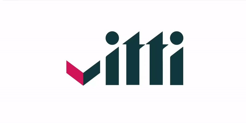
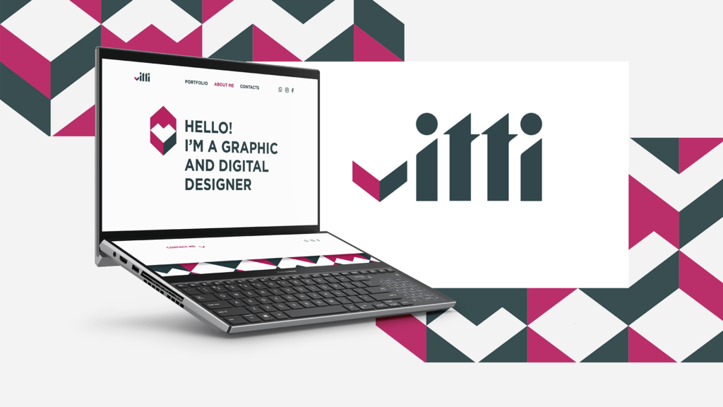
The concept of visual identity for Vitti, according to her preferences, aimed to create a minimalist style with a clear accent color.
I’ve chosen the color pink, which expresses creativity and the energy of my classmate and is combined with blue, which adds solidity. The logo combines triangular shapes – symbolizing movement, development. It is enclosed in a rectangle, which symbolizes reliability. I wanted to make the letter V in the form of a checkmark or arrow to connect it with Vitti’s design choice.
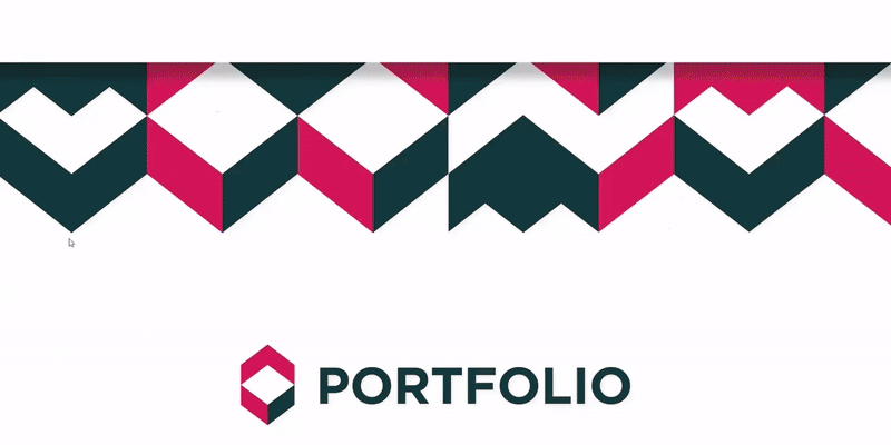
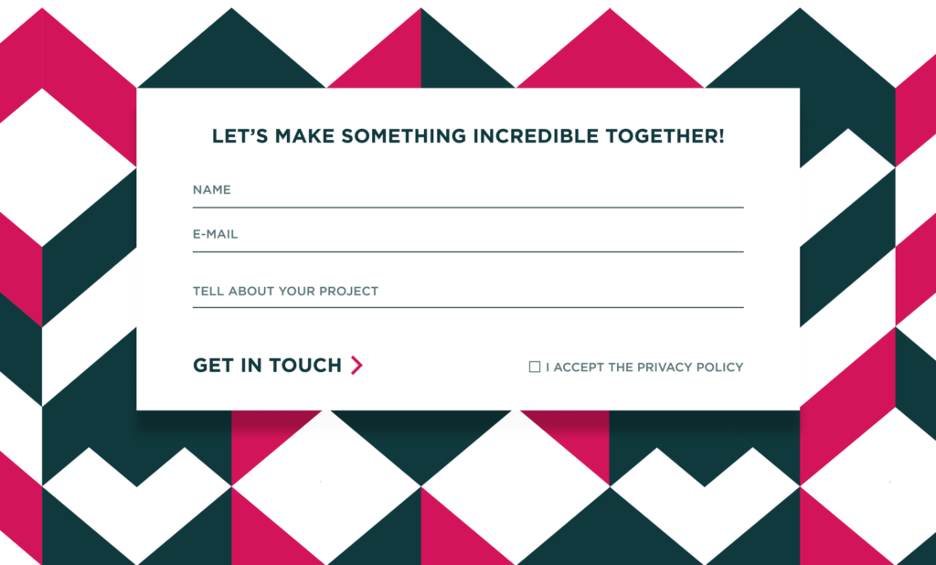
The pattern made up of parts of the logo serves as an accent and focal point.
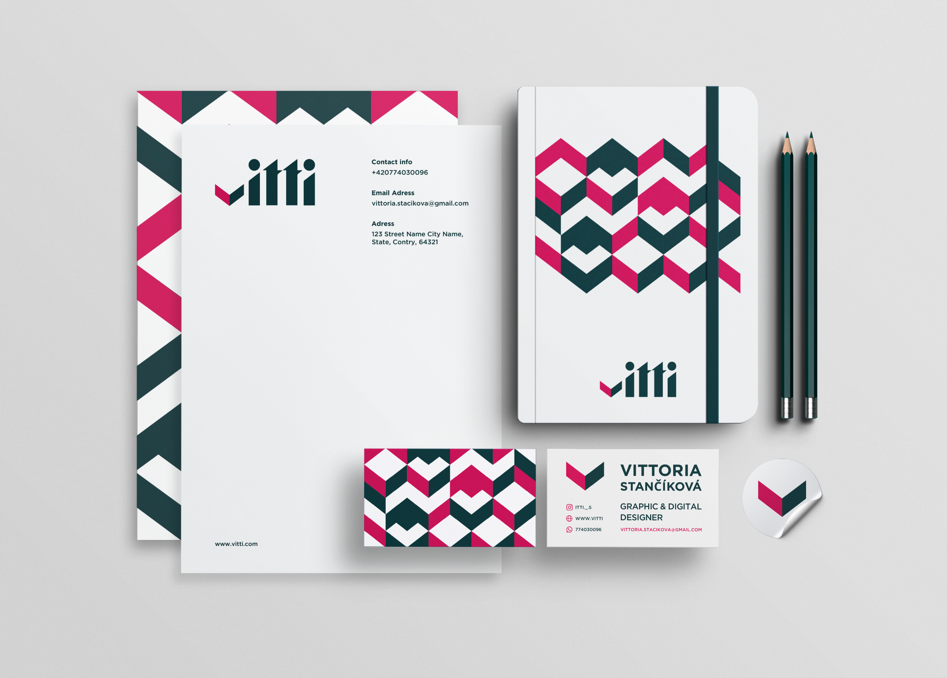
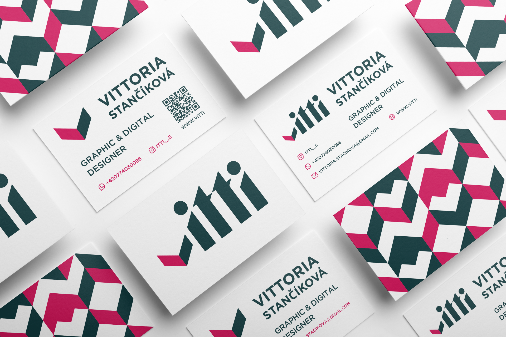
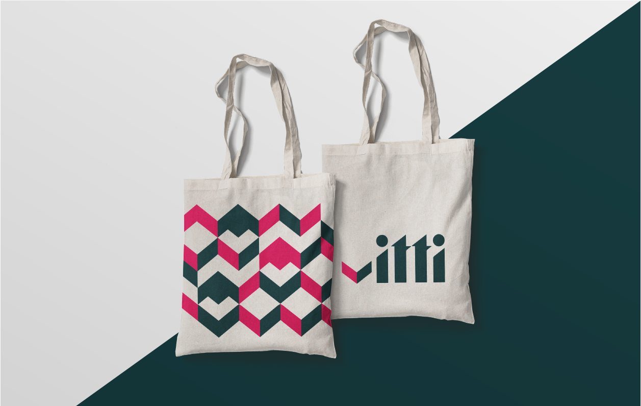
As part of the identity, a logo, basic corporate stationery, and a web portfolio have been created.
Using an introductory animation on the website evokes associations with Vitti’s design choice.